
For several thousand years, mapmaking was a discipline. People died at sea correcting these things. And now I’m looking at a chart where an entire landlocked country has been replaced with ocean, and I’m expected to have a professional opinion. These bad maps arrive with the full visual authority of real cartography and none of the accountability, and I’ve reviewed them the way I’d review a dissertation. The findings are troubling. The findings are also very funny. Let’s begin.
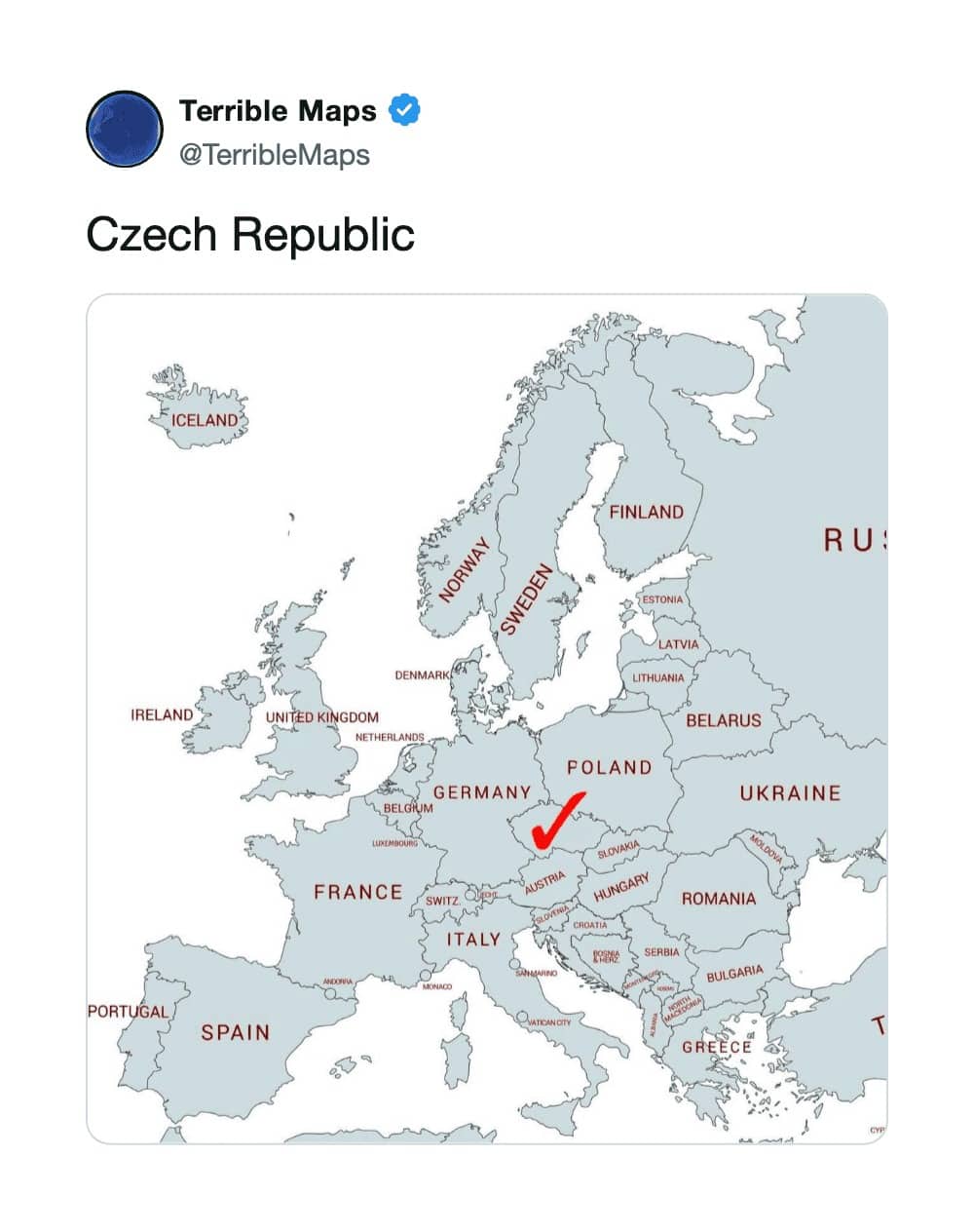
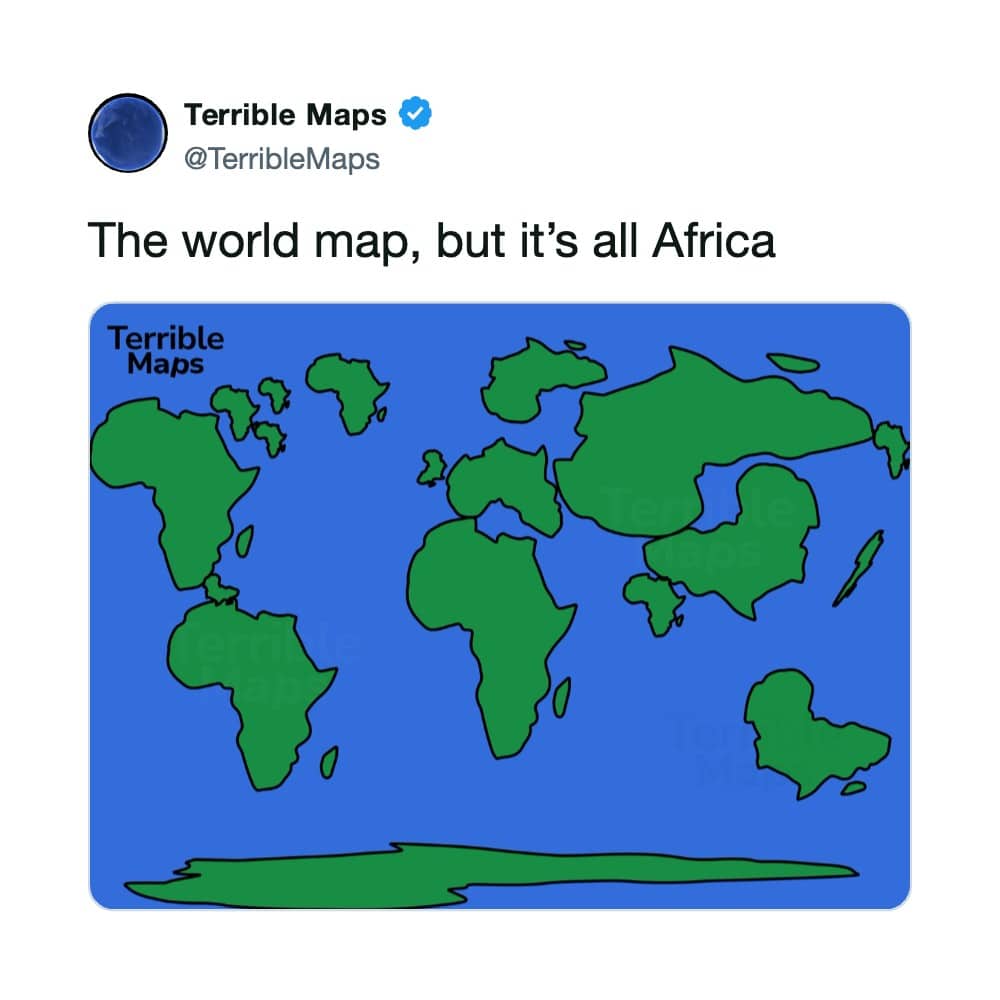
Finally, the Czech Navy has a purpose.
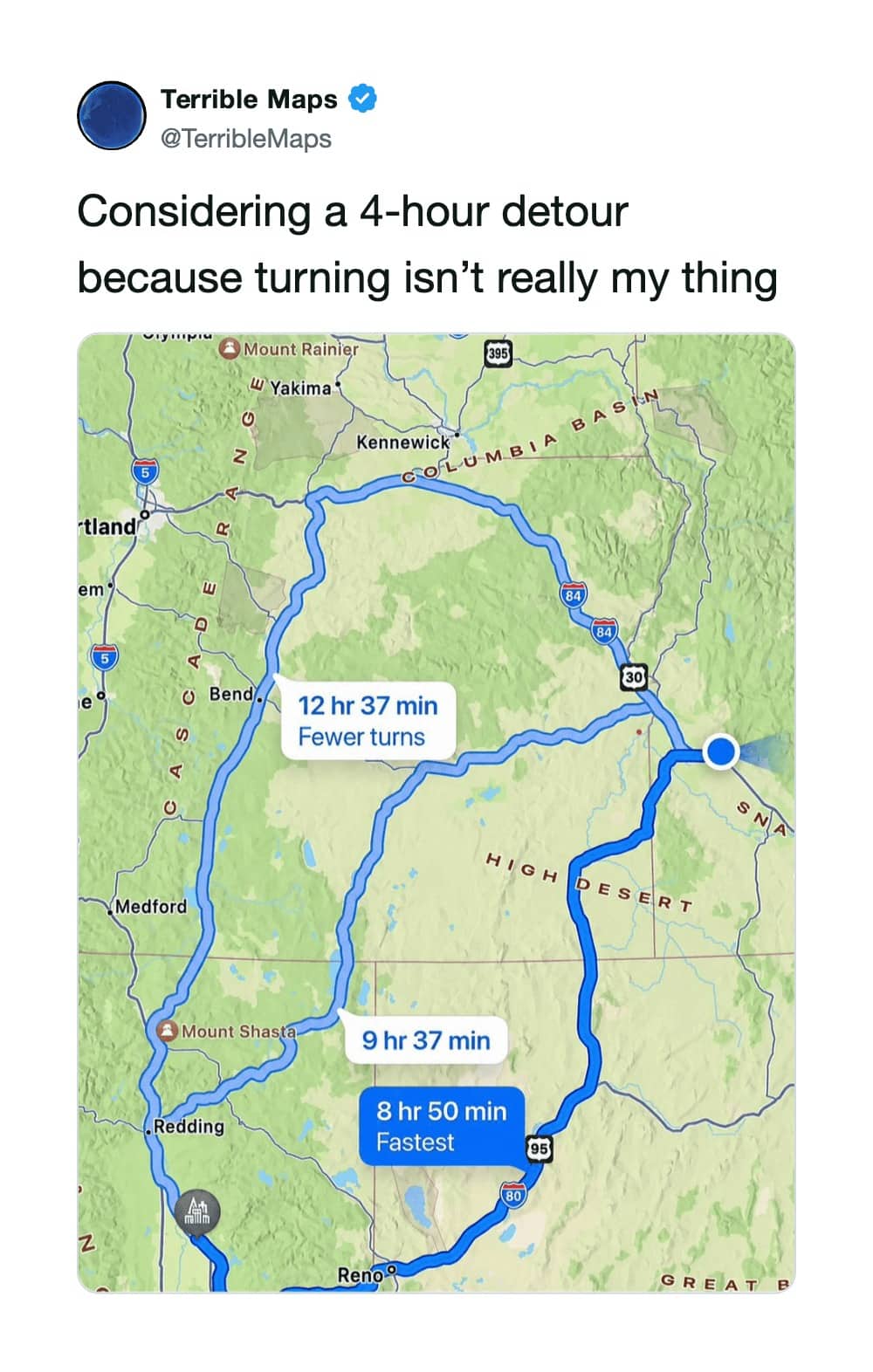
The official GPS setting for Derek Zoolander.
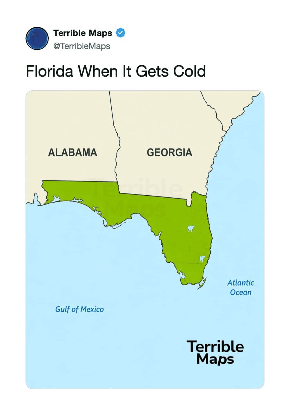
It happens to every state, okay?
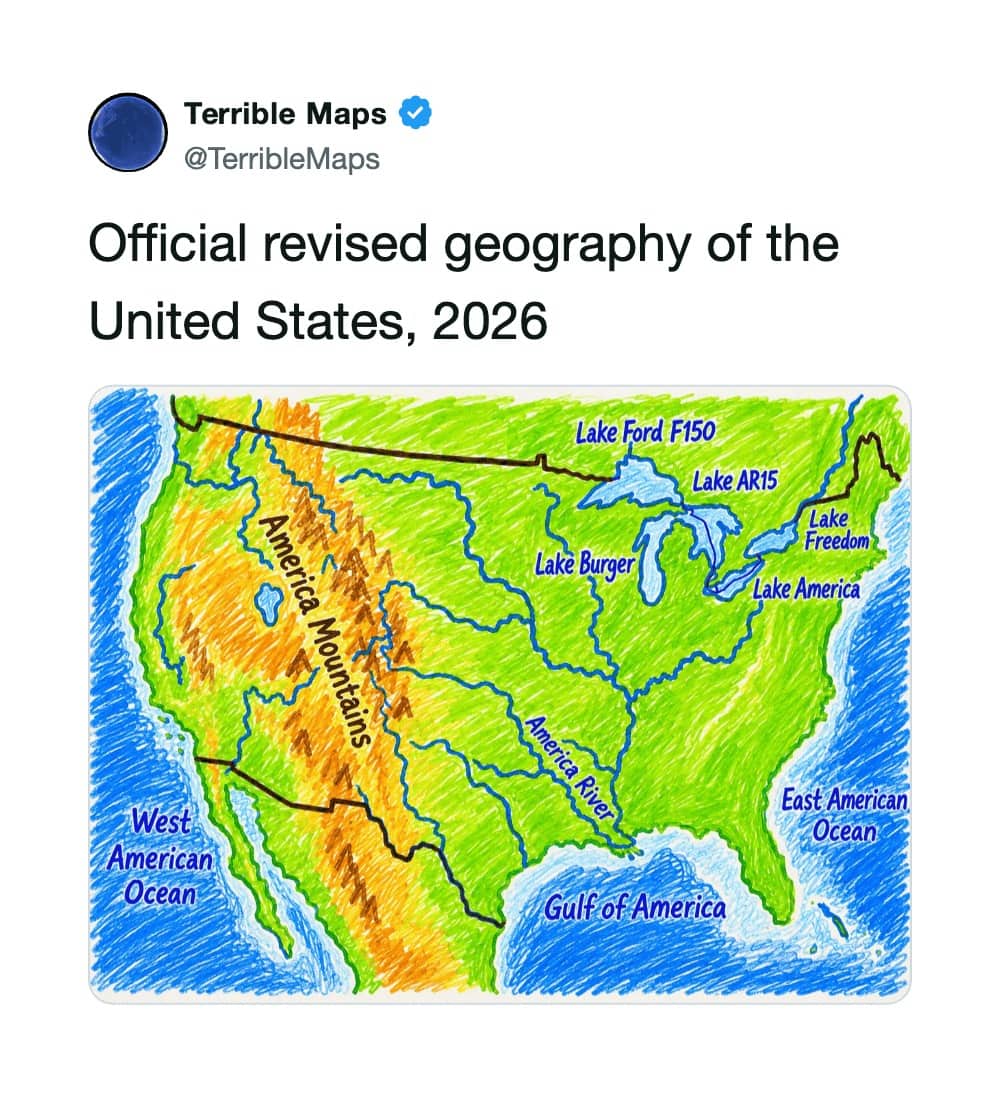
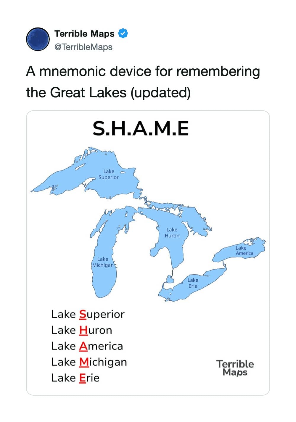
Can't wait to summer at Lake Ford F150.
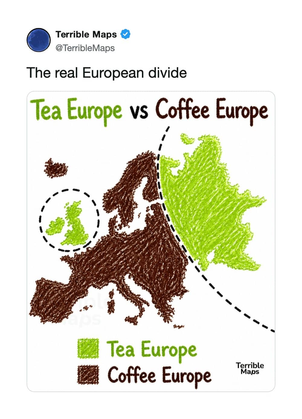
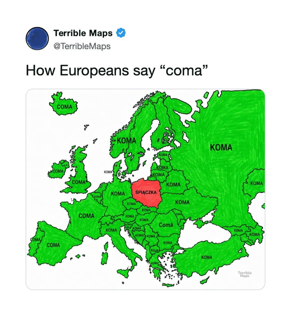
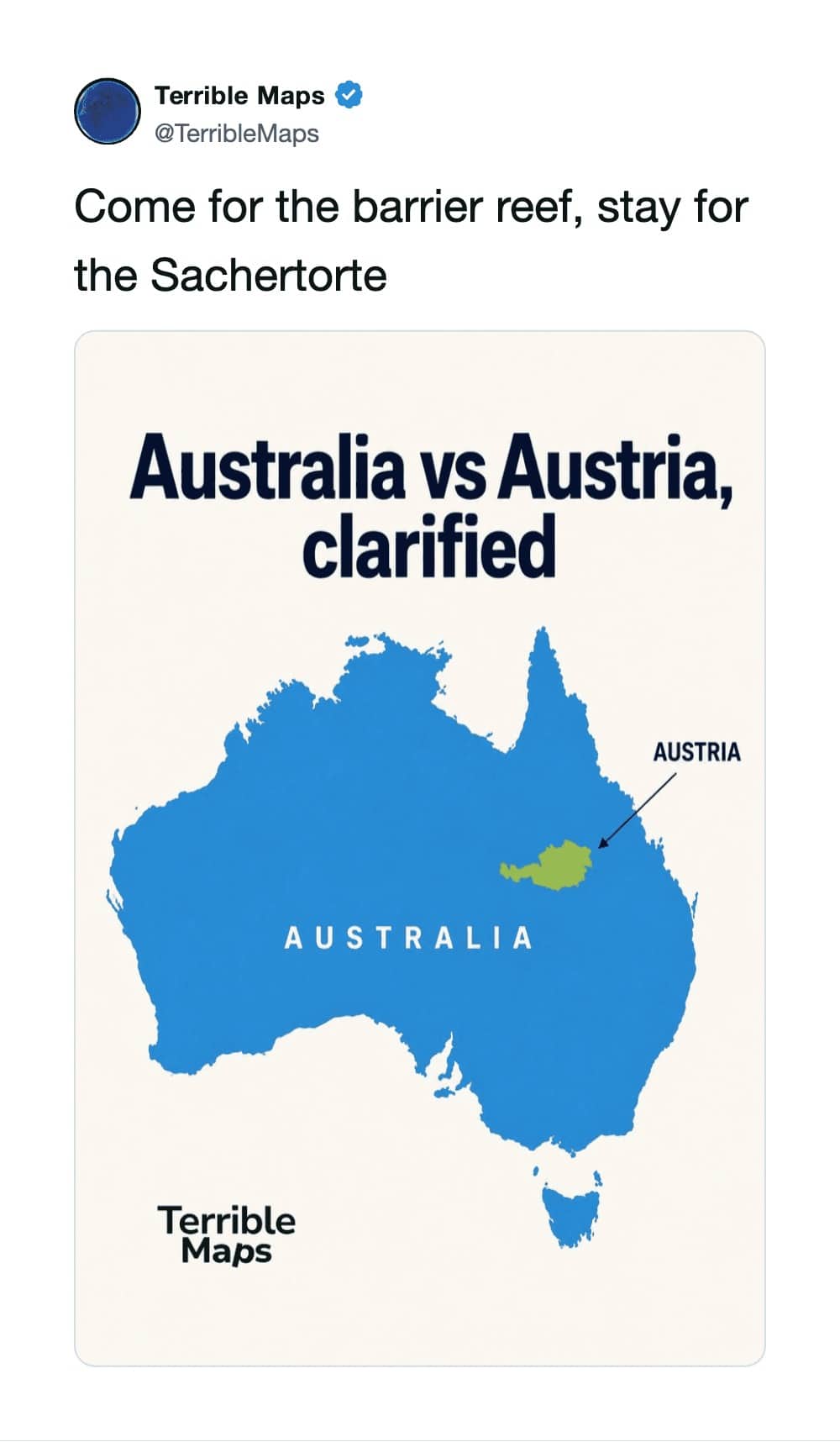
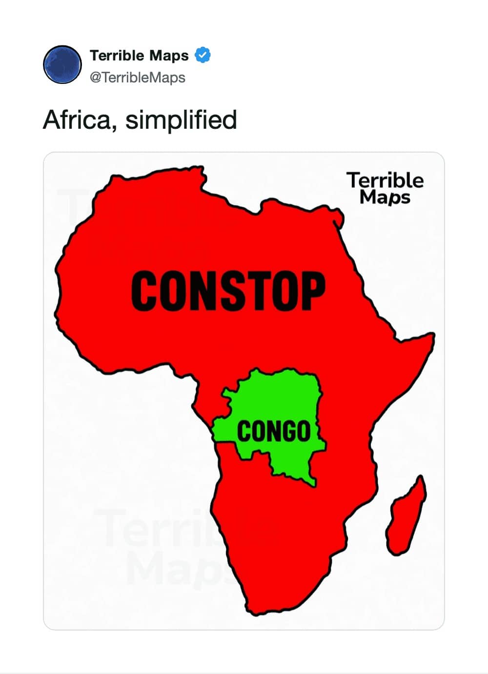
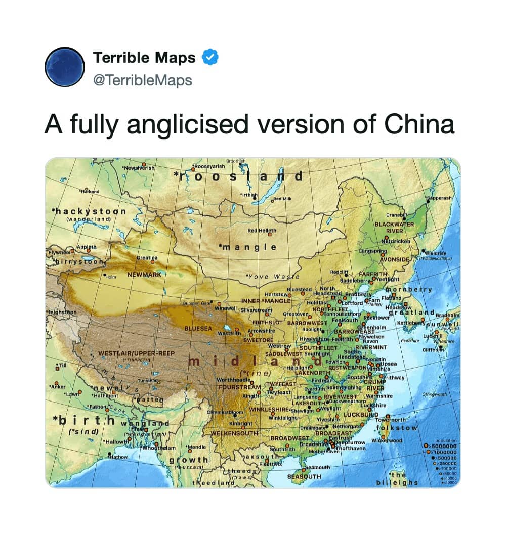
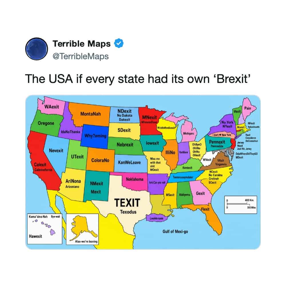
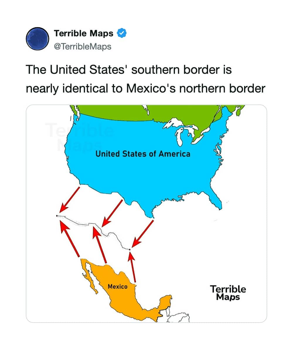
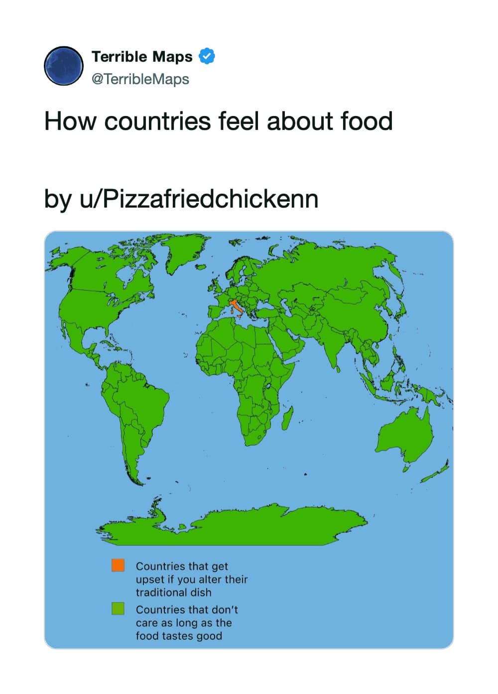
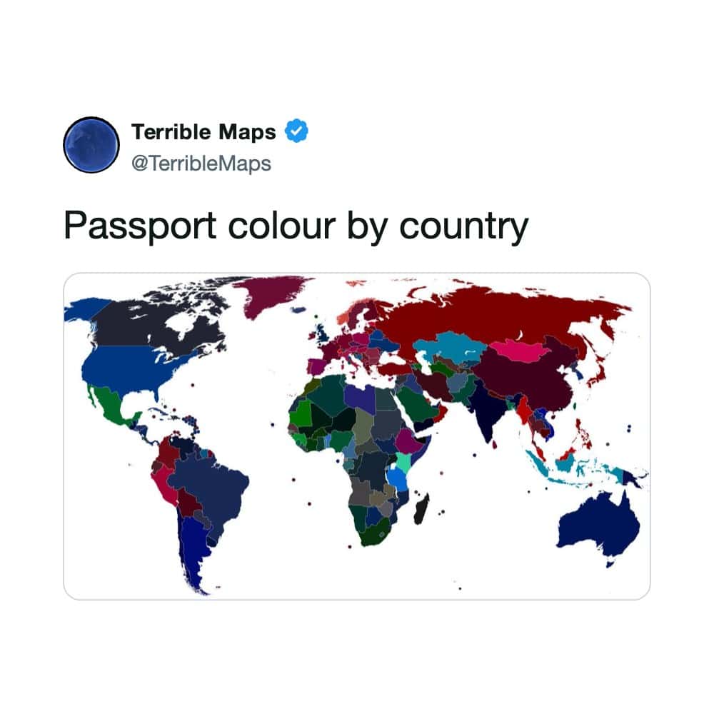
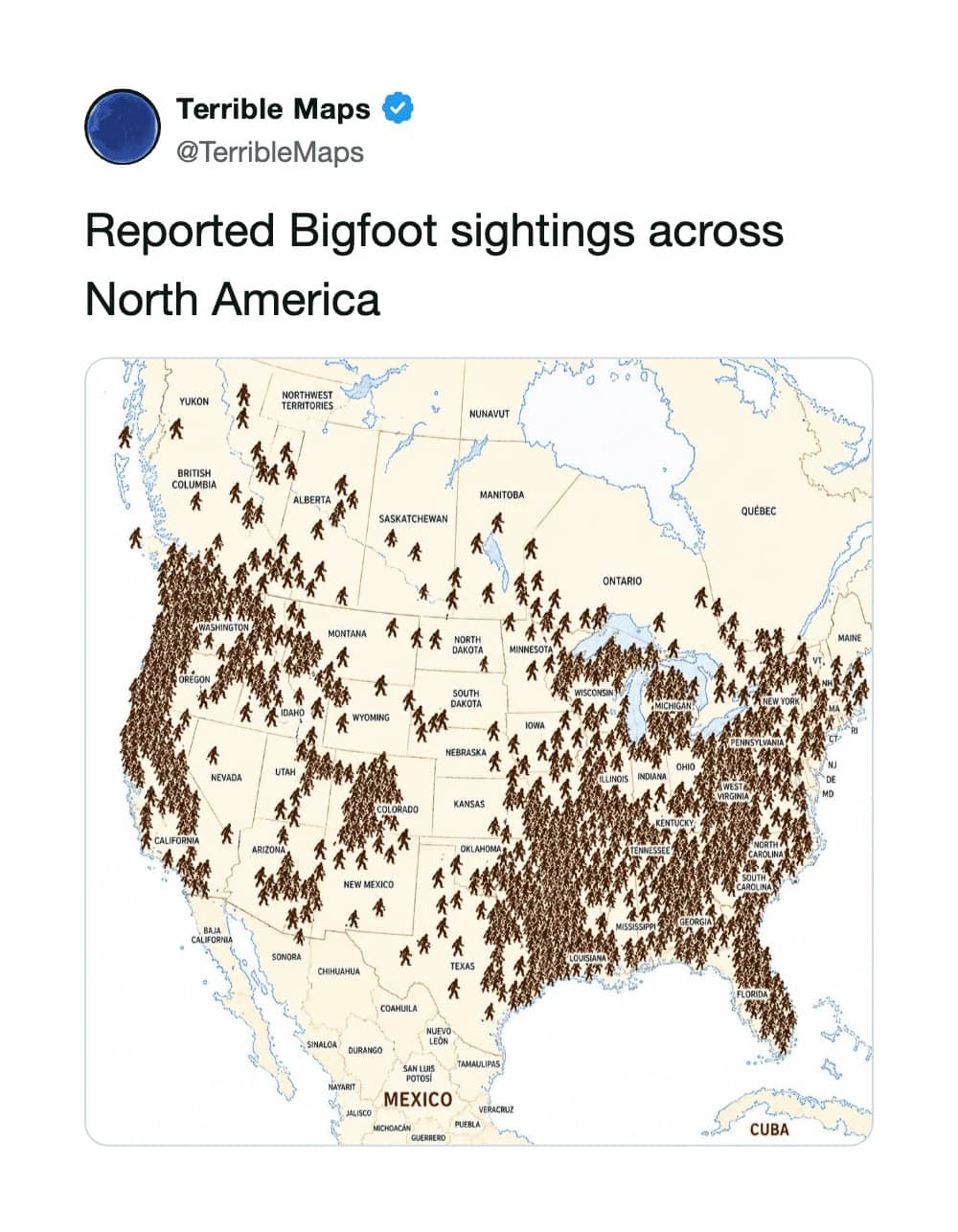
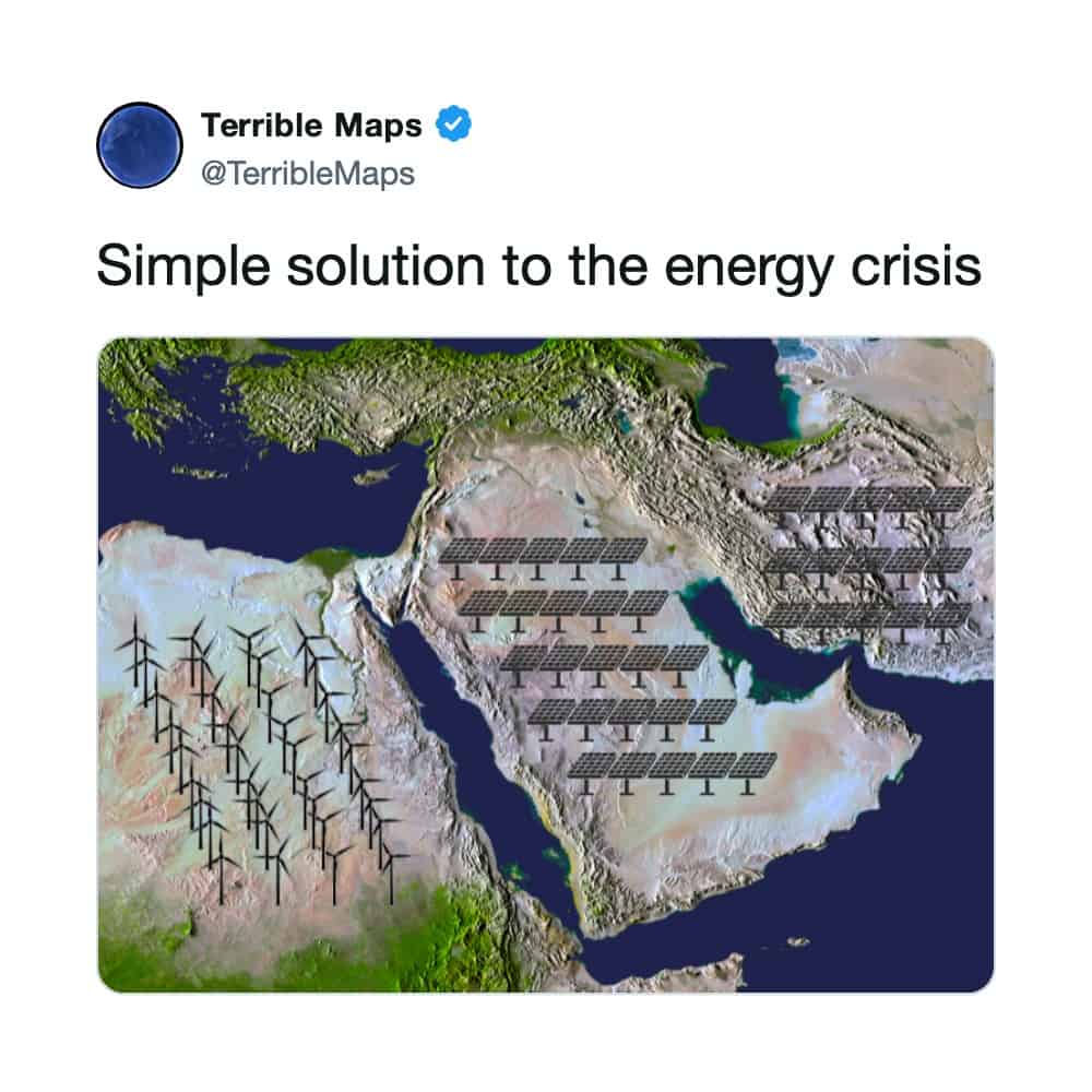
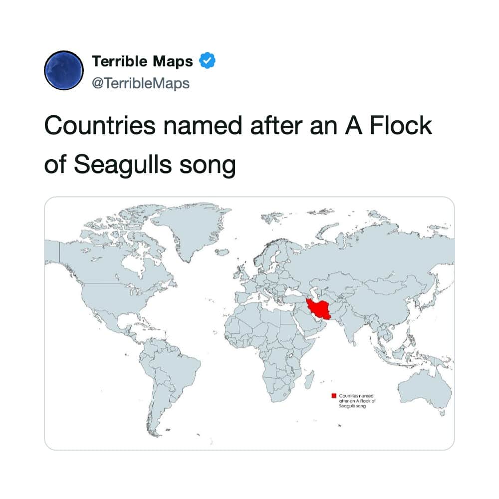
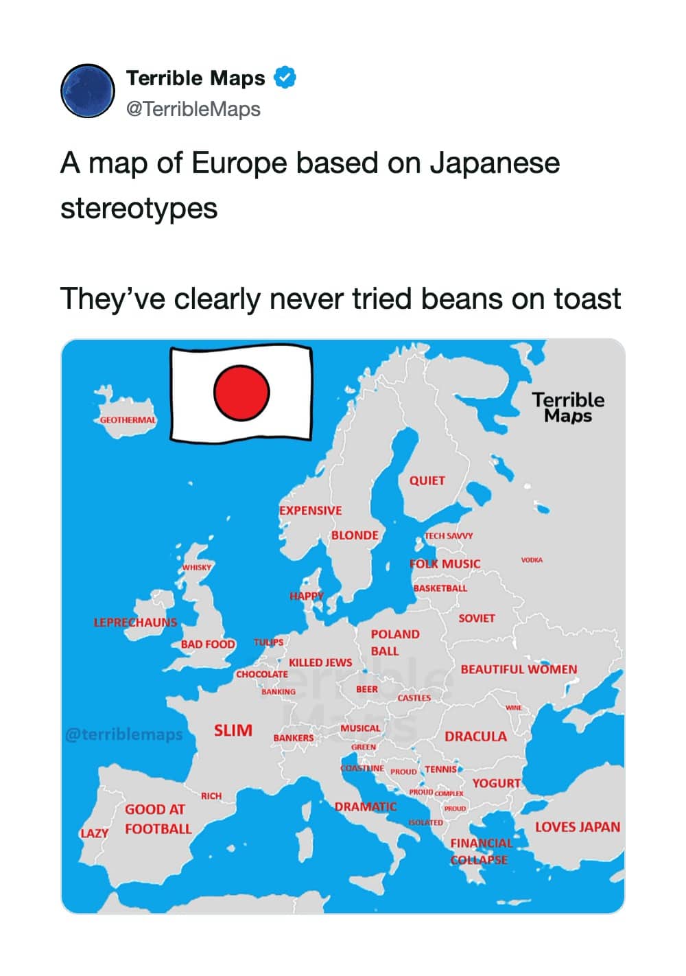
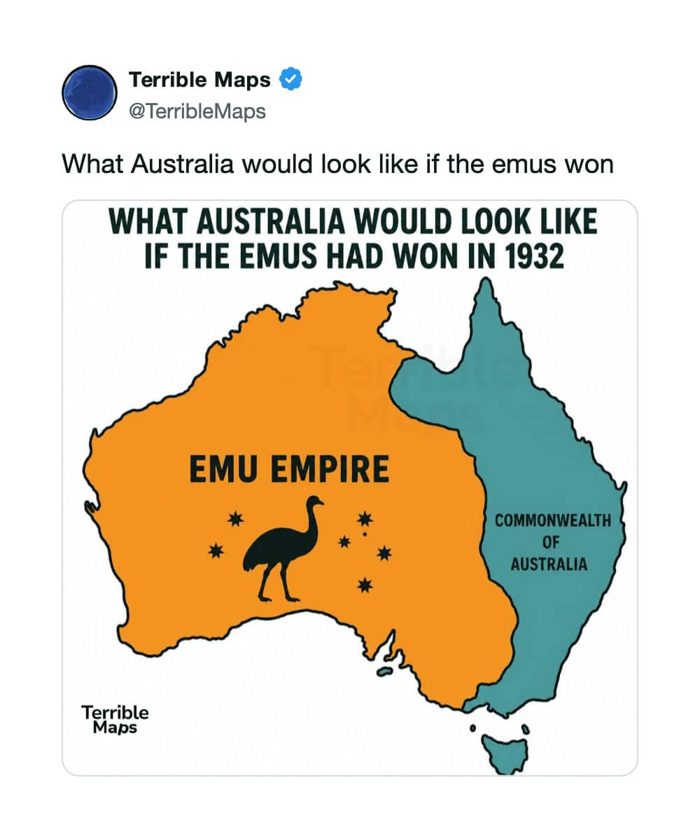
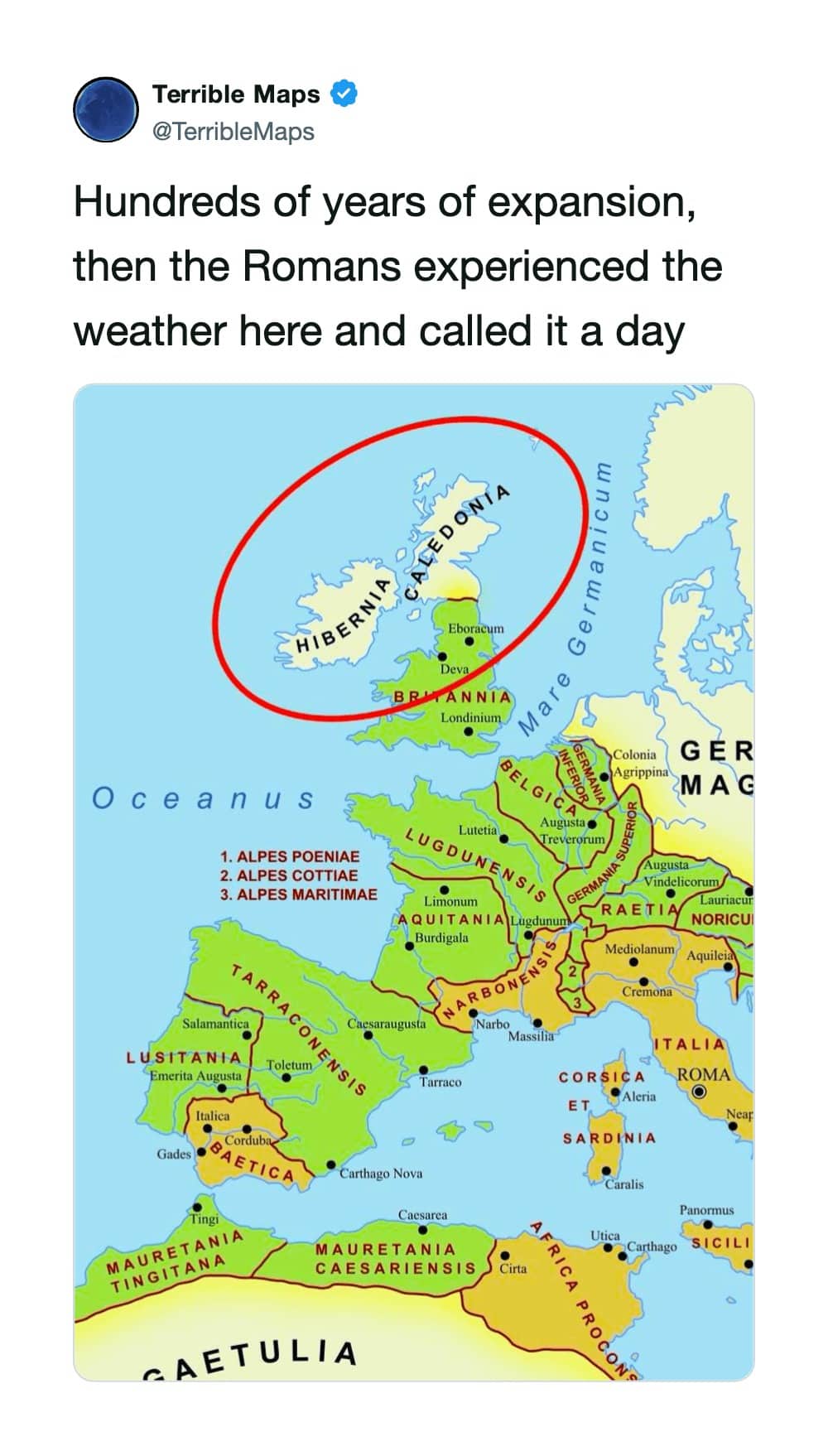
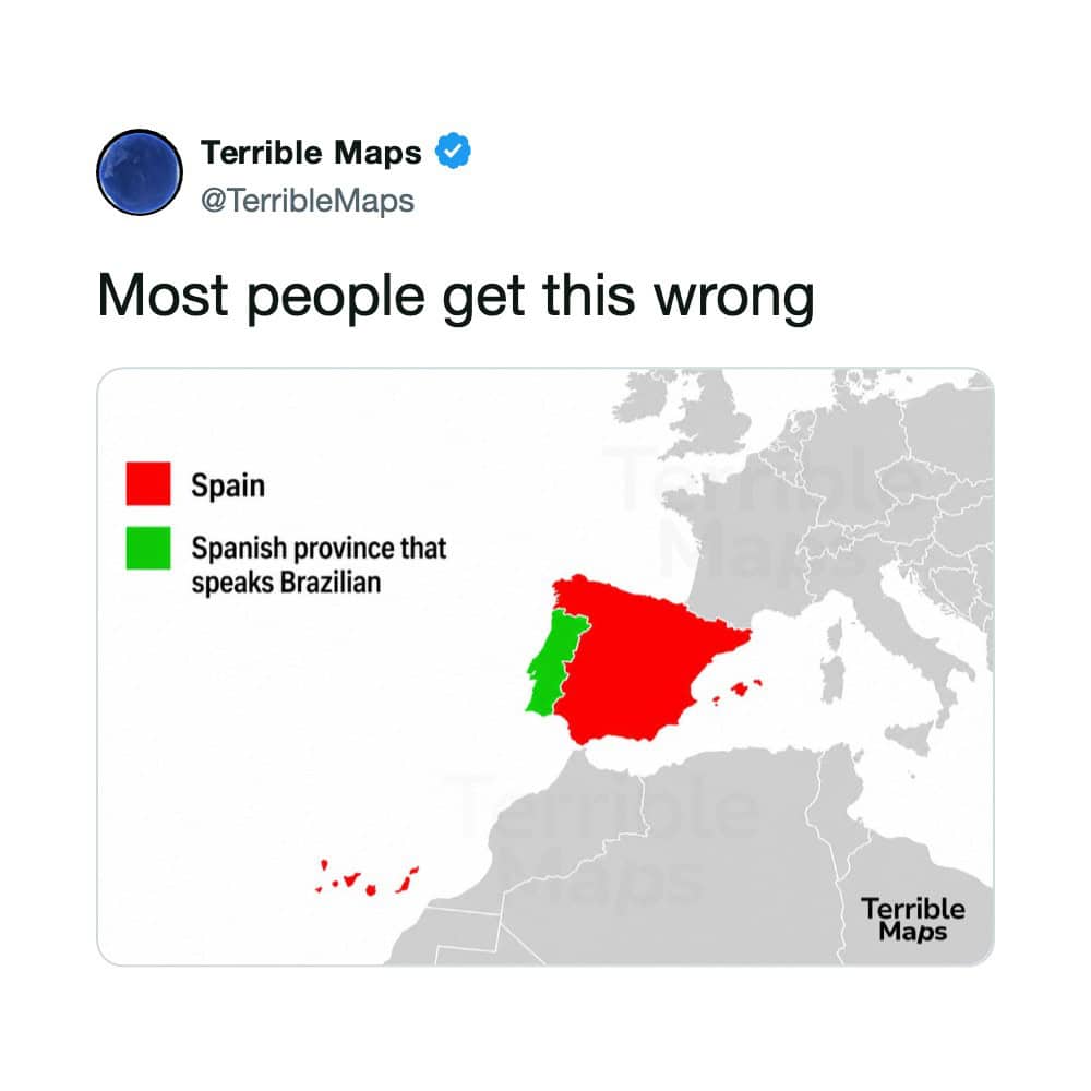
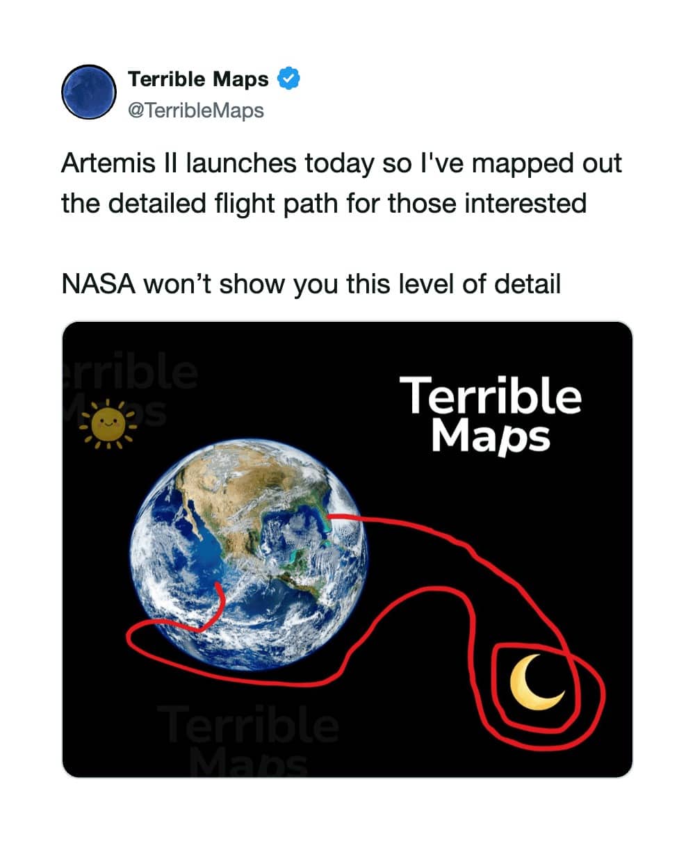





Bad maps
Read More
The navigational entries are where I lost my composure first, professionally speaking. There’s a route plotting a twelve-hour road trip specifically engineered to avoid making any sharp turns, which means someone sat down with mapping software and solved a problem that exists entirely inside their own psyche. That’s not a map. That’s a diagnosis with mileage. And there’s the one showing a certain southeastern state contracting upward in cold weather, presented with the calm authority of a climate study, which is the joke working exactly as intended: the format is credible, so your brain accepts it for a full second before the rest of you catches up.
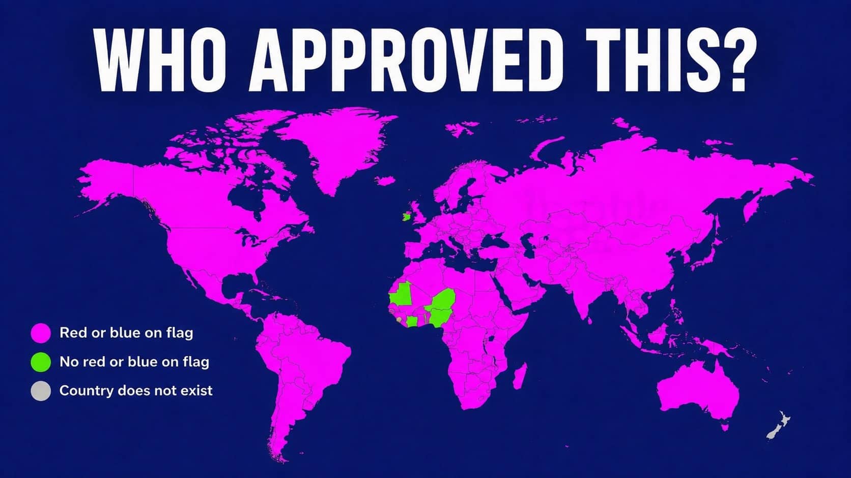
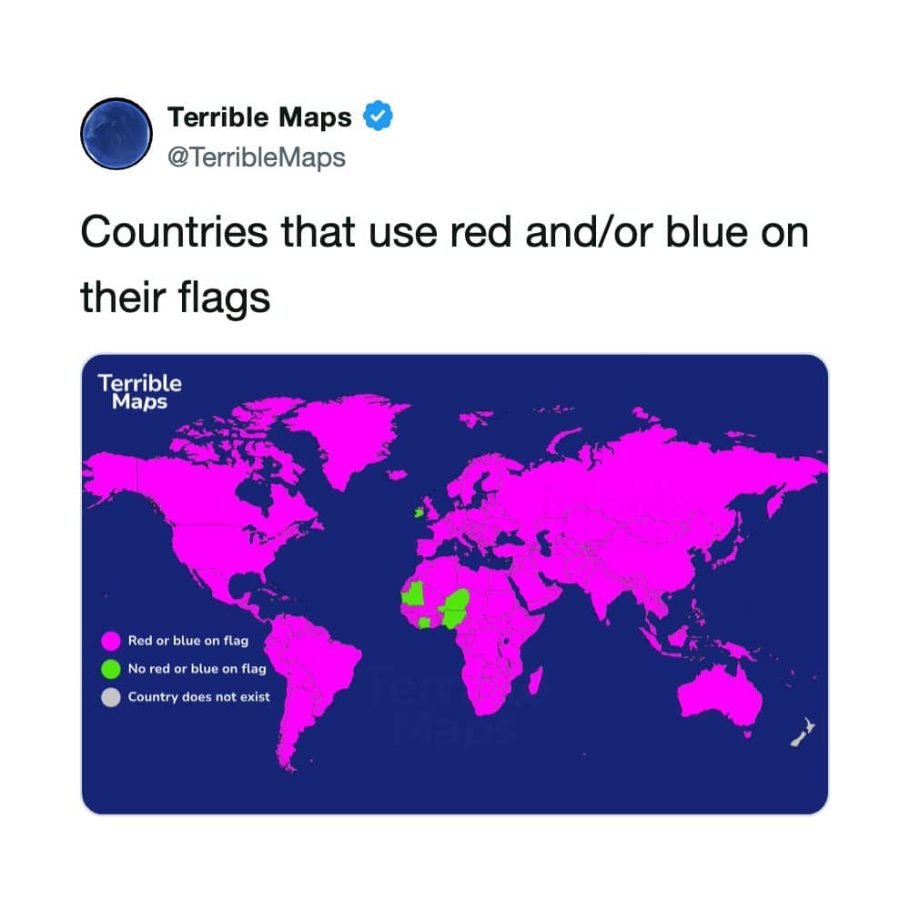
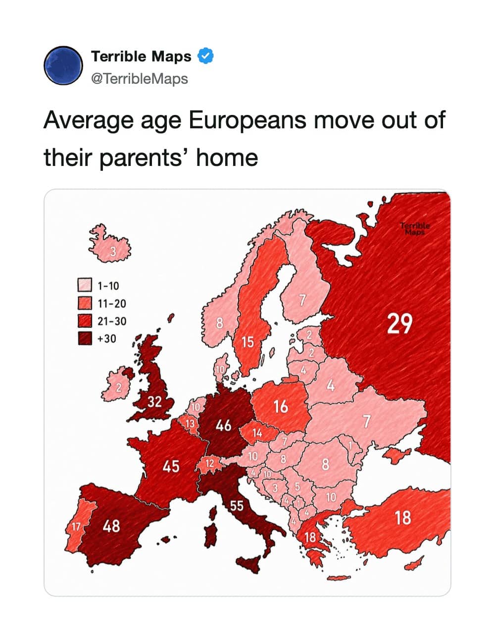
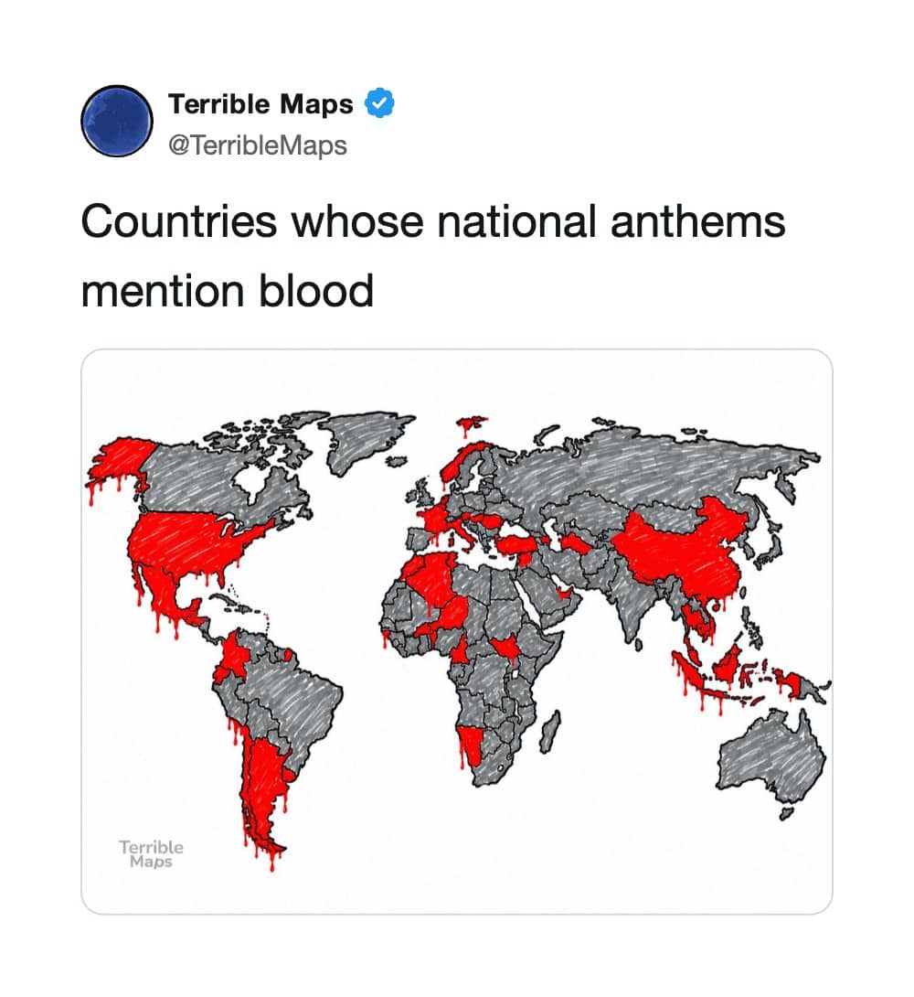
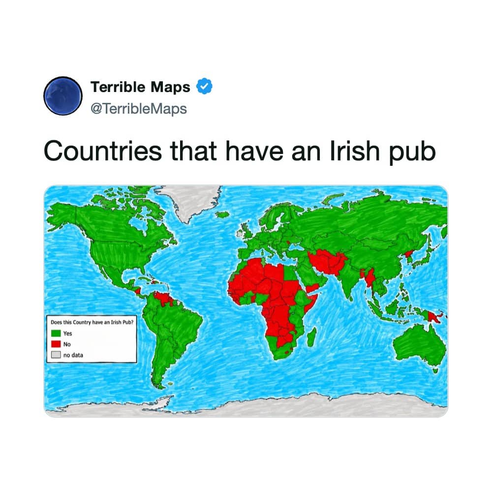
Then the statistical wing, and this is where these things get genuinely educational by accident. There’s a global chart establishing that nearly every national flag on earth uses red or blue, which is groundbreaking work in the field of vexillology and also correct. There’s a map marking every country whose national anthem mentions blood, and once you see how much of the world lights up, sporting events take on a somewhat different atmosphere. And there’s a chart of the ages at which Europeans leave their parents’ homes, wildly exaggerated in the details and, in spirit, an accurate visualization of a continental housing crisis. That’s the sinister thing about the genre. Half the jokes are just data with the volume turned up.
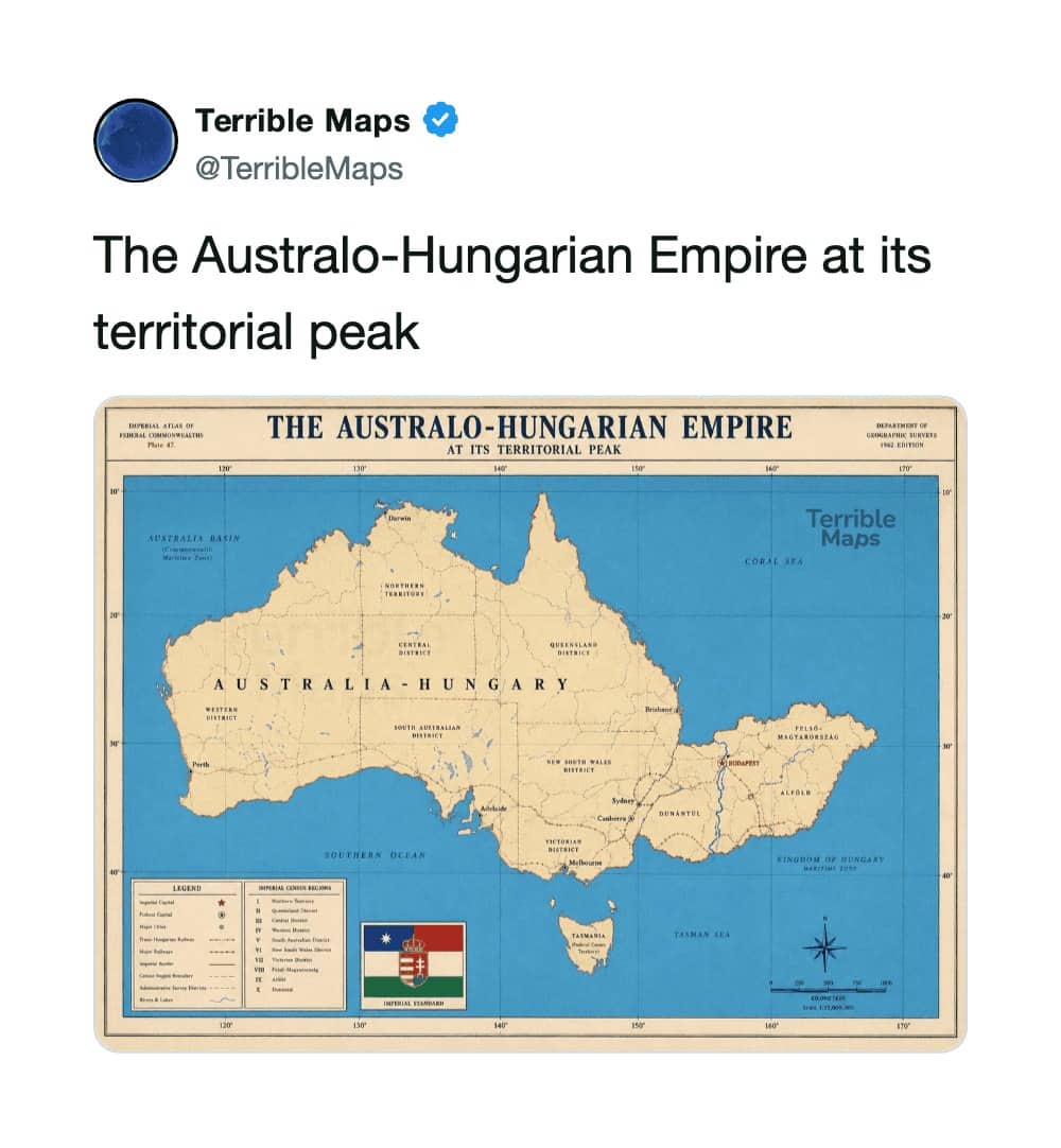
And the fictional-empire material is where all pretense of scholarship collapses and I stop taking notes. Two countries mashed into one nation for no reason beyond the pun in the combined name, which is the sort of thing that would end an academic career and instead ended up with forty thousand shares. A body of water renamed so that a group of lakes spells out an insult, which is petty international relations conducted through hydrology. And a hand-drawn chart of the United States renaming every geographic feature after pickup trucks and fast food, an act of manifest destiny taken to its logical saturated-fat conclusion. Geography teachers worldwide are weeping. I’m one of them. I’m also laughing, which is worse.
What genuinely bothers me, as someone who cares about this, is how effective the format is. A map carries automatic authority. It’s the visual language of fact, so the moment a joke wears that costume, your brain files it under “information” before your judgment intervenes. That’s why these are funny, and it’s also, in slightly less amusing contexts, why misinformation travels the way it does. The joke maps are harmless. They’re also a live demonstration of a vulnerability we all share.
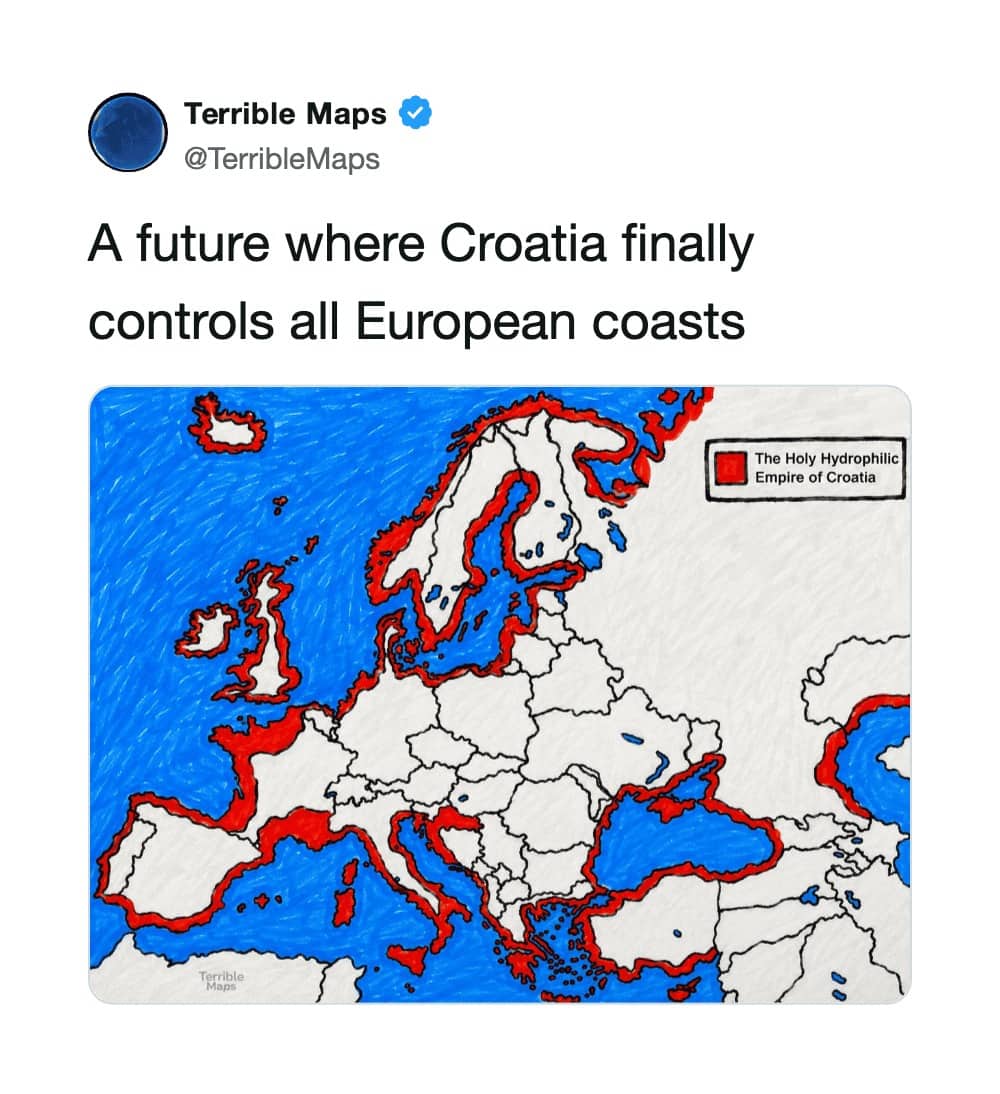
But I’ll set the lecture down, because the honest truth is these do something real cartography rarely manages, which is get people to look at a map at all. Nobody voluntarily studies the borders of central Europe. Everybody studies a map that has clearly done something wrong to central Europe. Accidental education, delivered by vandals. I’d rather that than a room of people who couldn’t find any of it. Coastal Prague remains fictional. Everything else, alarmingly, checks out.
The projection is wrong. The point stands. Do not navigate using these.
If you’d like more geography delivered irresponsibly, our knowledge content has the atlas, with map humor archives, geography fact threads, and cartographic crime compilations filed alphabetically. Read them for entertainment. Do not cite them. I will find out.
Read Memes
Get Paid


Roy R., Chief Meme Curator
Roy founded Thunder Dungeon in 2012 and has since guided its growth into a 2.5 million‑strong community of meme enthusiasts. With over a decade of digital‑media experience and a nose for viral humor, Roy oversees content strategy, ensuring every post is both hilarious and high‑quality