
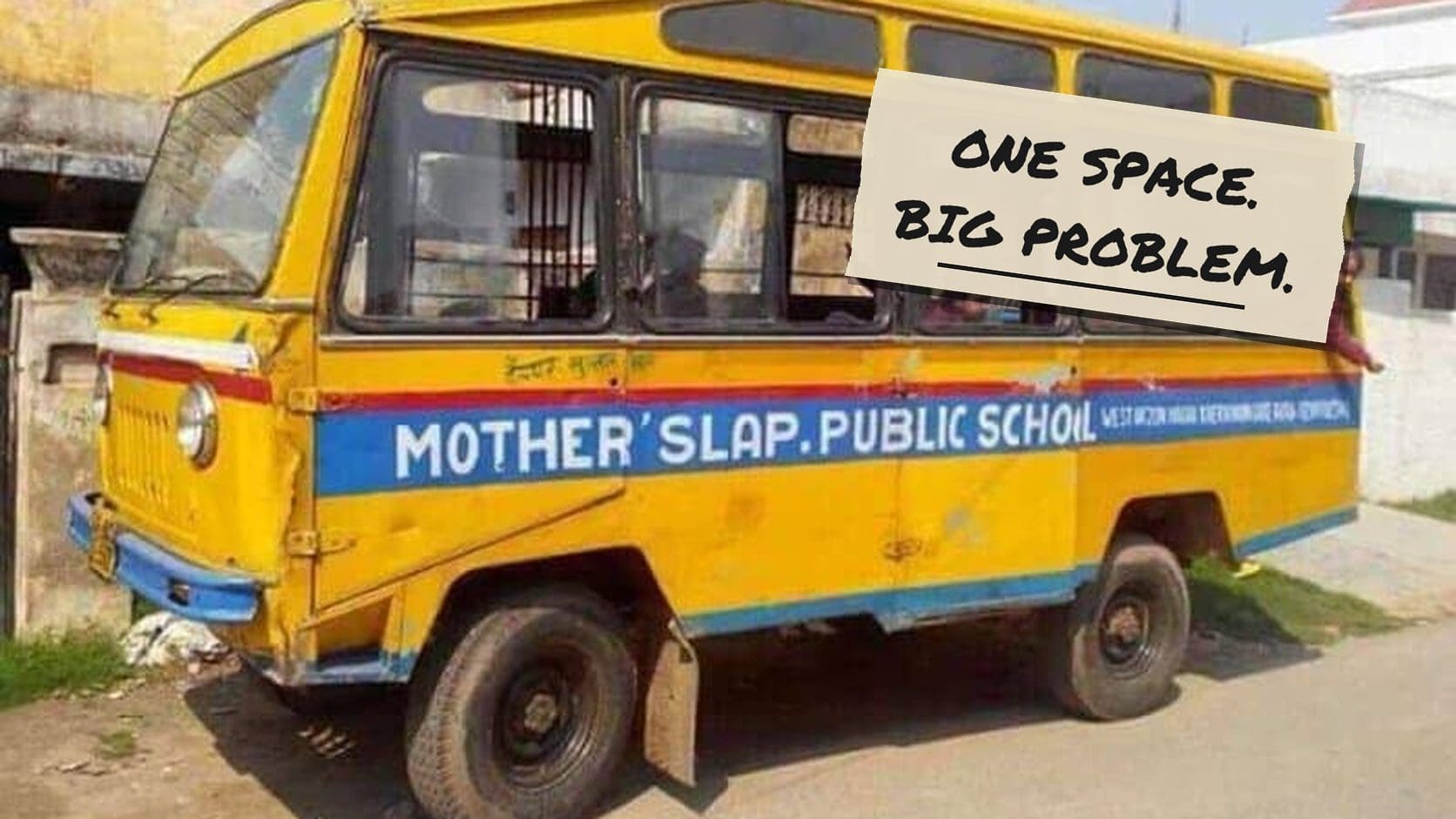
I am the kind of person who notices when a sign is slightly wrong, and then tells everyone at the table, at length, until they move. Bad kerning is my favorite kind of wrong, because nobody actually misspelled anything. Every letter showed up on time and did its job; someone just nudged a space a quarter inch to the left and turned a donation drive into a confession. Here are the spaces that got loose.
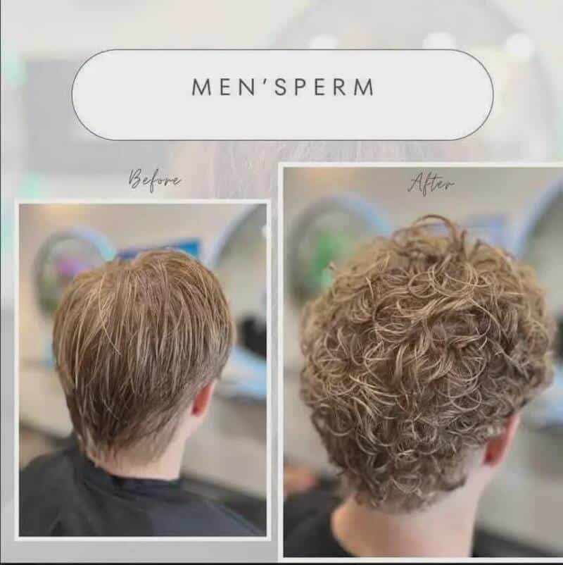
Somebody please call the sign guy.
Save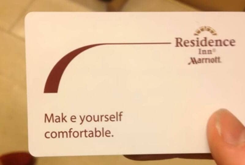
I'll mak e do.
Save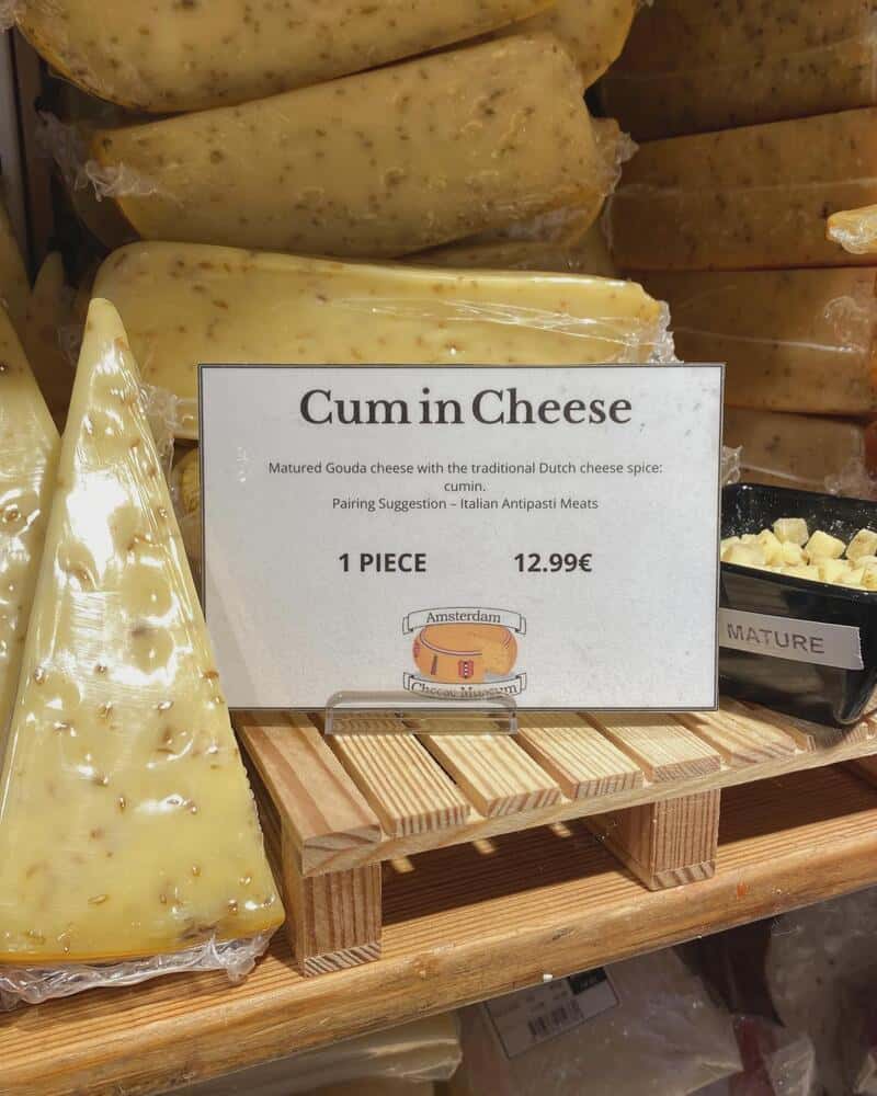
Somebody in marketing is laughing into a wheel of gouda.
Save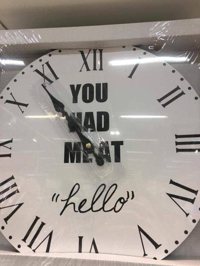
Romance, but make it a deli.
Save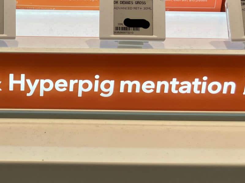
Finally, a serum for the farm.
Save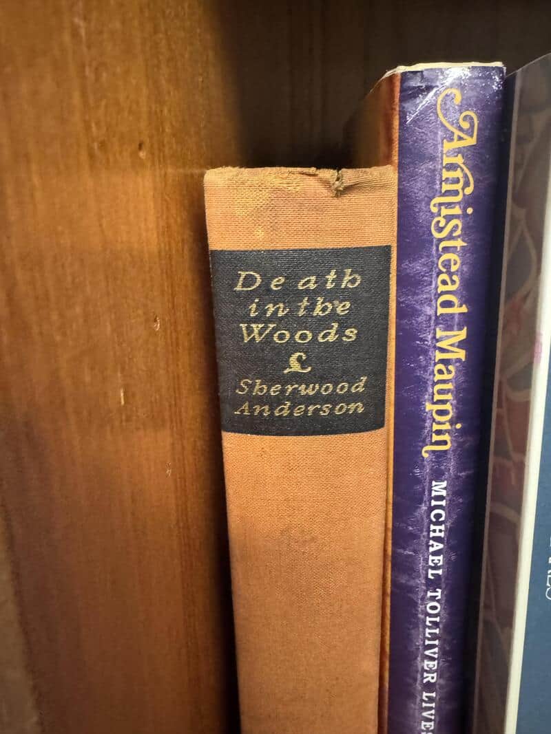
De ath in the Woods sounds like a sequel nobody ordered.
Save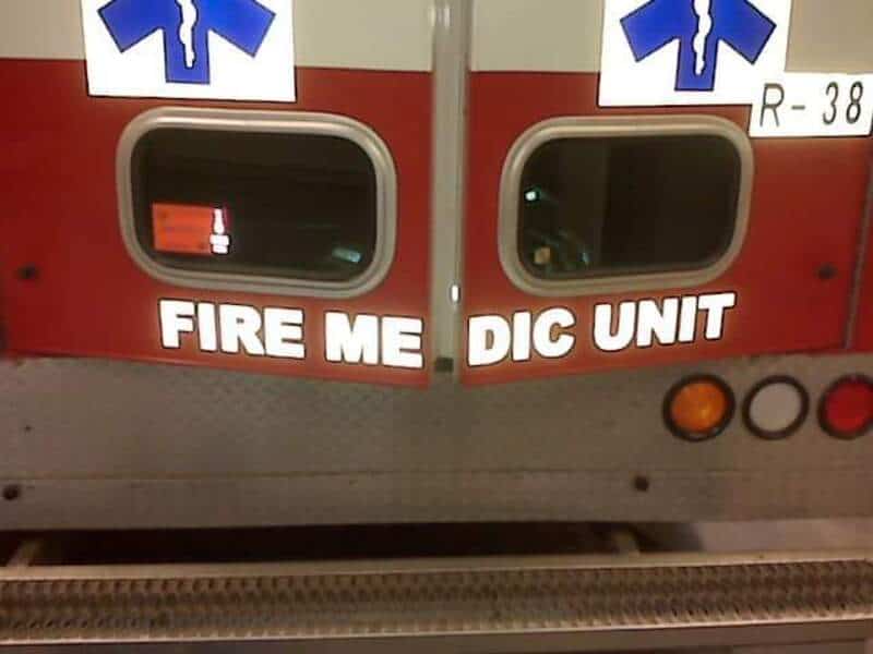
Every paramedic's daydream on a double shift.
Save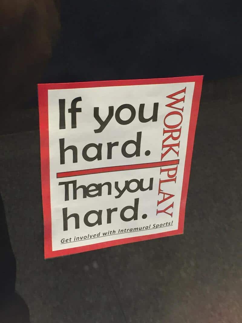
Get involved, apparently.
Save
Lulul? Emon? Gesundheit.
Save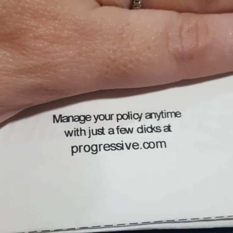
That's not the click they meant.
Save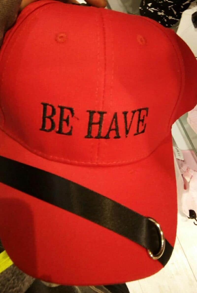
Be have. Be have not.
Save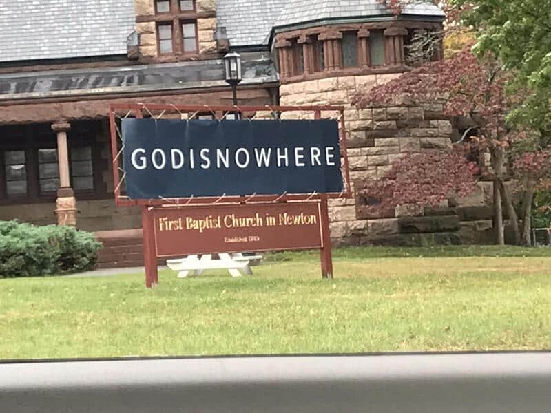
Now here or nowhere, depending on the pew.
Save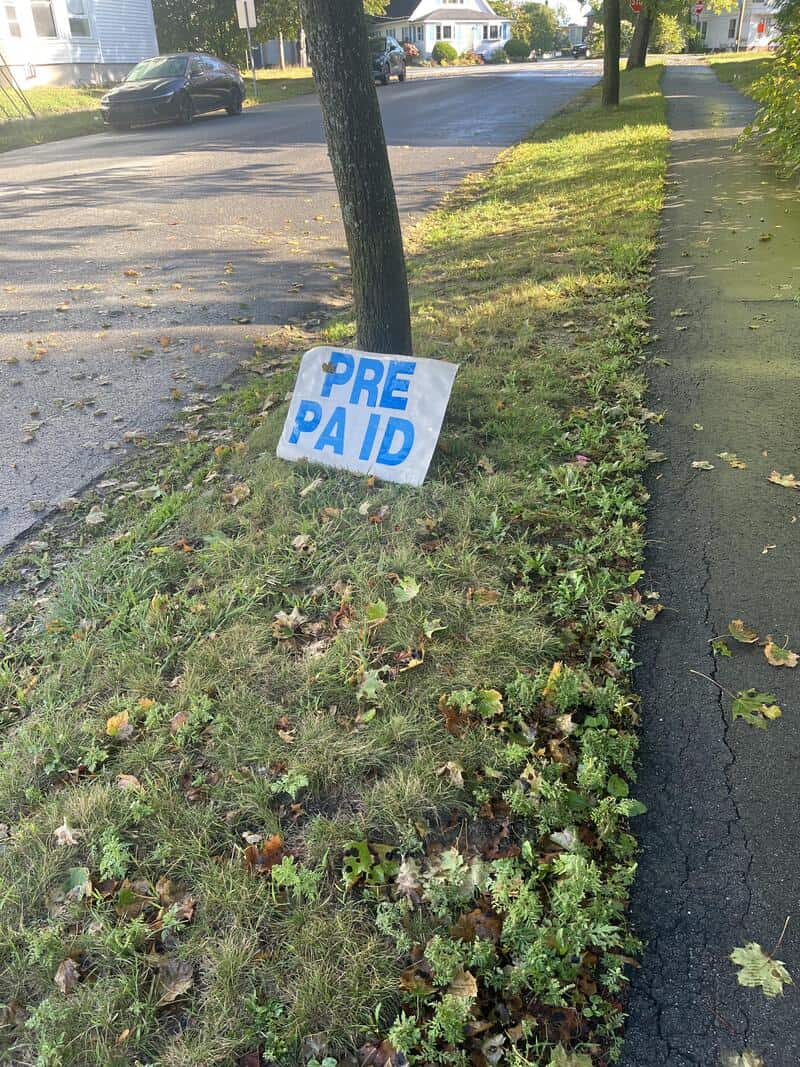
Who is Pa, and why is he being ID'd?
Save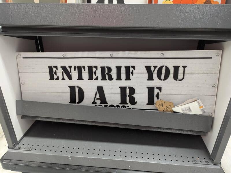
Enterif sounds like a cough syrup.
Save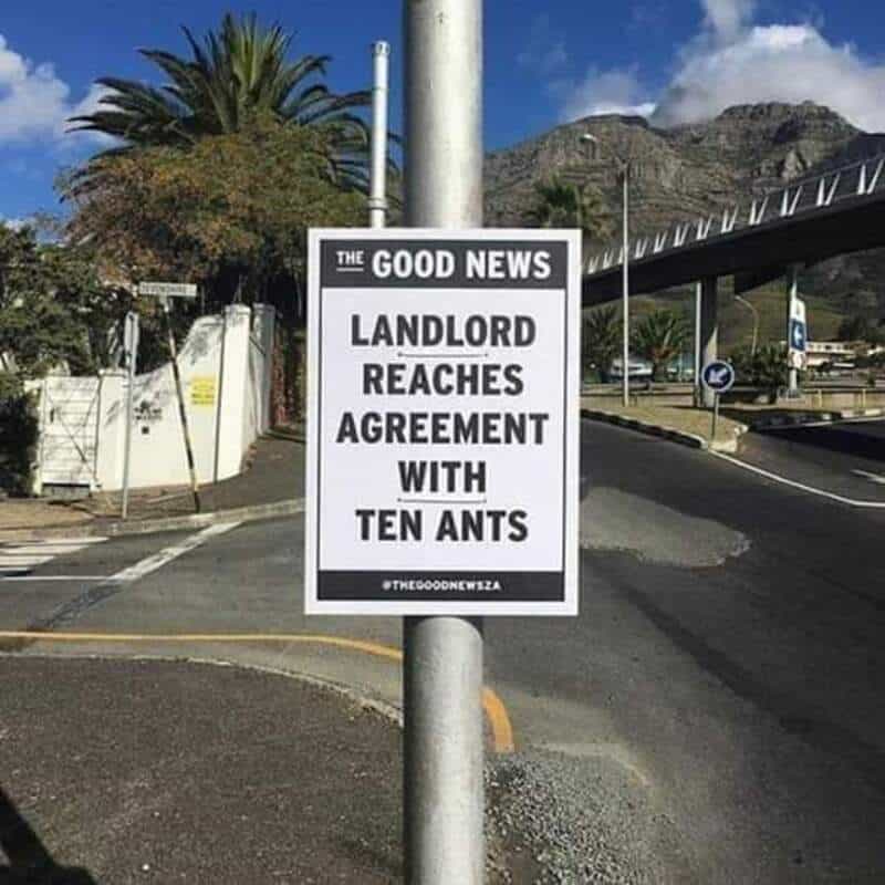
Rent is due in crumbs.
Save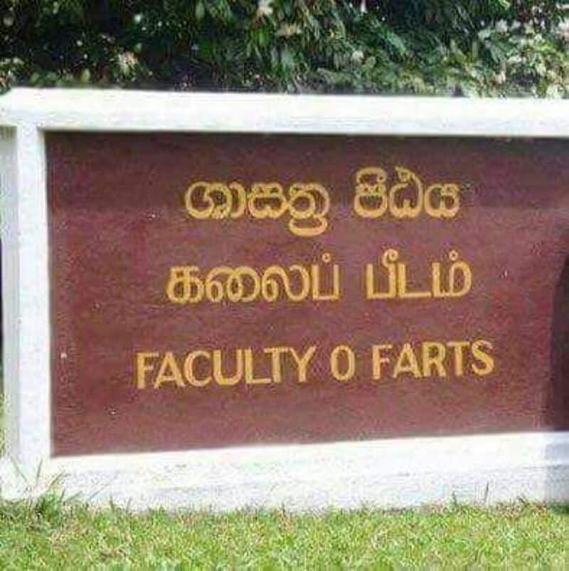
Graduates go on to great things, quietly.
Save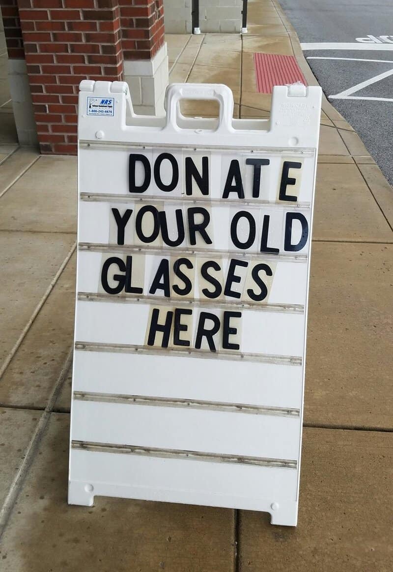
Somebody check on Don.
Save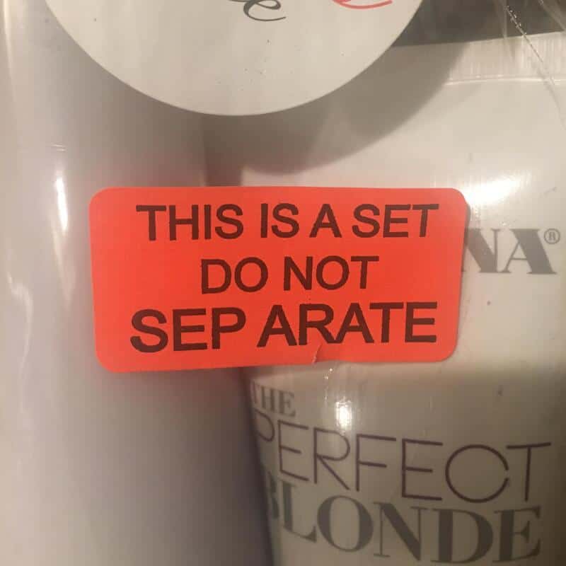
The sticker failed its own instructions.
Save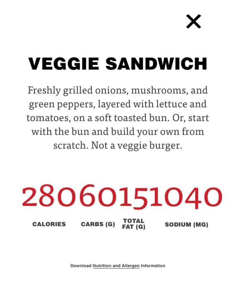
Healthy option: 28 billion calories.
Save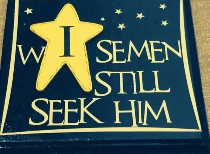
The star was placed with confidence and zero foresight.
Save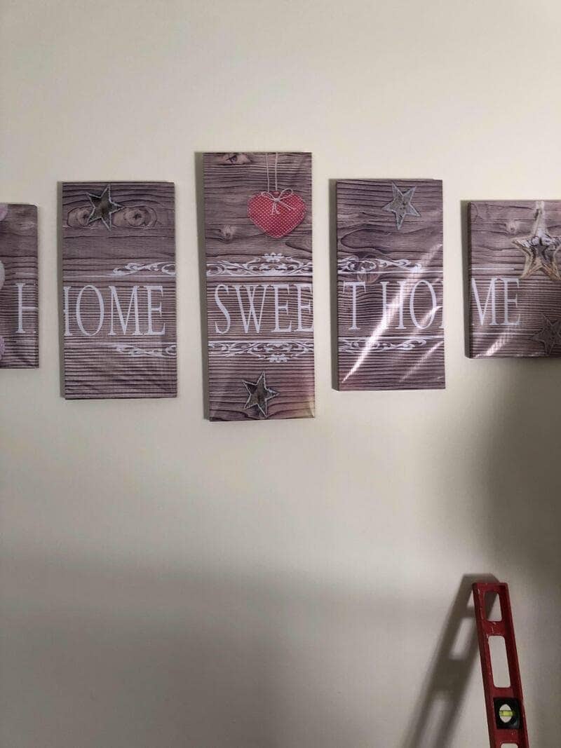
The level is right there, judging you.
Save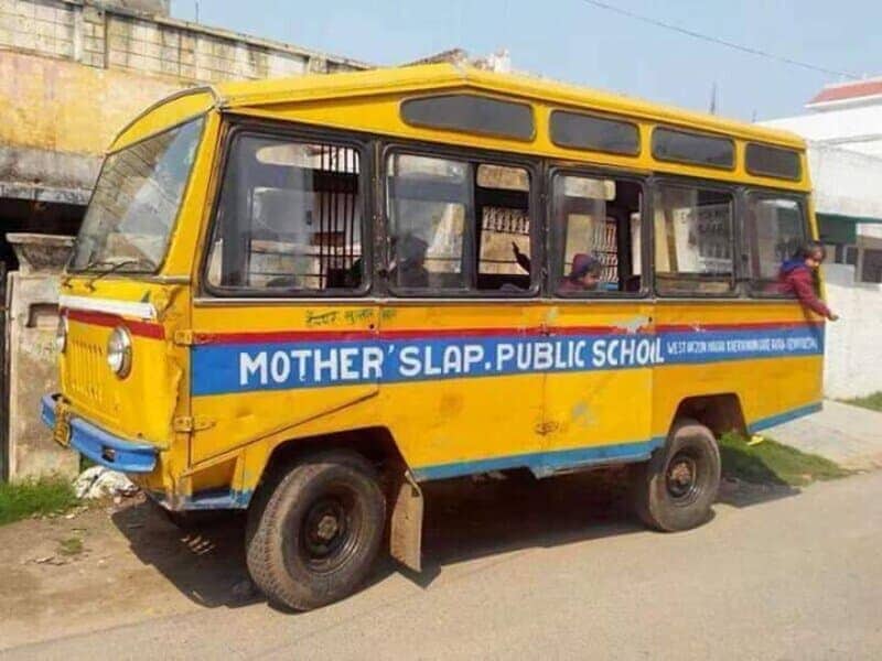
Discipline is in the name.
Save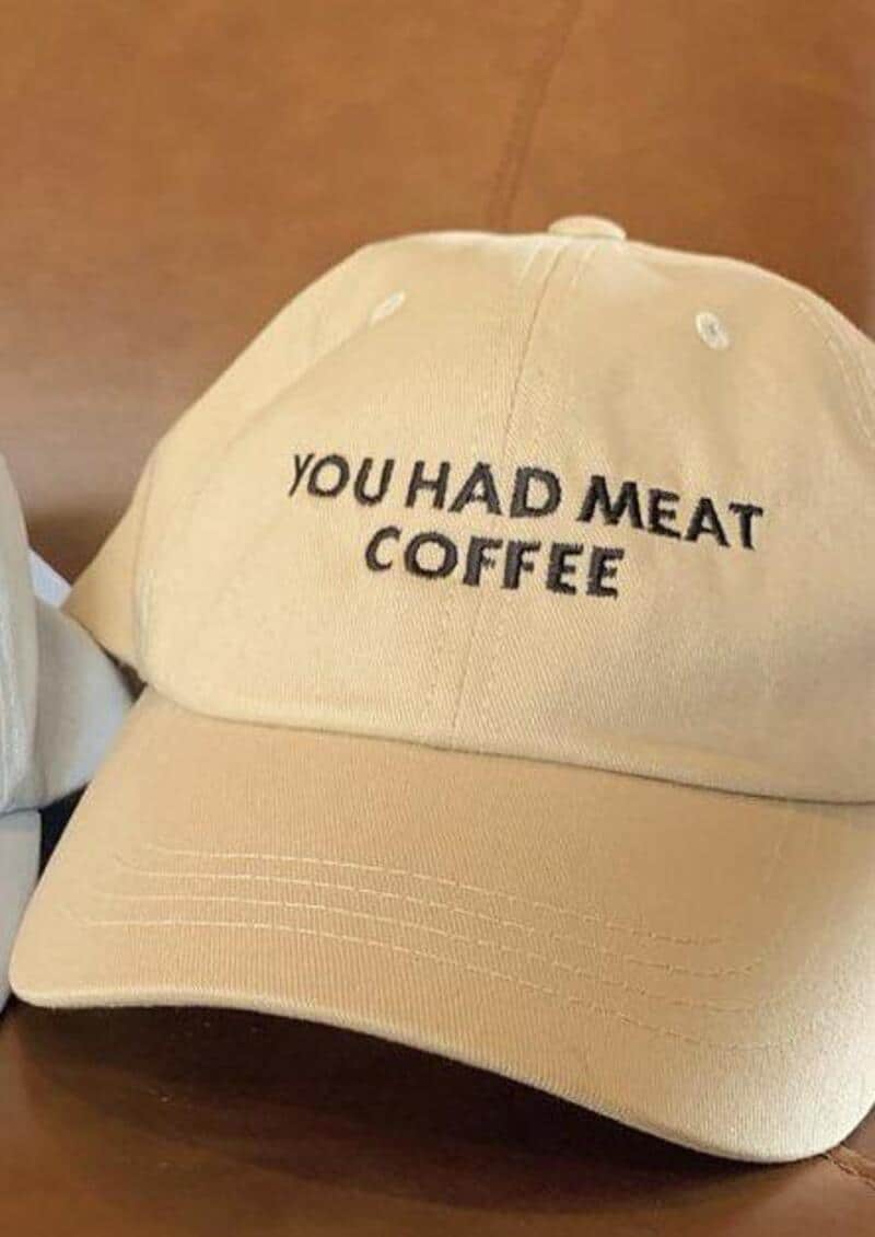
Breakfast of champions.
SaveBad kerning
Read More
I have a theory that every sign maker gets one free spacing mistake, and they always spend it on the most public surface available. Funny sign fails are never on a sticky note in someone’s kitchen. They are on an ambulance, a school bus, a university wall in actual stone. Somebody carved that, and nobody stopped the chisel.
The design fails on merchandise hurt more, because a hat passes through so many hands. A designer approved it, a factory embroidered it, a store stocked it, and a customer paid for it, and not one person read it out loud. I once printed fifty flyers for a comedy night with the wrong date on them, so I understand how momentum works. Momentum is how a beloved movie line becomes an announcement about lunch.
Then there are the typography fails that wander into territory nobody wants, where a cheese shop or a holiday plaque becomes briefly unprintable. I will not spell those out, partly out of decency and partly because my mother reads this. Just know that the distance between a spice and a scandal is roughly one space bar. Respect the space bar.
What gets me is how innocent the problem is. These are not spelling disasters or grammar crimes; the words were all there, behaving perfectly, until somebody let them stand too close together at a party. Reading, it turns out, is mostly guessing, and our brains will always guess the funniest option first. That is not a flaw in the sign, it is a flaw in us, and I treasure it.
I also find it oddly hopeful. Somewhere a person proudly put up a sign they built by hand, letter by plastic letter, and it went out into the world meaning something completely different. They were trying to help, and they did help, just not in the way they planned. If you have ever sent a text that autocorrected into a confession, you already know these people are family.
Mind the gap. Check the sign. Read it out loud.
If you are now squinting at every sign you pass, our kerning fails collection has dozens more letters behaving badly in public. The funny design fails archive covers everything that somehow survived the approval stage, and our worst business names gallery proves a whole company can go wrong before the sign is even printed. We also have sign fails, typo threads, and meme dumps waiting. Scroll on. Carefully. Mind the spaces.

Read Memes.
Get Paid.
The only newsletter that pays you to read it.
A daily meme recap, and every week one subscriber gets paid.
How it worksWho needs to see this?
Send it to the friend who’ll laugh the hardest, or post it for everyone.