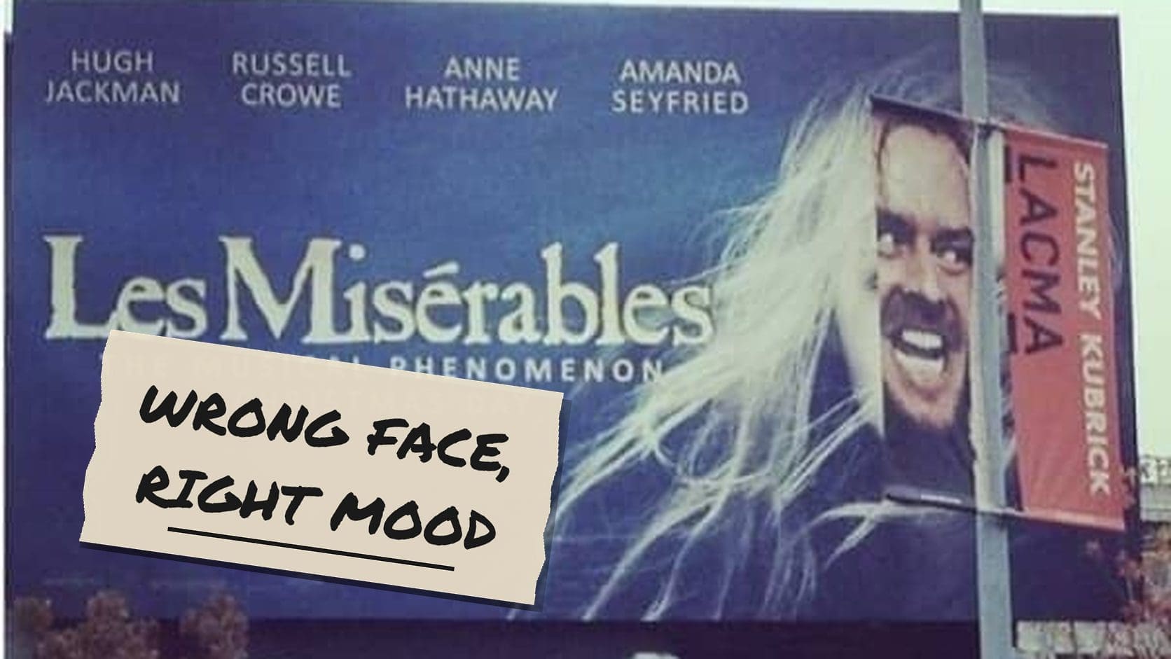
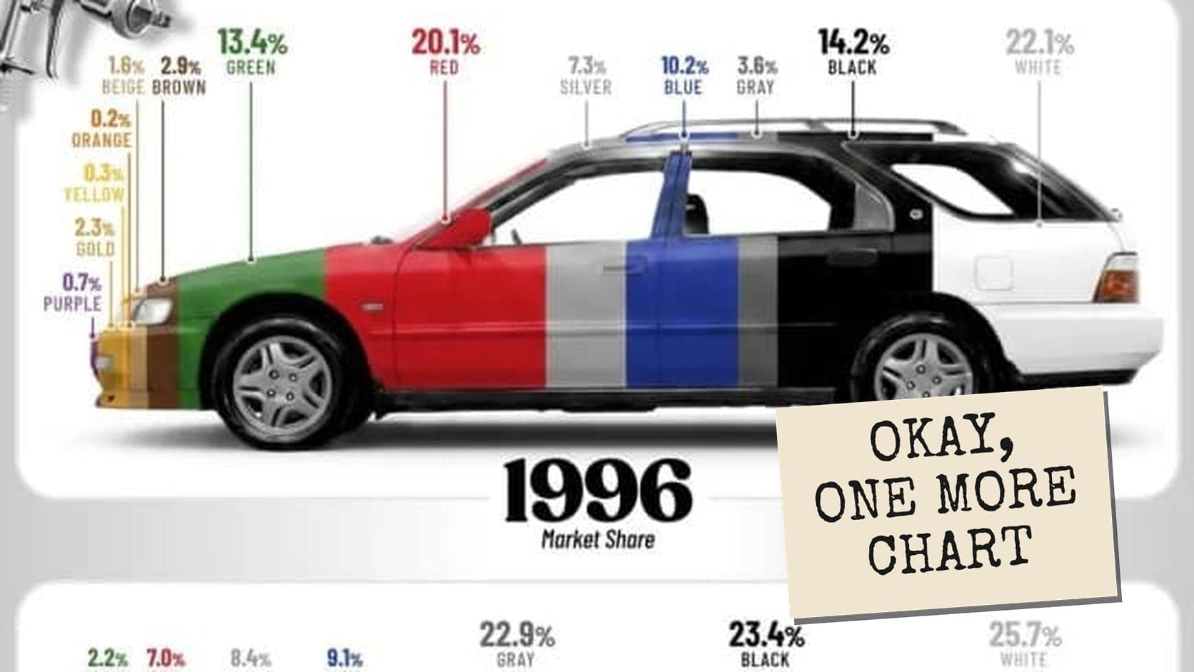
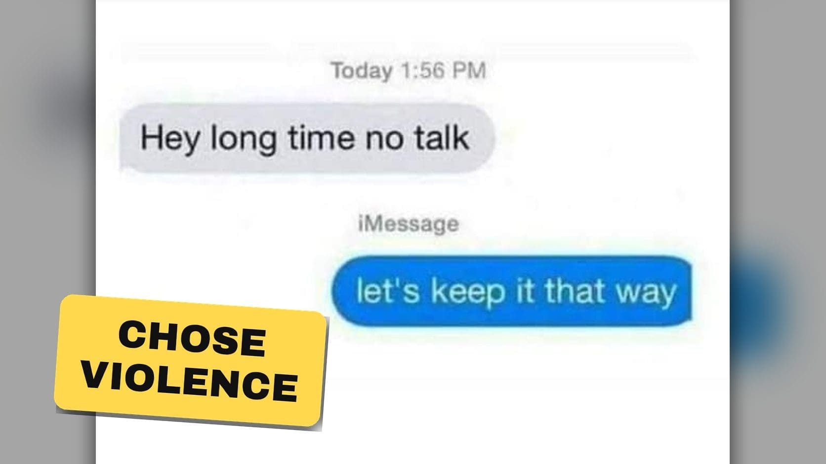
The distance between a professional business and a public embarrassment is approximately one space bar, and graphic design fails exist to prove it daily. A single misplaced gap, one letter swapped, a font chosen in haste, and suddenly a respectable storefront is advertising something nobody intended and everybody photographs. The stakes were low. The failure was permanent. Let’s inspect the damage.

Nothing says cutting-edge mobile marketing in 2026 quite like a Nokia brick phone from 2002.
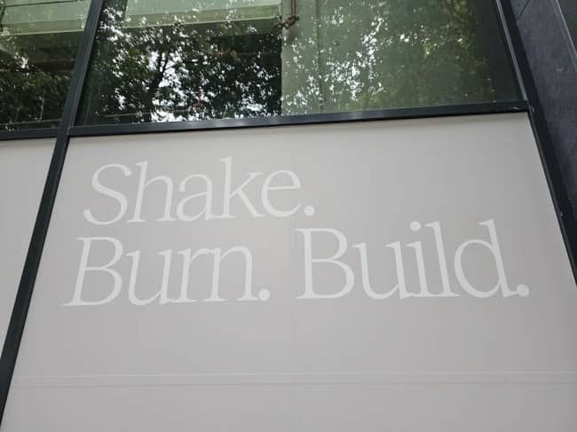
Arson or fitness inspiration? You decide.
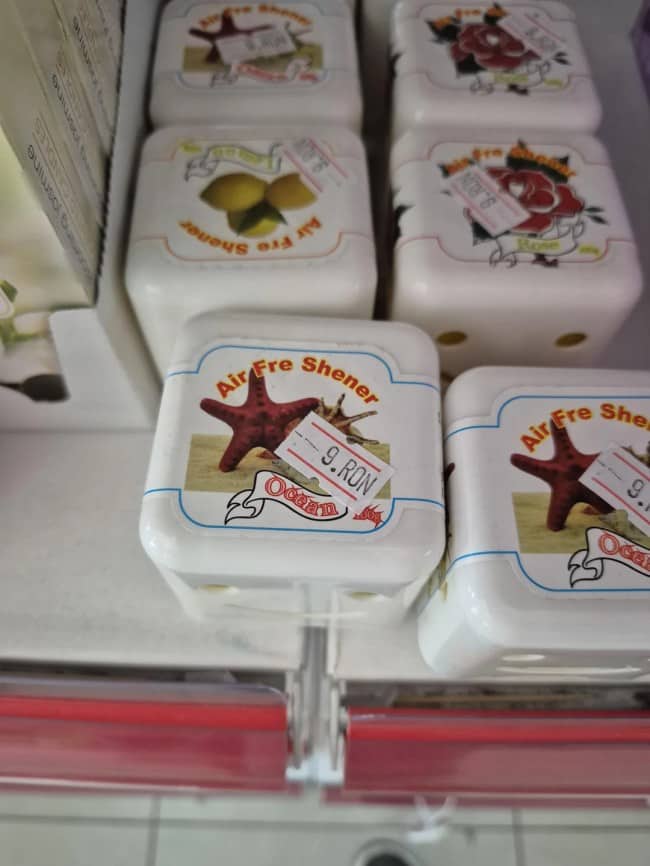
Space bar placement can completely change the entire vibe of your bathroom inventory.
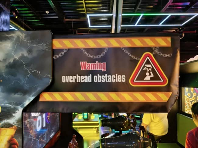


Call a plumber, because the typesetting is leaking.


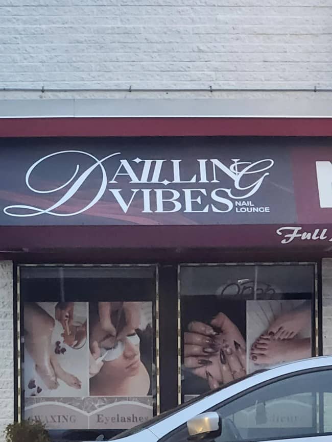
Vibes are immaculate.


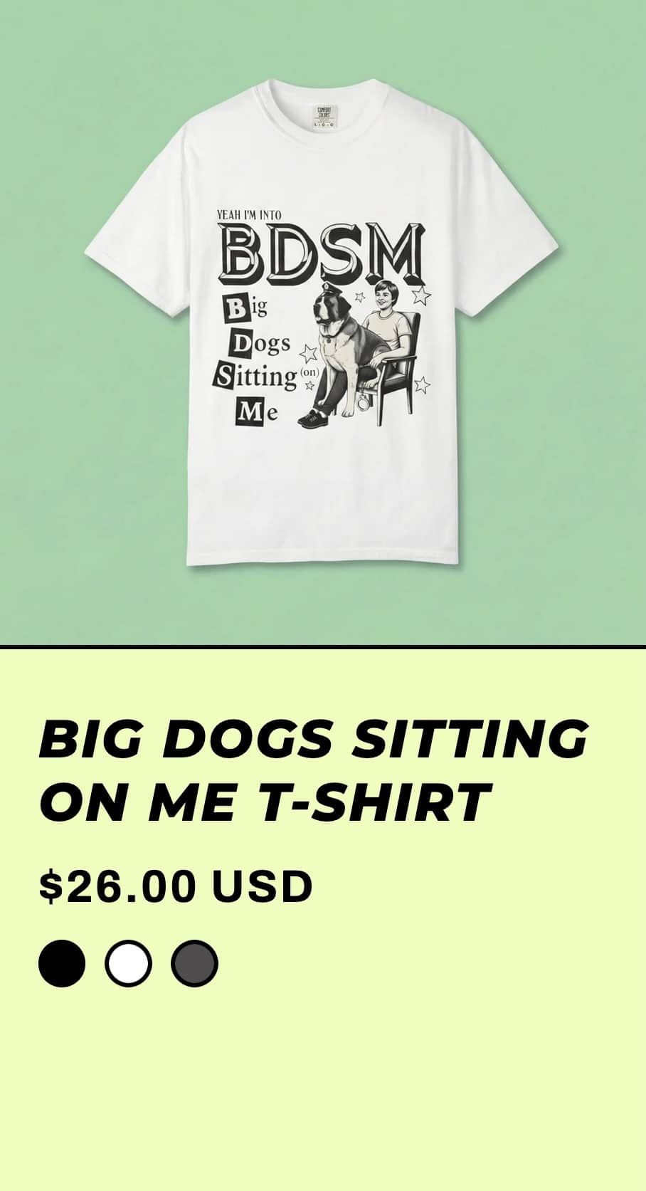

Graphic design fails
Read More
Kerning is the invisible art of letter spacing, and it only becomes visible when it fails, at which point it becomes the most visible thing in the world. There’s an entire category of signage where the letters have simply drifted apart or huddled together wrong, and the resulting text reads like a robot having a malfunction, or worse, like a completely different and far more alarming word. The designer saw nothing. Every single passerby sees it immediately. That’s the curse.
Then there’s the single-letter catastrophe genre, where one character out of place transforms the entire meaning of a business. A truck fleet becomes a dairy product. A safety warning becomes gibberish at the exact moment clarity mattered most. There’s something almost poetic about how little it takes, the whole professional identity of a company balanced on one letter, and the letter simply didn’t show up for work that day.
And my favorite is the template trauma, the published designs where the placeholder text is still sitting there, unedited, staring out at the world. Somebody built the layout, somebody scheduled the post, and at no point did anybody read it. It’s the purest form of the genre because there’s no confusion to blame, no font to scapegoat. Someone just hit publish without looking, and now the placeholder is famous.
What these fails actually reveal is how fragile written communication is, and how much invisible work goes into text just looking normal. We never notice the thousands of signs that are spaced correctly. We only see the one where the letters betrayed their owner, and that one gets photographed, shared, and preserved forever, which is a brutal incentive structure for the world’s sign-makers.
And the secondary effect is real, the paranoia these images install in the rest of us. You see enough kerning disasters and suddenly you’re proofreading your own texts twice, reading your emails out loud, squinting at your own handwriting. That’s the true legacy of the genre. It doesn’t just entertain, it radicalizes you into a proofreader, one catastrophic space bar at a time.
The letters drifted. The business suffered. Read everything twice.
If the typography carnage was your kind of fun, our design content is right where you’d want to land next, and we’ve got plenty of signage fail archives, font disaster threads, and layout catastrophe compilations for anyone who now compulsively checks letter spacing on every storefront they pass. Mind the kerning.
Read Memes
Get Paid


Laura Bennett has spent eight years immersed in internet culture, specializing in deep dives into meme origins, evolving meme trends, and digital subcultures. As a contributor for several prominent online platforms, including BuzzFeed’s meme division and Know Your Meme, she’s written extensively about viral moments from Crying Jordan to Woman Yelling at a Cat. Laura believes memes aren't just internet jokes—they're modern-day folklore. She brings that passion to Thunder Dungeon by keeping readers connected to what's culturally significant, hilarious, and timelessly viral.