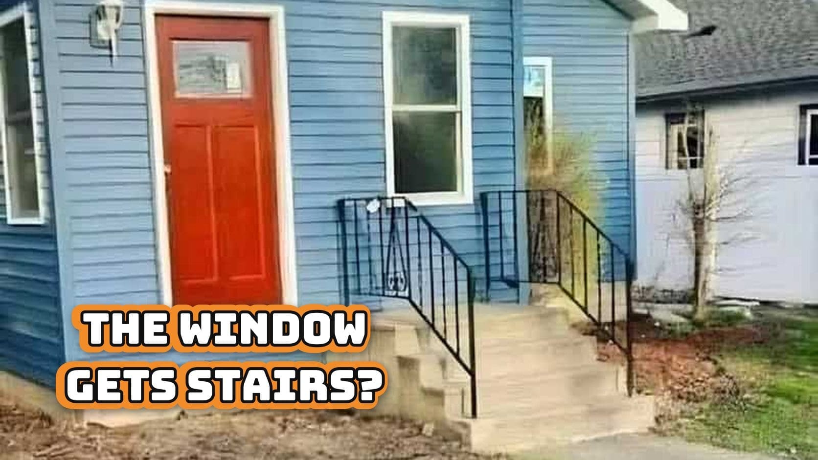
Font fails
Civilization runs on letters arranged politely. When they misbehave, society trips. This gallery collects font fails, the public typos, the kerning crimes, and the layout choices that turn meaning into slapstick. Somewhere in this intro I will use font fails exactly once and your inner proofreader will wake up swinging. The funniest part is how avoidable it all was. One nudge. One second set of eyes. One citizen willing to say maybe not Papyrus for the municipal seal. We are not here to shame beginners. We are here to honor the moment when text becomes interpretive dance and the sign becomes a meme. Squint, point, and chuckle. The lesson is free.
Expect typography fails that confuse on sight, kerning fails that create new words, and graphic design fails that betray the brief. There are menus that change your order, posters that confess crimes, and decals that should have slept on it.


Design is invisible when it works and famous when it does not. That is why typography fails, kerning fails, and graphic design fails travel. The images teach by accident, a seminar in spacing, contrast, and hierarchy. If one photo made you move a textbox one pixel and feel like a hero, congratulations, you just learned design by laughter.
Send a favorite to the friend who proofreads street signs and the designer who carries extra tape. For more delightful disasters, browse typography fails, kerning fails, and graphic design fails. Mind the gap and save the font.
Read Memes
Get Paid


Michael Hartley, or just "Mike," is an editor and seasoned meme historian whose articles have traced the evolution of meme humor from early Impact-font classics to today’s TikTok sensations. With nearly a decade spent as senior editor at ViralHype and as a regular contributor to Cheezburger, Mike has dissected the rise of meme legends such as Bad Luck Brian, Success Kid, and Doge. When he's not hunting down meme gold for Thunder Dungeon, Mike teaches workshops on meme marketing and the psychology behind shareable content.