These interesting infographics are for the part of me that loves feeling mysteriously capable—like I could fix a sink, pick the right tool, and also choose the correct outfit palette, all before lunch. I don’t even need to use the information. I just need to look at it and feel smarter. If you’re into data visualization, helpful charts, and life hacks that scratch the “order in the chaos” itch, this gallery is your snack.
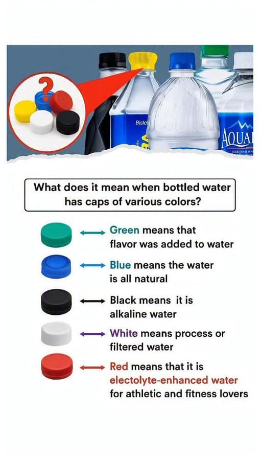
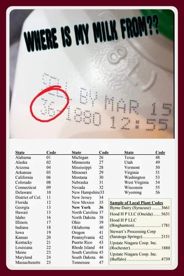
Finally, a handy field guide to help you determine if your premium hydration fluid was harvested from a pristine arctic glacier or compressed straight from the municipal tap.
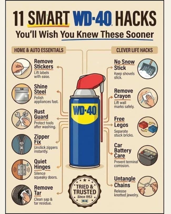
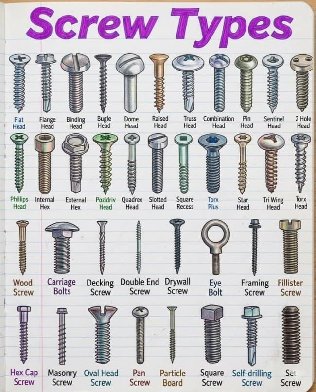
The sacred text for any homeowner who firmly believes that every single mechanical friction problem in human history can be conquered with a generous burst of blue-and-yellow aerosol spray.
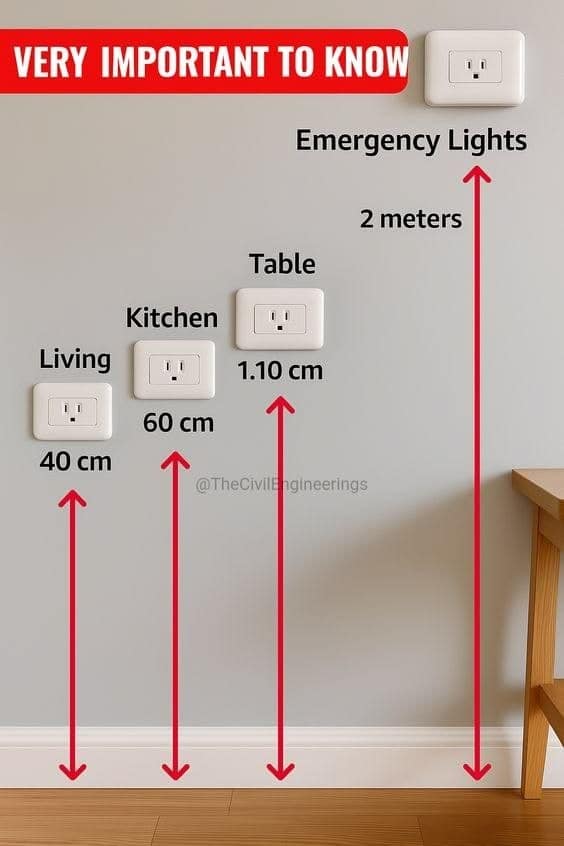
Looking forward to mounting my kitchen table outlets exactly 11 millimeters off the baseboards as explicitly commanded by this infallible civil engineering blueprint.
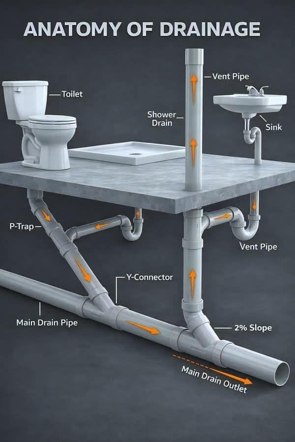
An exquisite x-ray view showing exactly how much complicated, multi-tiered physics it takes just to safely erase your morning disposal mistakes from the household ecosystem.
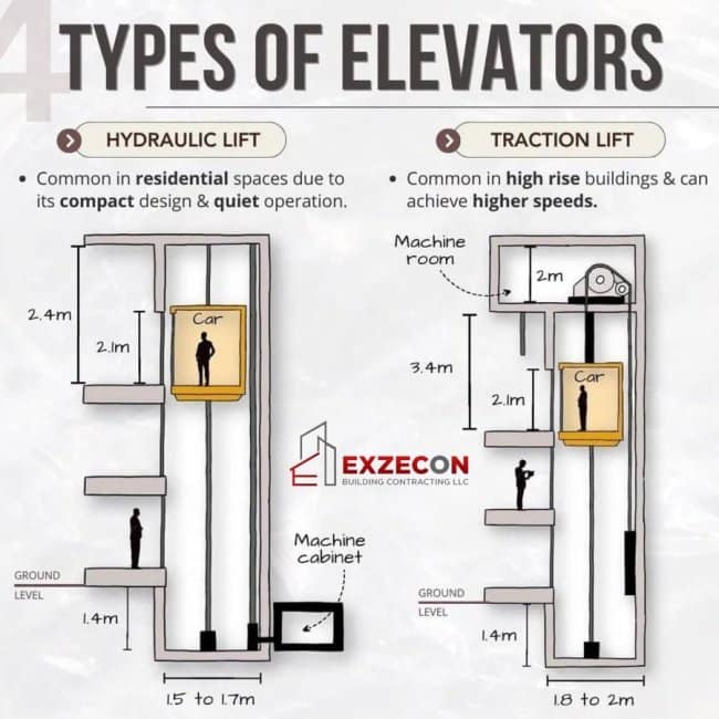
Prominently titled "4 Types of Elevators" despite only containing two distinct examples, because the graphic designers evidently got tired halfway through and took the stairs instead.
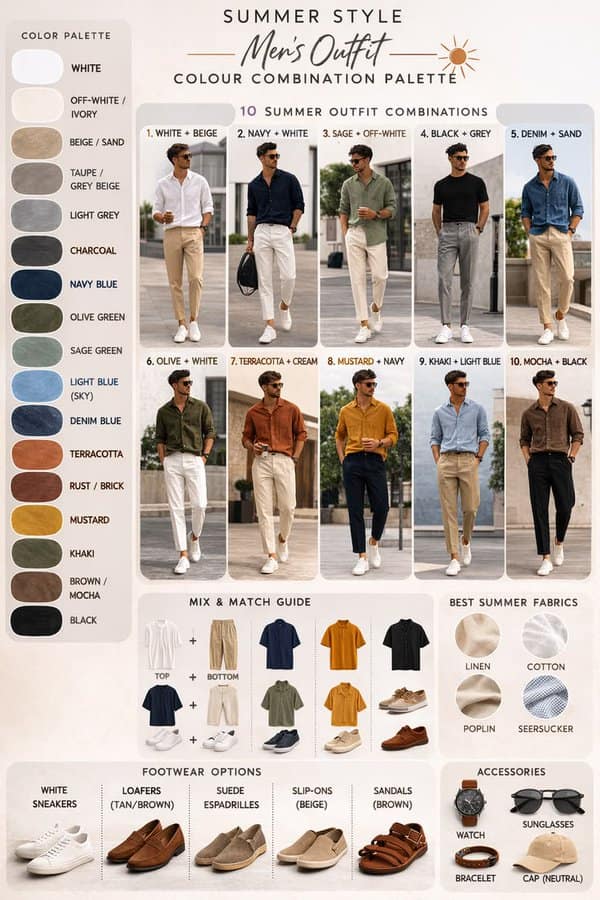
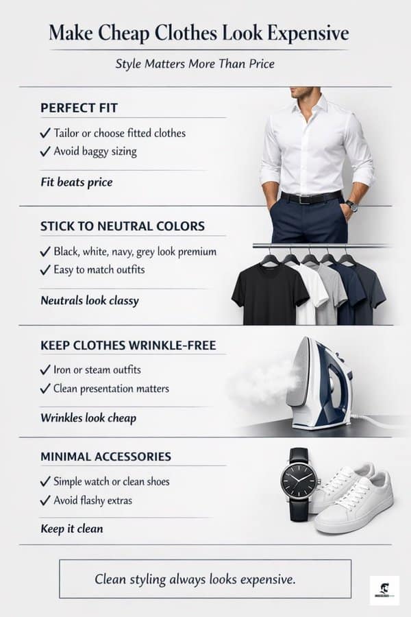
A highly structured structural layout designed to help men confidently choose between looking like a pristine coastal resort influencer or a high-end luxury minimalist.
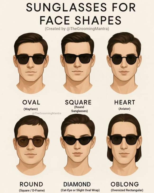
An essential protective map to ensure your choice of trendy summer eyewear makes you look like a sharp cinematic protagonist instead of an overzealous 1970s highway patrol operator.
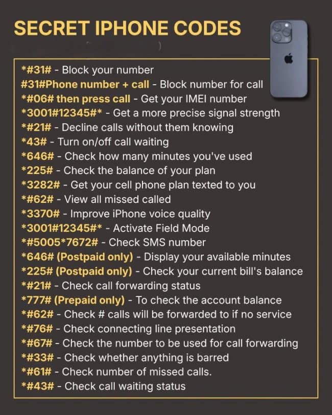
Punching an unhinged, 15-character string of hashes, asterisks, and numbers into your dial pad like a specialized terminal operator just to figure out why your cell reception instantly drops to zero bars whenever you sit down on the living room sofa.
Today’s theme: everything has a system, apparently.
The satisfying thing about interesting infographics is how they take a confusing problem and flatten it into something your brain can hold. Suddenly, the world feels less random. There’s a chart for it. A code for it. A diagram that says, “Relax, this is knowable.” That’s why data visualization is so addictive—it turns vague stress into a checklist.
And I love the mix of practical and slightly absurd. One minute you’re in “helpful charts” mode, learning how things connect behind walls or why certain sizes match certain parts. Next minute you’re staring at a guide that confidently explains something while quietly containing a typo that could launch a small household disaster. It’s human. It’s hilarious. It’s why life hacks need a second opinion.
There’s also something comforting about seeing everyday life treated like a puzzle instead of a personal failing. Can’t figure out why your device is acting up? Here’s a code list. Not sure what you’re buying at the store? Here’s a label guide. Want to look more put-together without spending a fortune? Here’s a simple visual rule set. Interesting infographics don’t judge you—they just hand you a map.
If you want more brain-tickling content, follow this with 45 Funny Shower Thoughts That Made Me Pause, 31 Random Facts For Your Next Trivia Night, and 32 Relatable Memes About Random Life Things.
I’m Laura Bennett, and I love helpful charts because they make adulthood look like a solvable problem for five straight minutes.
Read Memes
Get Paid

Laura Bennett has spent eight years immersed in internet culture, specializing in deep dives into meme origins, evolving meme trends, and digital subcultures. As a contributor for several prominent online platforms, including BuzzFeed’s meme division and Know Your Meme, she’s written extensively about viral moments from Crying Jordan to Woman Yelling at a Cat. Laura believes memes aren't just internet jokes—they're modern-day folklore. She brings that passion to Thunder Dungeon by keeping readers connected to what's culturally significant, hilarious, and timelessly viral.