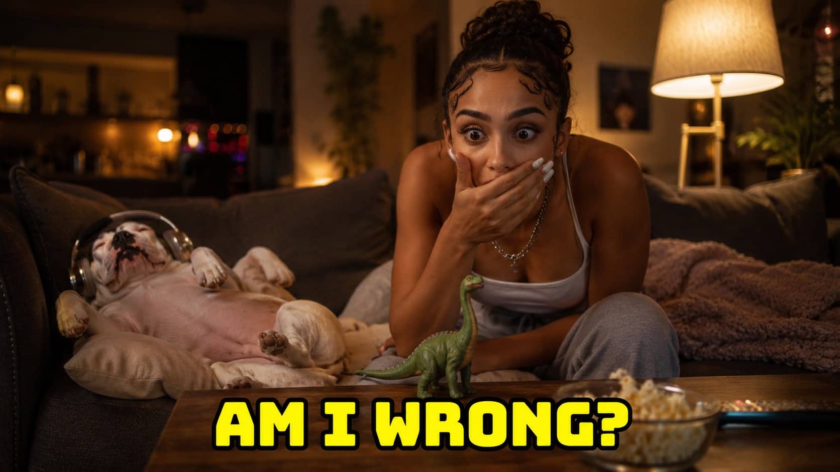
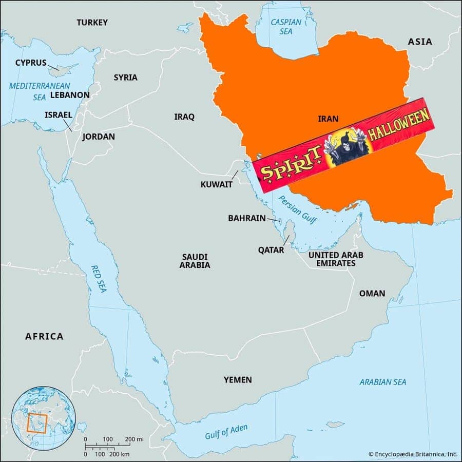
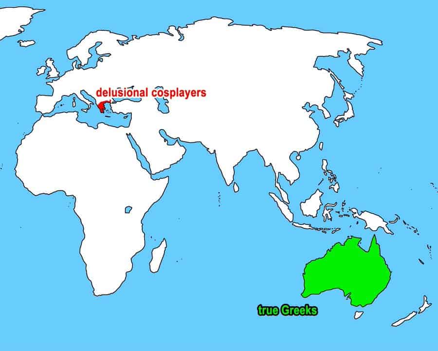
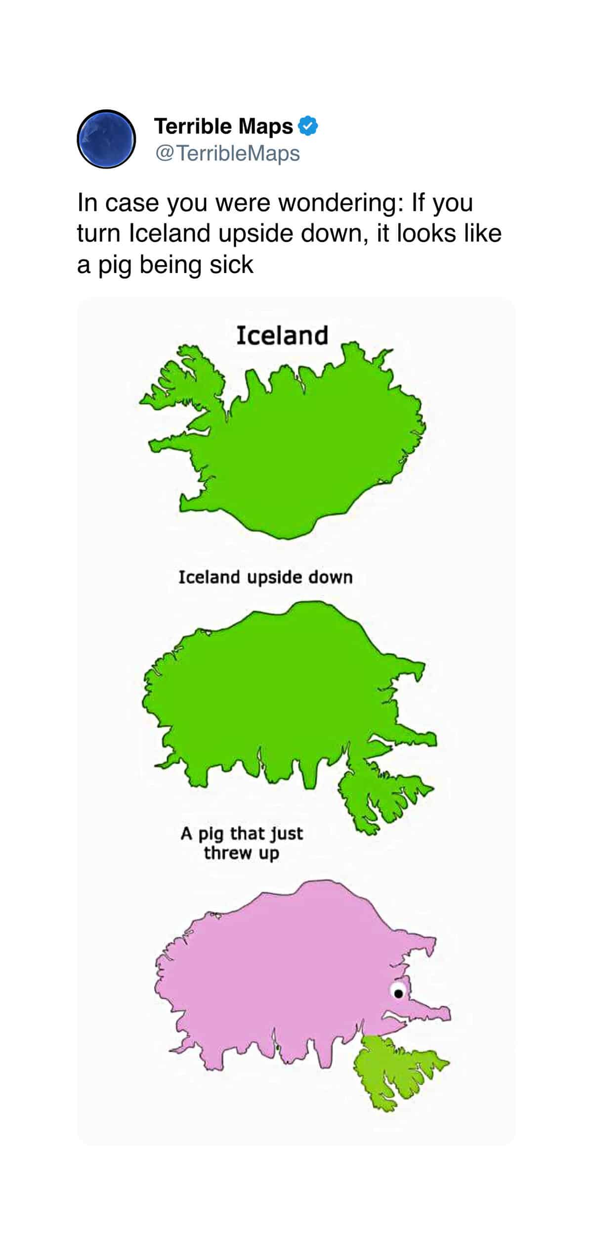
omebody recently flipped a map of Iceland upside down and discovered that the country, in that orientation, is the unmistakable silhouette of a small sick pig. The cartographers have been holding out on us, frankly. These bad maps are the ongoing internet project where geographical conventions get violated for comedic effect, and the violations are getting more sophisticated each year. The country of Cameroon, now starring Cameron Diaz, is in here. The Spirit Halloween storefront that has annexed Iran. Roll out the atlas.
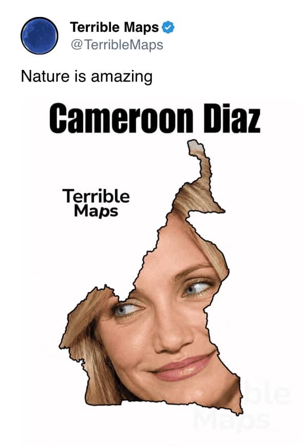
Nature really is amazing.
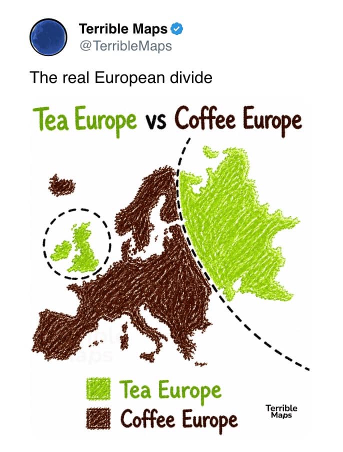
The United Kingdom standing tall as an isolated island of early grey.
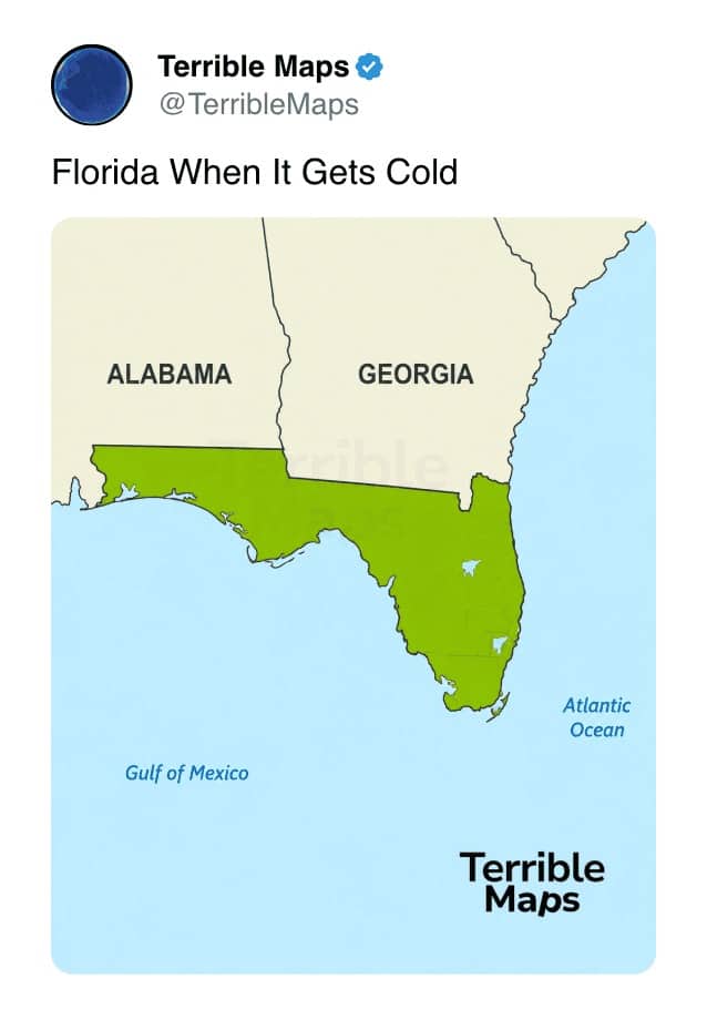
It's cold out, okay?
Bad maps
Read More
The bad-map genre is one of the more delightfully nerdy corners of internet humor, because the jokes require, at minimum, a working knowledge of where countries are and what they look like. That’s a higher barrier to entry than most meme categories, and the result is that the people producing this content tend to be genuinely well-informed about the geography they’re satirizing. The funny maps filling galleries like this are essentially geography lessons in disguise, where the joke is the payload and the geography is the carrier.
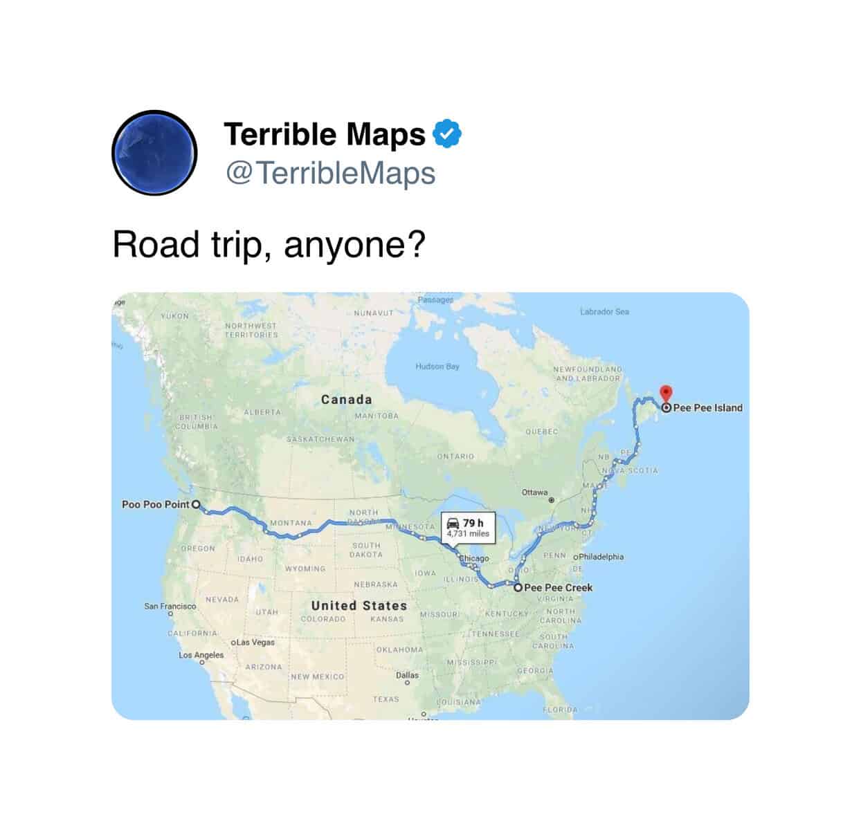
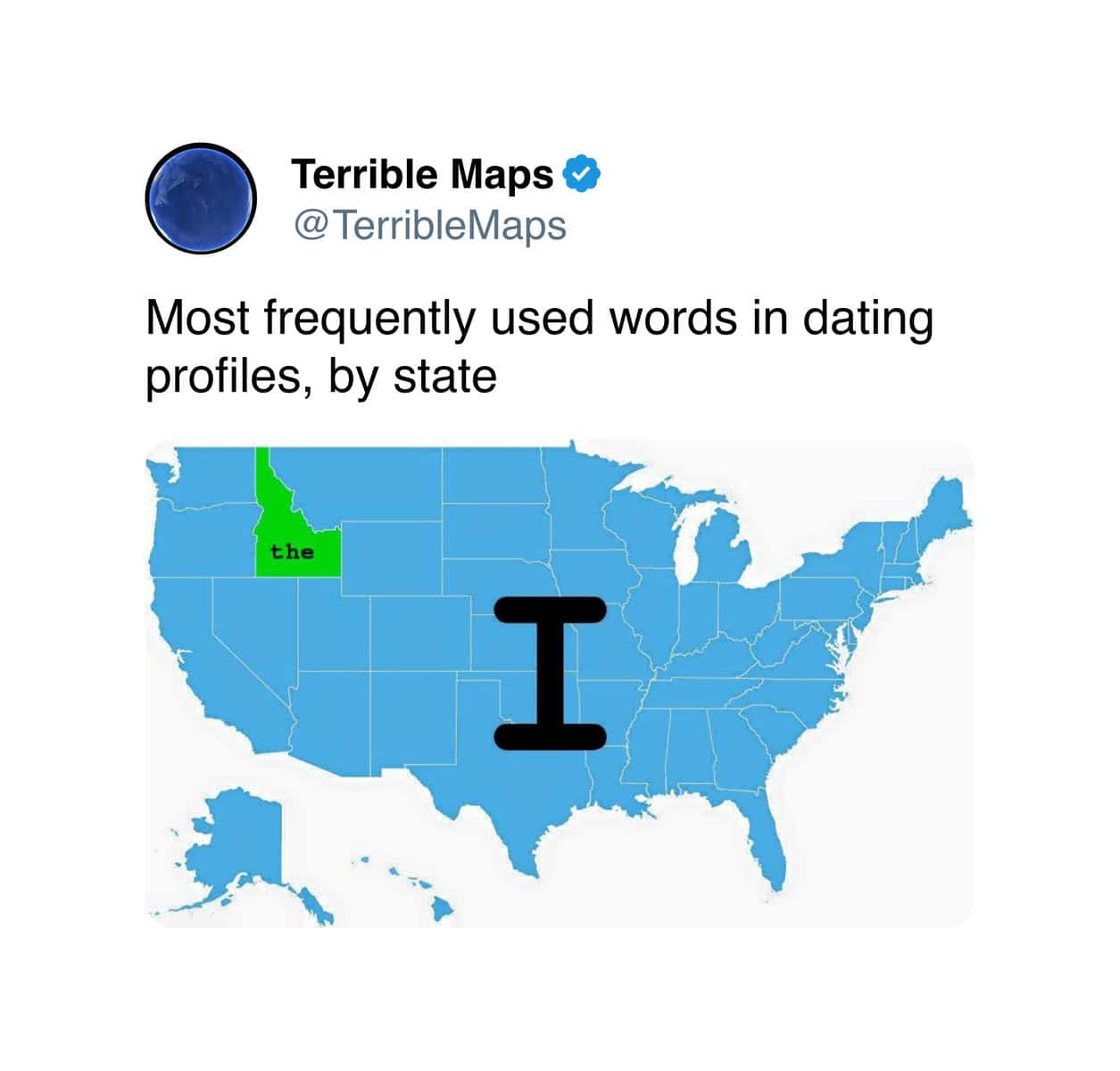
What makes the form particularly satisfying is how often the jokes reveal something true that you hadn’t noticed about a real shape on a real map. Iceland upside down does look like a pig. Florida does, in fact, look slightly different in different states of metaphorical climate stress. The geography memes in this gallery work because the visual pun is grounded in actual cartographic features, and the underlying features are, themselves, weirder than the average person noticed.
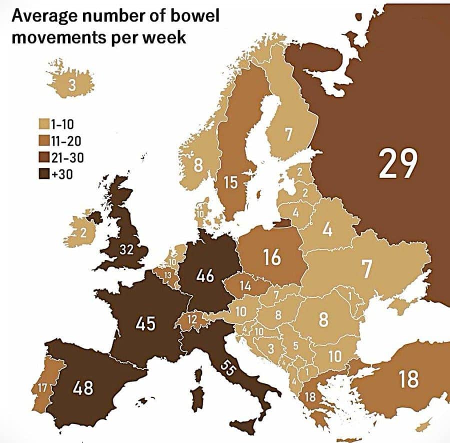
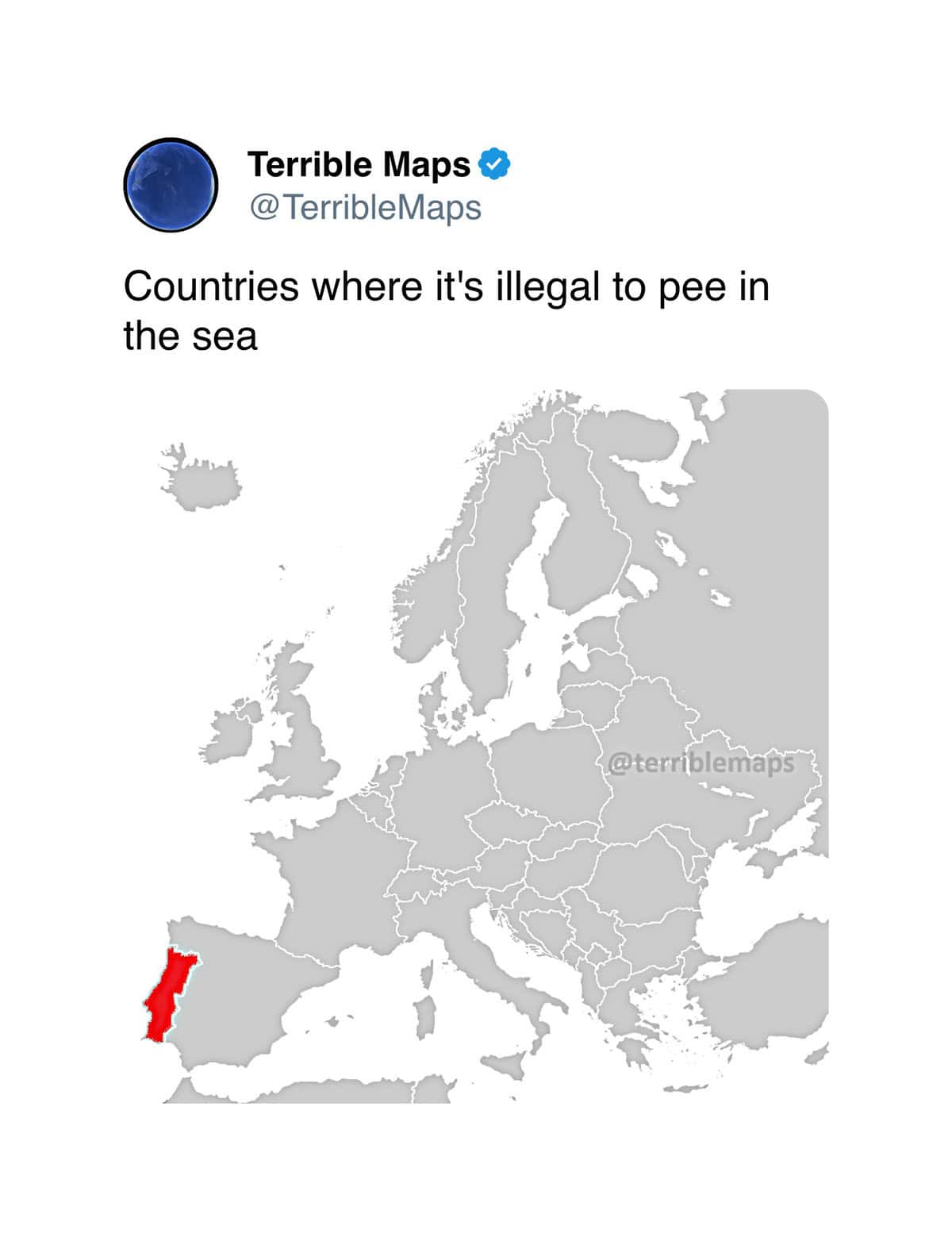
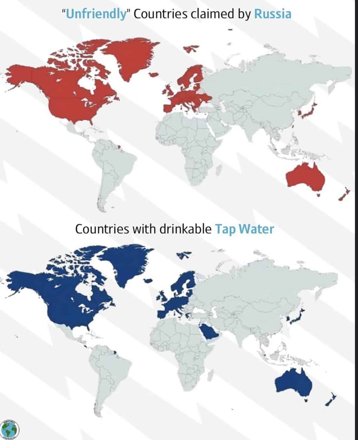
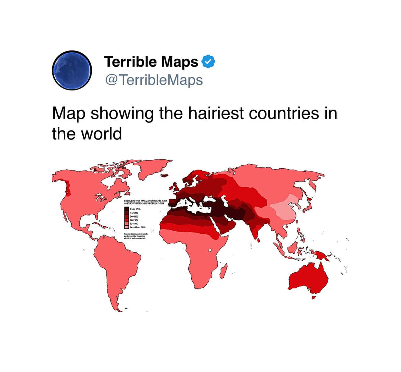
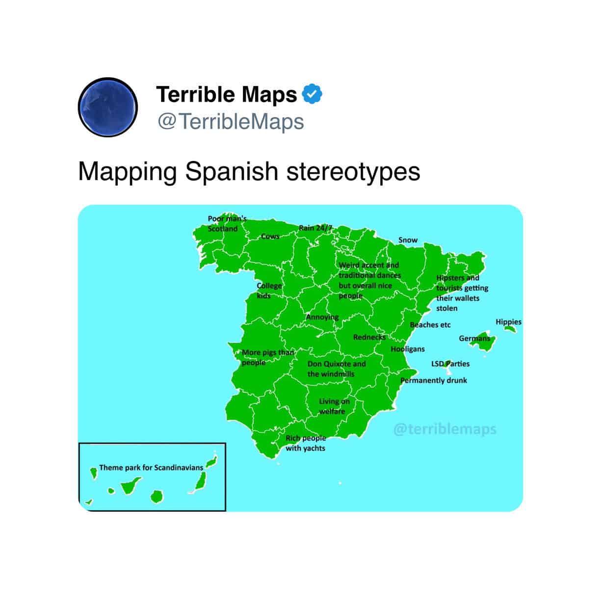
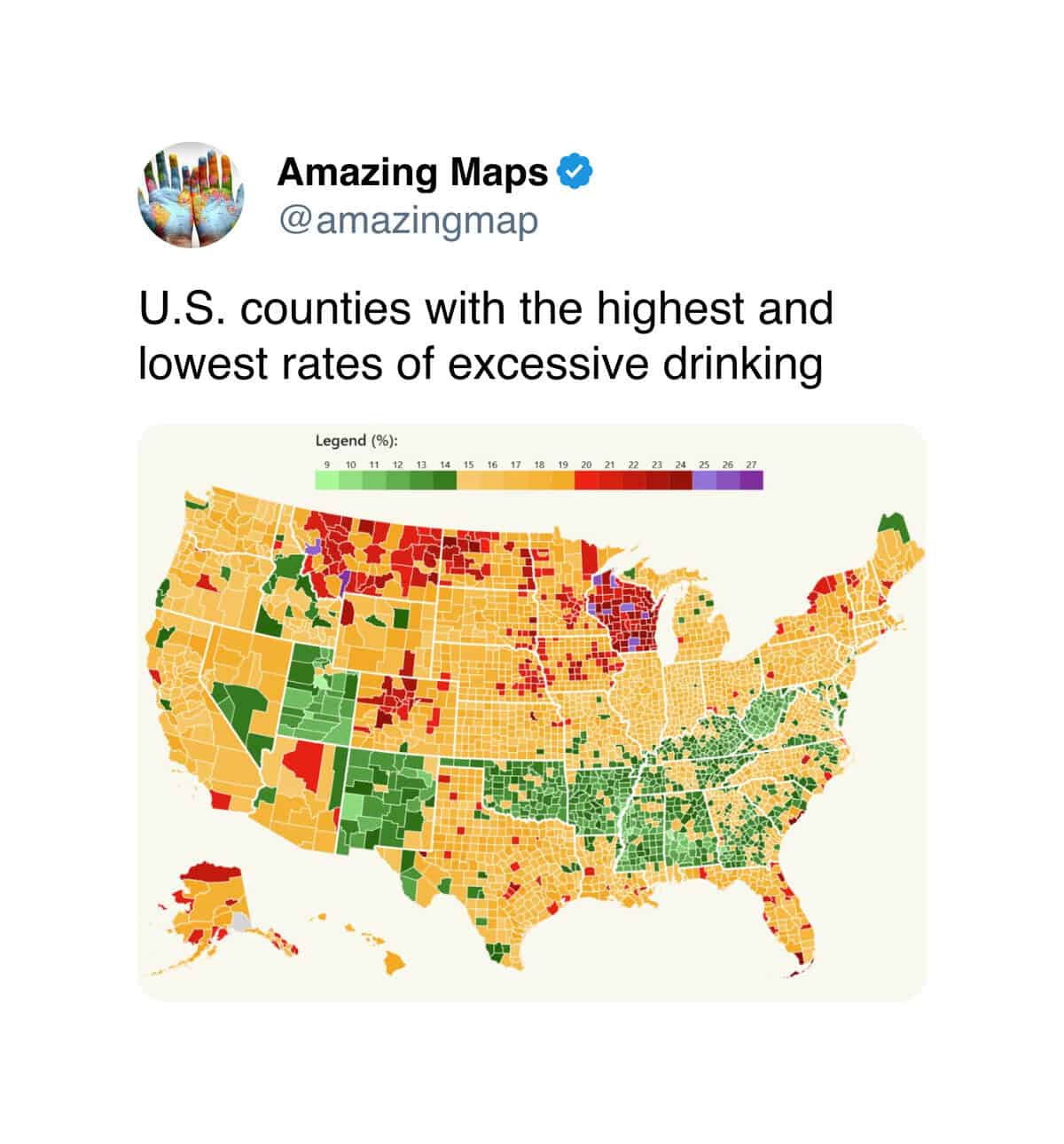
There’s also a strong recurring subgenre that uses maps as the vehicle for cultural commentary, often dressed up as fake data visualization. The east-versus-west tea-and-coffee divide. The European bowel-movement infographic. These cartographic humor pieces are not really maps in any functional sense. They’re opinions, presented in map form, because the map form lends a false authority to the opinion that makes the opinion funnier.
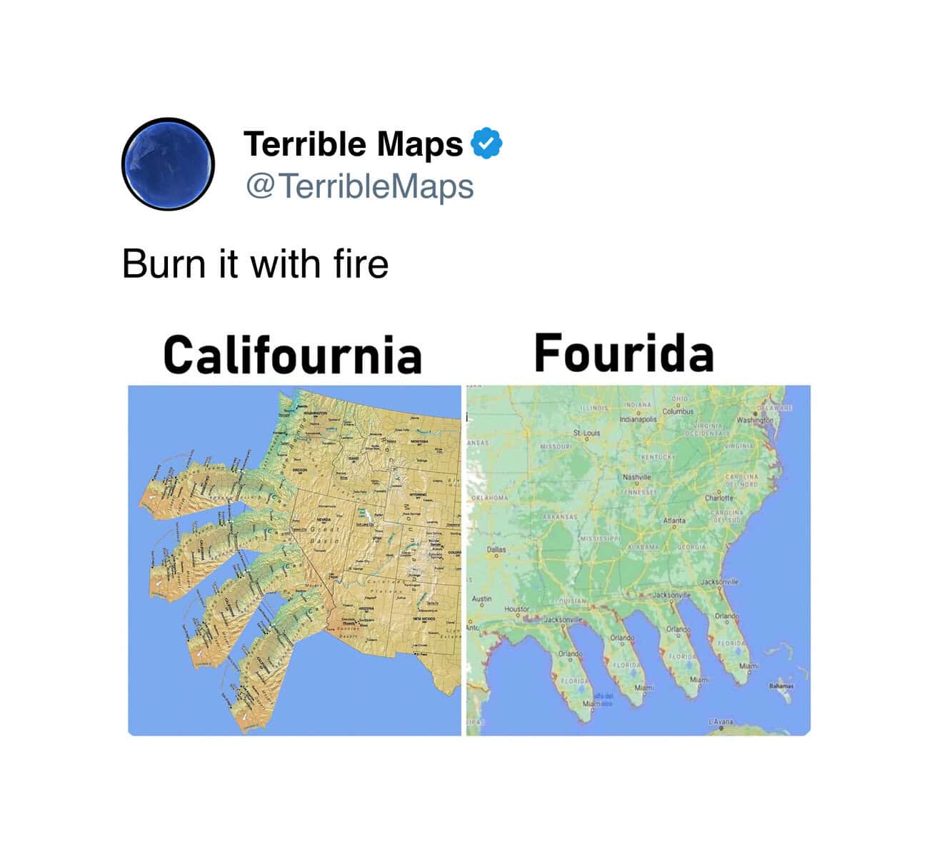
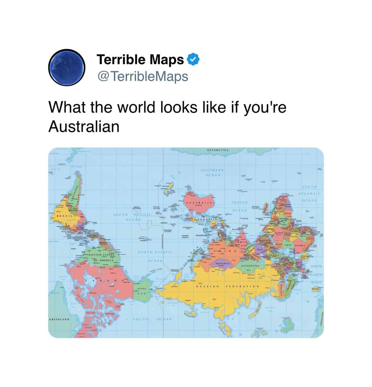
The other thing the genre does is play with the conventions of orientation itself. The upside-down world map. The four-California, four-Florida disasters. The map humor operating in this category is essentially gesturing at the arbitrariness of how we usually look at the planet, and the gestures are quietly philosophical underneath the cheap jokes.
CThe broader thing this whole genre captures, beyond the easy laughs, is the strange way maps have become emotional objects rather than purely functional ones. A map used to be a tool for getting from one place to another. The phone in your pocket has, for most users, completely replaced that function. What’s left, then, is maps as cultural artifacts, as visual jokes, as small statements about the world’s shape and our place in it.
The internet has, accordingly, repurposed the entire visual language of cartography for comedy. The mock data maps. The shape-recognition memes. The deliberate misrepresentation of borders for absurd effect. None of this would have worked in a world where maps were primarily navigational tools. We are in a world where maps are primarily decorative, and decoration is, by definition, available for play.
There’s also something quietly affectionate about the genre’s relationship with geography. The people making these maps are not, mostly, mocking the places themselves. They’re mocking the way maps are usually presented, the false certainty of borders, the suggestion that any one orientation is the correct one. Iceland is still Iceland. The pig is the bonus.
If the geography hit the spot, our internet infographics archive is right next door, and we’ve got plenty of weird Twitter posts, niche history humor, and absurd data visualization content for anyone who likes their jokes with a side of mock authority. Stay oriented.
Read Memes
Get Paid

Alex Thompson has been chronicling internet culture and meme phenomena for nearly seven years. Starting at CollegeHumor and later becoming lead meme editor at Mashable, Alex has covered everything from vintage internet memes like Rickrolling to recent viral events such as Corn Kid and Grimace Shake. With a keen eye for what connects and entertains digital audiences, Alex writes with humor, relatability, and deep knowledge of online culture. At Thunder Dungeon, Alex is the go-to source for meme analysis, viral breakdowns, and internet nostalgia.