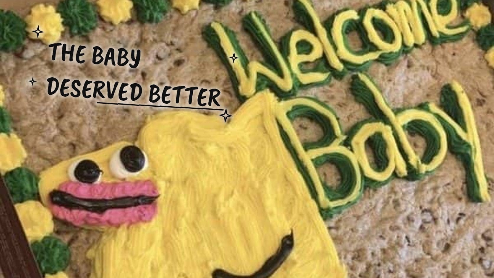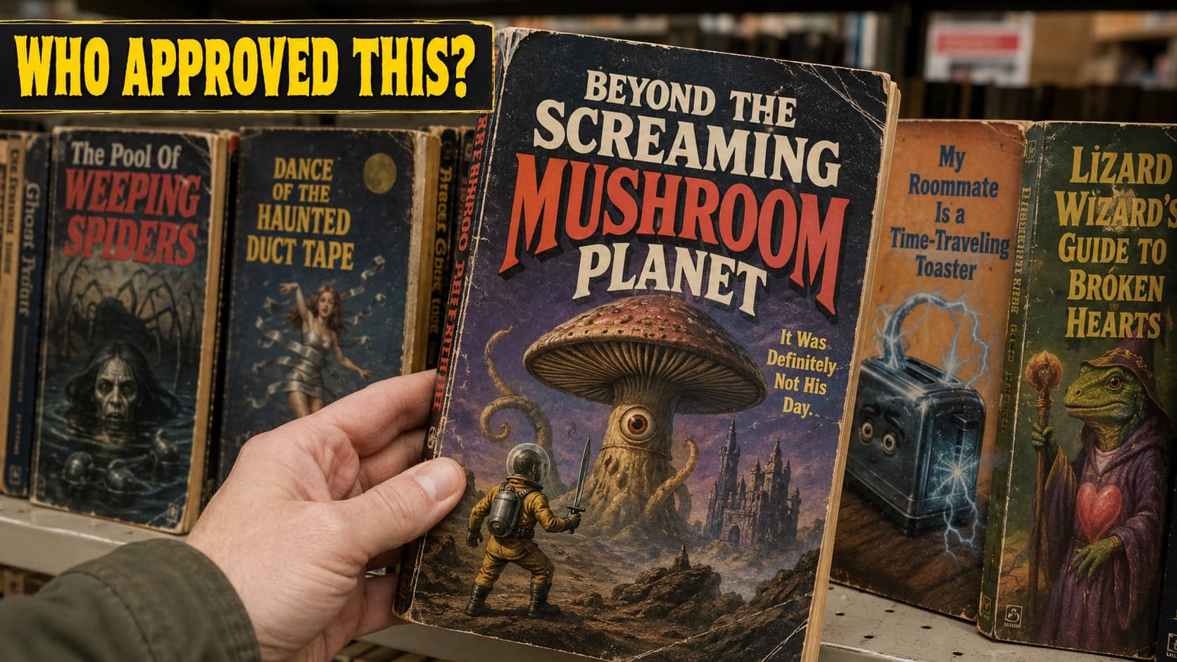

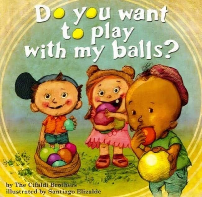
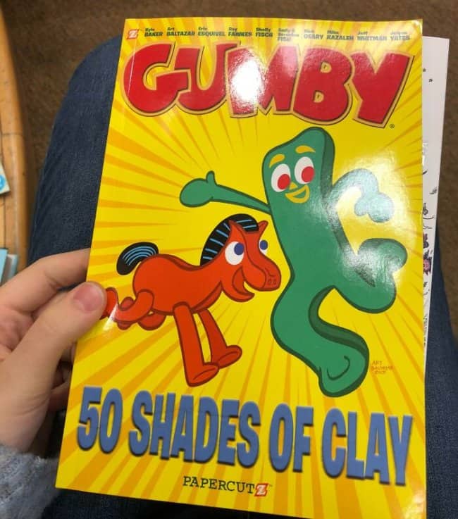
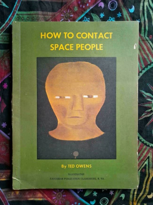
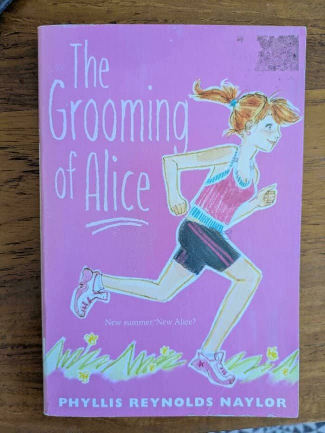
Somewhere in every publishing house there is a moment where a cover design gets approved, and I desperately want to know what happens in that room. These weirdest book covers are the evidence that sometimes nothing happens in that room, that a classic novel can be handed artwork chosen by dartboard, and the printing press simply does not ask questions. The books are fine. The covers are chaos. Judge freely.
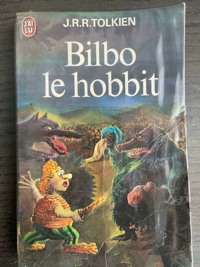
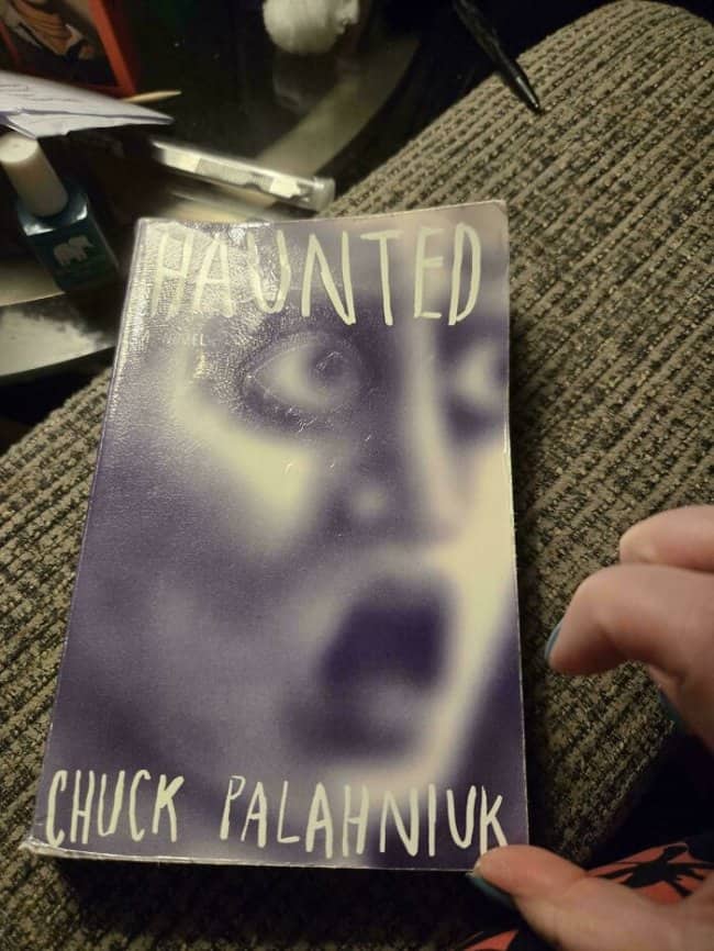
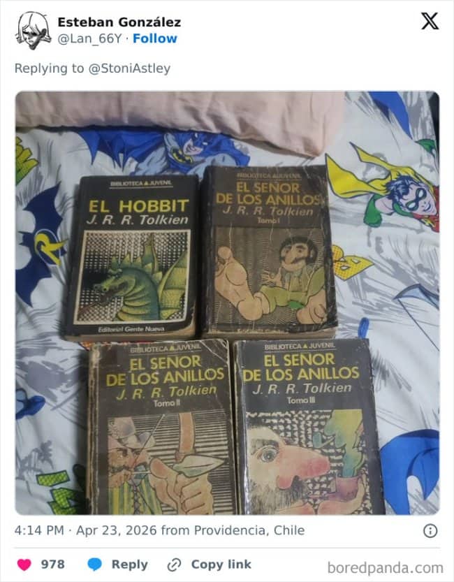
Terrifying.
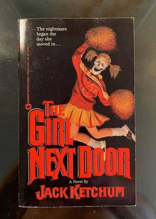
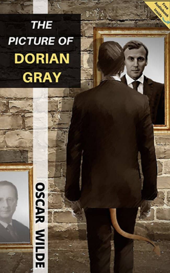
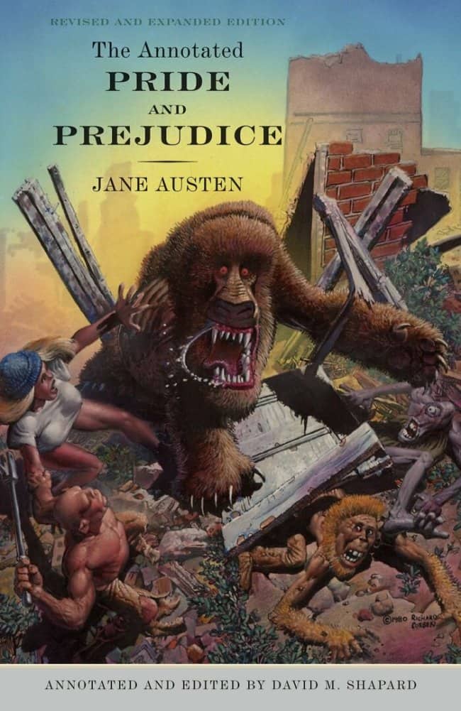
Just wait until you see the mascot.
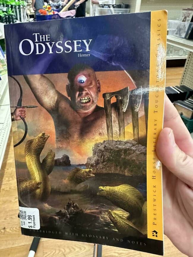
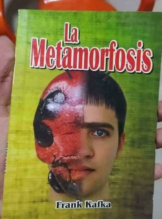
When your graphic design intern discovers the free trial of Photoshop.

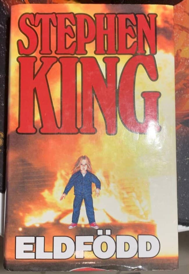
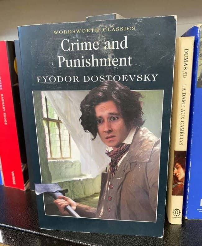
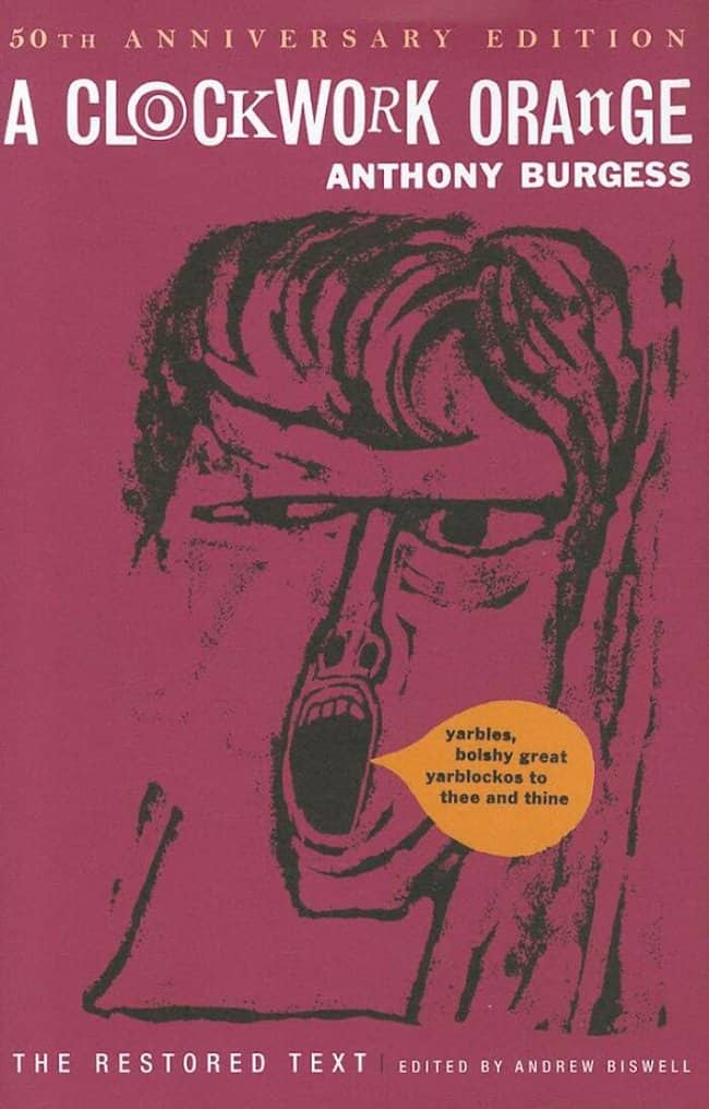
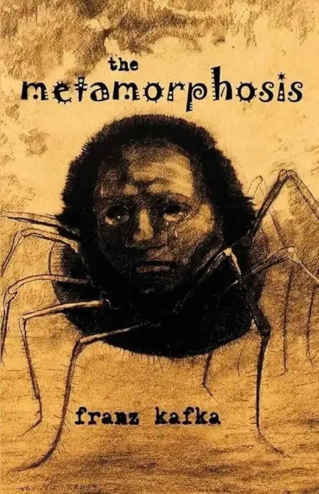
The original face of existential dread.

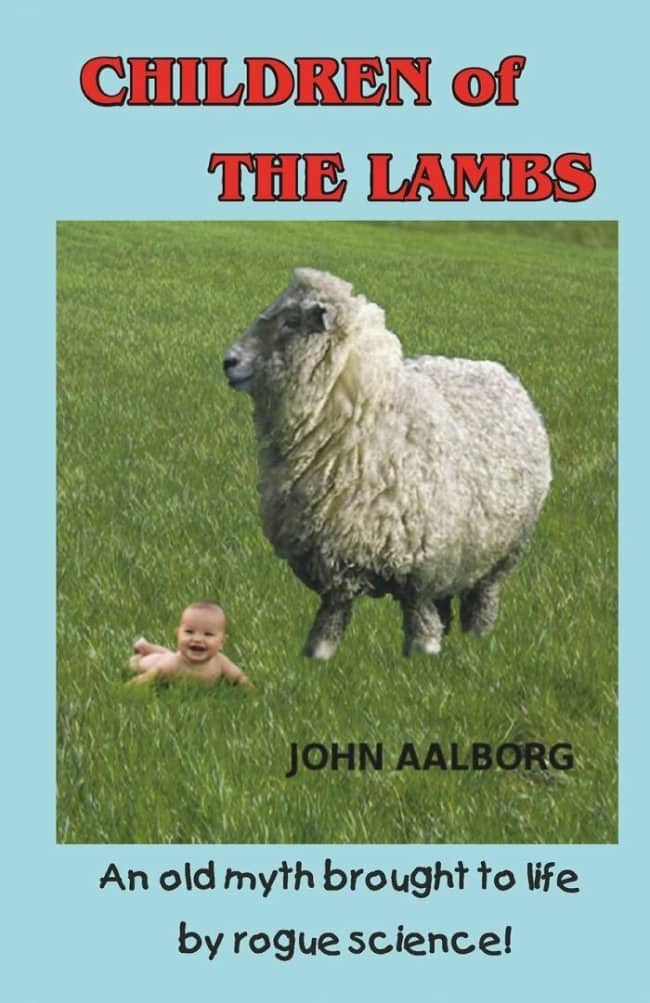
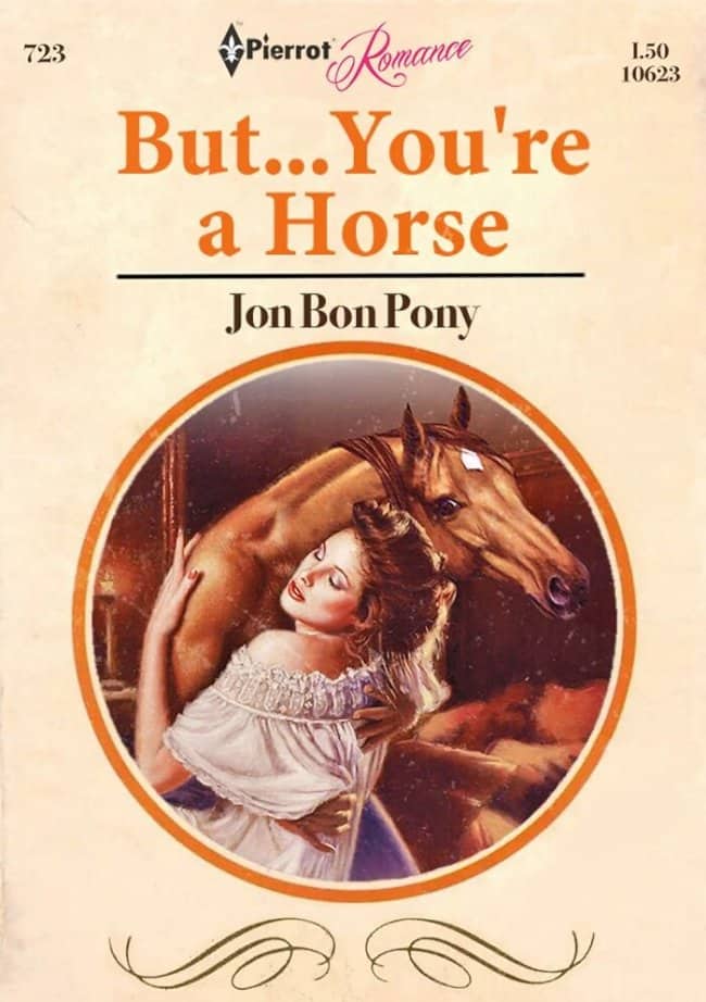
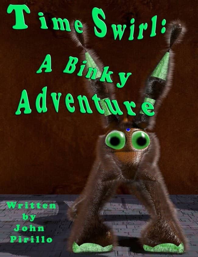
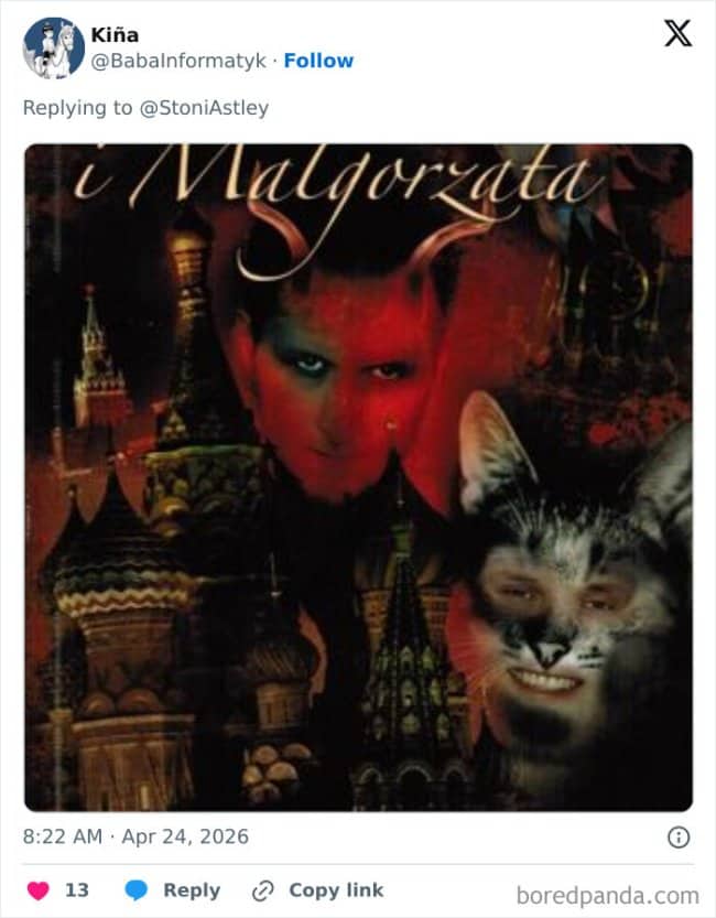




Weirdest book covers
Read More
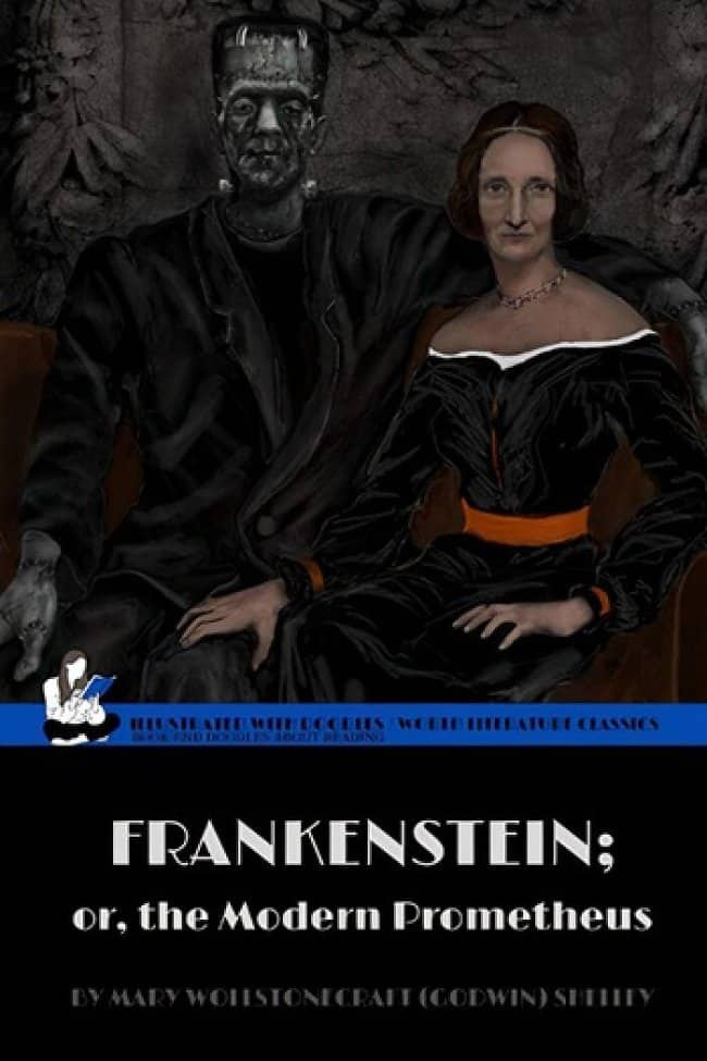
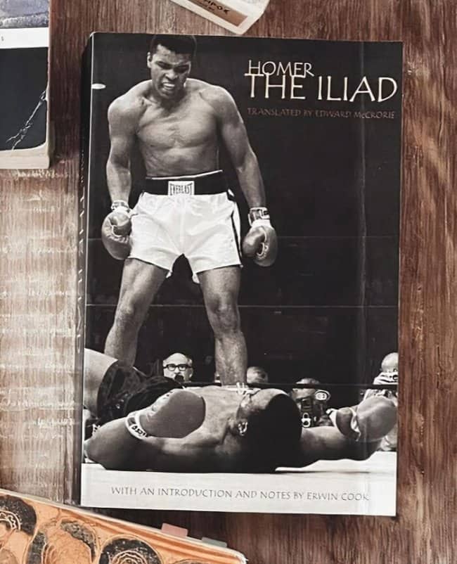
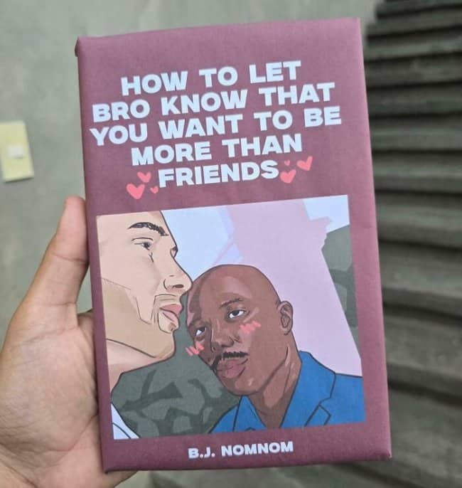
The core mystery of a bad book cover is the gap between the text and the art, and the wider the gap, the funnier it gets. There’s a whole genre of literary classics dressed in imagery that has nothing to do with anything inside, a nineteenth-century masterpiece wearing stock photos of extreme sports, an ancient epic fronted by a boxing photo. Somebody made that pairing. Somebody approved it. The chain of decisions is unknowable and I think about it constantly.
Then there’s the budget-editing school, where the cover clearly involved somebody’s first week with photo software. The proportions are wrong, the heads are pasted on at angles heads don’t achieve, the monsters look assembled from clip art during a lunch break. There’s an honesty to it, almost. A polished cover hides its labor. These covers show you every seam, every questionable crop, every moment where the designer thought “good enough” and went home.
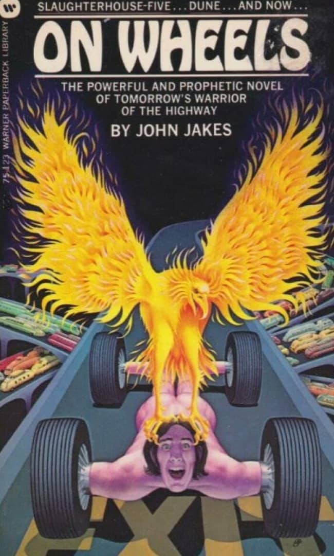
And the accidental-horror category is the one that haunts me, the covers for perfectly normal books that radiate menace nobody requested. Children’s classics illustrated by someone who apparently only had nightmares as reference. Cheerful genres rendered with an ominous energy that makes you check the spine twice. The scariest thing about these books isn’t the story. It’s whatever was happening in the illustrator’s head, and no one thought to ask.
The thing I genuinely love here is that every one of these covers made it all the way through. Multiple professionals looked at these, at some point, in a meeting, with coffee, and said yes. That’s the real comedy, not the art itself but the institutional confidence behind it, the collective shrug of an industry that decided the words inside would just have to carry the whole operation.
And in a strange way, the bad covers work. Nobody photographs a tasteful cover. Nobody starts a conversation about a competent one. These disasters get passed around, remembered, hunted down in used bookstores like trophies, which means the world’s worst designers accidentally achieved what the best ones rarely do. People are talking about the book. The advice was wrong. We judge covers constantly, and these earned every verdict.
The classics survive. The covers baffle. Never stop judging.
If the publishing chaos was your kind of fun, our design fail content is right where you’d want to land next, and we’ve got plenty of cover disaster archives, bad art threads, and questionable design compilations for anyone who lingers in the used bookstore hoping to find something gloriously wrong. Judge away.
Read Memes
Get Paid


Katie Rodriguez is a seasoned writer with eight years dedicated to meme commentary, viral internet events, and digital storytelling. Formerly a senior meme analyst at Bored Panda and an occasional guest contributor at Vice's Motherboard, Kat specializes in meme culture’s intersection with social media phenomena—covering trends like Milk Crate Challenge, Area 51 Raid, and Baby Yoda. She’s known for her witty writing style and deep understanding of why certain memes resonate across generations, making her a valuable voice on Thunder Dungeon.