Design Fails For “Who Approved This?” Energy
Updated on November 4, 2025
I was lining up picture frames when a stair railing in my feed melted into a slide—instant design fails spiral. My inner gallery docent grabbed a clipboard, and suddenly I’m curating chaos like it’s a pop-up exhibit.
Today’s lineup spans the whole toolbox: shampoo bottles with identical shapes but opposite formulas, crosswalks painted into fresh potholes, and logos that change meaning once you squint. Think graphic design fails with heroic kerning choices, product design fails that ignore human hands, and bad design decisions that turned stairs, sinks, and signs into riddles.
35 Design Fails
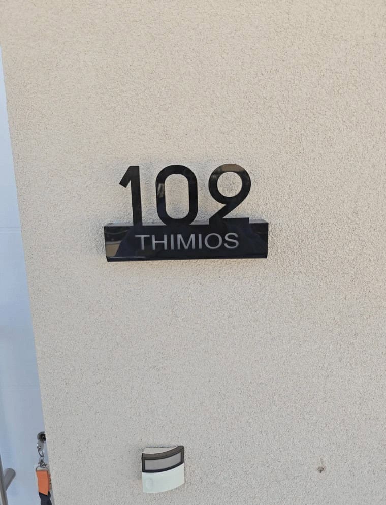
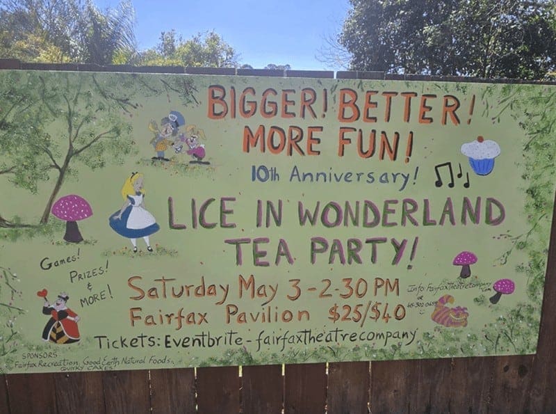
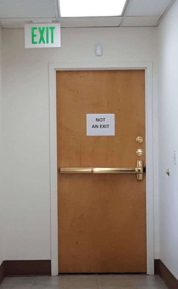
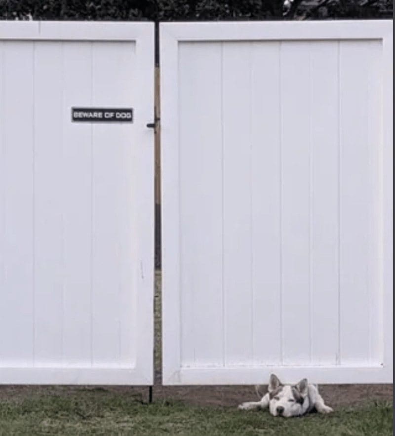
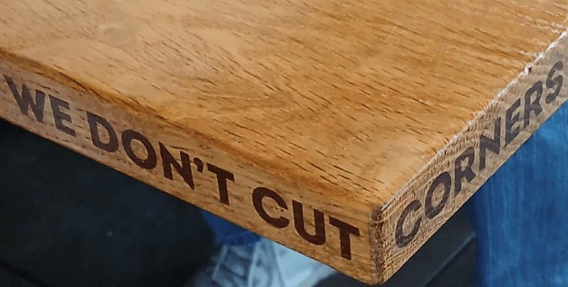
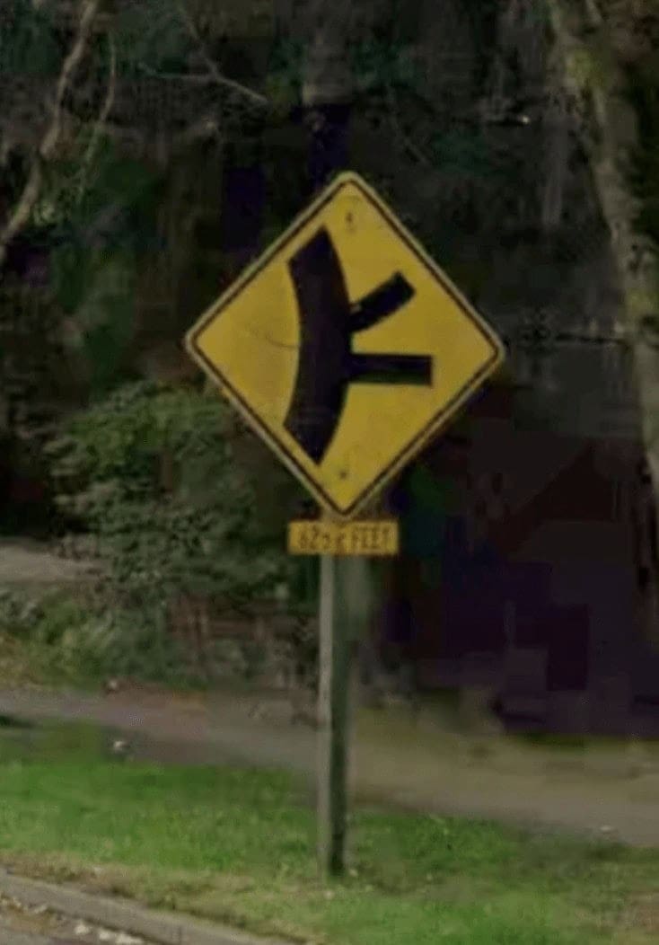
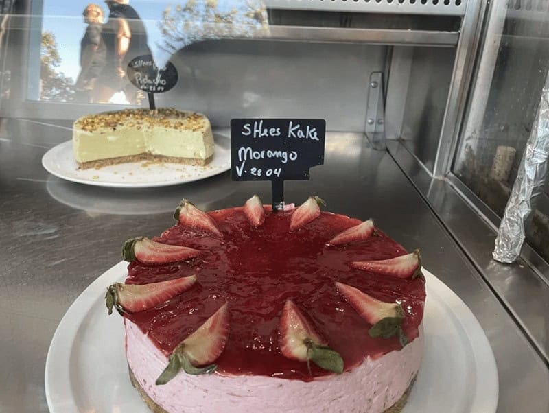

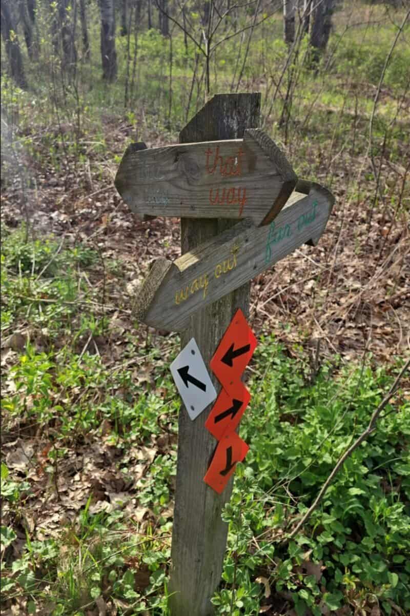
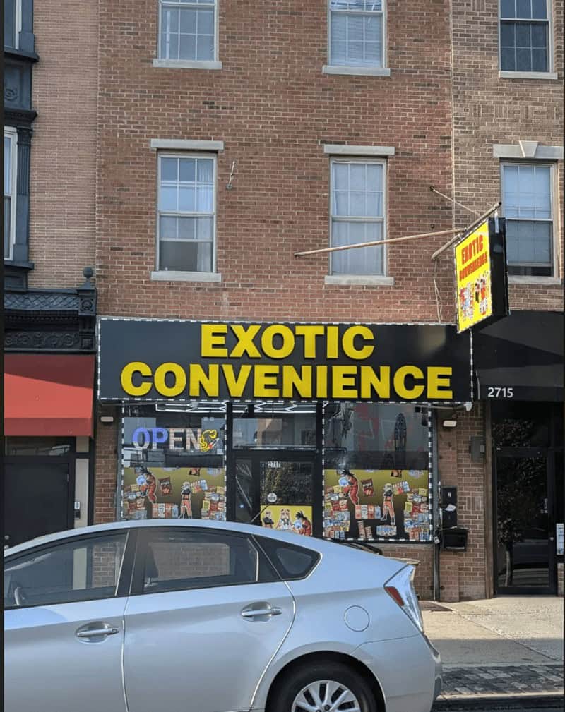
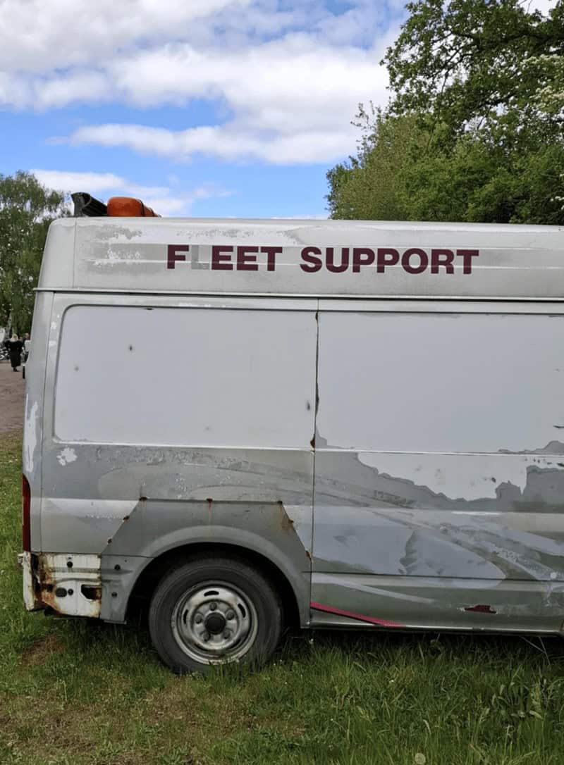
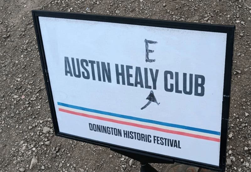
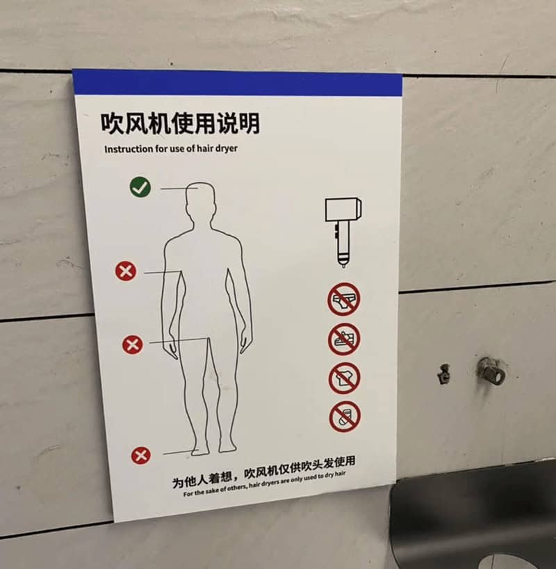
The funniest design fails are perfectly legible until a second glance unravels the plot: a “PUSH” door with a pull handle, a ramp ending at three surprise steps, a safety poster hiding the hazard with its own clip art. Screenshot the contradictions, crop tight, and let the photo do the punchline—objects are the best comedians.
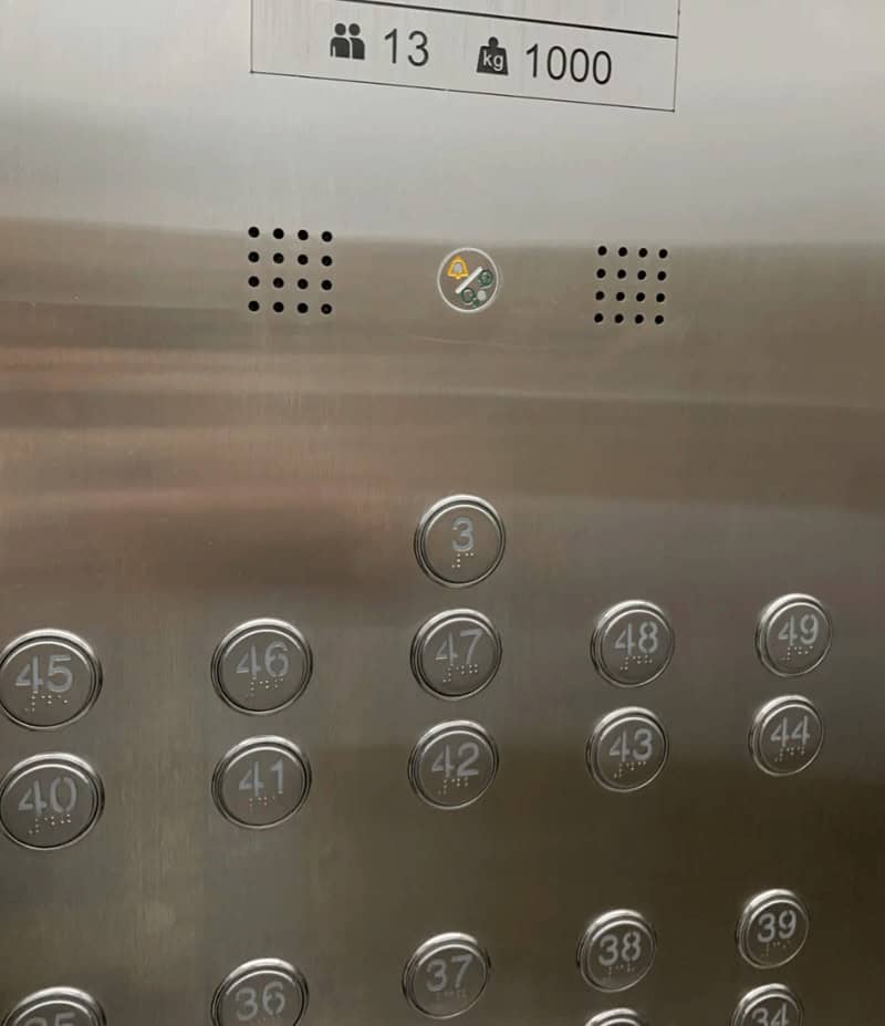
Typography has range—from cathedral to crime scene. Watch for decorative fonts on tiny labels, contrast that dies under fluorescent lights, and color palettes that abandon color-blind readers. A clean serif and decent spacing solve half of graphic design fails before they’re born, which is tragically unfunny but delightfully useful.
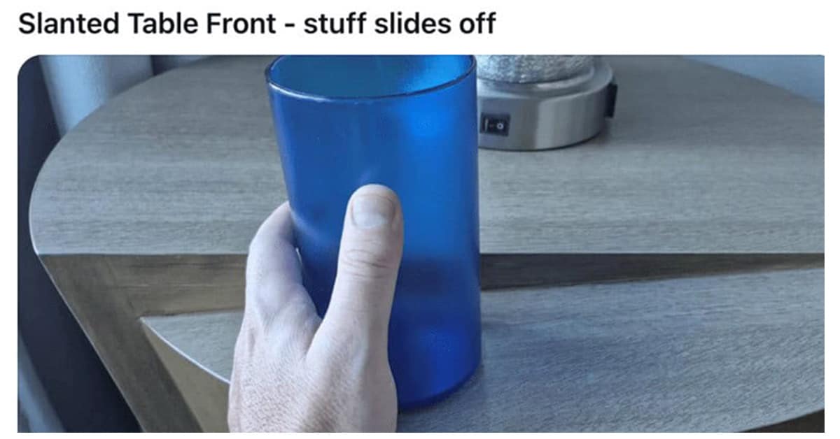
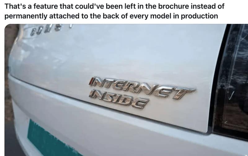
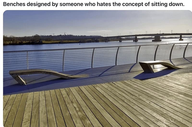
Physical world flubs hit harder. Product design fails love sharp edges where palms go, lids that require three hands, and chargers that block other outlets. Architecture joins the party with railings that don’t meet rails and windows that open into walls. Save a few gems under accessibility matters; future-you will need them in a meeting.
Photography makes or breaks the gasp. Shoot straight-on, fill the frame, and avoid faces and addresses—we aim jokes at situations, not people. Texture carries laughs: paint drips, misaligned tiles, glossy stickers slapped over worse news. Those close-ups become instant meme gallery favorites and painless work-safe laughs.
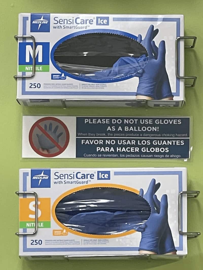
Tiny fixes haunt these images like helpful ghosts. One arrow, a high-contrast label, a rotated handle—done. That gap between “almost right” and “oh no” is where the share button lives. When a piece accidentally tells the truth (like a “Safety First” banner blocking the exit), tag it as irony in the wild and move on gently.
If your brain loves puzzles with consequences like these design fails, keep the scroll warm with 35 Funny Sign Fails We Can’t Unsee, 30 Architecture Oops Photos From Real Life, and 30 Packaging Mistakes That Accidentally Told The Truth—adjacent lanes that keep the laughs without repeating today’s exhibit.
Priya Coleman frames disasters like gallery pieces—soft light, kind snark, and captions that leave room to breathe.
Read Memes
Get Paid

Priya Coleman is a viral content specialist and meme analyst with over six years in digital publishing. Her past roles include viral content editor for PopSugar's humor vertical and meme correspondent for HuffPost’s comedy section. Priya specializes in spotting trending meme moments just before they peak—like the chaotic delight of the Ever Given’s Suez Canal mishap or the existential comedy of This is Fine. She brings her sharp wit and instinctive knack for viral content to Thunder Dungeon, always keeping the community a step ahead of the latest meme craze.