35 Bad Logos That Make Clip-Art Look Like Fine Art
Deadline pressure. Tiny budgets. Zero second opinions. Stir those together and you get the glorious universe of bad logos. Thirty-five brand marks and logo fails now line up like a blooper reel for marketing majors, each one ready to make your inner critic cheer. Put the style guide down, grab popcorn, and let design disaster brighten the workday.
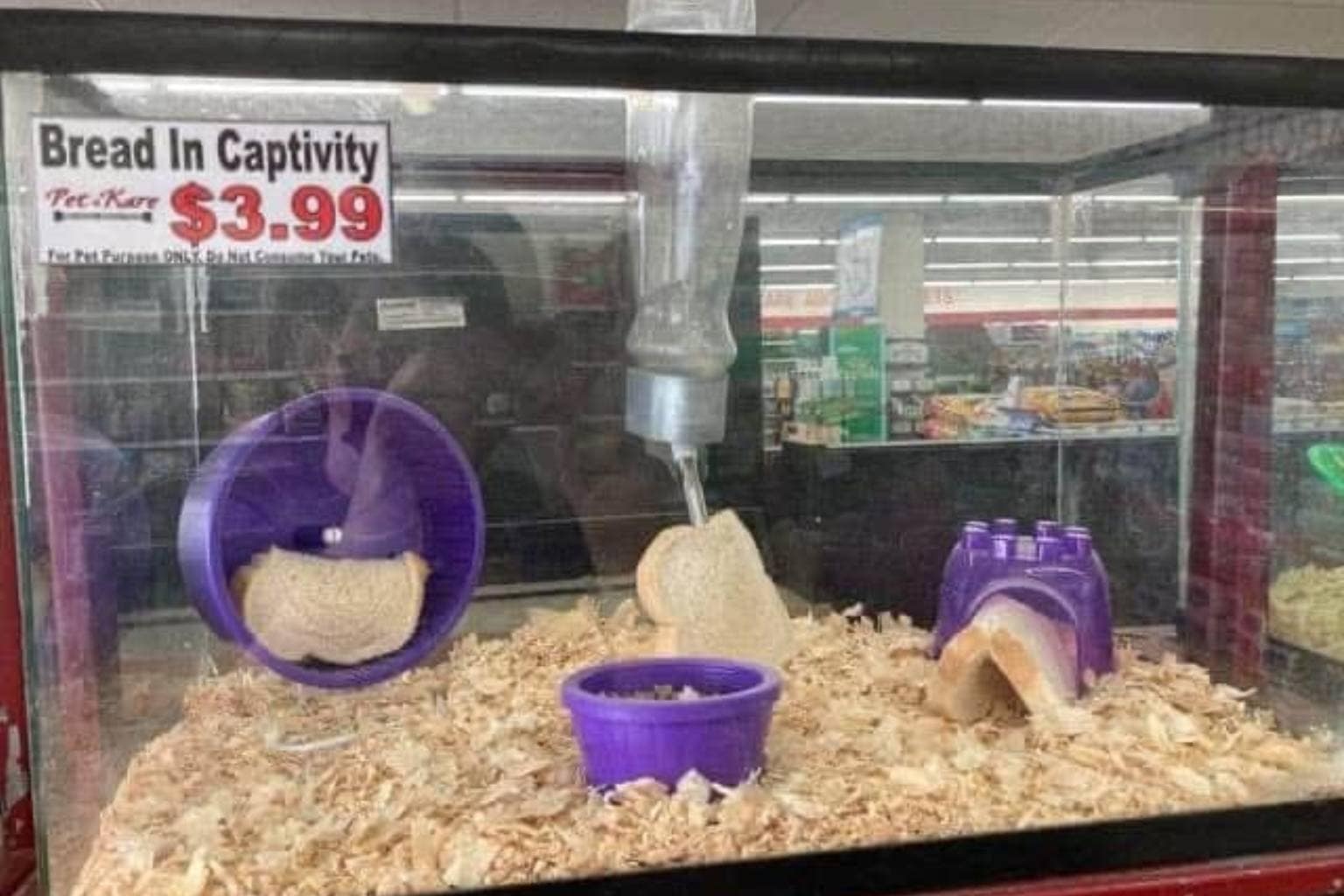
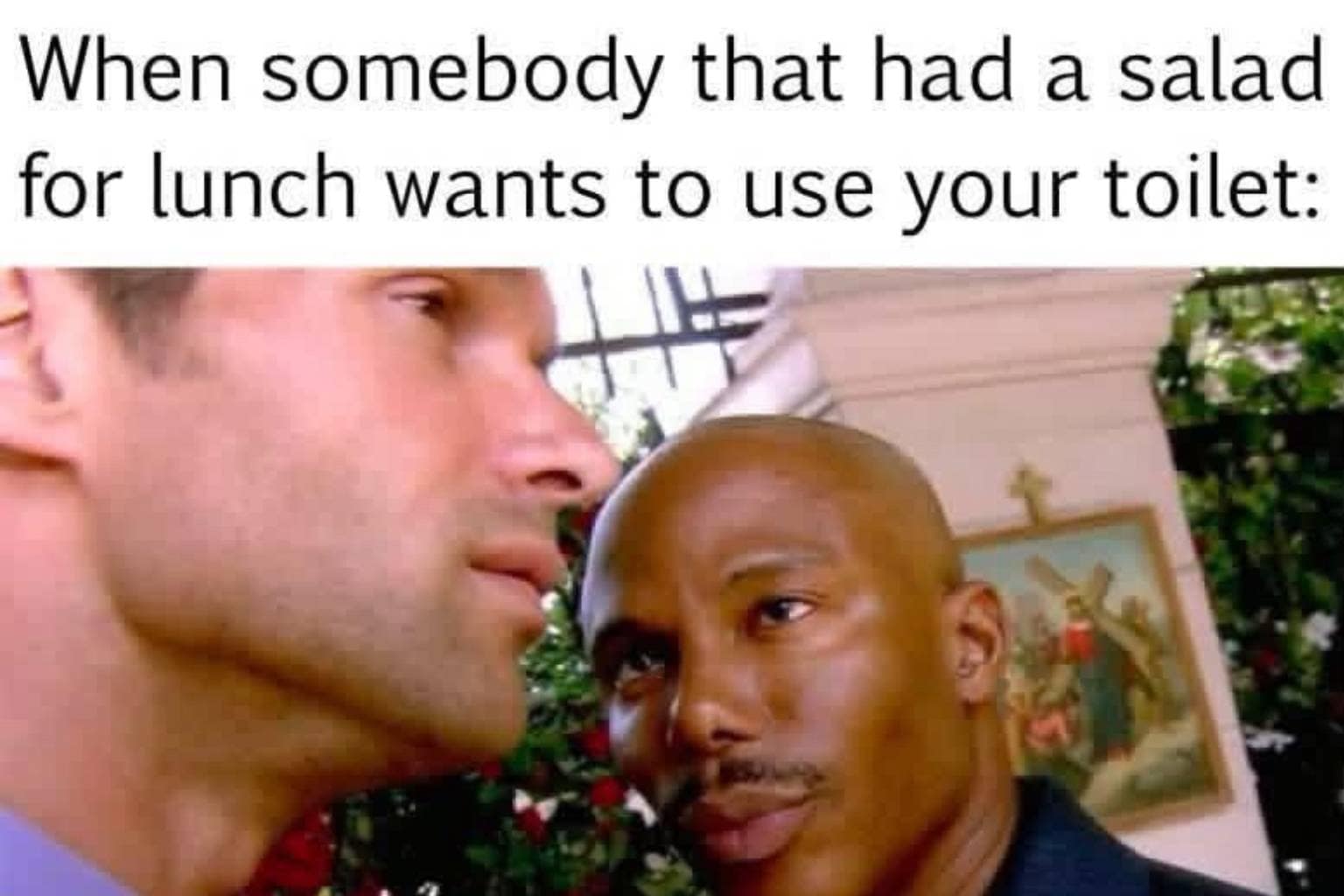
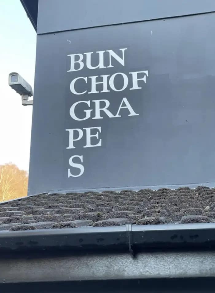
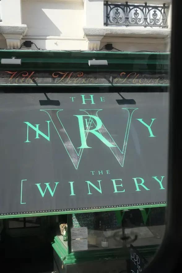
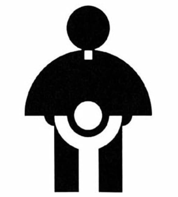
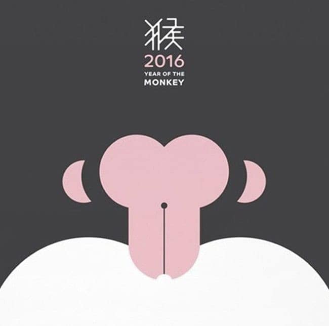
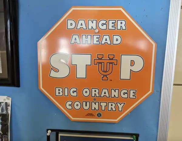
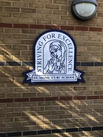
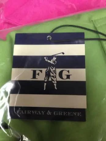
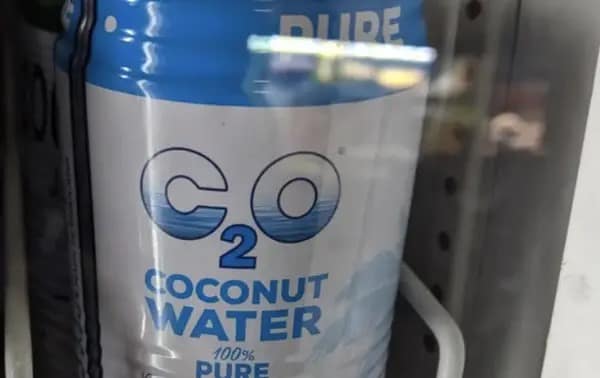
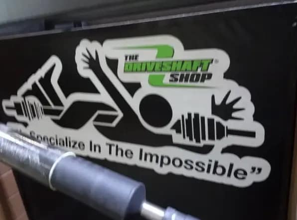
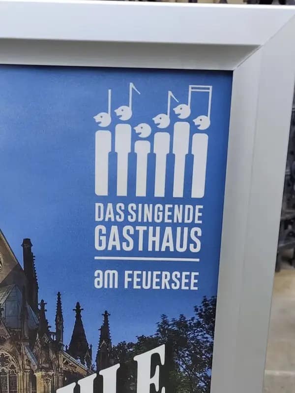
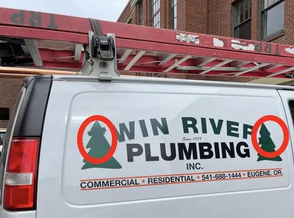
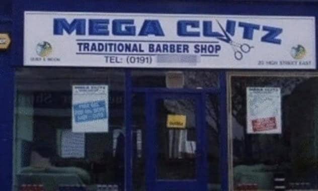
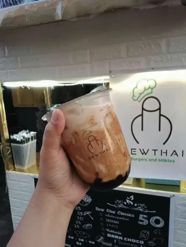
Every swipe drops bad logos worth a chuckle. A parade of wild logo fails showcases mascots that fight basic shapes for space, taglines mashed into accidental puzzles, and icons that hint at products no one sells. Next, a set of painful graphic design fails highlights alignment choices that must have skipped rehearsal. Rounding things out, a wave of branding fails reminds everyone why draft layers exist. The jokes keep pace—setup, grin, next—ideal for readers trained by endless scroll culture. Themes bounce from ambitious rebrands that forgot the brand to local shops whose marks look crowdsourced by cousins. Each of these bad logos underscores the same lesson: hire feedback before the printer hits “run.” By item fifteen you’ll respect white space like never before; by item thirty-five you’ll wish your screen came with an “undo” button for humanity.


These bad logos hover like sticky notes in your mind. Your own slide deck suddenly feels polished. Even that sloppy team whiteboard sketch appears award-worthy. Laughter rewires perfectionism into cautious optimism—and maybe a sudden urge to double-check every kerning choice you’ve ever made.
Bookmark a couple bad logos for emergency design pep talks, then swing by meme collections lampooning stock-photo overload or spelling misprints so bold they belong in a museum of oops. I’m heading off to proofread my email signature for the eighth time and hiding the clip-art button just in case inspiration strikes before caffeine does.
Read Memes
Get Paid

Phil M., Co‑Founder & Content Strategist
Phil is one of Thunder Dungeon’s co‑founders, doubling as our resident meme analyst and dark‑room brainstormer. He specializes in trend‑spotting across social platforms and shapes the editorial calendar to keep our galleries fresh, topical, and worthy of your valuable procrastination.