
Helpful Christmas Charts
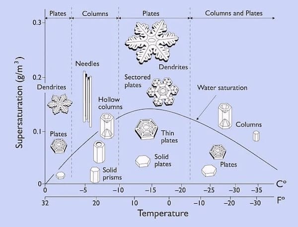
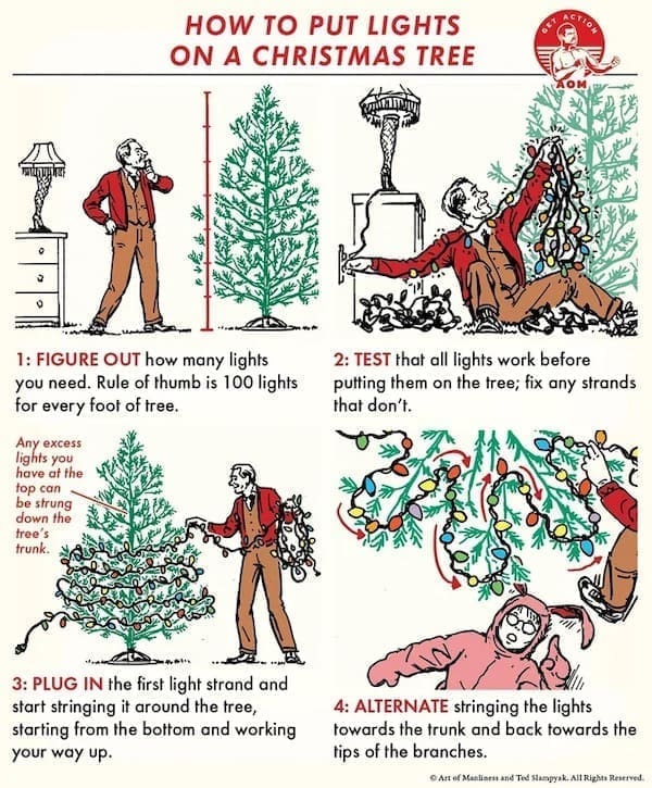
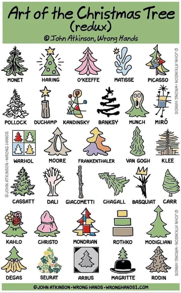
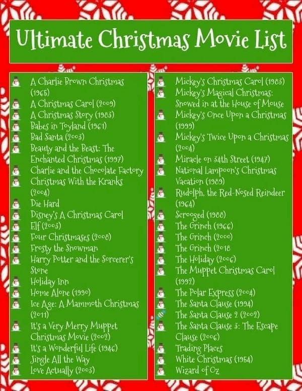
Tired of holiday chaos? Feast your eyes on 25 helpful Christmas charts that attempt to bring order to the festive frenzy. From charts explaining the varieties of snowflakes to statistical breakdowns of the amount of presents sold and even pie charts detailing the success rates of holiday baking, these visual goodies attempt to wrangle the chaos of the season into something slightly more manageable. Embrace the data-driven joy of Christmas!


Within this collection are the visual attempts to bring order to the chaos—the 'Christmas chaos control' depicted in these charts, the 'festive frenzy statistics' aiming to decode the holiday madness, and the 'holiday chaos diagrams' that attempt to streamline the yuletide madness. It's a visual expedition into attempting to put some logic into the joyful chaos of Christmas. Scouring the internet reveals discussions on 'Christmas statistics' and 'holiday data graphs,' where enthusiasts seek to decode the madness of the holiday season through visual aids.
Read Memes
Get Paid

Roy R., Chief Meme Curator
Roy founded Thunder Dungeon in 2012 and has since guided its growth into a 2.5 million‑strong community of meme enthusiasts. With over a decade of digital‑media experience and a nose for viral humor, Roy oversees content strategy, ensuring every post is both hilarious and high‑quality


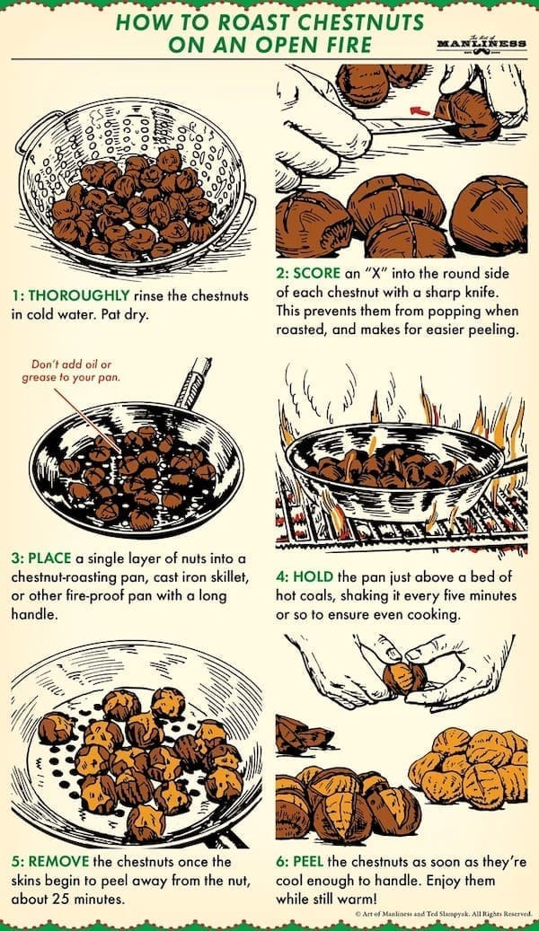
1