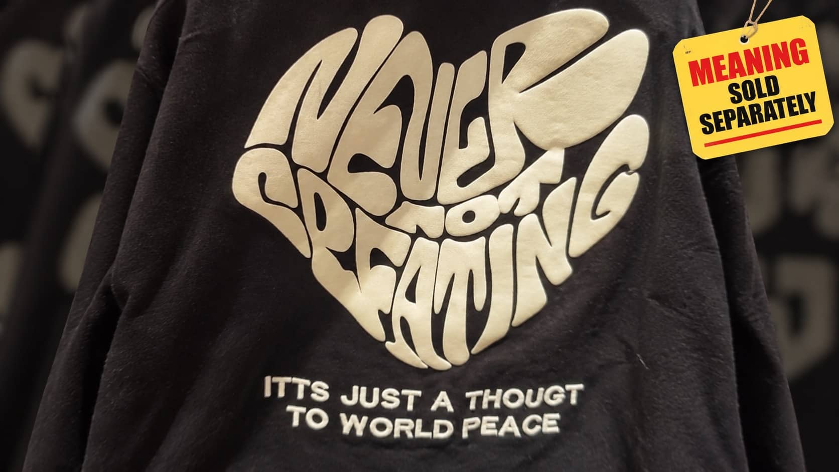
I want to frame this properly before we start. These weren’t made on a laptop in ten minutes. Somebody booked a studio. Somebody hired a photographer. Somebody printed thousands of copies and shipped them to record stores. These worst album covers represent a full production chain in which every single participant looked at the result and said “yes, ship it.” That’s the part I can’t get past. There were MEETINGS. Let’s go through the evidence.

Live-action Cats movie prototype.
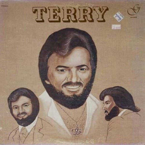
Triple the Terry, triple the romance.

He will sell you a used sedan, and he will do whatever it takes.


Pitch meeting: "Let's put them under a giant floating piano lid, it signifies depth."




Worst album covers
Read More
The unsettling portrait wing is where the direct eye contact starts, and it never stops. There’s a cover featuring a human-cat hybrid rendering that is, and I mean this technically, nightmare fuel pressed onto vinyl, the kind of image your own cat sees when it stares at a blank wall at 3 a.m. There’s a black and white close-up of a performer promising to please the listener, and the delivery reads as less of a promise and more of a warning. There’s a man in a suit whose smile suggests he has already locked the office doors and the team-building exercise is now mandatory. Nobody in this category is blinking. Not one of them.
Then the accidental innuendo division, which is entirely a proofreading failure and I love it dearly. There are covers with titles that read perfectly innocently in the context of their era and land catastrophically today, paired with photography choices that somehow make it worse rather than better. There’s one featuring performers positioned beneath a floating piano lid, presumably to signify depth, which in the pitch meeting must have sounded artistic and in execution looks like a structural hazard. And there’s a religious volume with a font and title combination that is genuinely a crime scene, and the infant on the cover appears to be actively calculating an exit route.
And then the vintage styling overload, which is where I get truly happy. There’s a man in aviators and a red shirt surrounded by graphic shooting stars, the official spokesperson of an entire decade’s worth of chest hair and questionable confidence. There’s a triple-portrait cover featuring the same bearded performer from three angles, because selecting one angle would have meant choosing, and choosing is for cowards. There’s a group photo of four men stacked into a human totem formation, in which not a single participant appears comfortable. And a cover promising dance featuring a man standing beside a synthesizer with a jacket draped over his shoulder like he’s about to audit your church basement. Absolute party animal. Undefeated.
Here’s what genuinely fascinates me about all of this: the sincerity. Every one of these was somebody’s dream. Somebody saved for the studio time, chose their best shirt, sat for the photo, and mailed the finished record to their family with real pride. Nothing here is ironic. The irony was added decades later by us, scrolling, and the original artist had no idea their sincere effort would eventually become internet content.
Which makes me like them more, honestly. Modern album art is focus-grouped into oblivion, safe, tasteful, forgettable. These are unmistakable. You see one and you remember it forever, which is precisely what cover art is supposed to accomplish, so by the only metric that matters, they succeeded completely. Bad? Sure. Effective? Devastatingly. Somewhere a person who posed under a floating piano is still the most memorable thing in your feed today. That’s a legacy. Own it.
The meeting happened. Nobody objected. It shipped anyway, and thank goodness.
If you want more relics that nobody stopped in time, our pop culture content has the crate, with vintage design archives, album art threads, and forgotten media compilations filed under bewildering. Dig freely. There’s always a worse one underneath.
Read Memes
Get Paid


Jake Parker, known around the web as "Jay," is a digital writer with over 10 years of experience covering internet humor, meme trends, and viral content. Before joining Thunder Dungeon, Jay was the lead editor at MemeWire, where he helped curate memes that broke the internet, including coverage on trends like Distracted Boyfriend, Kombucha Girl, and Bernie Sanders’ Mittens. A self-proclaimed "professional procrastinator," Jay spends his downtime scrolling Reddit and Twitter to stay ahead of what's about to break the internet next.