
Everyone carries an internal map of the world, assembled from classroom posters and vague assumptions, and everyone’s internal map is wrong in ways they’ve never checked. These amazing maps are the audit, the overlays and comparisons that reveal cities in unexpected latitudes, populations crammed into impossible corners, and scales that make no intuitive sense whatsoever. Your compass will be recalibrated. Your dinner party material will improve dramatically. Unfold with me.
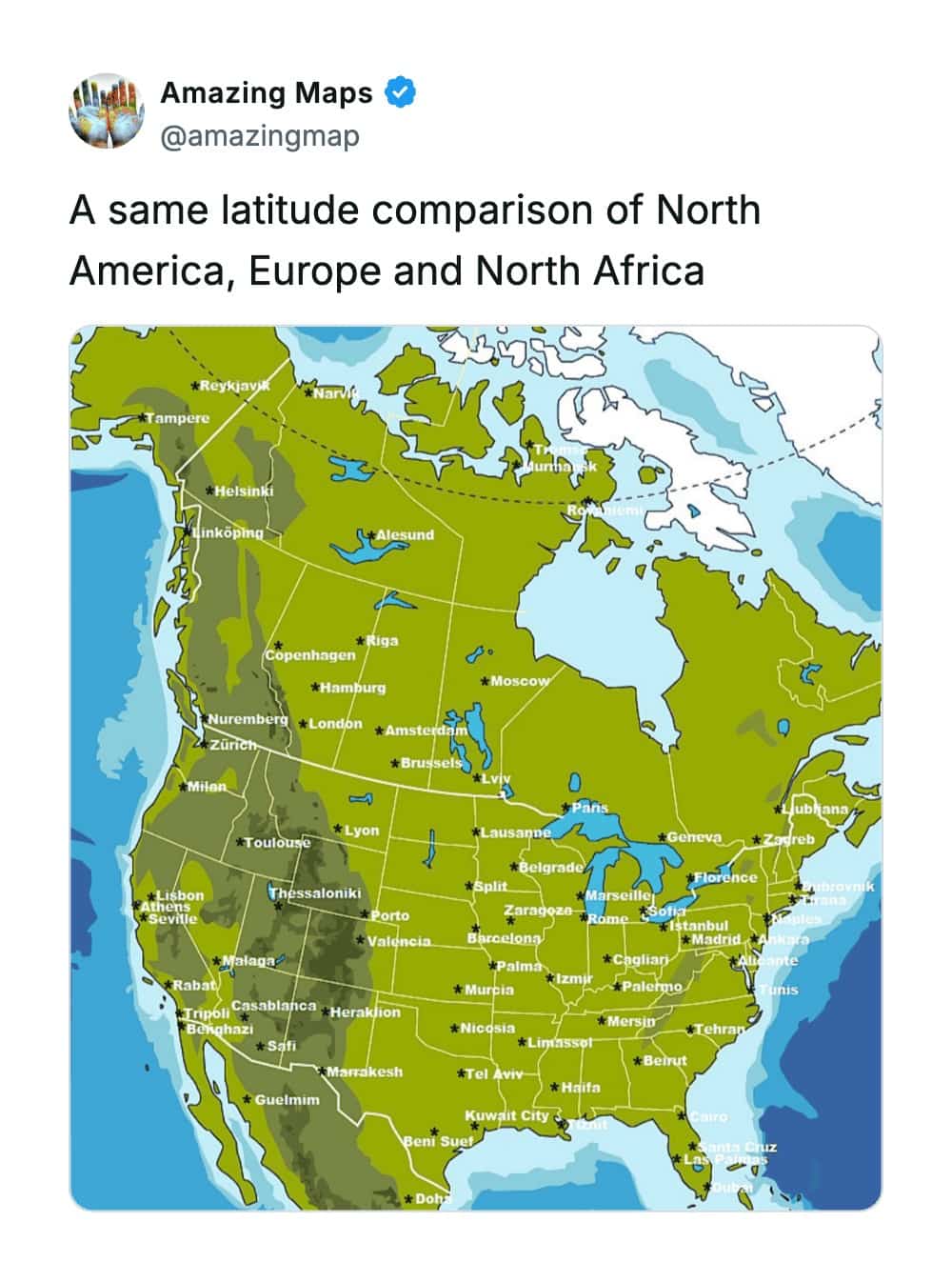
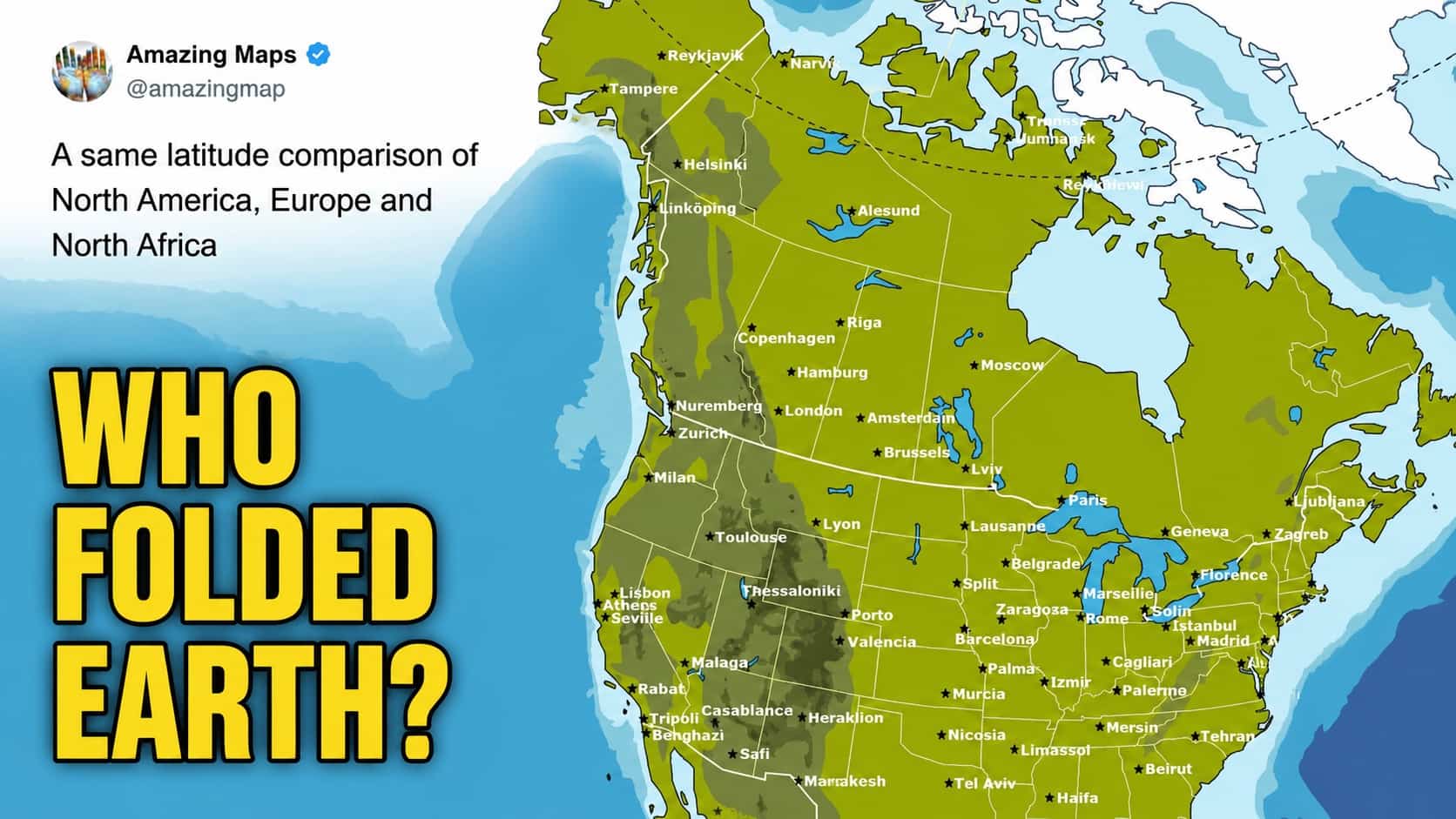
London being at the same latitude as Calgary explains why British people melt in 70-degree heat.
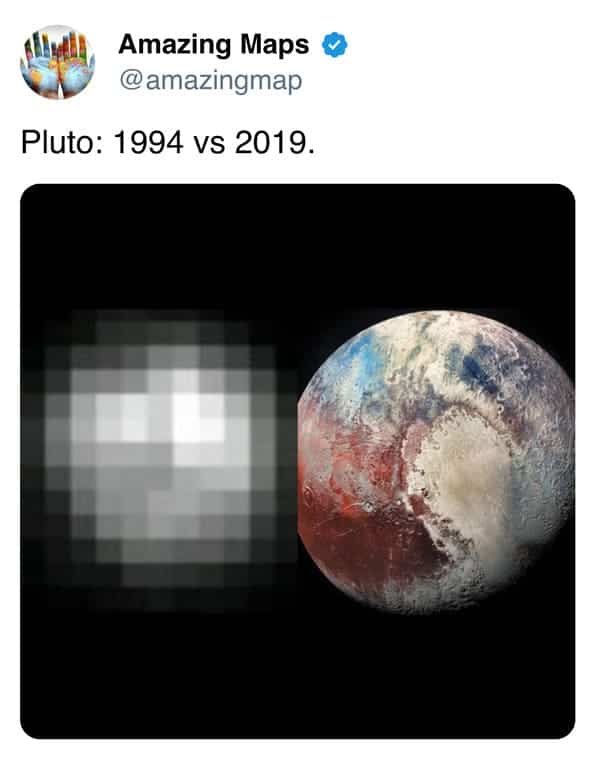
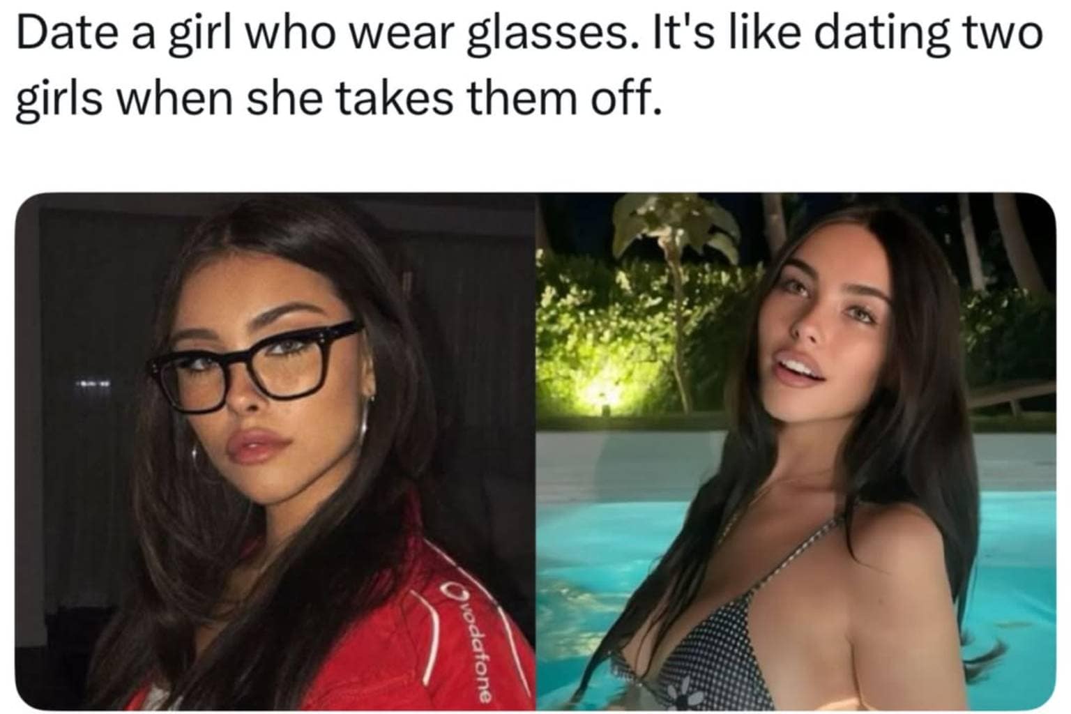
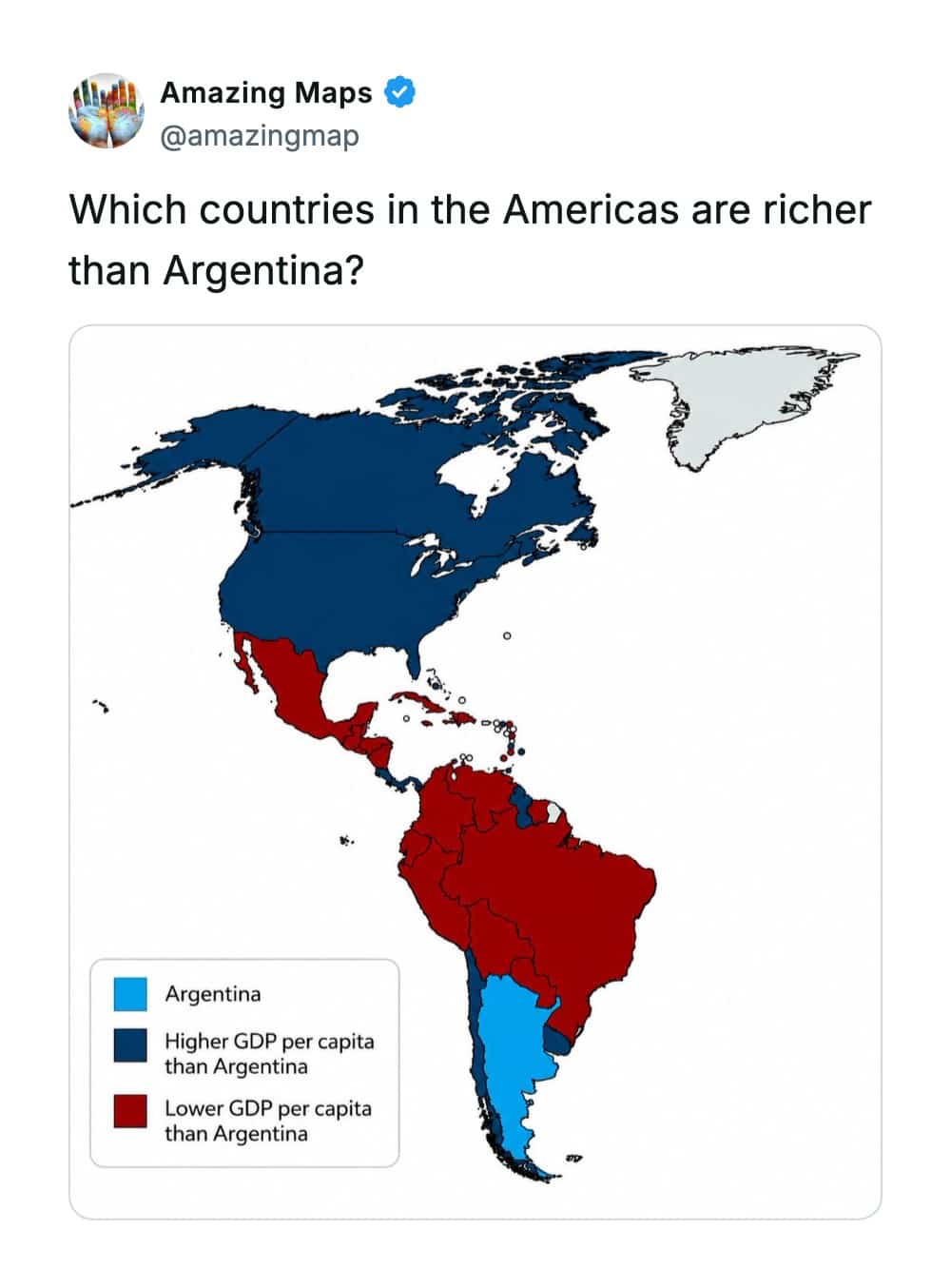
Talk about a glow-up.
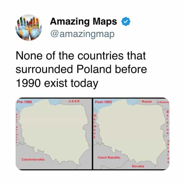
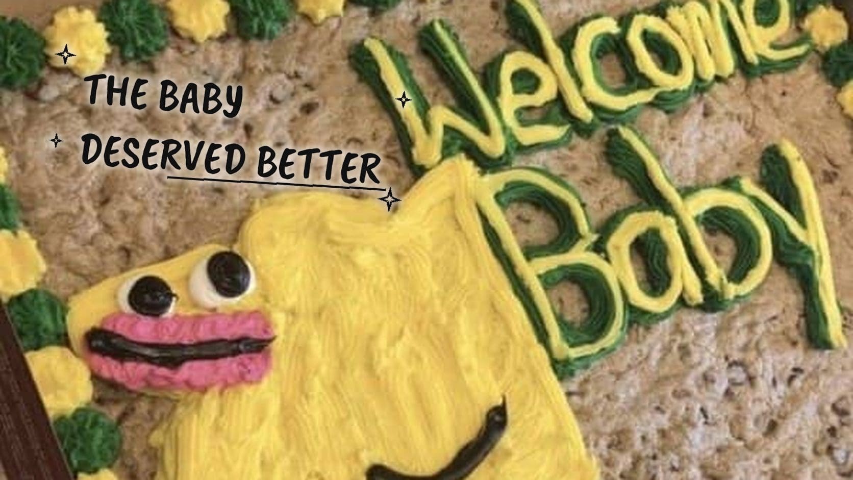
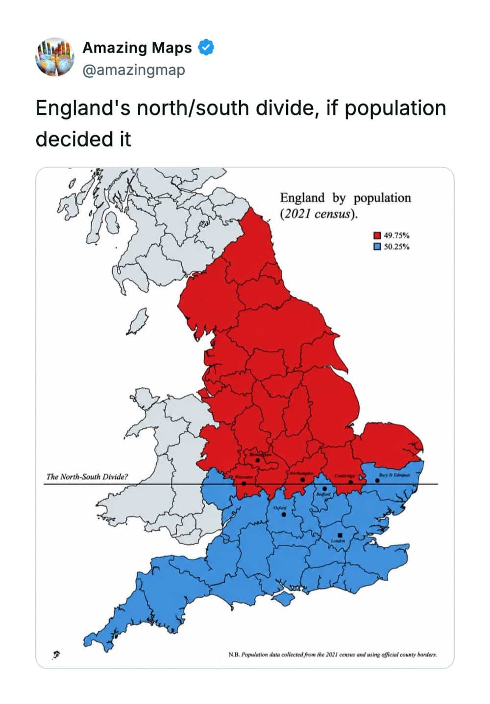
Ultimate geography plot twist.
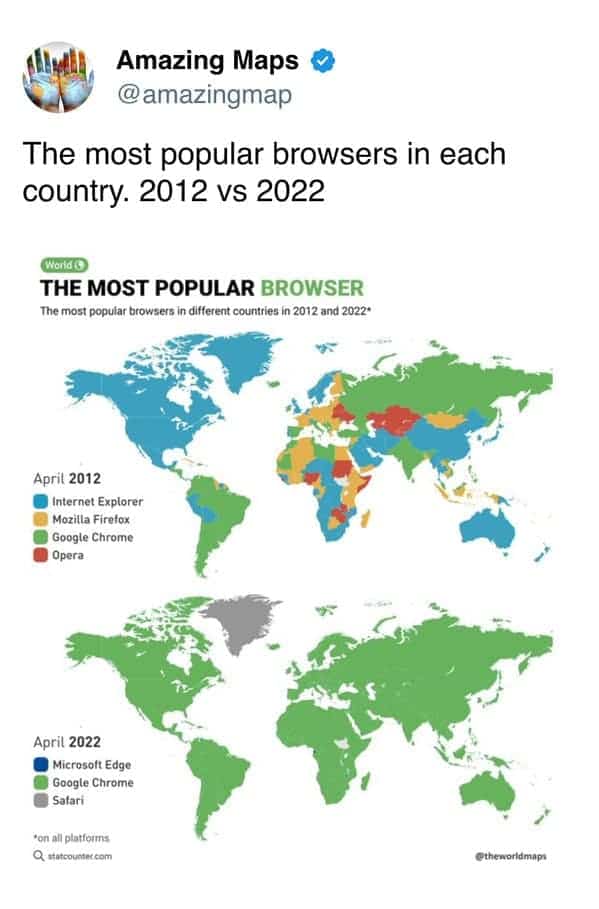
Greenland standing strong in grey, completely unbothered by RAM consumption.
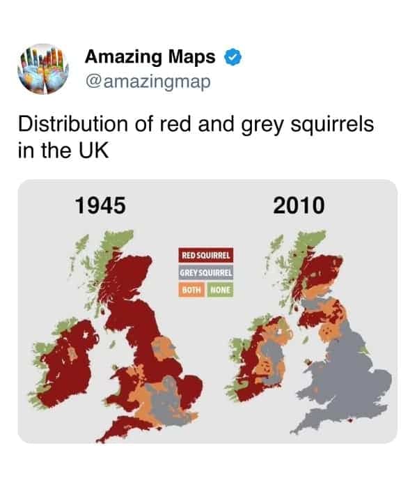
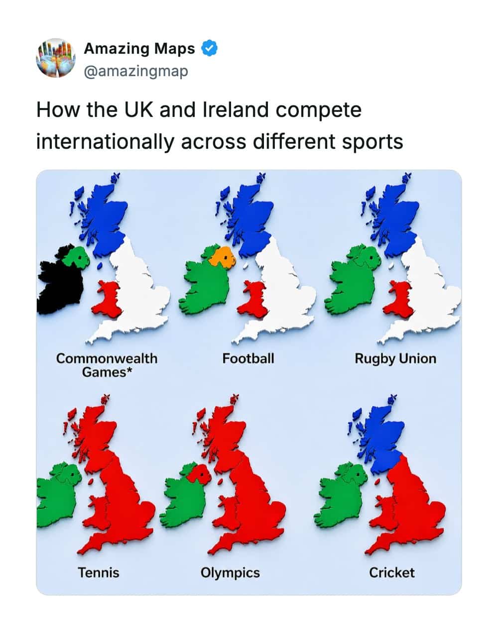
The grey squirrel invasion was ruthless and swift.
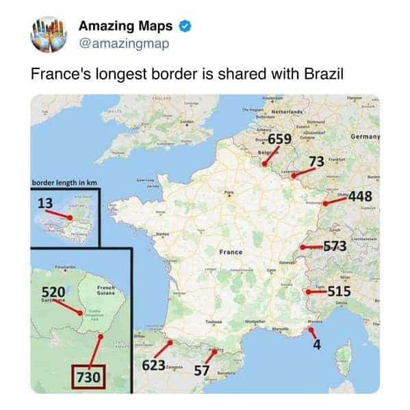
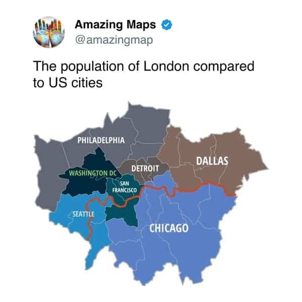
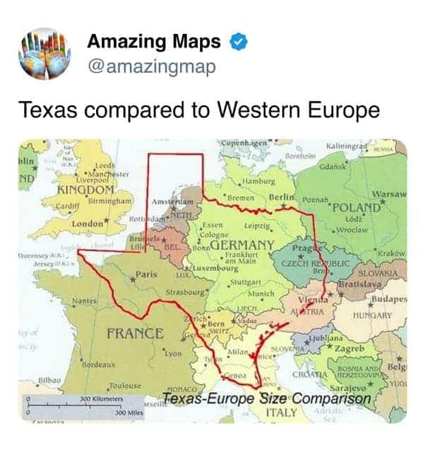
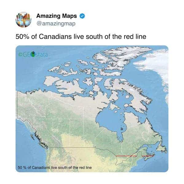
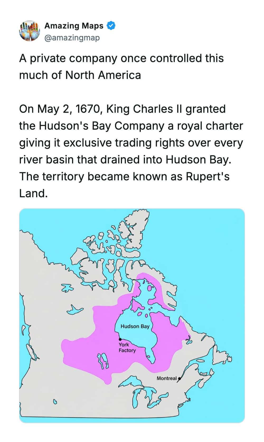
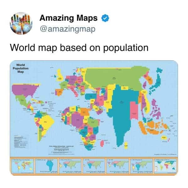
Southern Ontario doing population heavy lifting.
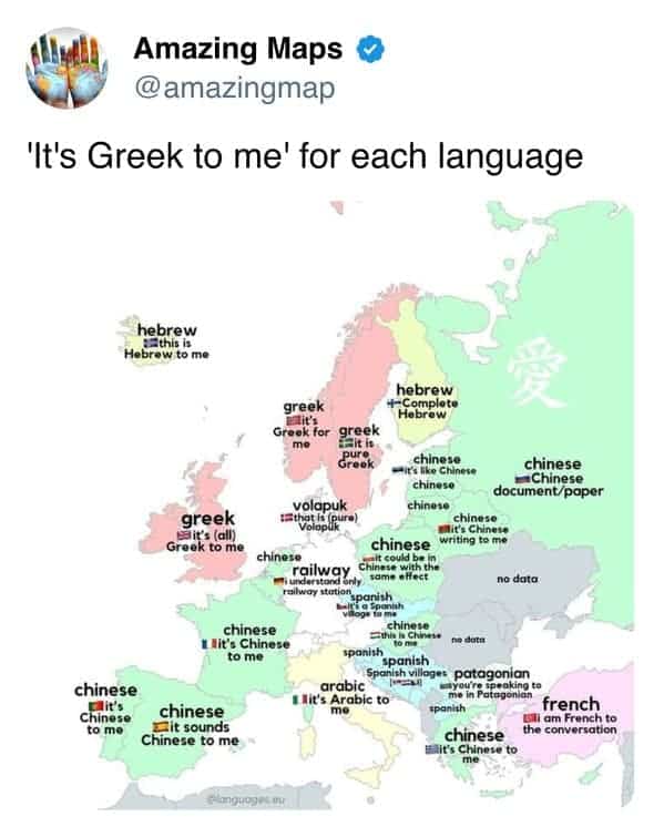
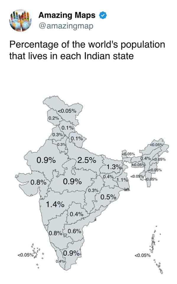

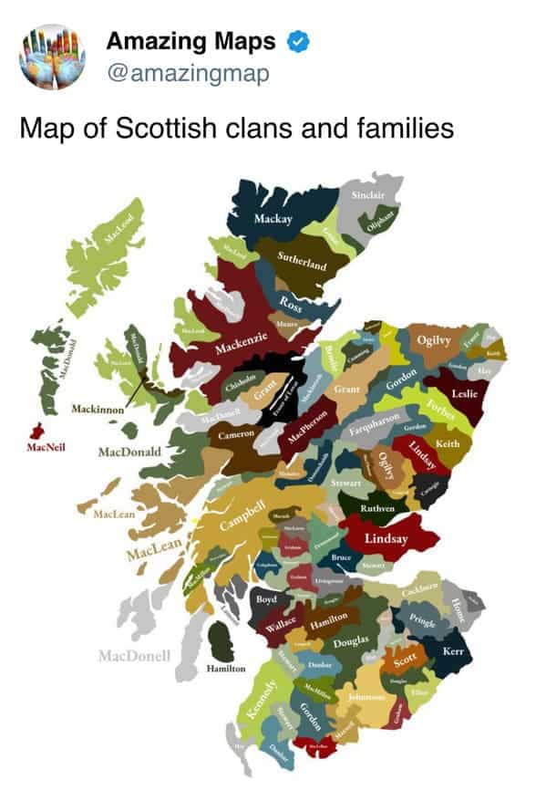
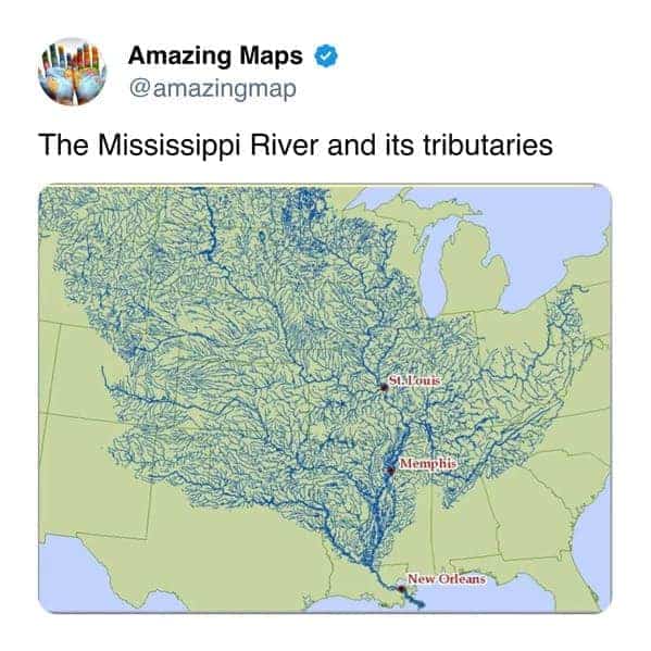
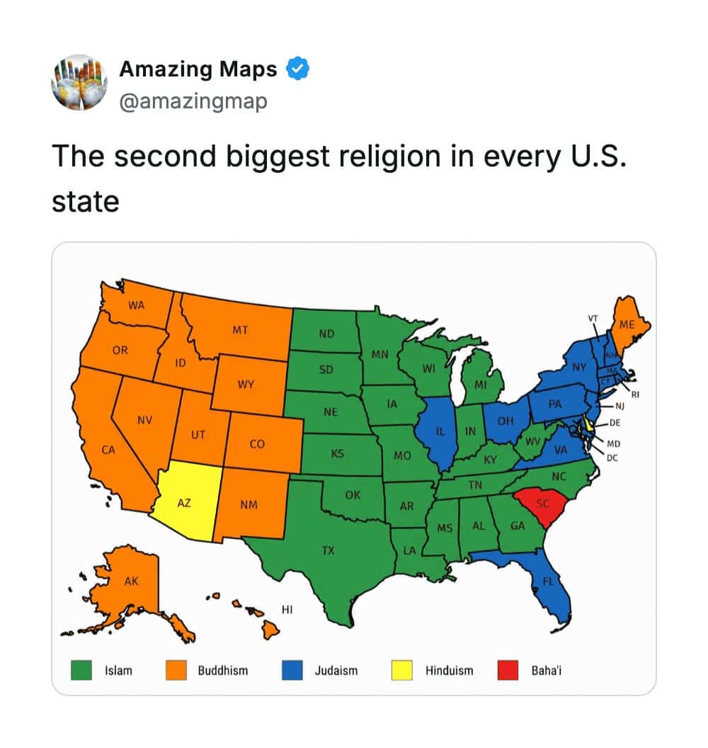
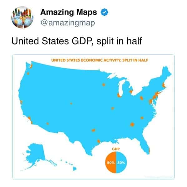
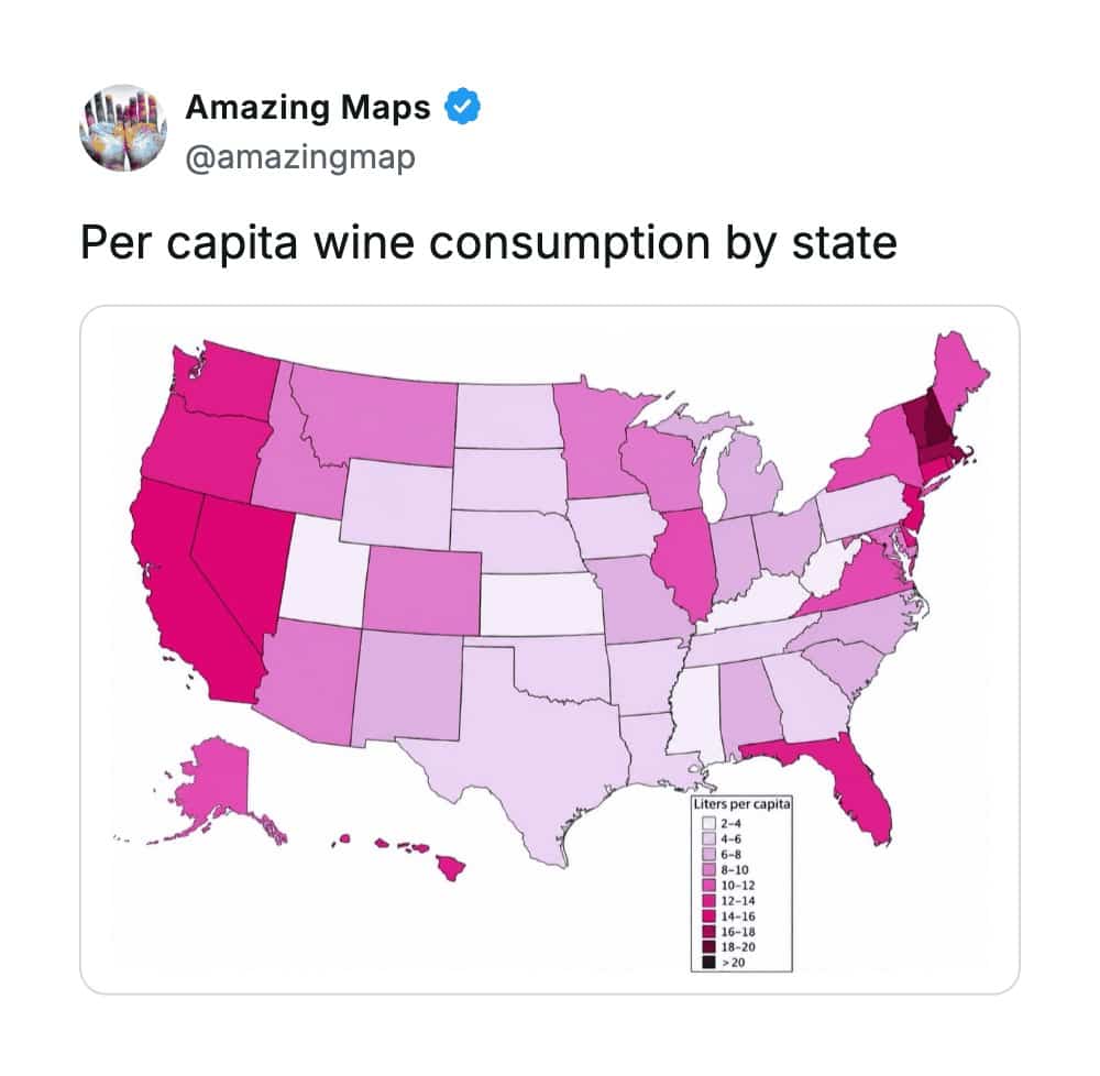
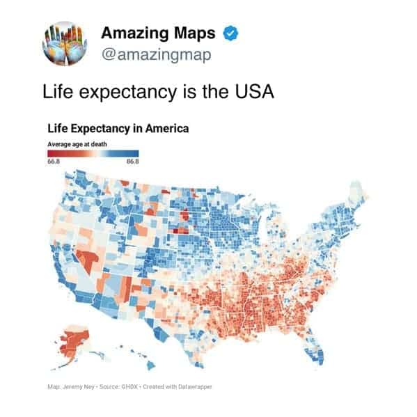
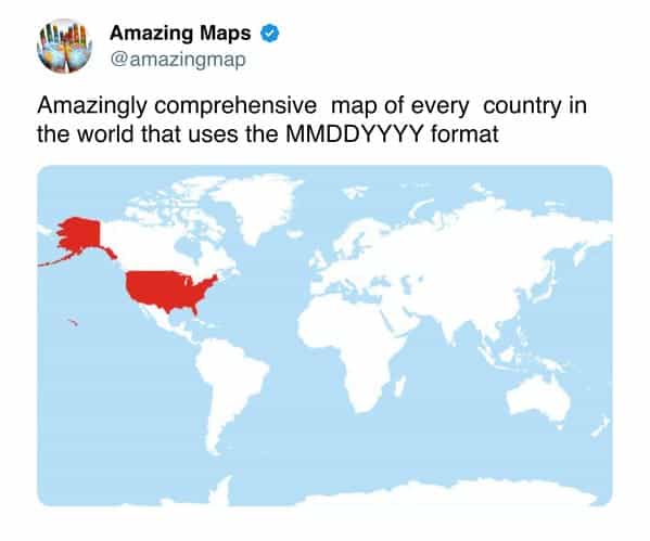
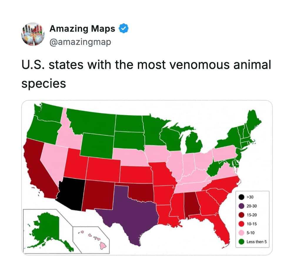
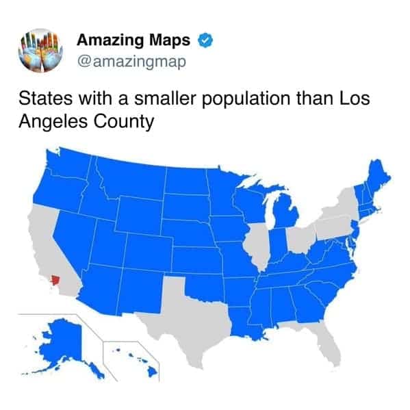
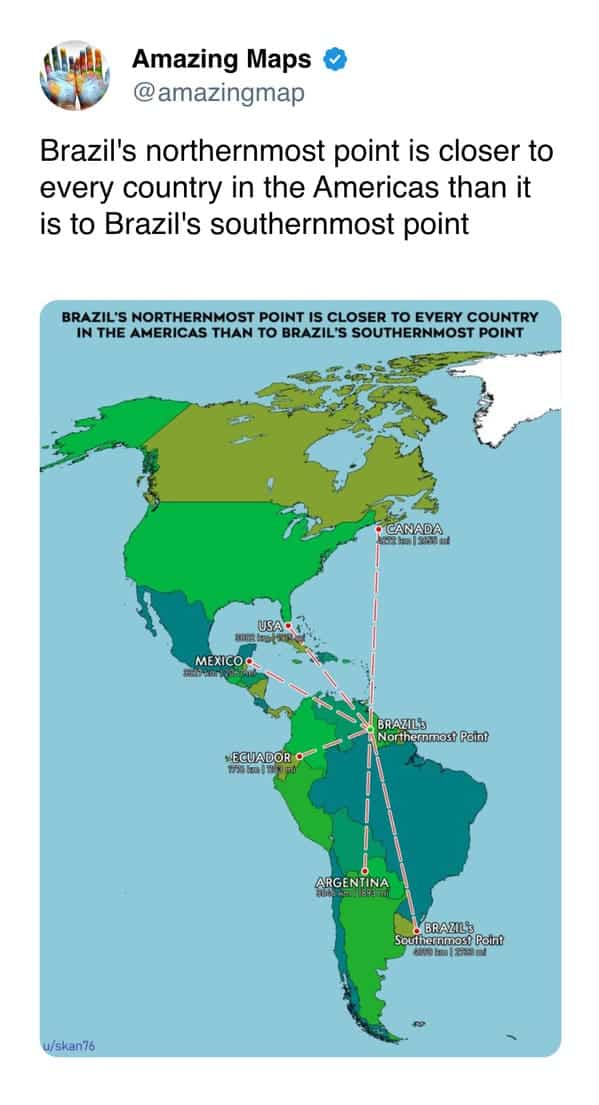
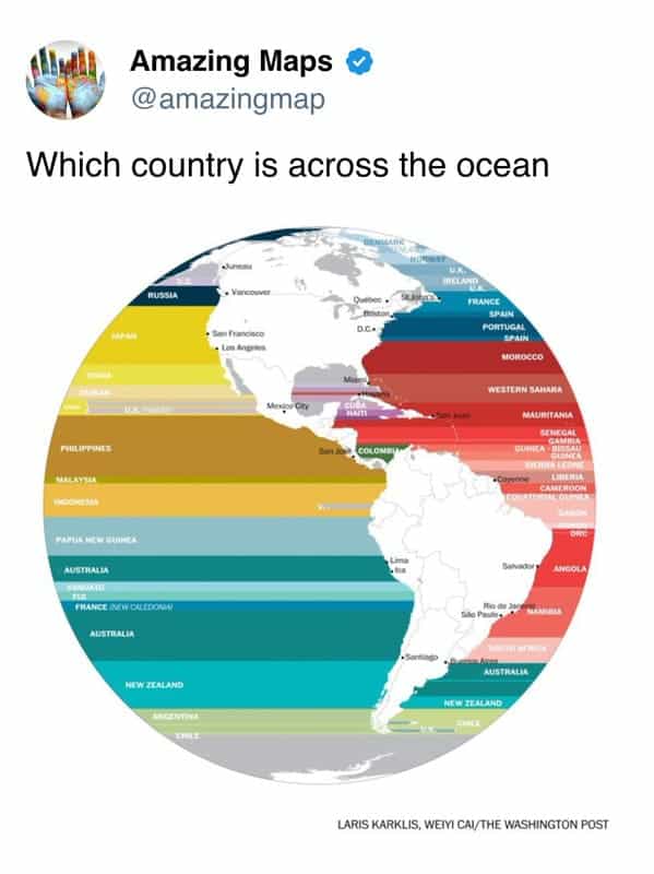
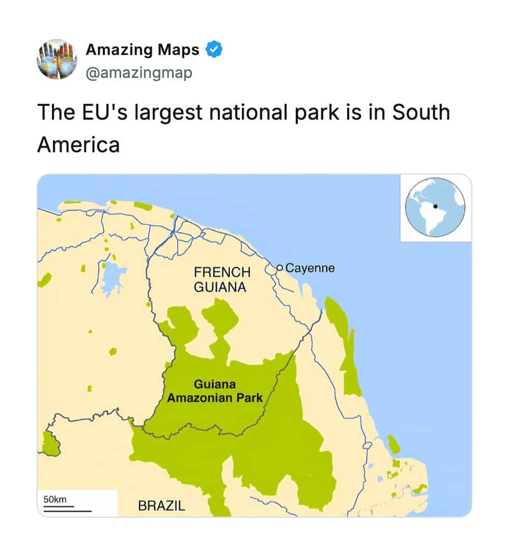
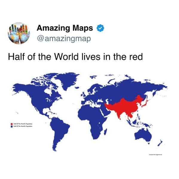
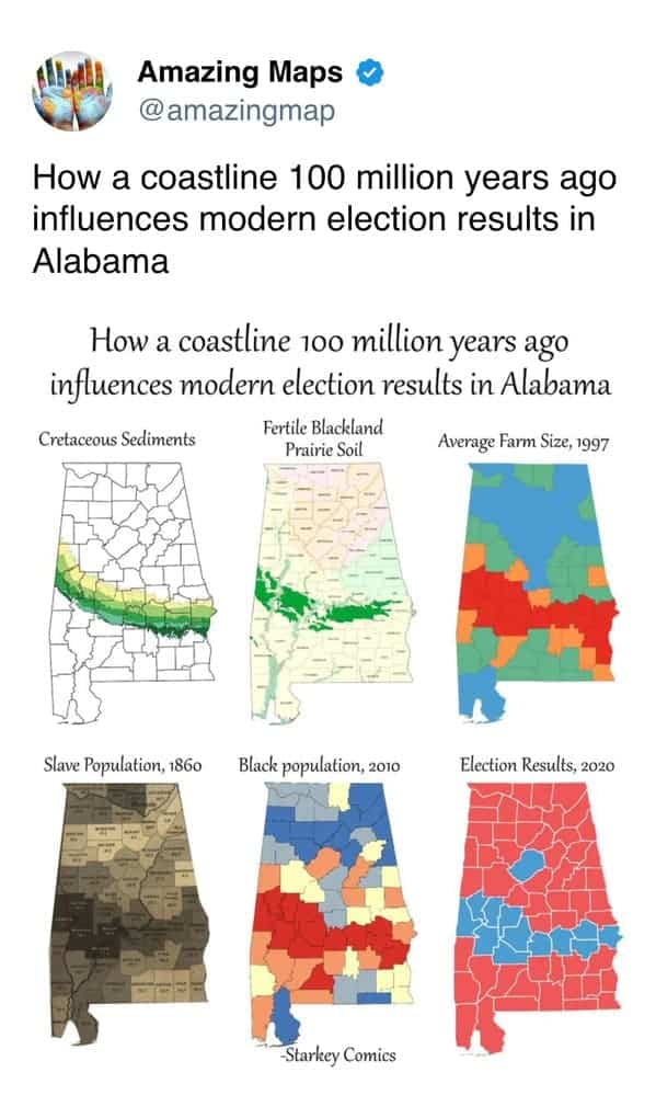
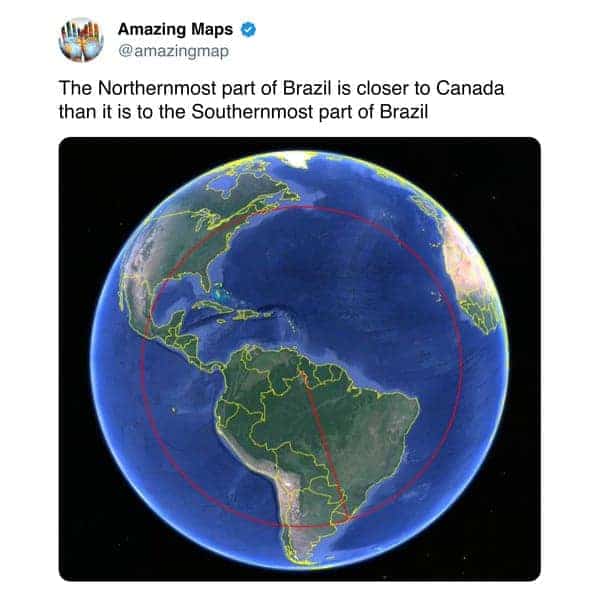
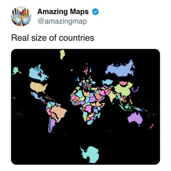
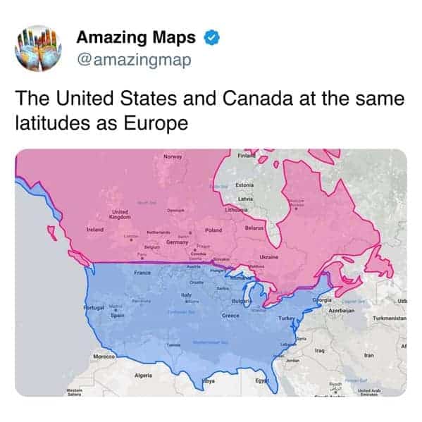
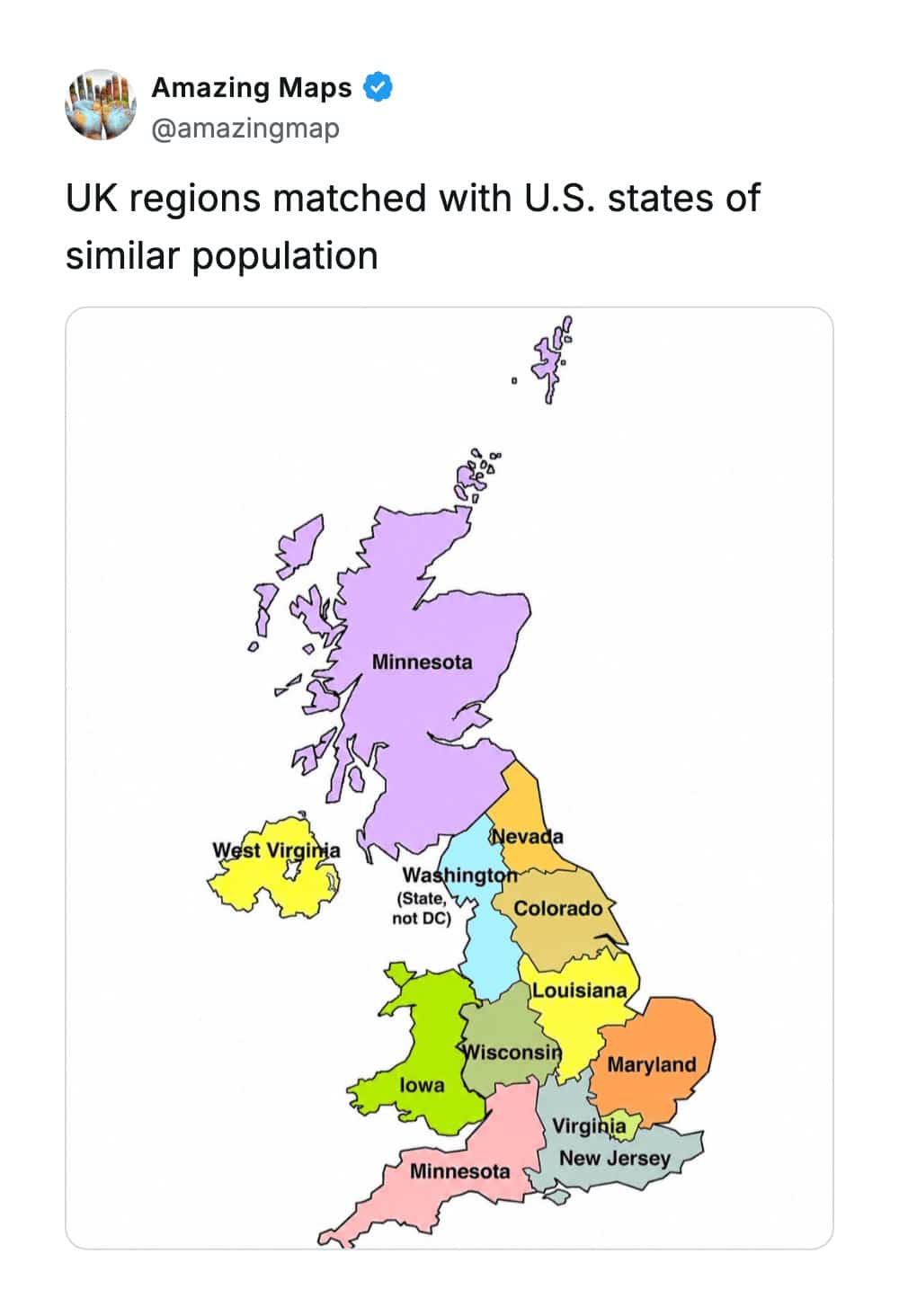
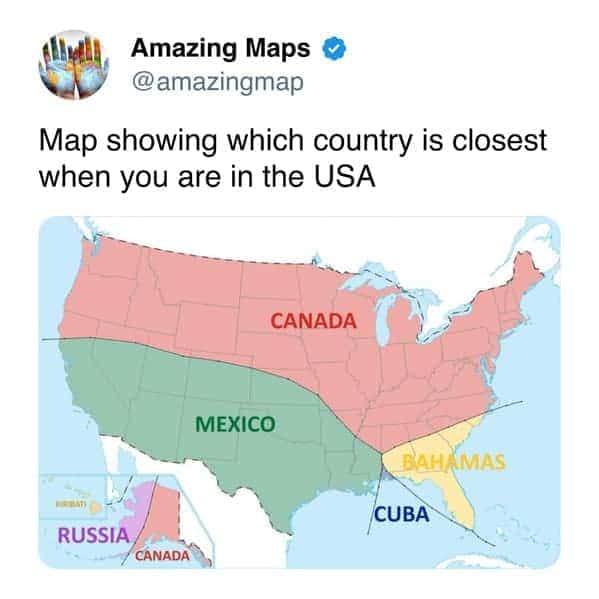
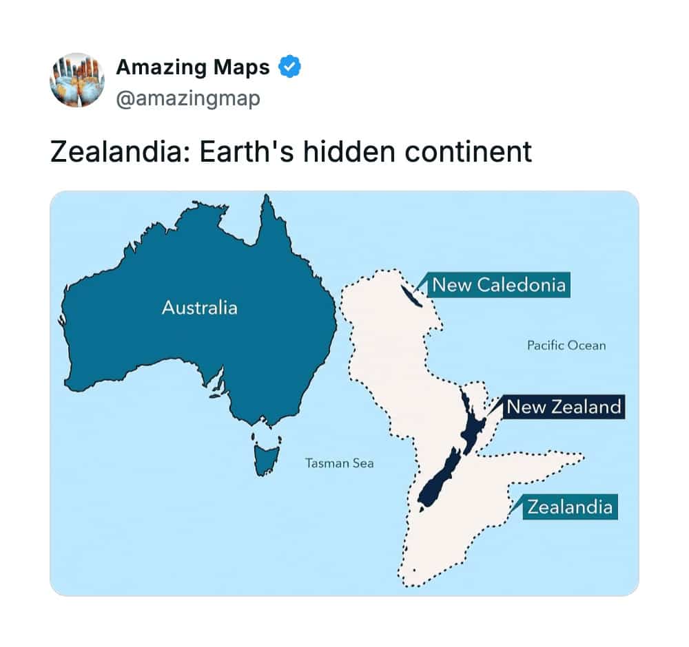
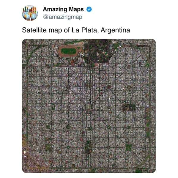
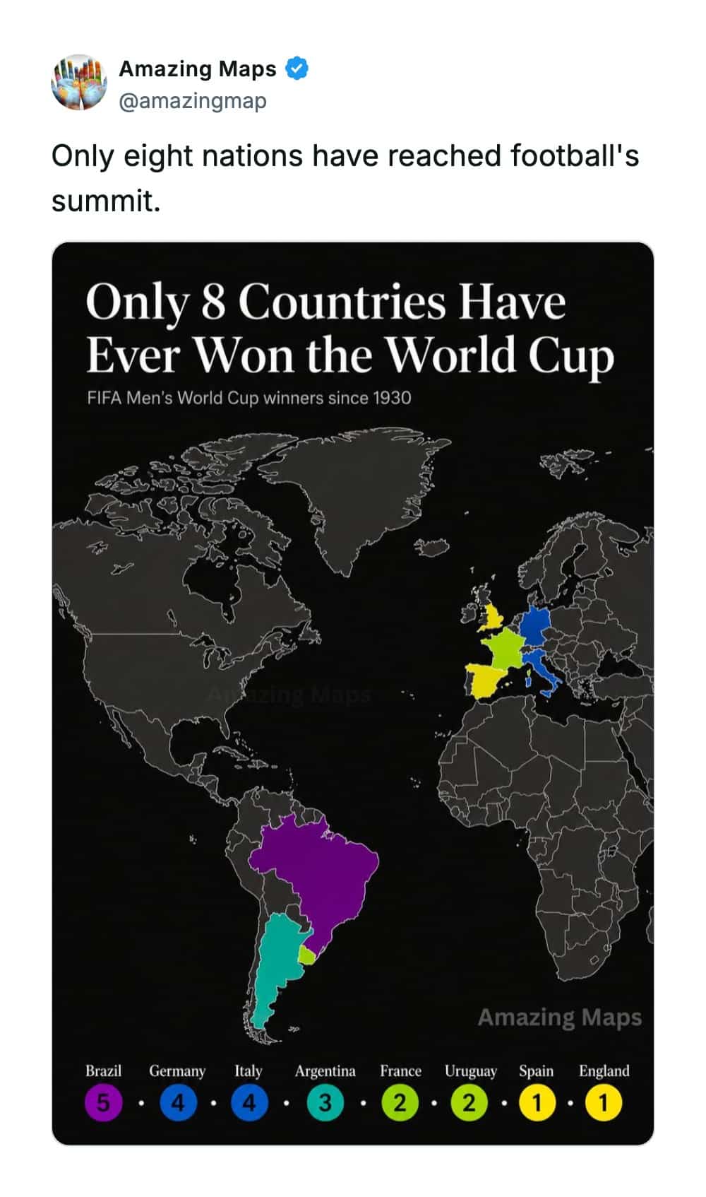


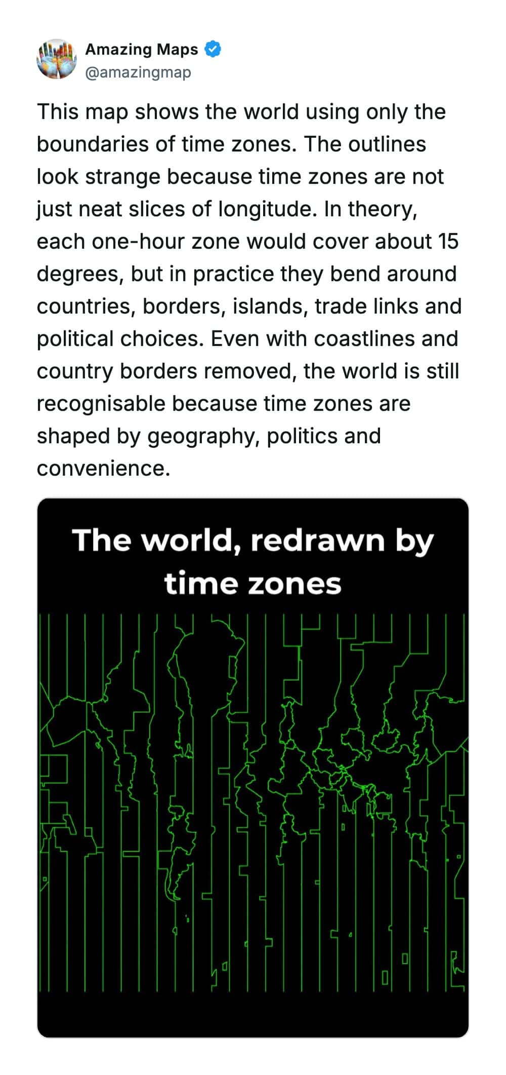
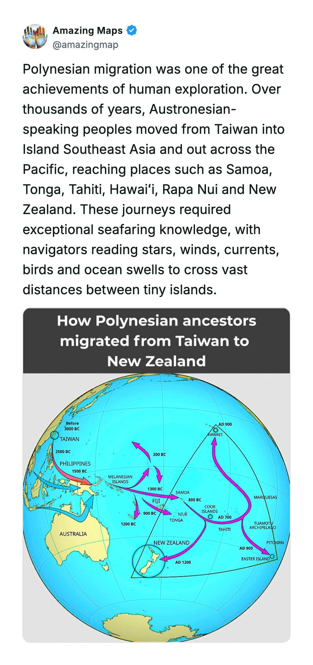
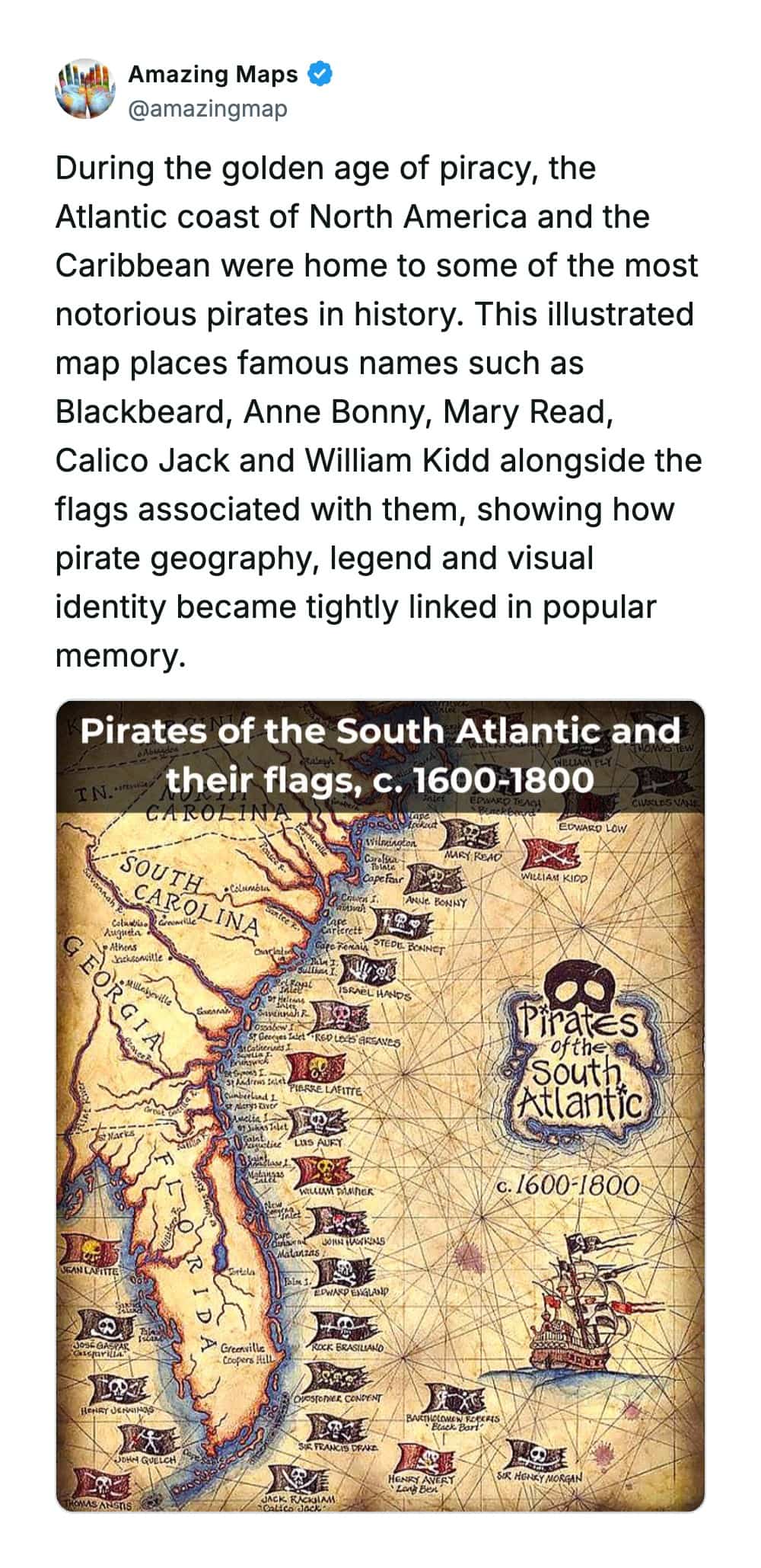



Amazing maps
Read More
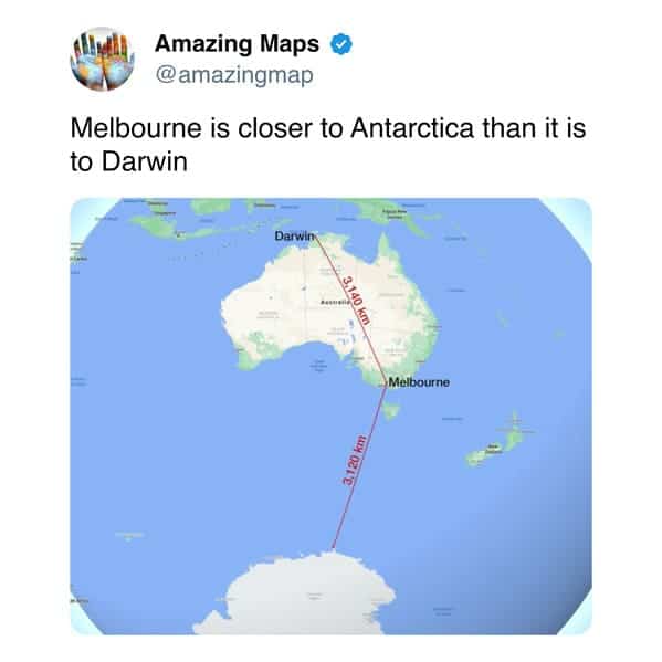
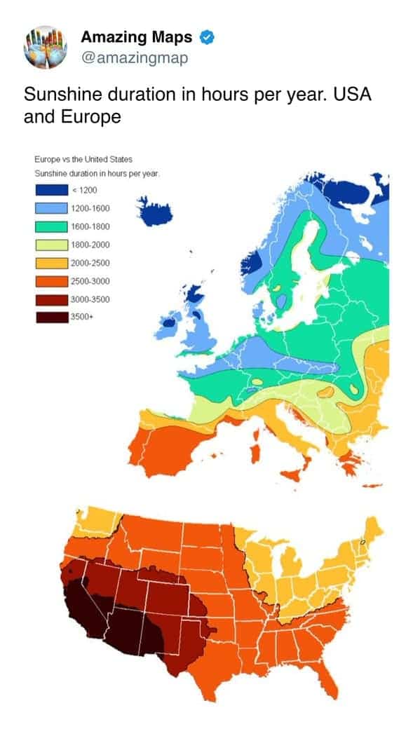
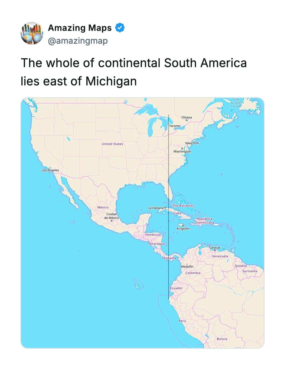
The latitude-shock genre is the fastest working correction in the whole collection, the overlays proving that famous cities sit far from where our mental maps filed them. European capitals aligning with Canadian prairie towns. Mediterranean icons matching northern American coordinates. The realization arrives with a small cognitive jolt, because these placements contradict everything the climate and culture implied, and the contradiction is the education. Ocean currents were doing invisible heavy lifting the entire time, and nobody thanked them until the map made it obvious.
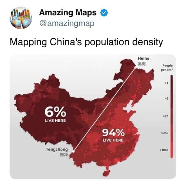
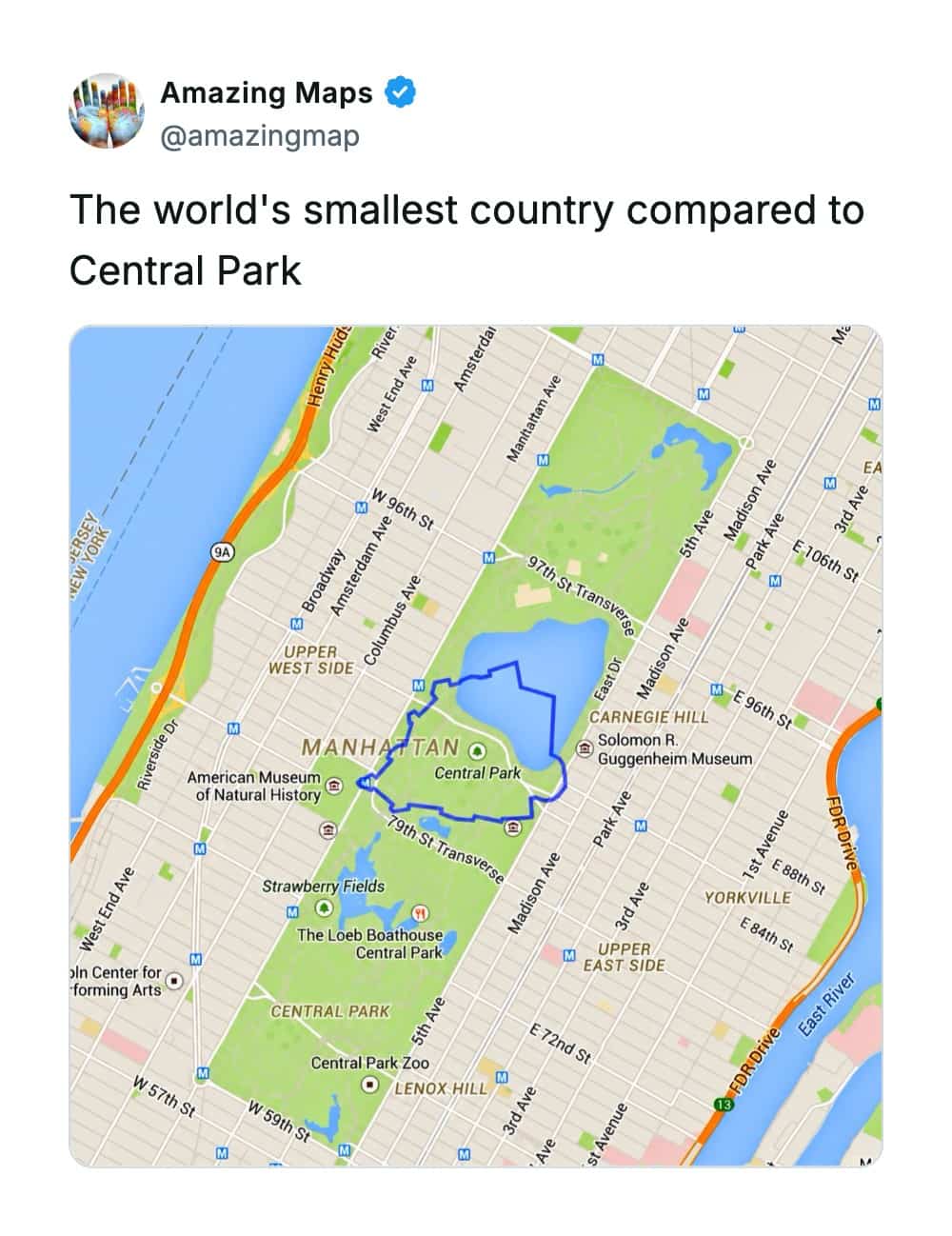
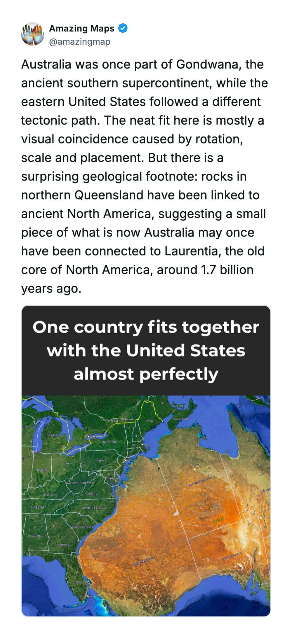
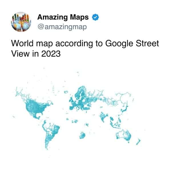
Then there’s the scale-comparison wing, the superimpositions that expose how badly standard projections have distorted our size intuitions. Single states swallowing multiple countries. One city containing the populations of several famous ones stacked together. Entire national populations hugging a single border line for warmth. These maps work because size is the thing we’re most confident about and most wrong about, and watching an outline settle over a comparison region is watching a lifetime of assumptions get adjusted in one image. The projection lied. The overlay confesses.
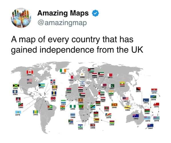
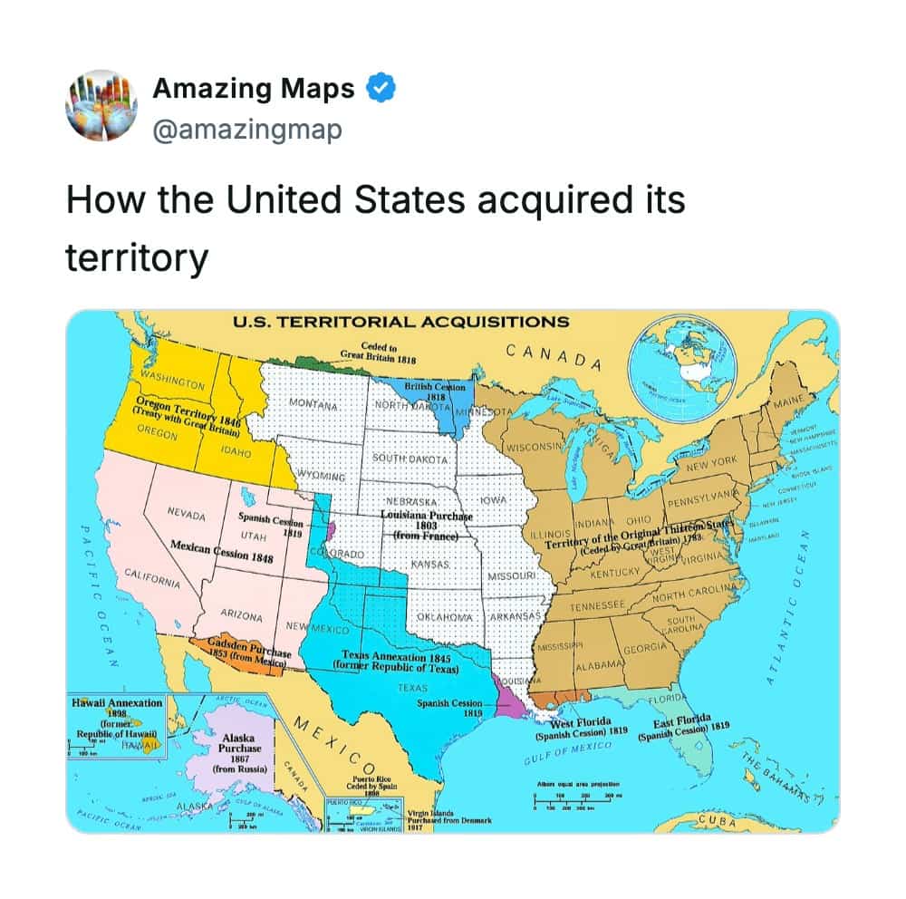
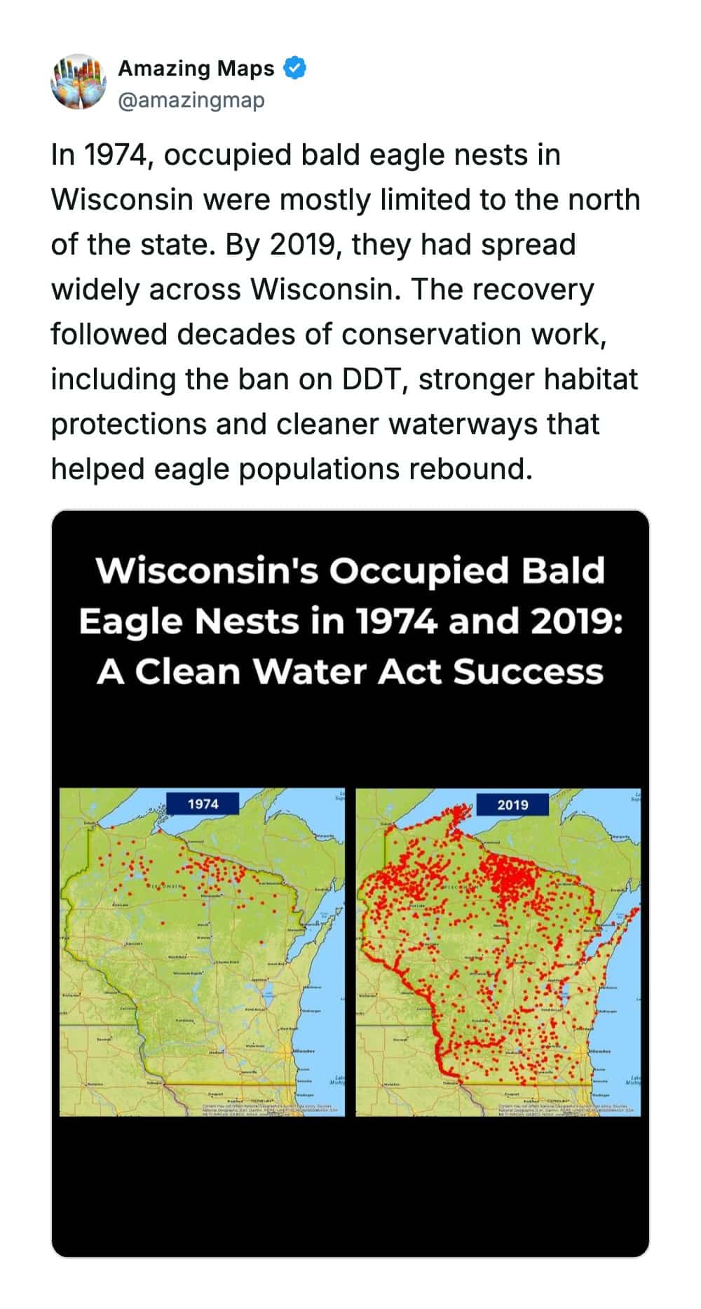
And the change-over-time category delivers the narrative drama, the before-and-after maps showing borders reshuffling around stationary countries, technologies conquering the globe in a decade, species ceding entire islands to invaders. These are the maps that tell stories, complete arcs compressed into two panels, and they land because change at this scale is invisible while it’s happening. Nobody watched the neighbors change or the browsers take over in real time. The map shows the whole movie at once, and the movie is always wilder than the daily experience suggested.
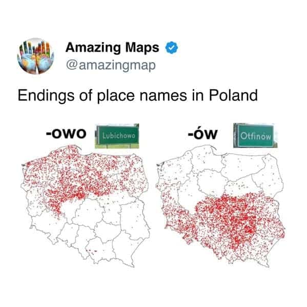
What these maps actually deliver is the specific pleasure of confident wrongness corrected, which might be the purest form of learning available. Nobody feels bad discovering their latitude assumptions were off, because nobody was ever tested on it. The correction is free, painless, and permanent, and it comes with the immediate urge to inflict it on someone else, which is how the whole genre propagates. Trivia is just corrected wrongness in circulation.
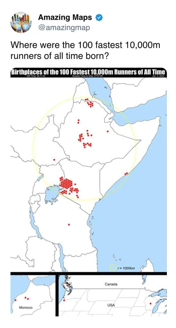
And there’s a genuine humility in the aggregate lesson, because every one of these maps says the same underlying thing, which is that the world resists intuition. The sizes are wrong, the positions are wrong, the distributions are lopsided beyond reason, and our tidy mental globe was always a convenient fiction. That’s not discouraging. That’s an invitation, a planet with this many surprises left in its basic geography clearly has more where those came from, and the maps keep coming.
The compass is recalibrated. The trivia night is doomed. Unfold another.
If the geographic recalibration was your kind of fun, our knowledge content is right where you’d want to land next, and we’ve got plenty of map archives, data visualization threads, and world fact compilations for anyone who has ever ruined a dinner party with an unsolicited latitude comparison. Pack for Redding.
Read Memes
Get Paid

Laura Bennett has spent eight years immersed in internet culture, specializing in deep dives into meme origins, evolving meme trends, and digital subcultures. As a contributor for several prominent online platforms, including BuzzFeed’s meme division and Know Your Meme, she’s written extensively about viral moments from Crying Jordan to Woman Yelling at a Cat. Laura believes memes aren't just internet jokes—they're modern-day folklore. She brings that passion to Thunder Dungeon by keeping readers connected to what's culturally significant, hilarious, and timelessly viral.