
Incredible maps and visualizations
I once believed spreadsheets were the final frontier for dull figures until I saw a color-coded map of worldwide coffee consumption. Suddenly, data seemed more alive than I was pre-coffee. If you think numbers are boring, these visuals might nudge you to reconsider.
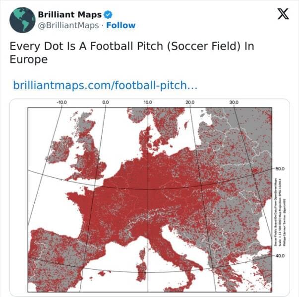
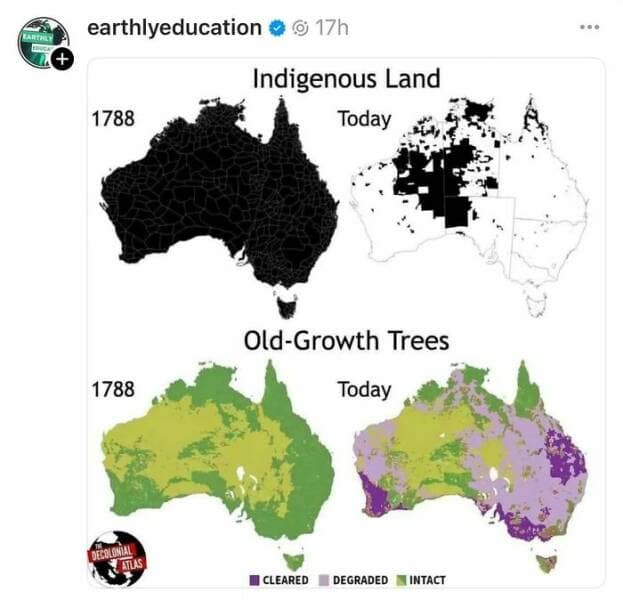
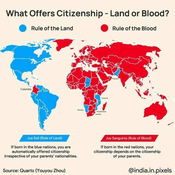
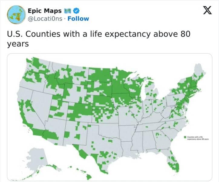
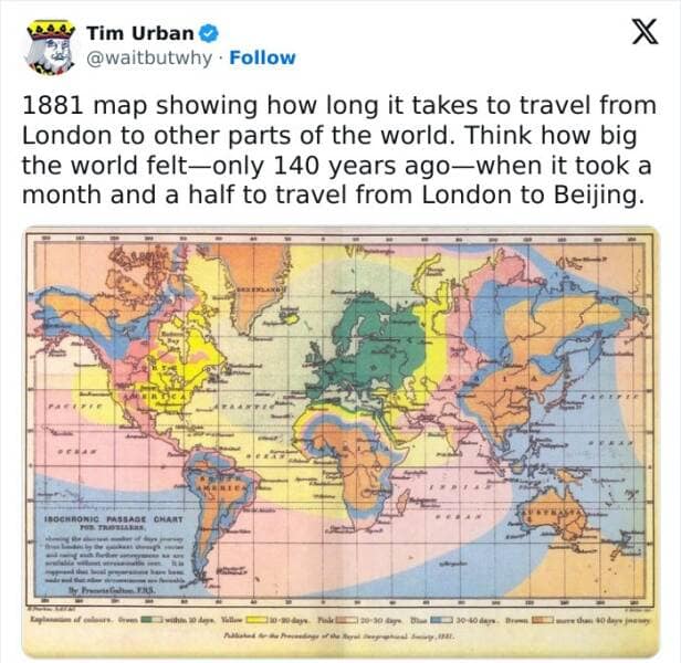
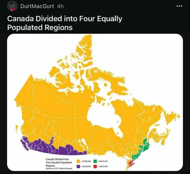
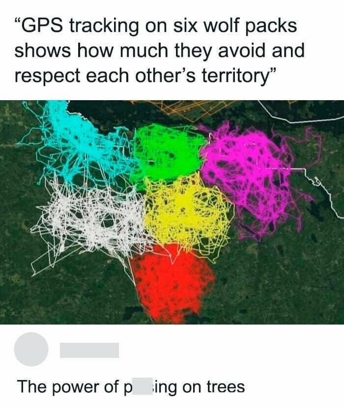
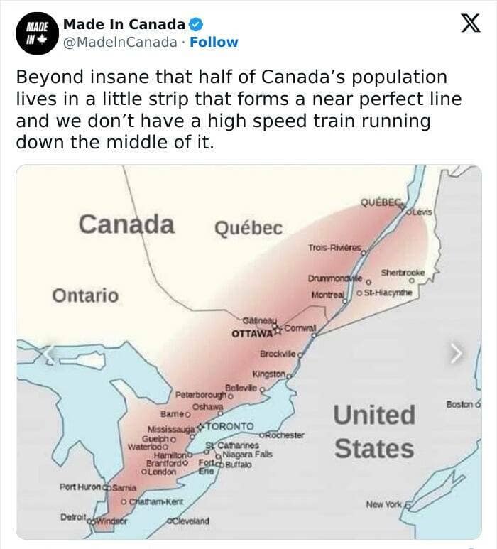
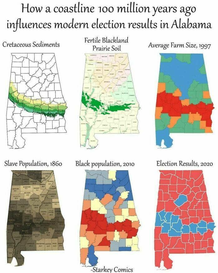
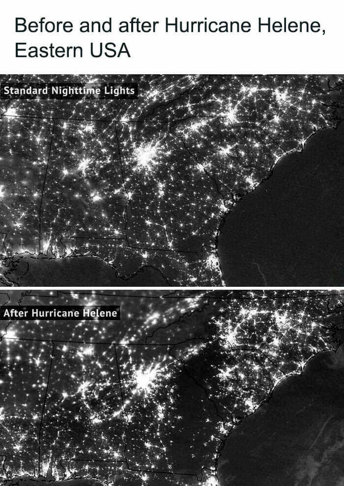
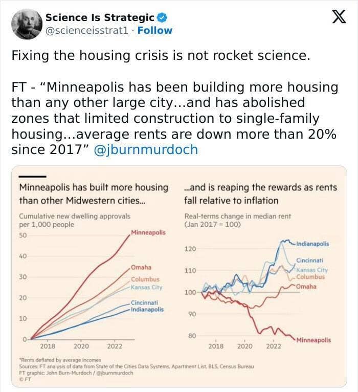
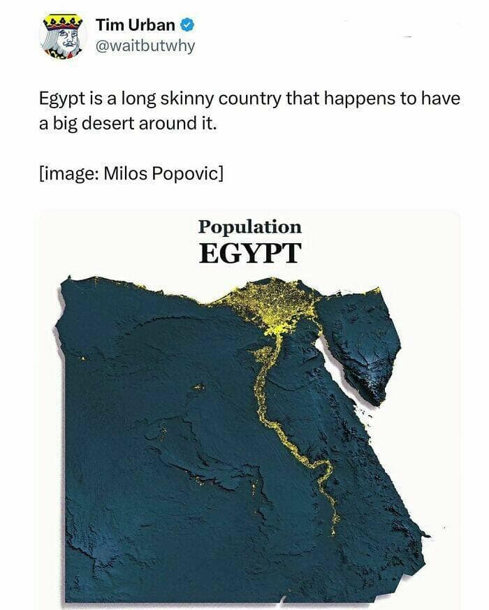
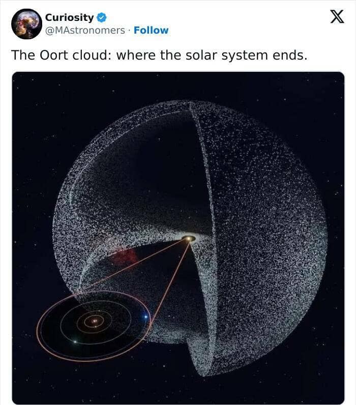
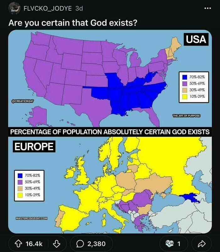
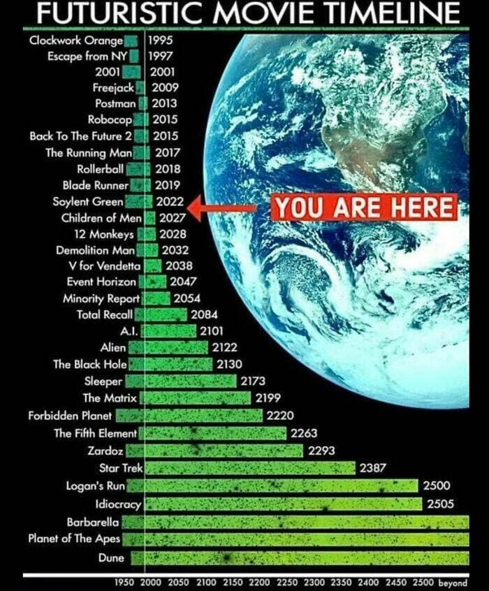
Envision scanning through a range of eye-catching data showcased as vibrant maps and charts. Each piece transforms raw stats—like the location of every pub in the UK or the minuscule details of human anatomy—into map-based graphics that pique your curiosity. You’ll likely be impressed at how a cluster of tiny squares or lines can convey complex realities in a blink. Some images resemble interactive visual charts, presenting enthralling details you’d otherwise skip in a dense research report. By the final one, you might wonder how you ever stared at black-and-white tables when this rainbow array of approachable data was within reach, bridging the gap between comprehension and aesthetic intrigue.


After looking over each map and chart, you probably felt the usual dryness of numeric info fade away. Instead, you saw how thoughtfully arranged visuals could highlight patterns, trends, and realities with an inviting spark, making data feel like a quick read rather than a chore.
If you enjoyed these incredible maps and visualizations, you might also like checking out meme posts featuring clever geography humor, infographic parodies, or global trivia jokes. It’s a fun way to realize how creative people get when combining images, data, and a dash of humor.
Read Memes
Get Paid

Roy R., Chief Meme Curator
Roy founded Thunder Dungeon in 2012 and has since guided its growth into a 2.5 million‑strong community of meme enthusiasts. With over a decade of digital‑media experience and a nose for viral humor, Roy oversees content strategy, ensuring every post is both hilarious and high‑quality


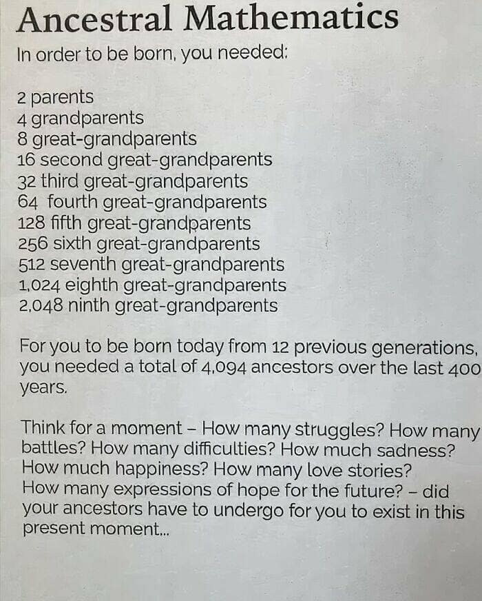
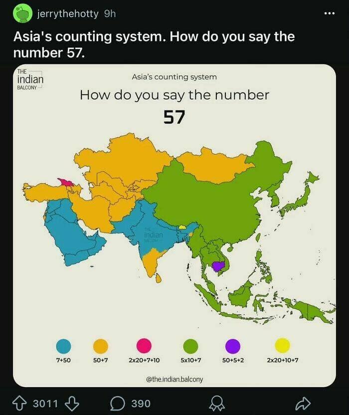
Number 16, about ancestor mathematics.
Pretty certain the Hapsburgs would disagree. If they could open their moths enough to talk.
Super super interesting!