35 Interesting Maps For Anyone Who Loves A Good World Map

Katie Rodriguez

10 hours ago

A collage of interesting maps featuring the vein-like blue network of the Mississippi River drainage basin, the multi-map correlation between prehistoric soil and modern Alabama election results, and the dramatic high-definition transformation of Pluto from 1994 to 2019.

These interesting maps are for anyone who loves that brain-tingle moment when a familiar place suddenly looks brand new. If a world map, geography facts, and map of the world trivia are your kind of “just one more slide” scrolling, you’re going to be very happy here.

interesting map of the world where only the United States and Alaska are highlighted in red, sarcastically described as a "comprehensive map" of the only countries that use the MMDDYYYY date format.
This amazing map illustrates the sheer scale of the Mississippi River basin, showing the continental United States covered in a dense, vein-like network of blue lines representing its countless tributaries.
comparative climate visual showing sunshine duration in hours per year across Europe and the USA. This interesting map reveals that even the sunniest parts of Europe often receive less annual sunlight than the majority of the United States
demographic amazing map of the U.S. where nearly every state is colored blue, indicating that their individual populations are smaller than that of a single county: Los Angeles County, highlighted in red.
striking satellite view of La Plata, Argentina, showcasing a perfectly symmetrical, rigid square grid pattern with long diagonal avenues and precisely placed green spaces, earning its place as an interesting map.
This amazing map challenges geographic intuition by showing that Melbourne, Australia, is actually closer to the coastline of Antarctica (3,120 km) than it is to the northern Australian city of Darwin (3,140 km).
interesting map overlaying the U.S. and Canada onto Europe and North Africa at identical latitudes, showing that most of the United States actually aligns with the Mediterranean and the Sahara.
A population density amazing map of Canada with a single red line through southern Ontario and Quebec, revealing the startling fact that 50% of the entire Canadian population lives south of that line.
interesting map of France's international borders that reveals a surprising trivia fact: France's longest land border is not in Europe, but is the 730 km stretch shared with Brazil in French Guiana.
A globe-view amazing map with a red radius line demonstrating that the northernmost point of Brazil is geographically closer to Canada than it is to Brazil’s own southernmost point.
This interesting map reveals the global reach of Google Street View as of 2023, depicted as a glowing network of blue veins concentrated heavily across North America, Europe, and Japan, while leaving vast swaths of Africa and northern Asia dark.
An amazing map of China that breaks down the country’s immense linguistic diversity beyond Mandarin, illustrating the regional territories of languages like Cantonese, Tibetan, Mongolian, and Uyghur in a colorful patchwork.
This interesting map pinpoints the birthplaces of the 100 fastest 10,000m runners in history, showing an incredible cluster centered almost entirely within a specific 1000km radius in Kenya and Ethiopia.
clever linguistic amazing map of Europe showing how different languages express the idiom "It's Greek to me." It reveals a chain of confusion where English points to Greek, Greek points to Chinese, and French points to "Patagonian."
A detailed interesting map of Poland comparing the geographical distribution of town names. It shows a stark divide where names ending in "-owo" dominate the north while those ending in "-ów" are heavily concentrated in the south.
This amazing map is a world population cartogram, where the size of each country is distorted to represent its number of inhabitants, resulting in a massive India and China that dwarf a shrunken Russia and Canada.
A stunning technological interesting map comparison of Pluto, showing the blurry, grey pixelated blob captured in 1994 versus the high-definition, rust-colored celestial body revealed by the New Horizons mission in 2019.
Breaking down the distortions of the Mercator projection, this amazing map displays the "real size" of countries, showing that landmasses like Africa and South America are far larger than typically depicted relative to Europe and Greenland.
A profound interesting map series correlating Alabama's geography with its history; it shows how 100-million-year-old Cretaceous sediments created fertile soil that led to high slave populations in 1860, which still aligns with modern Black populations and Democratic voting patterns today.
This amazing map uses a Voronoi diagram to show which neighboring country is closest to you at any point in the USA, revealing that large portions of the Southeast are closer to the Bahamas and Cuba than Canada or Mexico.

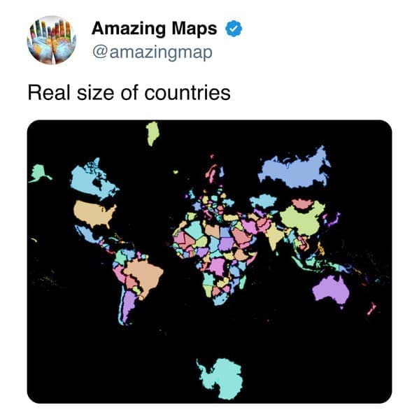
What makes this collection so addictive is the variety of “wait, really?” reveals. Some of these are pure scale shocks—how big something truly is, how far a region reaches, or how a tiny-looking line on a map actually represents an enormous real-world pattern. Those are the geography facts that stick, because they don’t feel like homework; they feel like a magic trick your brain falls for on purpose.

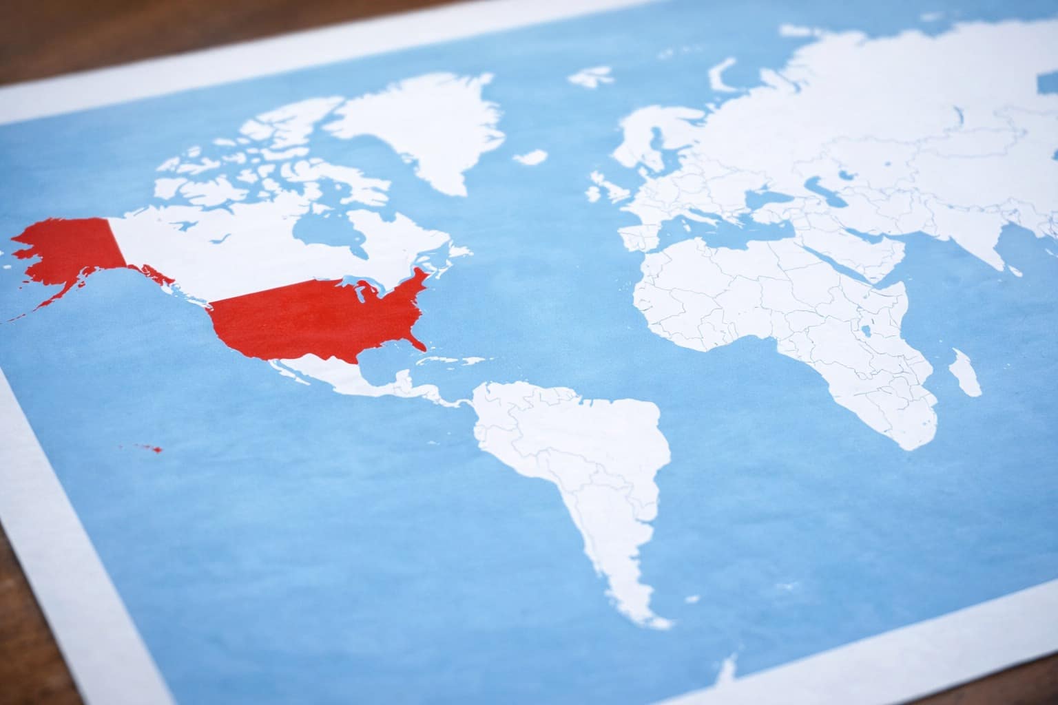
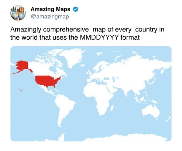
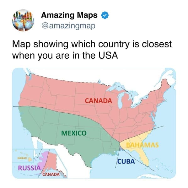
Another big theme is perception versus reality. A lot of us grew up with the same familiar map of the world in classrooms, so seeing projections, sizes, and distances reframed can be genuinely jolting in the best way. It’s a reminder that maps aren’t just pictures—they’re choices, and a different choice can flip what you assume you know. That’s why a well-made world map can feel like a mini reset.

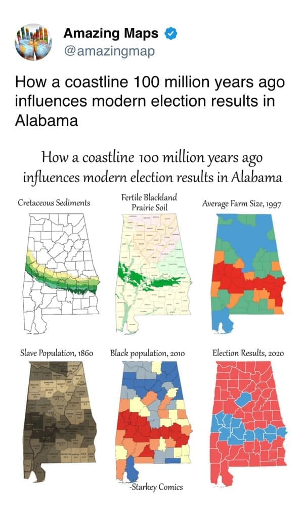
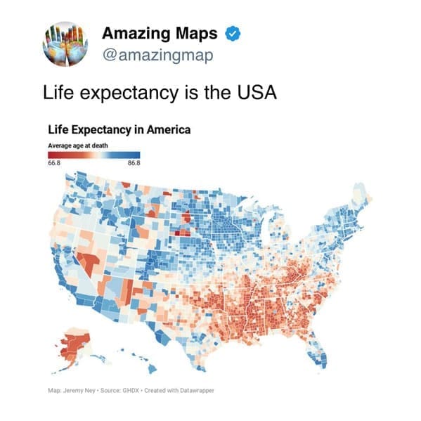
Then there’s the “maps as stories” category, which might be my favorite. Some visuals connect language, culture, sports, history, and even science in a way that feels surprisingly emotional—like a data-driven scrapbook. When you see how natural features shape human patterns over time, or how clusters form in unexpected places, it’s hard not to just stare for a minute. These interesting maps don’t just show where things are; they hint at why things ended up that way.

And the best part? You don’t need to be a geography person to enjoy it. You just need curiosity and a willingness to say, okay, that’s going in the group chat.

If you want more “tell me something I didn’t know” energy next, try 30 Charts That Sound Fake But Aren’t, 30 Data Visualizations That Made Me Stop Scrolling, and 40 Random Facts That Put Everything In Perspective.

I’m Katie Rodriguez, and I love collecting the kind of smart little internet finds that make you feel curious again in under five minutes.

Katie Rodriguez is a seasoned writer with eight years dedicated to meme commentary, viral internet events, and digital storytelling. Formerly a senior meme analyst at Bored Panda and an occasional guest contributor at Vice's Motherboard, Kat specializes in meme culture’s intersection with social media phenomena—covering trends like Milk Crate Challenge, Area 51 Raid, and Baby Yoda. She’s known for her witty writing style and deep understanding of why certain memes resonate across generations, making her a valuable voice on Thunder Dungeon.

Read Memes

Get Paid

The only newsletter that pays you to read it.

A daily recap of the trending memes and every week one of our subscribers gets paid. It’s that easy and it could be you.