Funny Charts That Make Everything Weirdly Clear
Updated on January 11, 2026
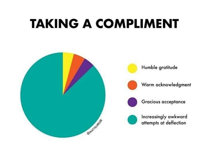
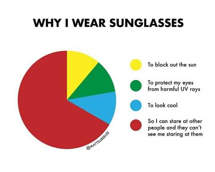
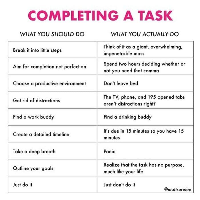
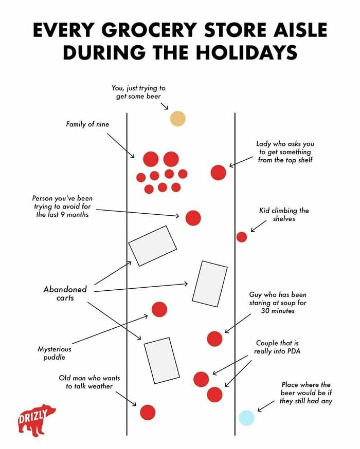
Some jokes hit harder when they come with a graph. Funny charts can make you feel seen in a way that is both comforting and slightly rude.
This set is visual humor for anyone who loves seeing the chaos of life organized into neat little shapes. Funny infographics, relatable charts, and enough data jokes to make your brain do a tiny happy clap.
45 Funny Charts About Random Things
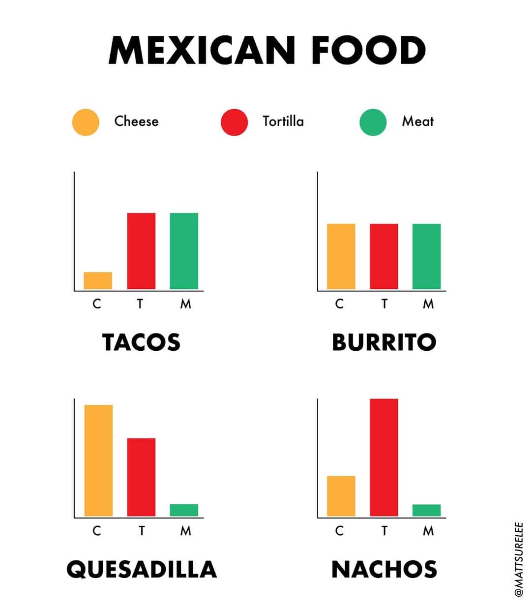

The tacos/burritos/quesadillas/nachos bar graphs are a perfect opener because they tell the truth with confidence: it’s the same ingredients, just rearranged with different levels of audacity. If you’ve ever stared at a menu and felt overwhelmed, this funny chart is basically permission to relax.
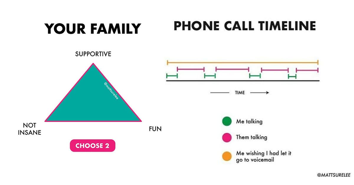
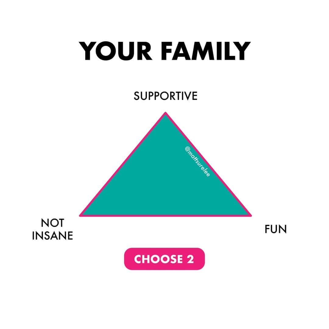
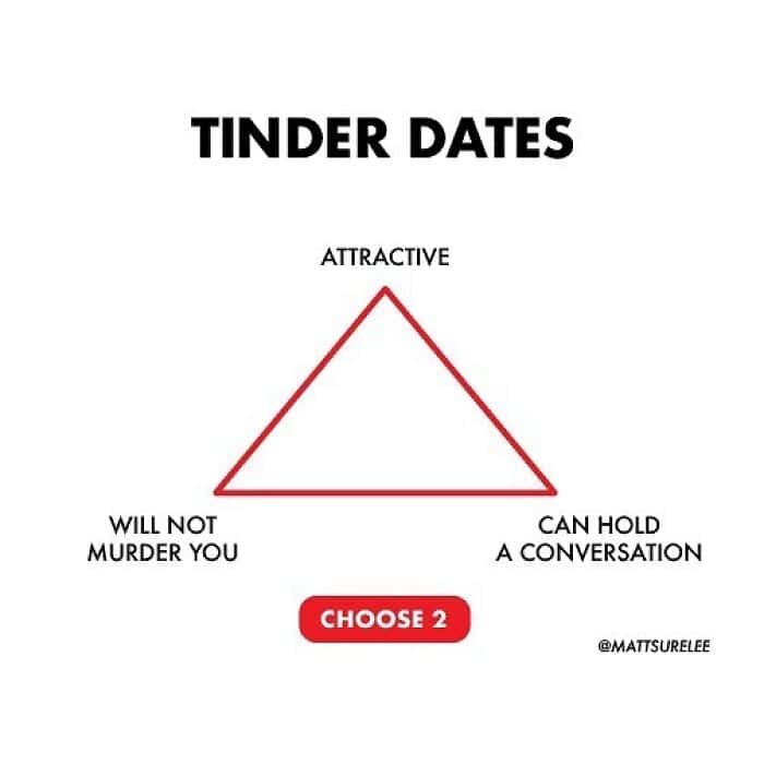
Then there’s the triangle about your family: supportive, fun, not insane, choose two. It’s a relatable chart that somehow feels like a personality test and a warning label at the same time.
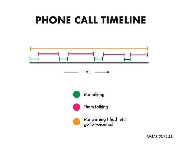
The phone call timeline is another masterpiece. The tiny sliver of actual conversation, surrounded by a sea of “I wish this went to voicemail.” That’s not exaggeration. That’s modern etiquette rendered as a funny infographic.
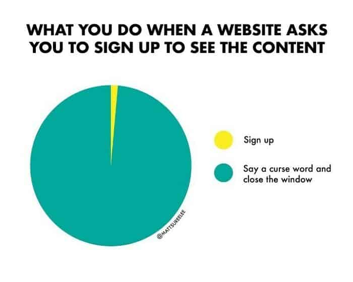
And the pie graph about websites demanding a signup? The most relatable internet behavior ever: we don’t subscribe, we close the tab and act like the site personally insulted us. Data jokes are better when they mirror what we already do instinctively.
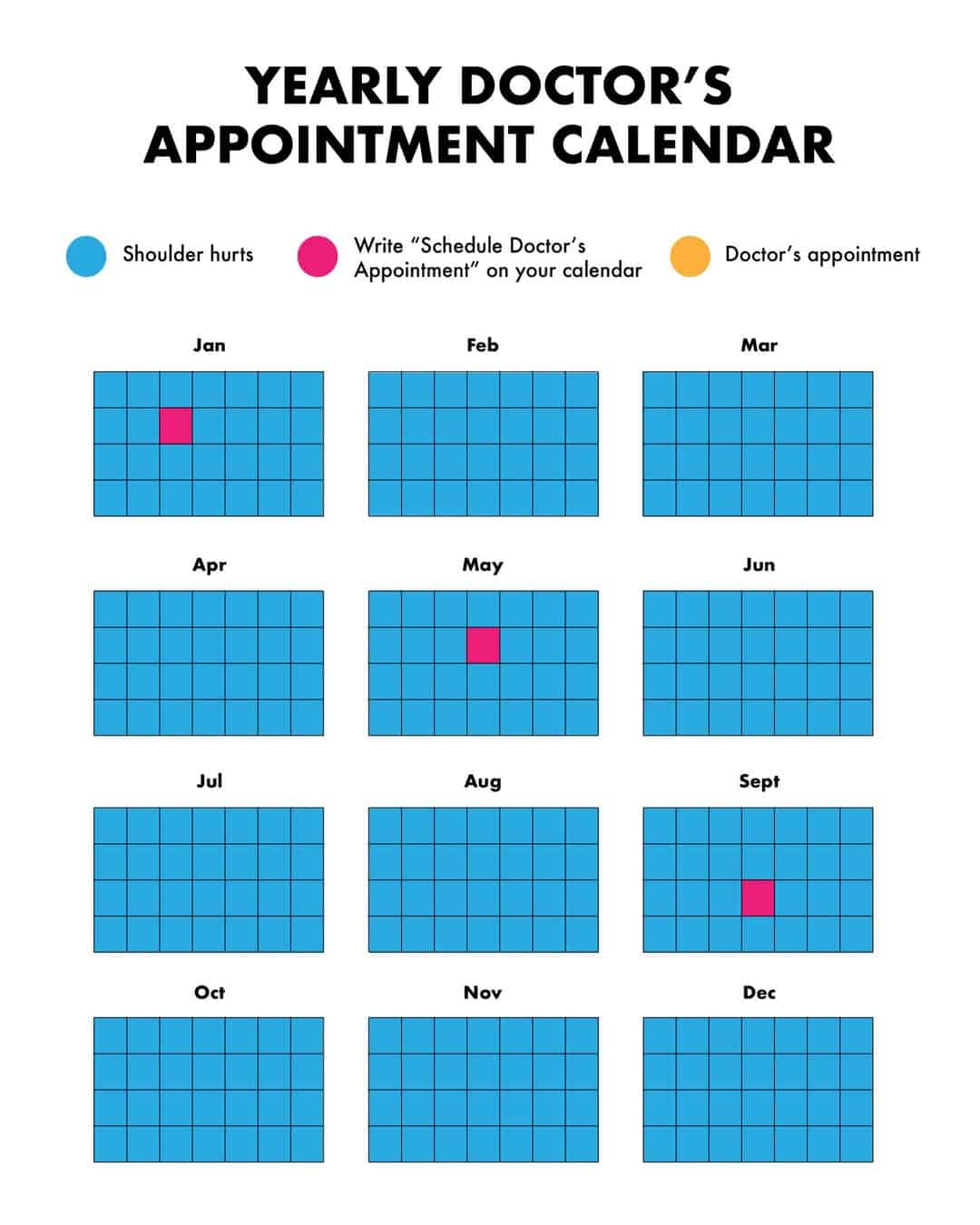
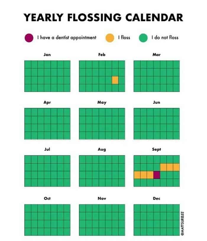
I also love the calendar chart of pain and procrastination instead of going to the doctor, because it’s funny and also a little too accurate. The months pass. The shoulder still hurts. The appointment remains theoretical.
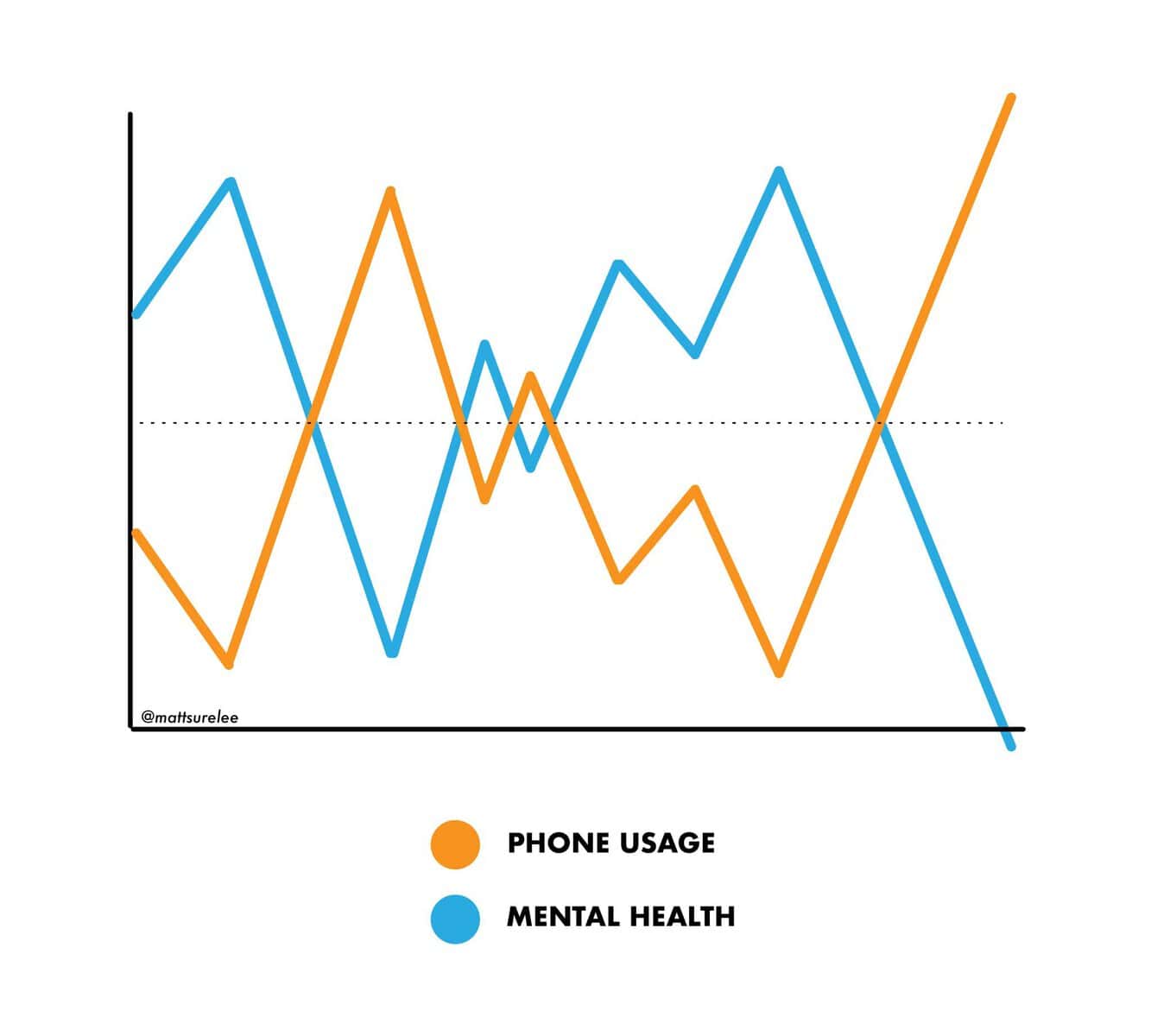
The doomscrolling line graph showing phone usage climbing while mental health drops is the kind of visual humor that makes you laugh, then immediately put your phone down for three seconds as an act of respect. Relatable charts always land because they compress a whole habit into one line.
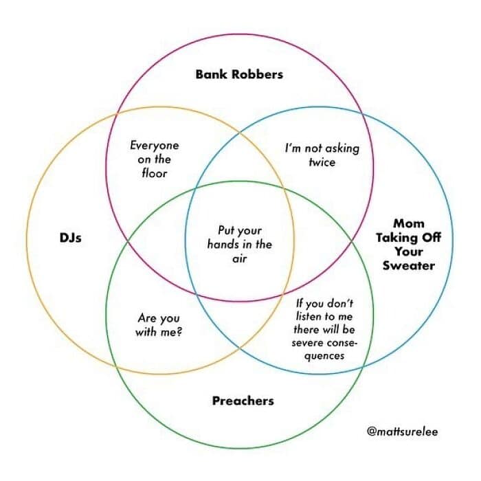
And the Venn diagram connecting DJs, bank robbers, preachers, and moms taking off sweaters? The center overlap being “put your hands in the air” is such a clean punchline it feels inevitable.
If you want more low-pressure brain candy after these funny charts: 30 Relatable Tweets That Feel Too Accurate, 30 Millennial Memes That Explain Modern Life, and 30 Data Jokes That Actually Work.
Priya Coleman writes like she’s handing you a tiny graph that says, “You’re not broken. You’re just statistically predictable.”
Read Memes
Get Paid

Priya Coleman is a viral content specialist and meme analyst with over six years in digital publishing. Her past roles include viral content editor for PopSugar's humor vertical and meme correspondent for HuffPost’s comedy section. Priya specializes in spotting trending meme moments just before they peak—like the chaotic delight of the Ever Given’s Suez Canal mishap or the existential comedy of This is Fine. She brings her sharp wit and instinctive knack for viral content to Thunder Dungeon, always keeping the community a step ahead of the latest meme craze.