Funny Charts & Graphs For People Who Cope With Life By Turning Everything Into A Diagram

Jun 04, 2026 02:00 PM EDT
A viral funny charts mega-curation archiving top-tier internet data parodies, highlighted by a Venn diagram linking drive-time radio DJs to the mythological struggles of Sisyphus, an intricate six-circle layout uniting ducks and bank robbers under the phrase "Let's Get This Bread," and a physical custard pie pan tracking real-time dessert consumption metrics.
google discoverFollow us on Google Discover

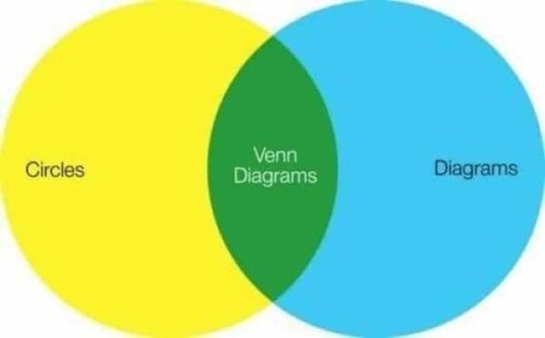
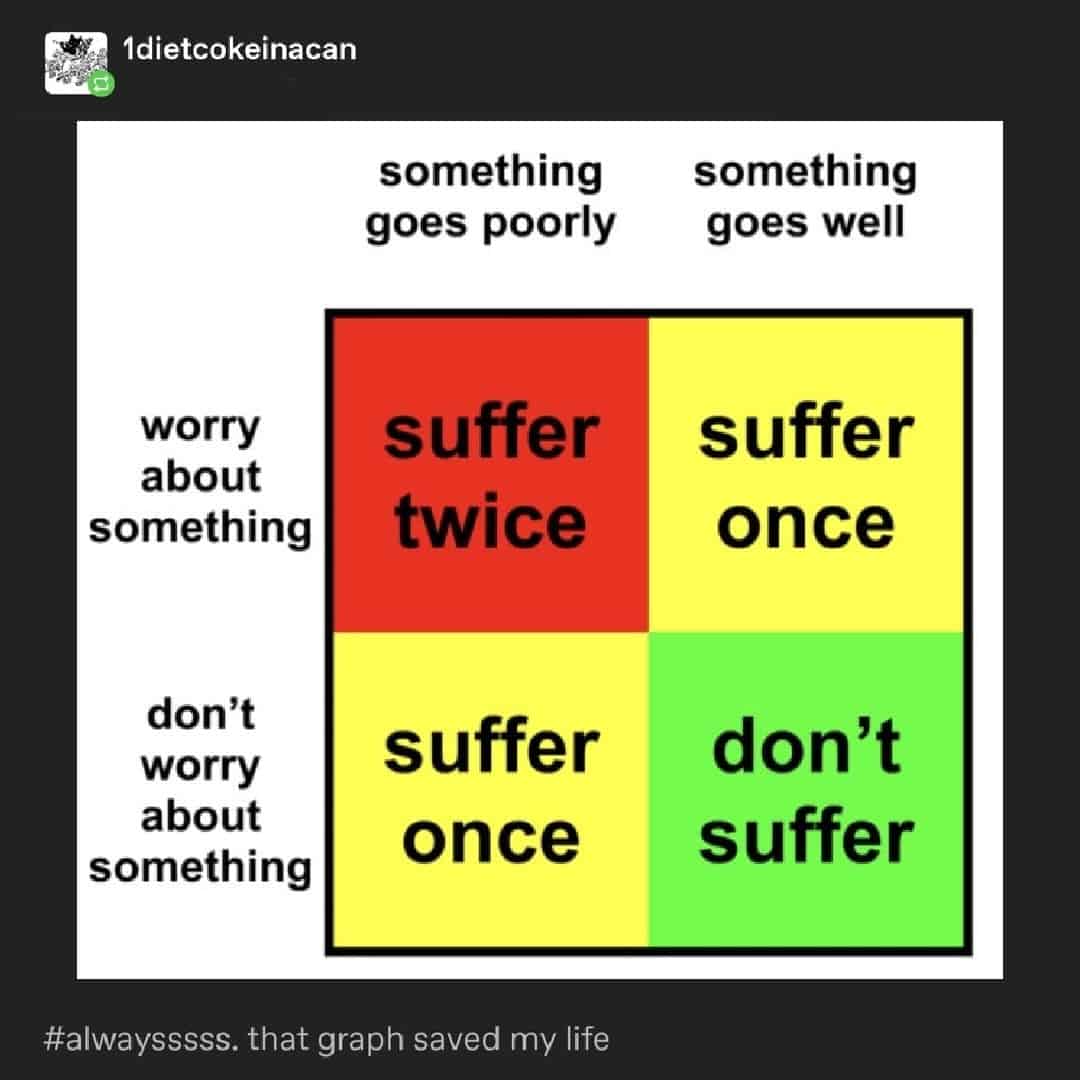
I don’t know what it is about funny charts, but they hit me like a little public service announcement for my brain. Like, yes, thank you, I too would like my emotional spirals summarized as a Venn diagram with a labeled arrow and a tiny sliver of doom.

A funny chart that's a venn diagram about venn diagrams.

This set is for anyone who enjoys funny graphs, lives for infographics, and has ever looked at data visualization and thought, “Cool… now make it stupid on purpose.” Because there’s something weirdly soothing about taking the chaos of modern life and compressing it into a clean shape with a punchline. It’s the closest I get to feeling organized.

viral X post by Amanda Deibert shares a literary funny chart structured as a Venn diagram, charting "Drive-time DJs" on the left and the mythical Greek figure "Sisyphus" on the right, perfectly intersecting at the phrase: "Bringing you the same great classic rock night after night."

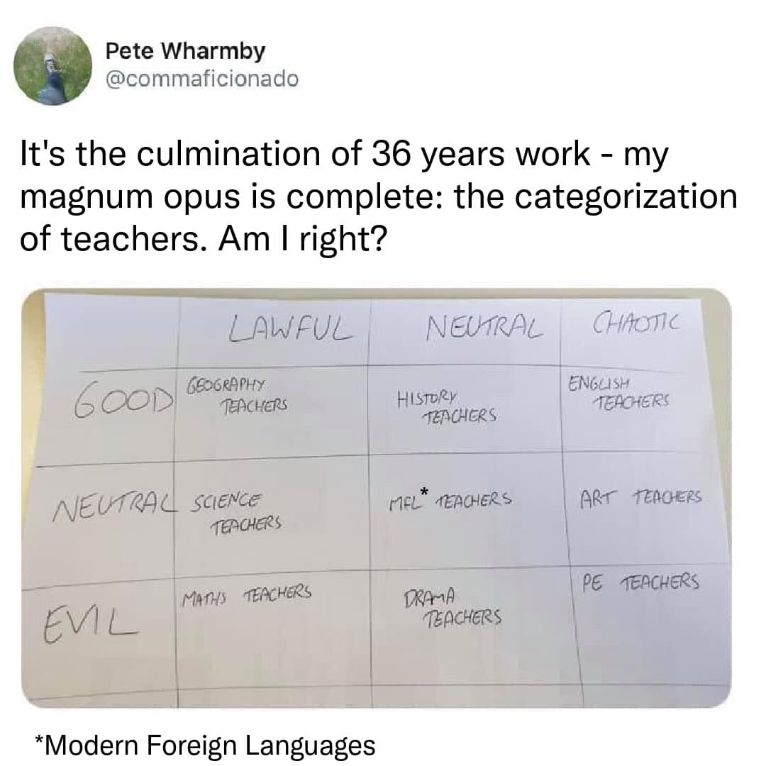
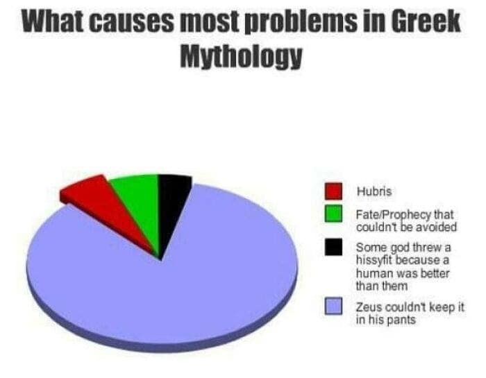
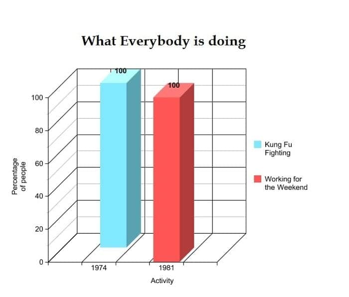
Corporate classic rock radio program directors and ancient Greek mythological figures sharing the exact same curse of eternal, agonizing repetition.

satirical European map shared by Alasdair Beckett-King acts as a funny infographic titled "WILL THE DETECTIVE INVESTIGATING YOUR MURDER BE SAD?". The color-coded legend parodies crime television tropes, labeling Nordic Noir regions as "Sad & Cold," Western Europe as "Sad & Wet," Eastern Europe as "Sad & Drunk," and Mediterranean countries as "Sexy."

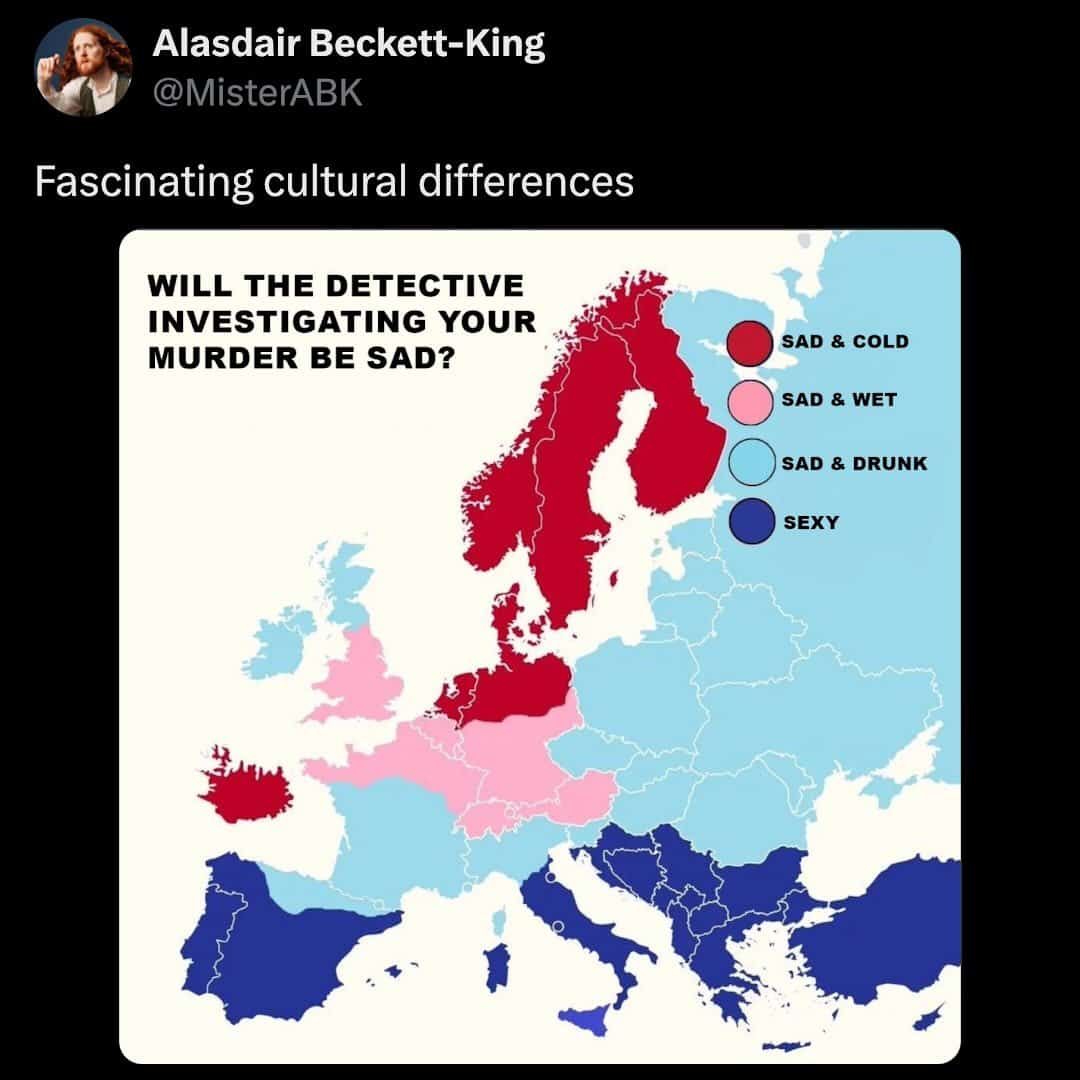
A geographical guide to choosing your optimal European holiday destination based purely on the cinematic aesthetic of your inevitable true-crime documentary spin-off.

An existential corporate-burnout funny chart shared by Tom Cashman presents a Venn diagram with a light brown circle for "Apocalypse" and a blue circle for "Having to go to work," utilizing a bold blue arrow to point directly to the tiny sliver of overlap where humanity currently resides.

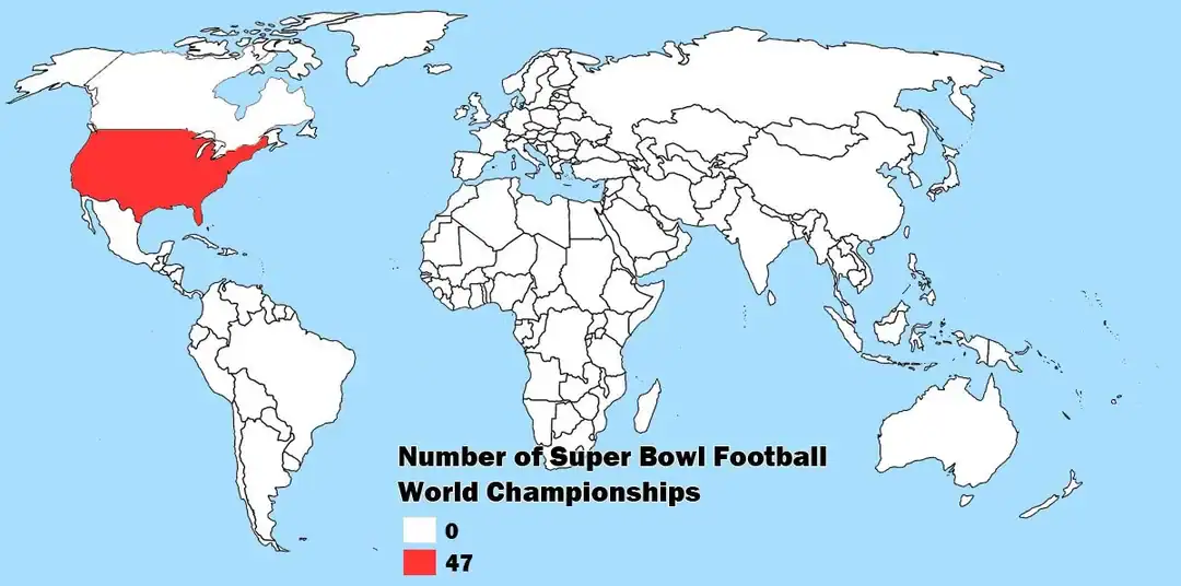
The modern global landscape where local weather channels can casually forecast historical, world-ending climate events and office workers will still log onto Slack to ask if the team meeting is pushed back.

A messaging-etiquette funny chart titled "A handy guide to understanding the text you just received" uses dashed lines to deconstruct the sliding scale of punctuation inside the word "hiiiiiiiiiiii," mapping the length from "normal" and "excited to chat" up to "100% a serial murderer" and a generic "cat on keyboard."
A statistics-pun funny chart compares a mathematical "Normal Distribution" bell curve line against a spooky "Paranormal Distribution" curve that is visually shaped exactly like a classic cartoon sheet ghost with small black eyes.
A highly intricate six-circle Venn diagram layout serves as an advanced funny chart on Tumblr, cross-referencing the baseline motivations of "People at a Bakery," "Early Morning Grinders," "Bank Robbers," "Ducks," individuals who "Woke Up At 6:00am For This," and those who say "Too Many People Are In Here." Every single circle merges at the supreme focal point: "Let's Get This Bread."

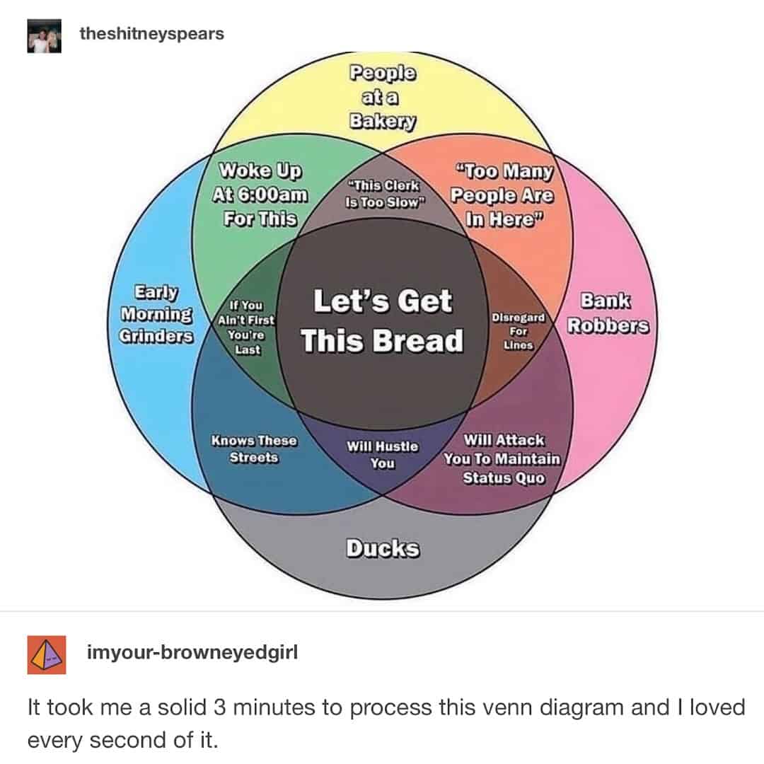
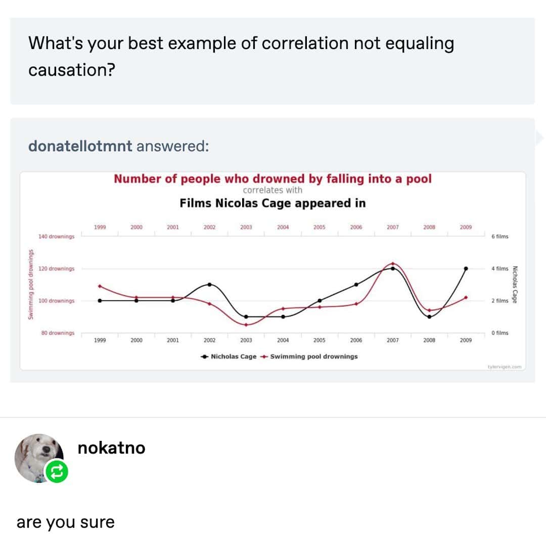
The absolute pinnacle of online data synthesis, linking the survival instincts of local aquatic waterfowl, armed criminals, and tired corporate corporate ladder climbers.

An academic alignment funny chart handwritten on paper by Pete Wharmby categorizes high school teachers into traditional RPG metrics, filing Geography, History, and English teachers as "Good," while placing Maths, Drama, and PE teachers directly into the "Evil" tiers.
An ironic health-perspective update functions as a funny chart, comparing the grams of sugar inside standard carbonated beverages and energy drinks to physical piles of sprinkled donuts, quote-tweeted by Dr. Glaucomflecken noting that it simply makes donuts look healthier than he originally thought.
A brutally realistic parenthood funny chart watermarked by @mattsurelee breaks down a circle graph titled "HOW KIDS ARE FUNNY." A tiny sliver accounts for "Things that kids do that are funny on purpose," completely dominated by a massive purple slice representing "Things that kids do that are funny because kids are stupid."

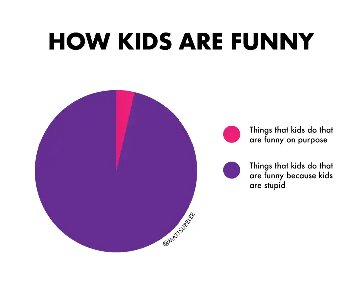
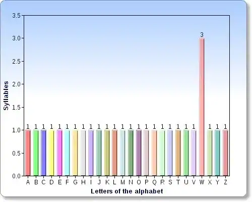
A definitive data metric confirming that toddlers are essentially tiny, unpredictable, highly uncoordinated physical comedy engines operating with zero environmental awareness.

A workplace-linguistics funny chart posted by jonny sun details an "Email Greeting Alignment" grid, organizing office introductions from "Dear [Name]," as Lawful Good and "hey :)" as Chaotic Neutral down to an aggressive lack of greeting as Neutral Evil.
literalist human hygiene diagram functioning as a funny chart maps out bathing habits via a color-coded body map, where critical zones are labeled "Deep Scrub" while the lower limbs remain light blue under the relaxed logic of "Water Will Get it."
relatable office productivity funny chart by @mattsurelee presents a pie graph titled "WRITING AN EMAIL," showing that an overwhelming majority of working time is completely devoured by trying to think of a good subject line.

Spending 45 seconds drafting a crucial, hyper-detailed multi-paragraph operations update, followed by 35 minutes staring blankly at the wall trying to decide if "Quick question" sounds too aggressive.

A deadpan lifestyle logic funny chart by @mattsurelee maps out an inescapable flowchart titled "ARE YOU TIRED?", breaking down choices where both paths lead to an absolute corporate trap: needing to be awake when tired, or needing to sleep when alert.
A corporate breakroom etiquette diagram operating as a funny chart breaks down "A Guide To Eating Fish In The Workplace," classifying processed Goldfish crackers and gummy Swedish Fish as entirely acceptable, while universally blacklisting every real seafood item.
A brilliant cultural-reference Euler diagram serving as a funny chart titled "THINGS I BELIEVE" shows a small circle for "I CAN FLY" contained inside a larger orange circle, while a completely isolated green circle on the right reads "IT'S NOT BUTTER."

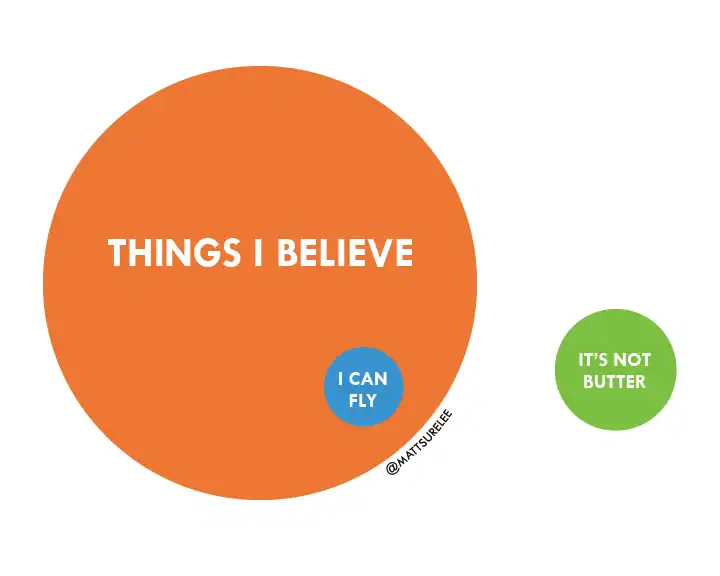
The absolute structural limits of human cognitive conviction, neatly separating 1990s R&B pop lyrics from grocery aisle margarine brand confusion.

A cyclical household frustration diagram functioning as a chaotic funny chart tracks the infinite, maddening loop of trying to turn off a multi-speed ceiling fan via a pull string, inevitably resulting in a complete emotional breakdown.
A medical handwriting parody chart acting as a sharp funny chart presents a "MEDICAL ALPHABET" grid from A to Z, where every single character is hilariously represented by an identical, unreadable ink scribble.
A real-world food macro operating as a literalist funny chart captures a dessert inside a tin pan with a quarter-section missing, titled "World's Most Accurate Pie Chart" to map out sections of pie already eaten against what remains.

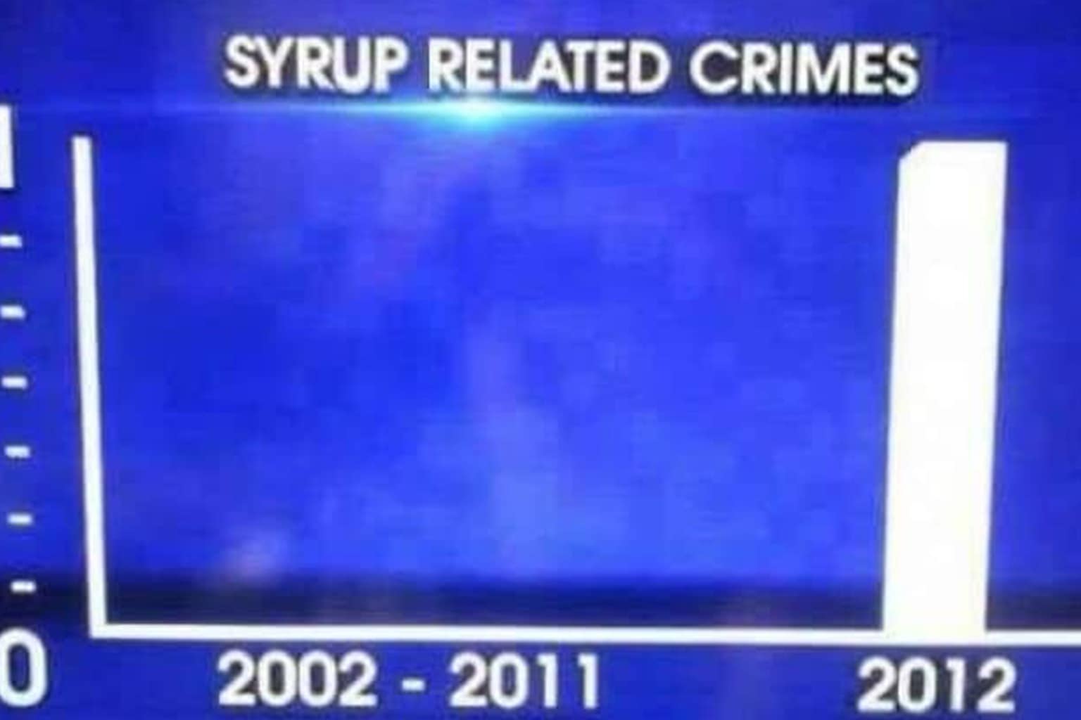
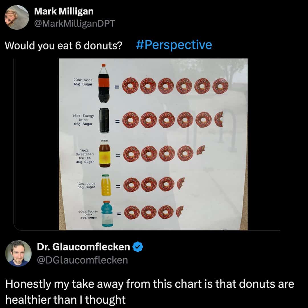
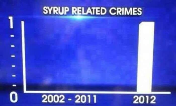
Finally, a beautifully interactive statistical model that rewards data collection with an immediate, delicious dose of high-fructose corn syrup.

A data representation layout circulating as a funny chart displays a heavily overlapping density map tracking the exact position of stars on every national flag, paired with a funny Tumblr comment comparing the visual clutter to getting a bump on the head.
An optical health pie graph functioning as a relatable funny chart breaks down what people say when trying on a prescription lens, showing a solid 100% red slice for friends screaming that the owner must be legally blind.

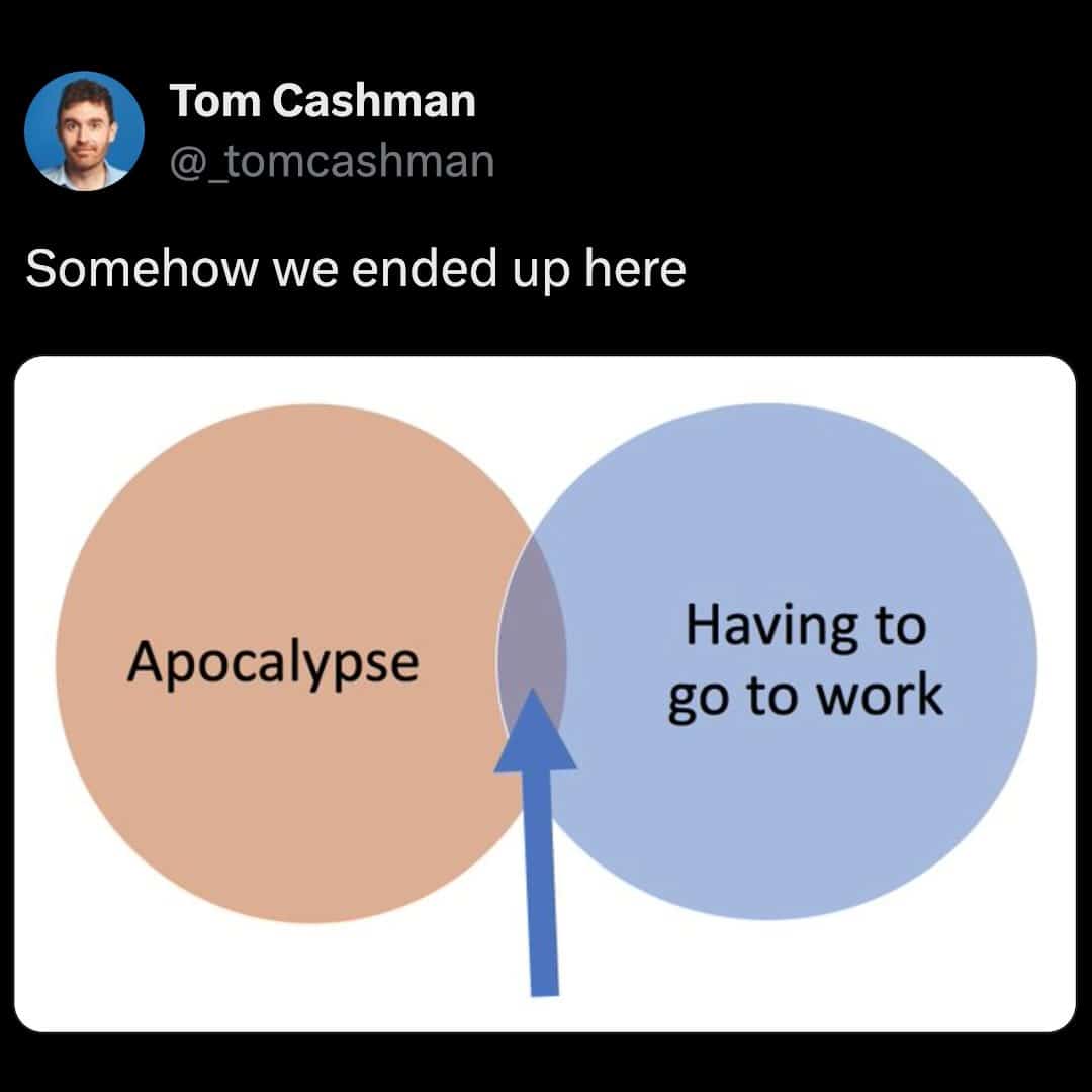
A lot of these funny charts are basically tiny therapy sessions with grid lines. The best ones take a normal thought—like how an email greeting can quietly reveal your entire personality—and treat it like a scientific discovery. Others go full existential and just admit we’re living in the overlap between “apocalypse” and “still have to go to work,” which is… yes. That is exactly where I live.

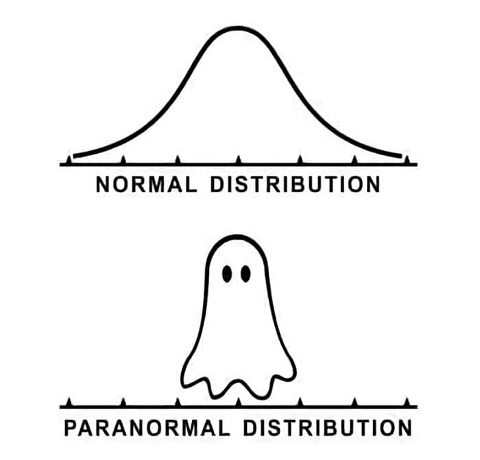
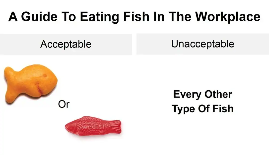
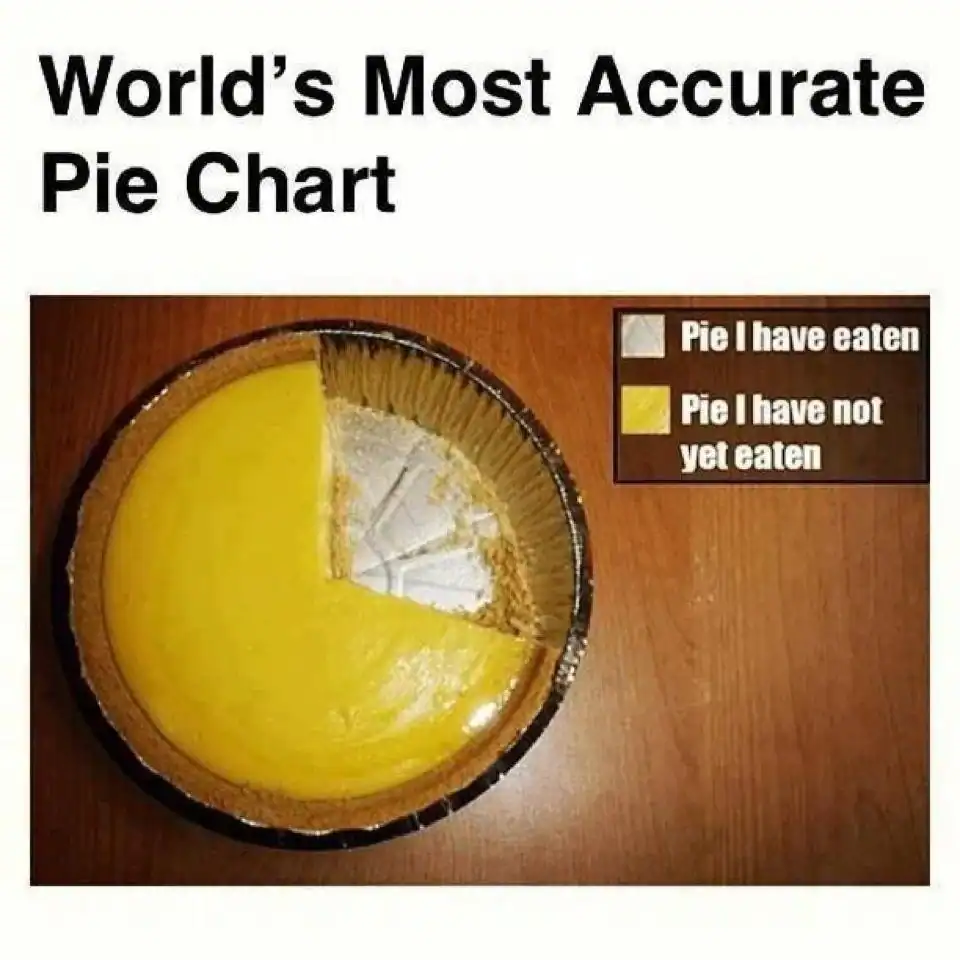
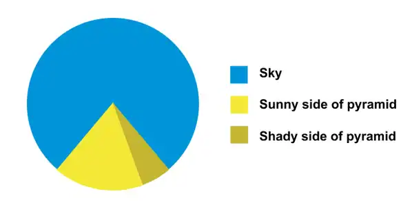
There’s also a special joy in charts that are technically correct but emotionally unhinged. A pie chart that’s literally a pie. A distribution curve that becomes a ghost. A guide to workplace fish consumption that somehow feels more useful than most HR onboarding documents. It’s all the same vibe: making the mundane look official, then immediately humiliating it.

If you want to keep the visual nonsense going, try 39 Oddly Specific Memes That Feel Too Accurate, 35 work email memes for people who are one subject line away from quitting, and 42 no context images that refuse to explain themselves.

Jake Parker writes about the internet like it’s a spreadsheet someone filled in with feelings and then emailed to everyone by mistake.

Jake Parker, known around the web as "Jay," is a digital writer with over 10 years of experience covering internet humor, meme trends, and viral content. Before joining Thunder Dungeon, Jay was the lead editor at MemeWire, where he helped curate memes that broke the internet, including coverage on trends like Distracted Boyfriend, Kombucha Girl, and Bernie Sanders’ Mittens. A self-proclaimed "professional procrastinator," Jay spends his downtime scrolling Reddit and Twitter to stay ahead of what's about to break the internet next.
Read Memes
Get Paid

The only newsletter that pays you to read it.

A daily recap of the trending memes and every week one of our subscribers gets paid. It’s that easy and it could be you.