40 Interesting Maps That Make The World Look Different
Updated on January 4, 2026
I opened my phone this morning to check the weather and somehow ended up staring at interesting maps and amazing maps like I was cramming for a quiz I never signed up for. That’s the January effect: your body is cold, your brain needs stimulation, and suddenly geography feels like entertainment.
These are the kind of map images you save instantly. You learn one weird fact, then start demanding everyone else look at it too. Reddit is the natural habitat for this, National Geographic vibes sneak in through the side door, and your group chat becomes a place where you argue about scale like it’s a sport.
40 Interesting Maps For When You Want A Smarter Scroll
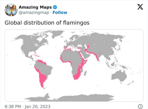
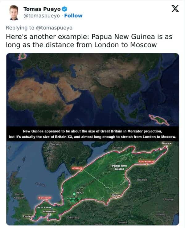
The US–Mexico border overlay across Europe is an immediate “wait, what” moment. Seeing it stretch from Portugal toward Russia makes your brain recalibrate distance like a busted GPS finally updating. Similar energy with the Papua New Guinea comparison—stretching from London to Moscow is not the size I imagined while casually ignoring it on a globe.
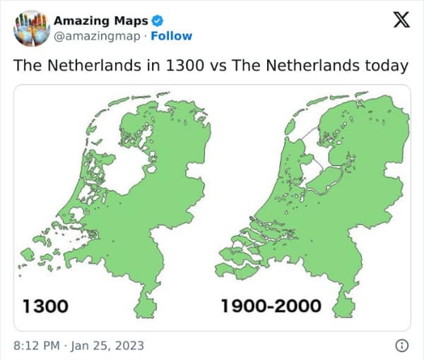
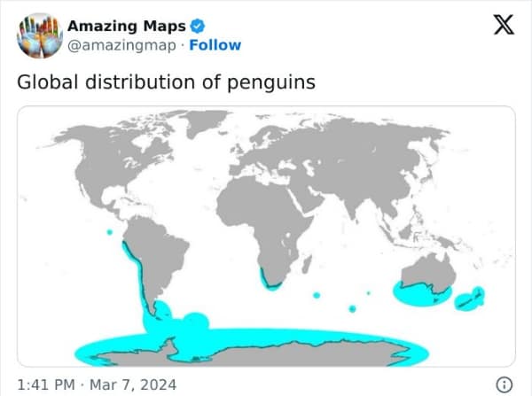
Then the flamingo distribution map shows up and makes you realize these pink weirdos are basically international. South America, Africa, even parts of India—turns out flamingos are out here running a global tour schedule. It’s one of those interesting maps that’s pretty and educational, which is rare and suspicious.
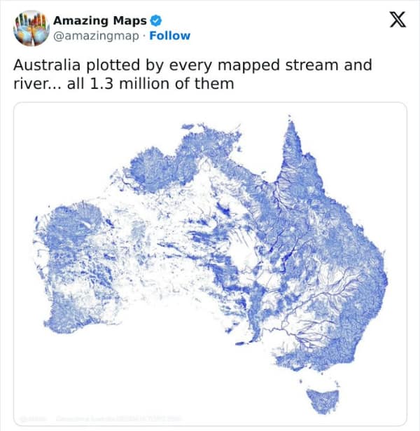
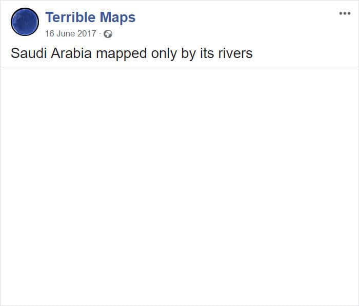
The Netherlands land-reclamation comparison is pure engineering flex. The Dutch didn’t just live near the sea. They negotiated with it. Meanwhile, the Australia map made only of streams and rivers looks like a watery nervous system, especially when you remember how dry the interior is supposed to be. It’s the kind of map image that feels like anatomy class, but for continents.
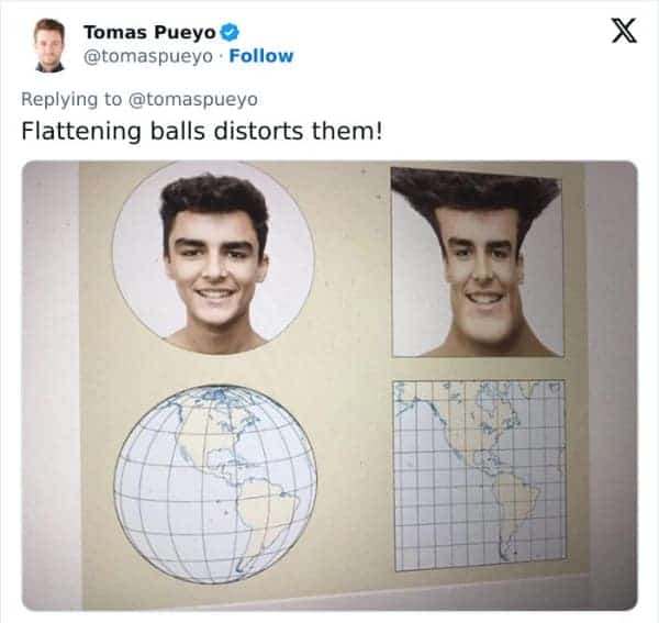
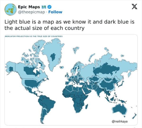
The Mercator projection meme using a human face to explain distortion is also a perfect teaching tool. Greenland looks huge because the map is basically stretching the top like taffy. Once you see it, you can’t unsee it. That’s why amazing maps are dangerous—they change how your brain interprets everything.
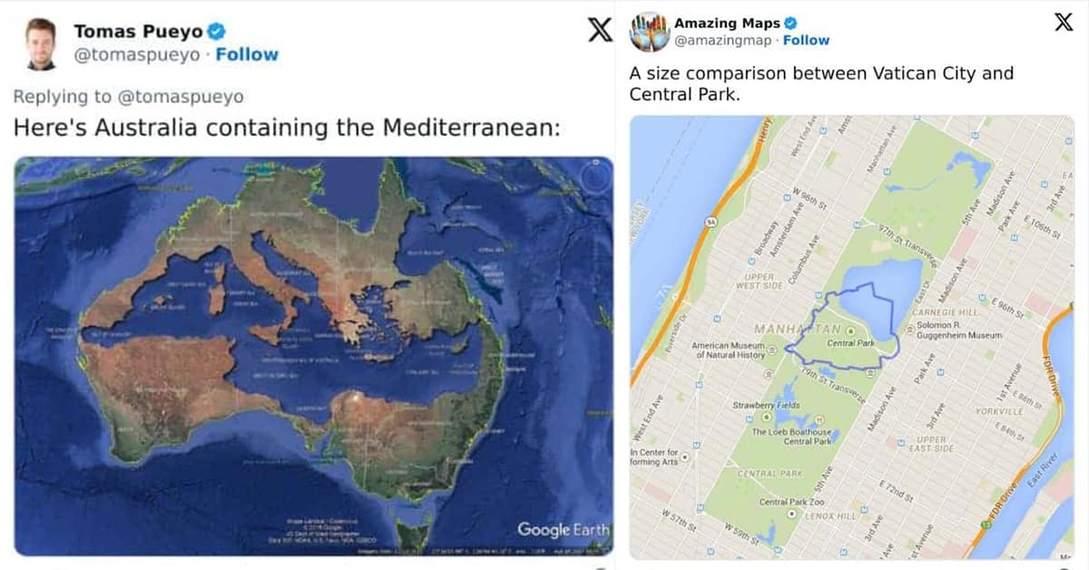
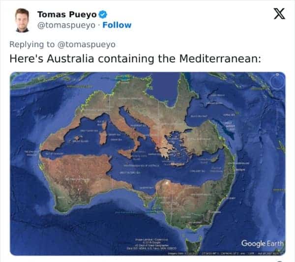
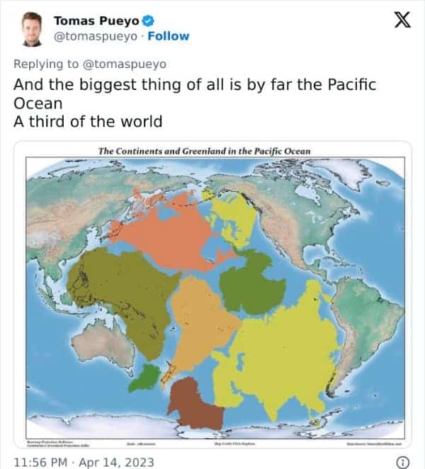
The Mediterranean Sea fitting inside Australia is another size shocker. Italy and Greece tucked into the Outback like they’re houseplants in a giant living room? Wild. And the Pacific-centered view is a reminder that we live on a water planet. One-third of Earth is just that ocean, making the continents look like little add-ons.
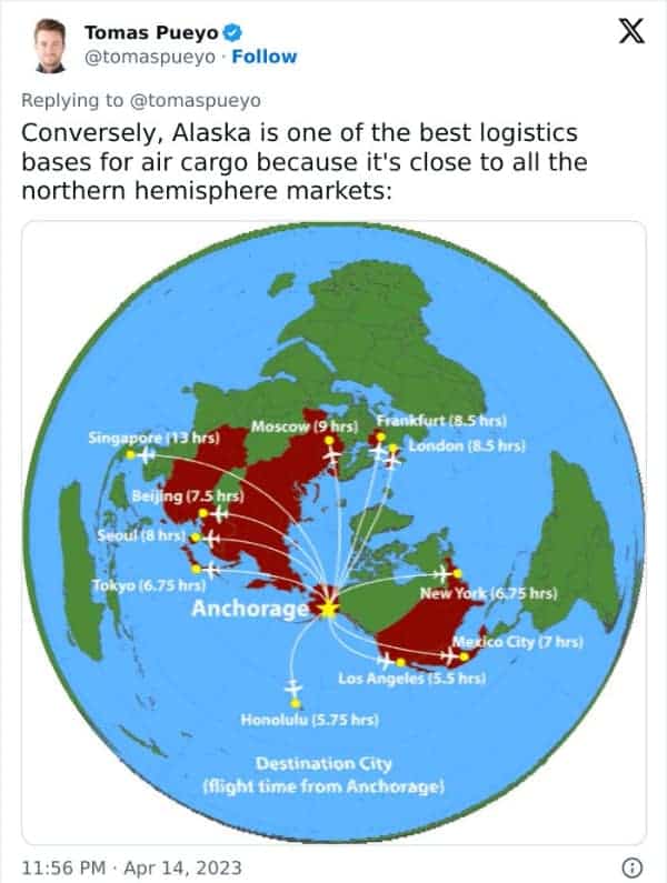
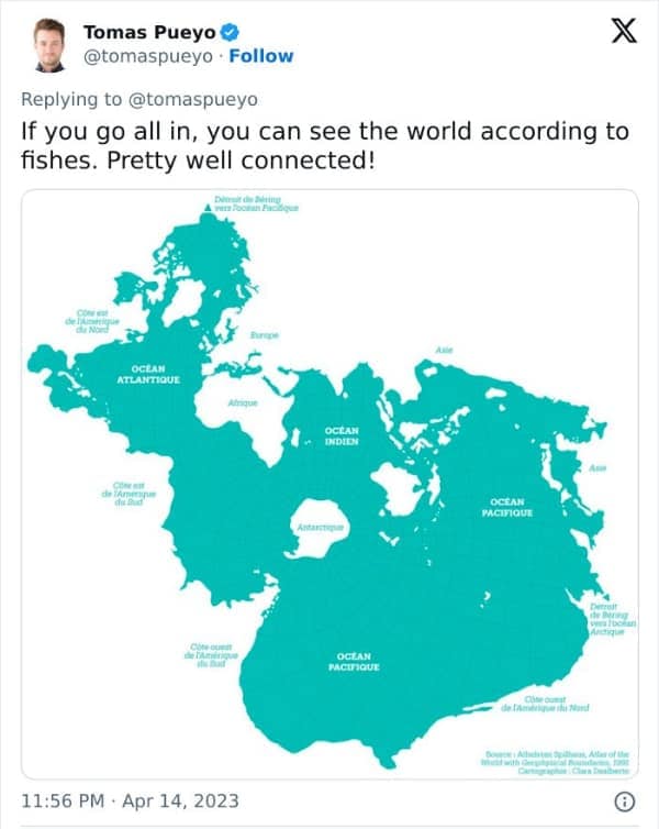
My favorite practical one is Alaska as an air-cargo hub. Anchorage being a short flight to major Northern Hemisphere cities makes the logistics nerd in me do a tiny fist pump. Then the Spilhaus projection closes things out by making the oceans look like one connected body, which feels like the planet whispering, “You are on a wet rock, behave.”
If you’re staying in the interesting maps mood, tap 30 Infographics That Feel Like Cheat Codes, 25 Weird Facts That Look Better In Pictures, and 40 Airport Memes That Make You Want A Passport.
Mike Hartley writes like a guy reading a tape measure in a blizzard—dry jokes, clean comparisons, and a deep respect for anything that proves scale is lying to us.
Read Memes
Get Paid

Michael Hartley, or just "Mike," is an editor and seasoned meme historian whose articles have traced the evolution of meme humor from early Impact-font classics to today’s TikTok sensations. With nearly a decade spent as senior editor at ViralHype and as a regular contributor to Cheezburger, Mike has dissected the rise of meme legends such as Bad Luck Brian, Success Kid, and Doge. When he's not hunting down meme gold for Thunder Dungeon, Mike teaches workshops on meme marketing and the psychology behind shareable content.