Medieval logos
I recall seeing a fast-food chain’s classic logo reimagined as medieval calligraphy, and it felt more regal than my entire closet. If you’ve ever wondered what a modern brand might look like in the era of jousts and knights, these artistic takes will satisfy that curiosity, or at least amuse you for a moment.
Picture a digital gallery where your favorite tech or food brand ditches sleek minimalism in favor of a historical art style brimming with ornate lettering and swirling flourishes. The artist Ilya Stallone on Instagram spearheaded these transformations, merging modern logos with Renaissance flair to create medieval logos that tickle both your sense of nostalgia and your love for pop culture. Each image embodies a playful nostalgia—like seeing everyday icons reworked in a style reminiscent of ancient manuscripts. You might encounter swirling banners, subdued color palettes, or detailed flourishes that speak to a time of handwritten scripts. By the time you finish admiring these clever pieces, you’ll wonder why we ever let go of such rich craftsmanship, even if it’s purely for a humorous reinvention of our era’s corporate emblems.
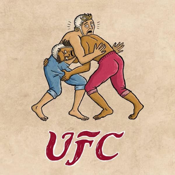
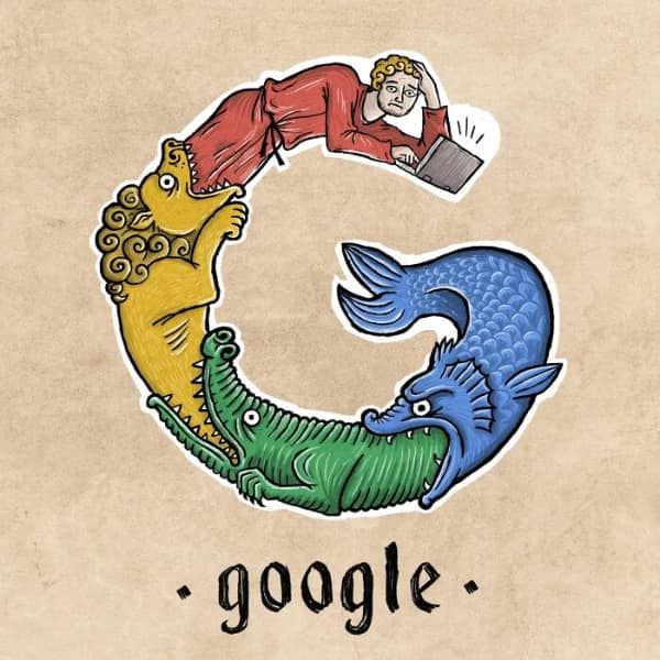
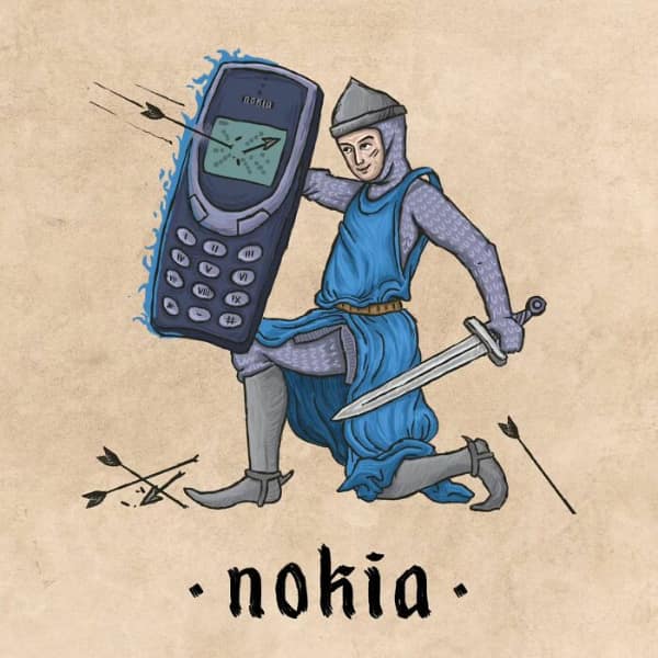
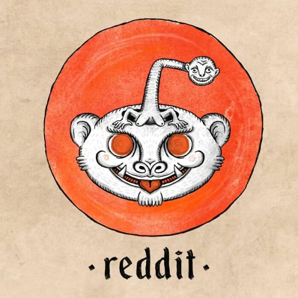
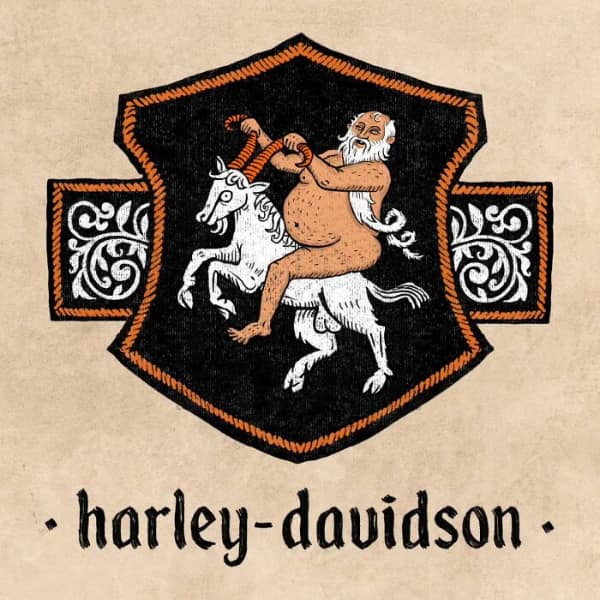

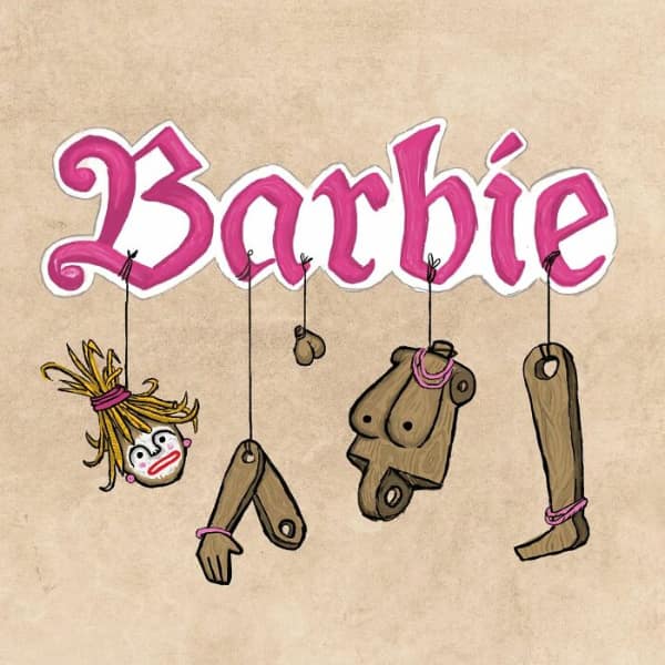
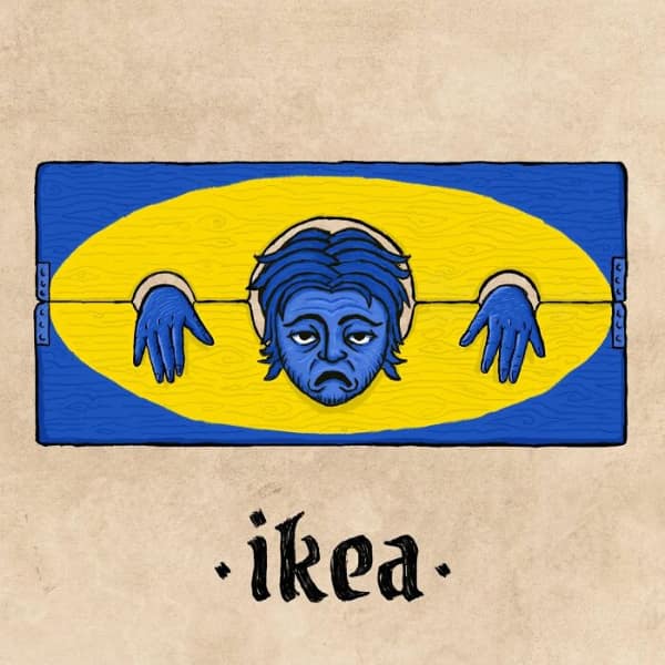

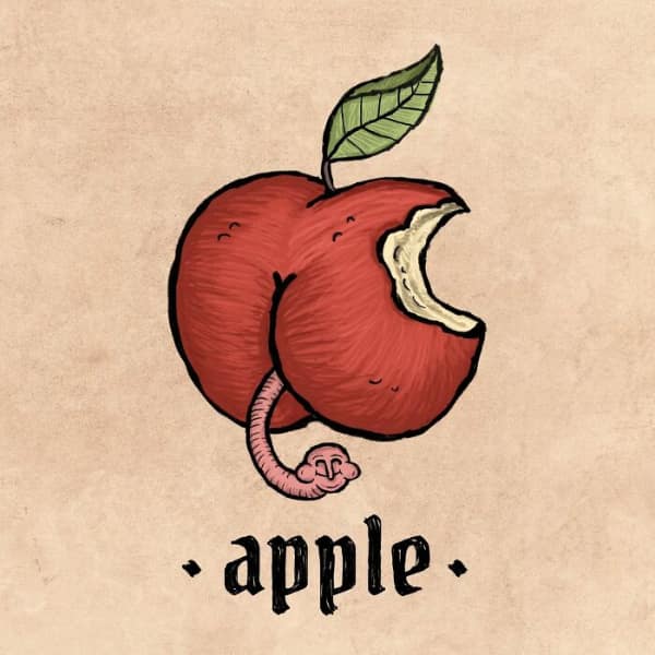
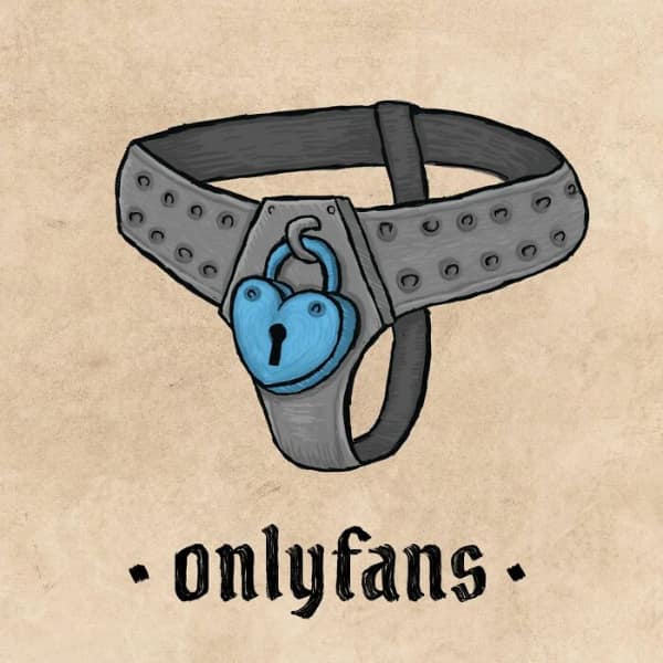
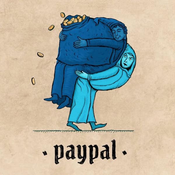
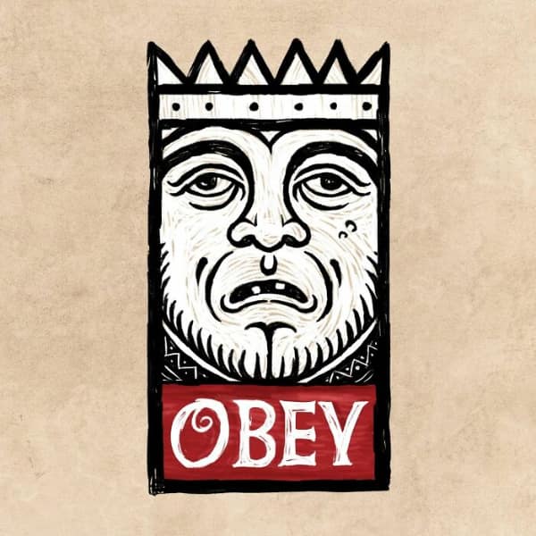
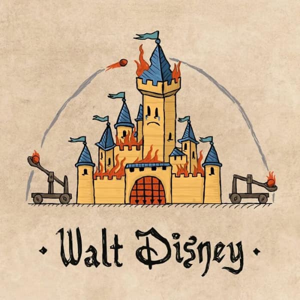
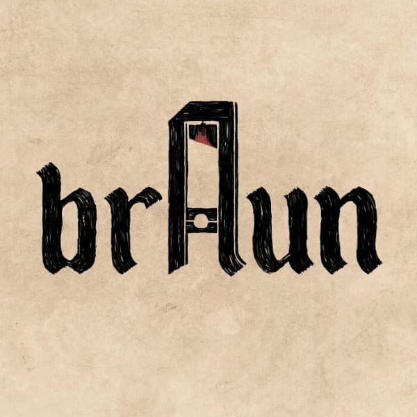
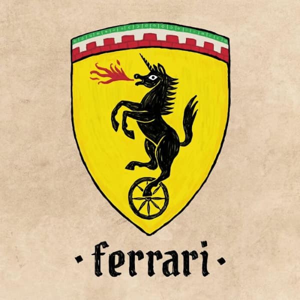
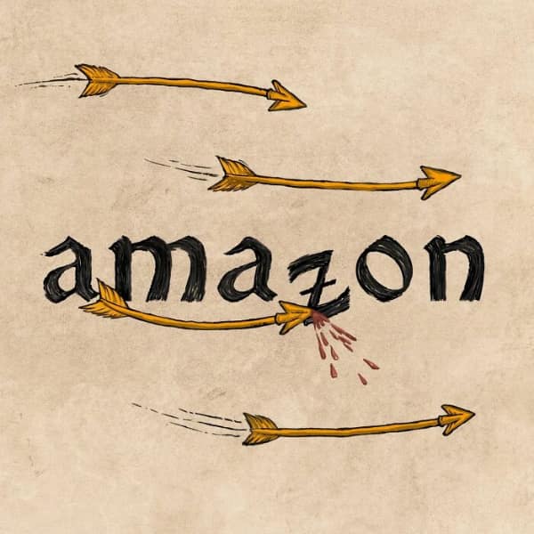
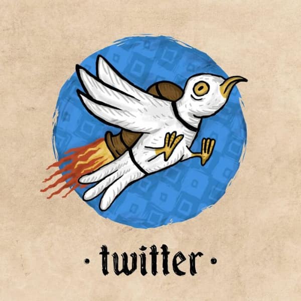
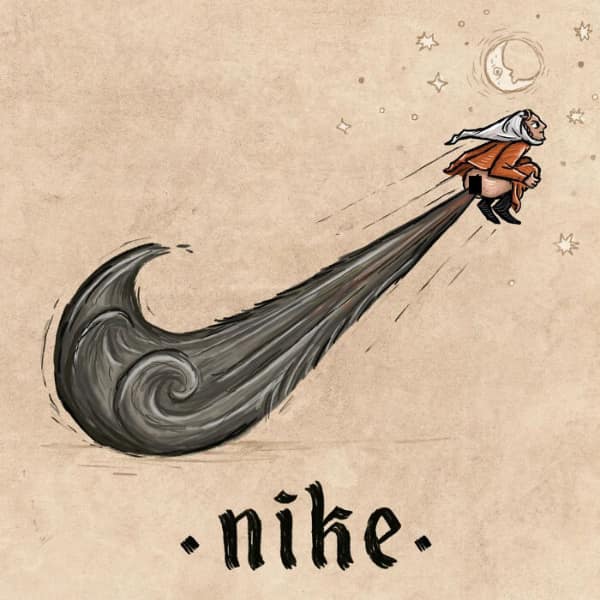
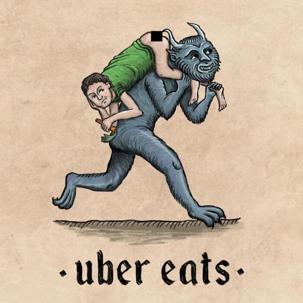
After perusing each medieval logo, you likely felt a strange enchantment, imagining your everyday coffee stop or favorite streaming service with a coat of arms and a Latin motto. You saw how subtle details like flourishes and color schemes can shift an entire brand’s vibe into something fit for castle walls.
If these medieval logos enchanted you, consider checking out other meme posts revolving around retro brand redesigns, art-inspired corporate spoofs, or creative historical twists on everyday imagery. You may discover that even the simplest logos can be reimagined in ways that tug at the imagination and awaken an odd longing for a time of scrolls and quills.











I really love it when you guys censor stuff that doesn’t need to be censored, like a hand drawn butt crack. What was it hurting?
5 would be funnier if he was riding a hog (animal)