45 Kerning Fails That Hilariously Change the Meaning
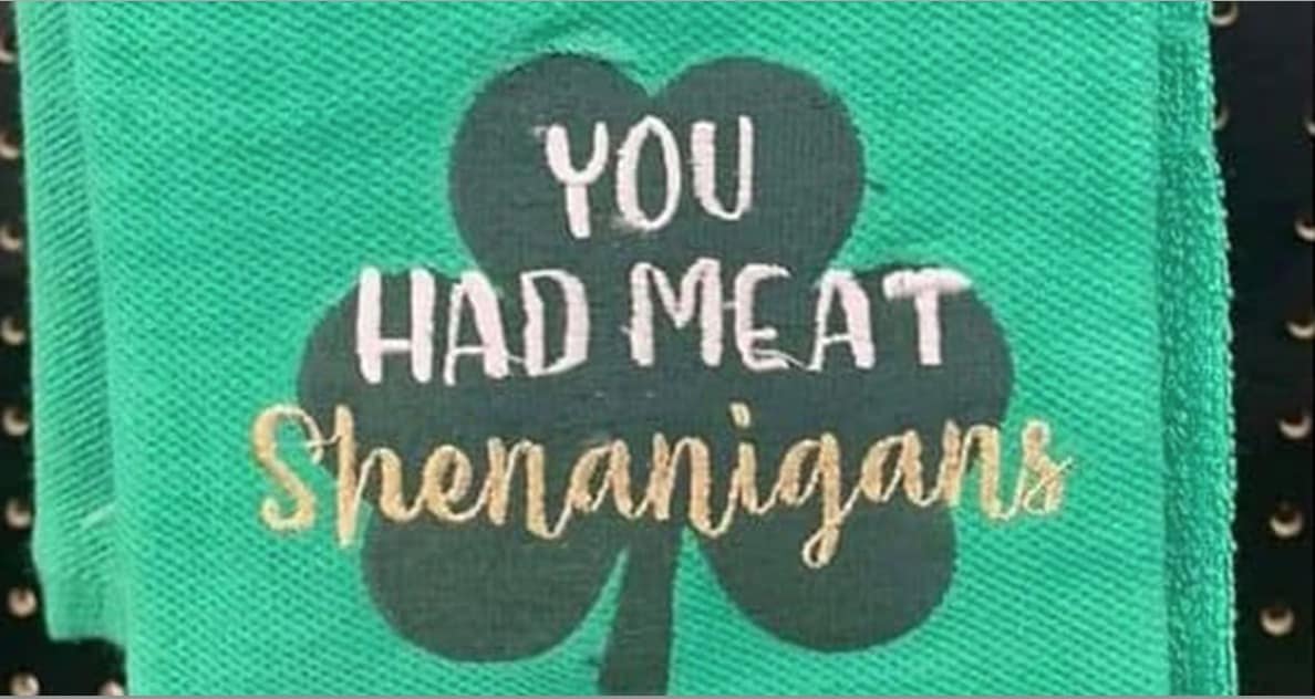
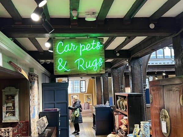
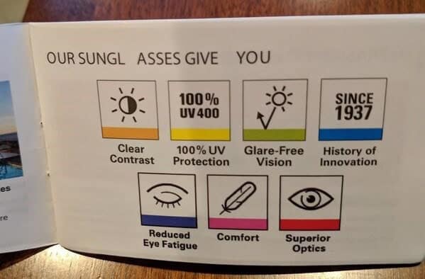
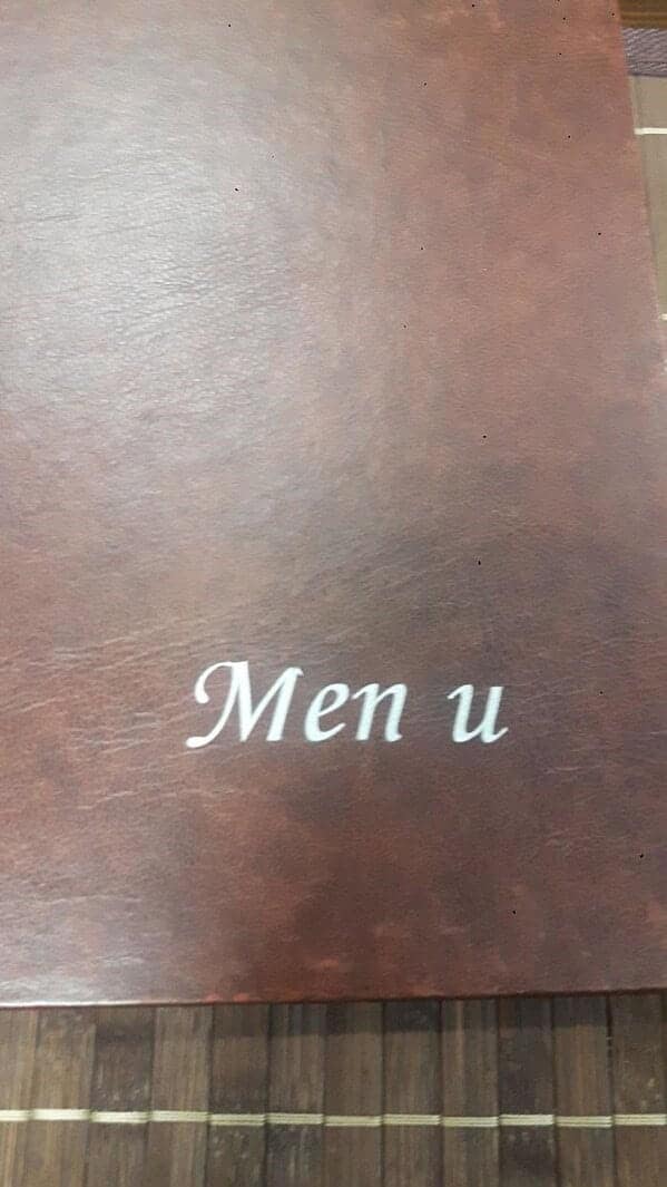
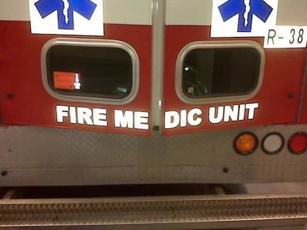
Kerning fails are a graphic designer's nightmare and a comedy goldmine for the rest of us. These 45 examples of poorly spaced letters on signs, packaging, and various other forms of lettering provide endless amusement by unintentionally altering the meaning. Whether it's a misplaced letter or an unfortunate word break, these kerning disasters will leave you laughing and shaking your head.
Join us on this journey through the wild world of kerning fails, where a single space can turn a mundane message into comedic brilliance. This collection of 45 kerning fails highlights the impact of typography gone wrong. From signs that inadvertently create new (and often hilarious) words to packaging that sends unintended messages, these images showcase the importance of proper letter spacing.
You'll see classic examples of kerning mishaps, funny signage errors, and hilarious packaging fails. Each image serves as a reminder that even the smallest design details matter, and when they go wrong, the results can be both embarrassing and entertaining.

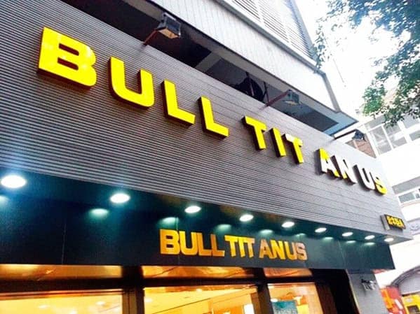
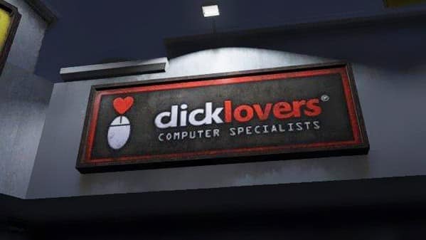
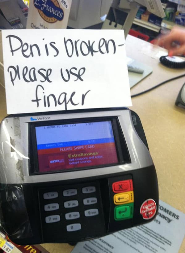
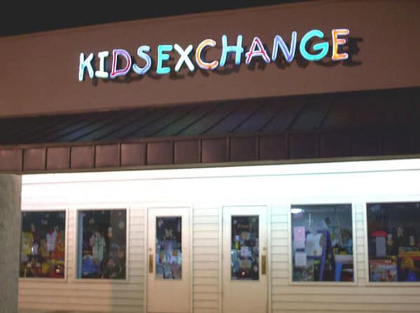
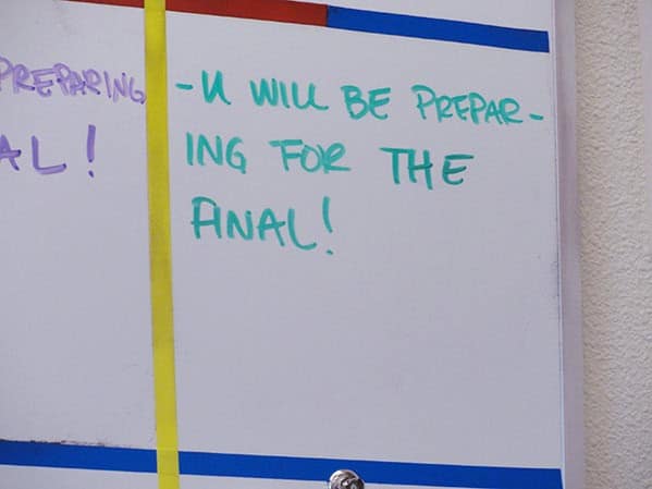
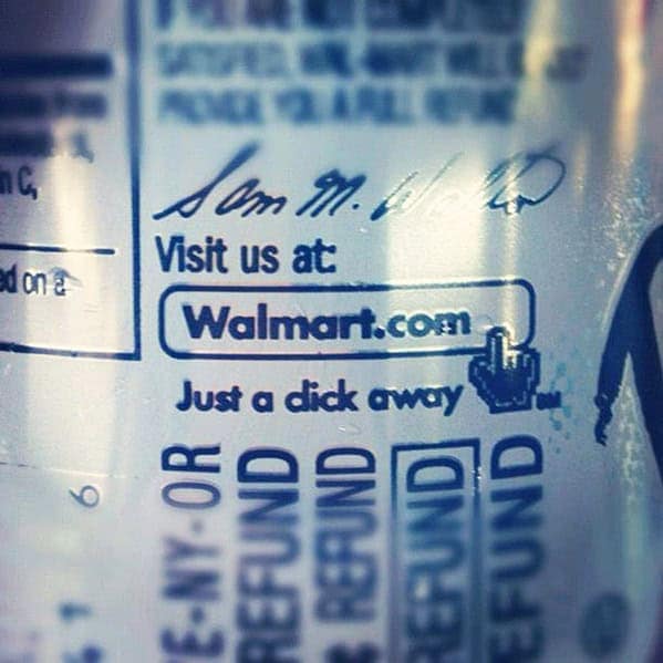
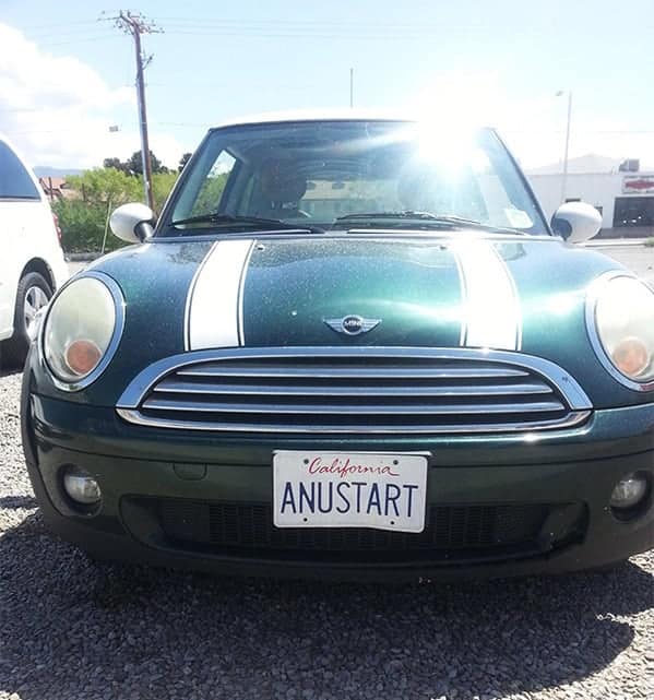

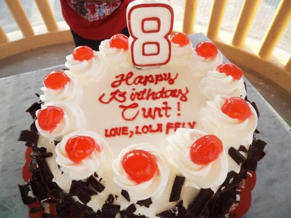
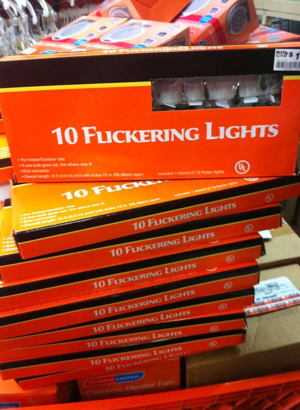


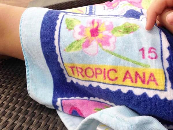
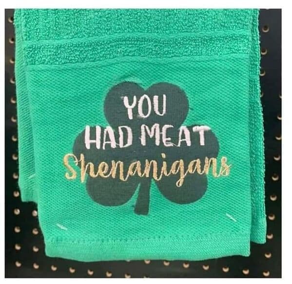
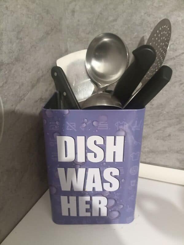
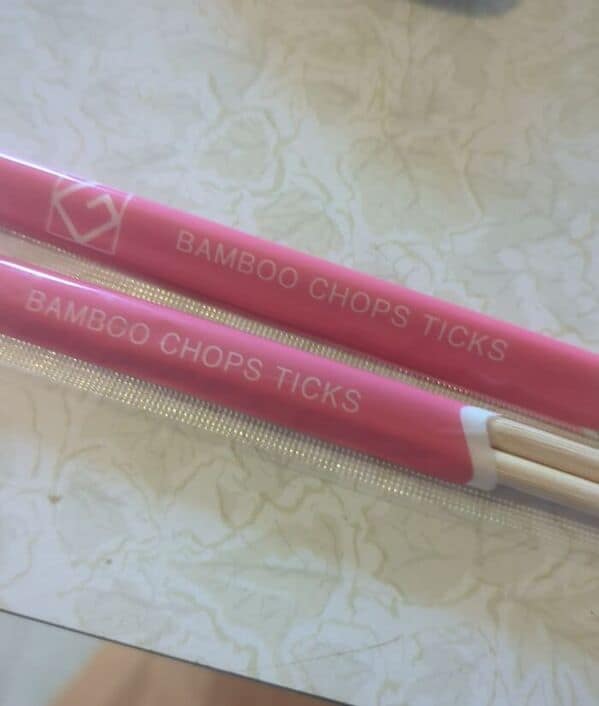
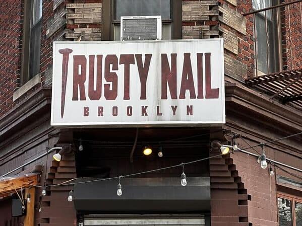




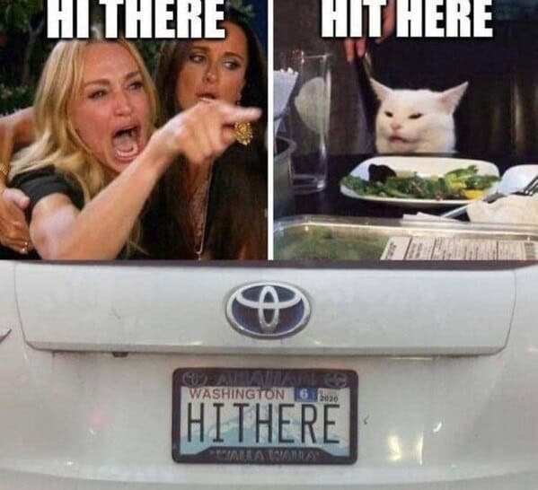
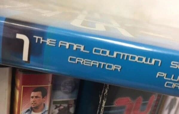
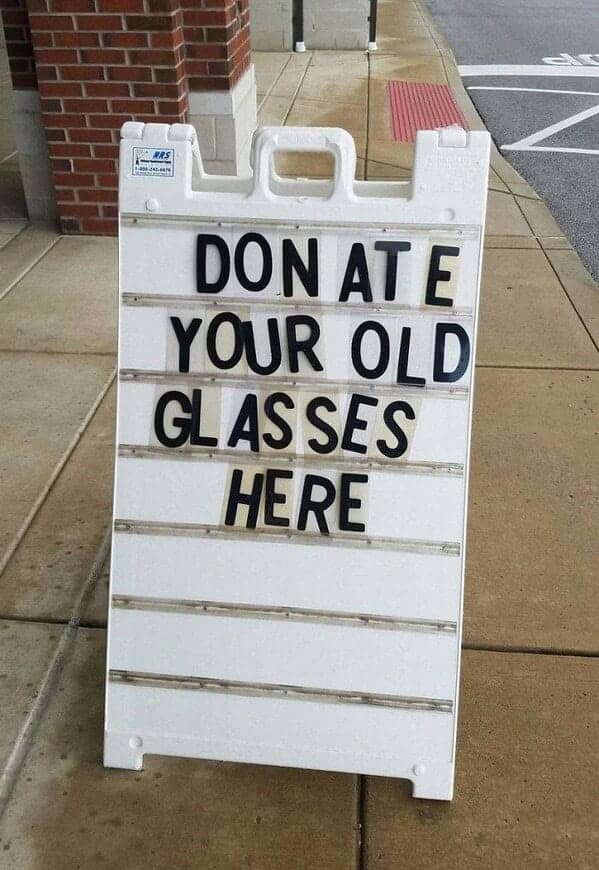
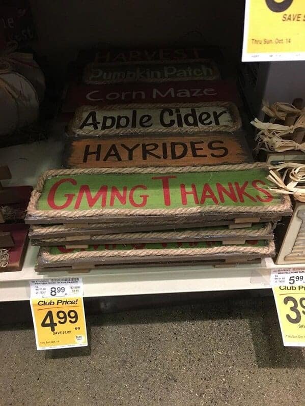
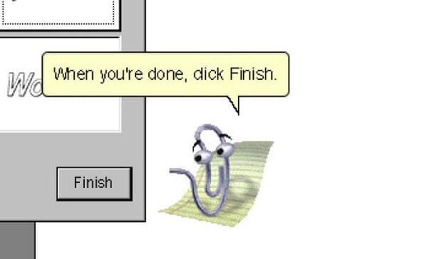


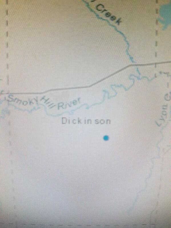

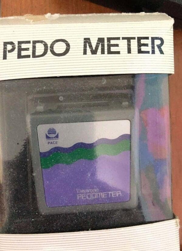


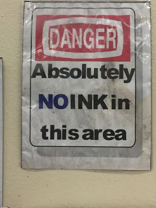
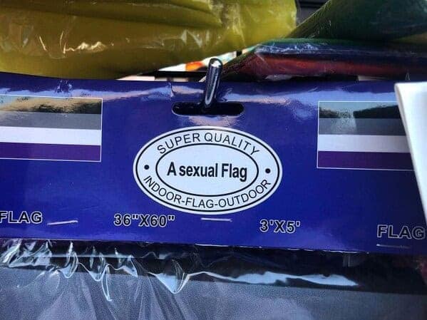
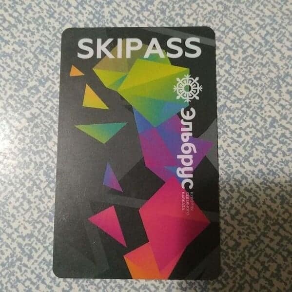
After viewing these kerning fails, you likely found yourself laughing at the absurdity of it all. The poorly spaced letters and unintended word breaks turned ordinary messages into comedy gems. You probably couldn't help but wonder how such mistakes made it past quality control, and you might even have a newfound appreciation for the importance of good typography. These kerning disasters provided a lighthearted look at the world of graphic design, leaving you entertained and maybe a little more vigilant about letter spacing in your own work.
If you enjoyed laughing at these kerning fails, there are plenty more typography and design mishaps to explore. Check out posts featuring hilarious spelling fails, and the most unintentionally funny signs people have spotted in the wild.
These collections offer a mix of humor and cautionary tales, perfect for anyone who appreciates the finer points of design gone wrong. So keep scrolling, keep laughing, and remember: good kerning matters. Until next time, stay amused and stay attentive to those letter spaces!

