
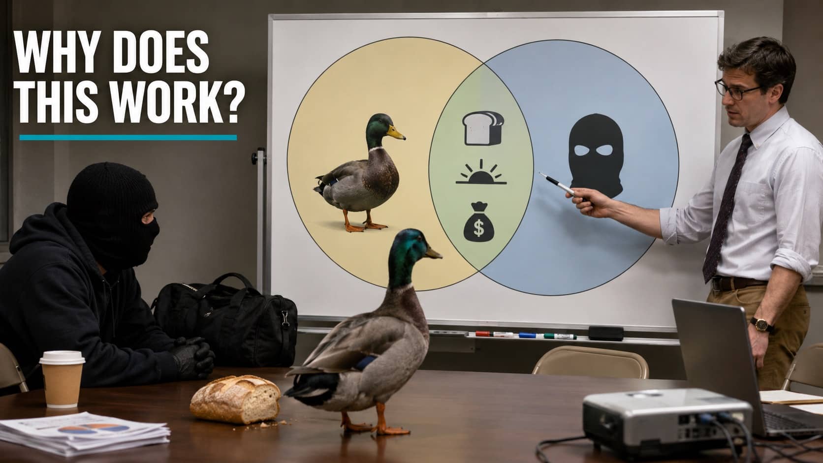

There is no weapon more devastating than a Venn diagram that turns out to be about you. These funny charts weaponize data visualization against the reader, taking the tools of serious analysis and using them to expose exactly how predictable your daily behavior actually is. You come for a laugh. You leave having been diagnosed. Grab a protractor and let’s get personally attacked together.

If I hear "Hotel California" during rush hour one more time, I’m rolling myself into oncoming traffic.

Statistically speaking, if you get murdered in Italy, at least your investigator will look incredible in a trench coat.
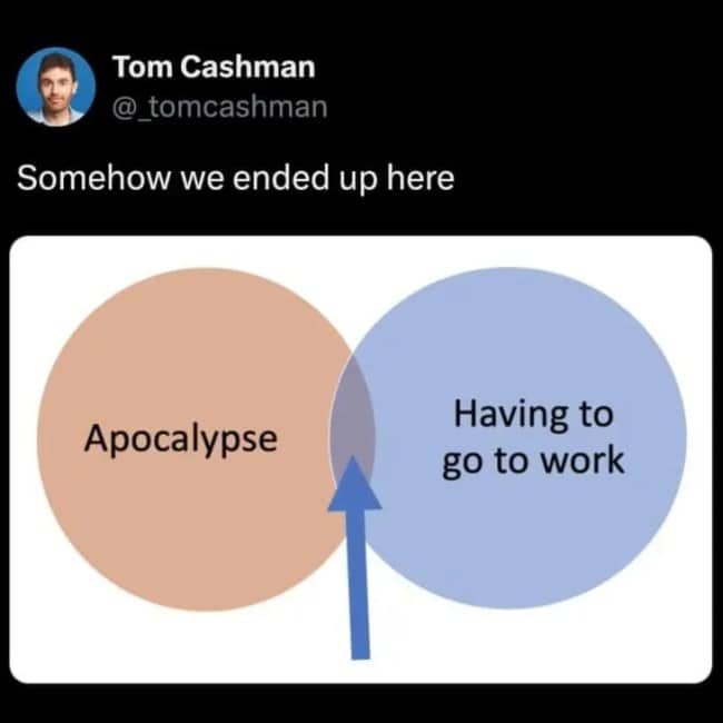
Commuting through a hellscape just to hop on a Zoom call that definitely could have been an email.
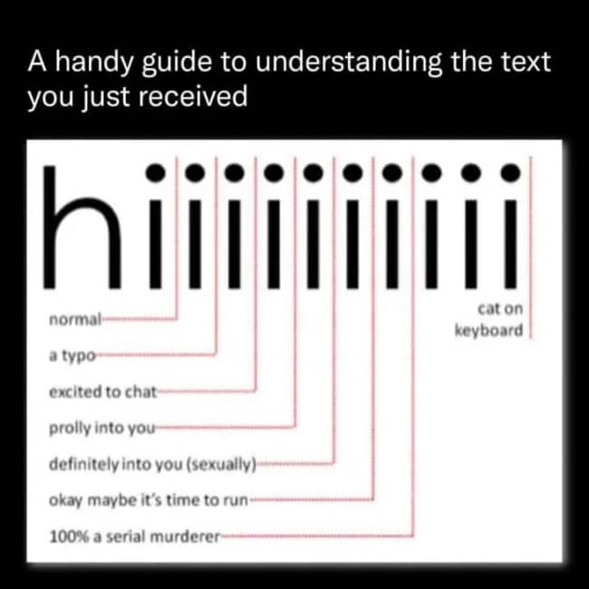
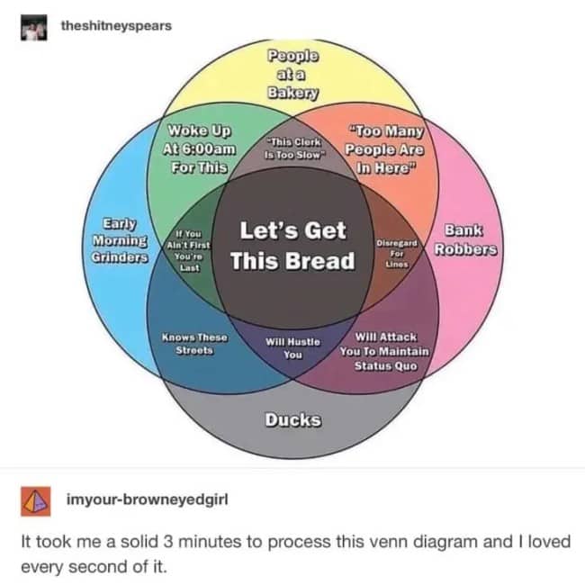

Funny charts
Read More
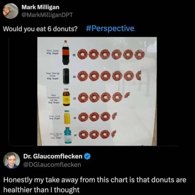
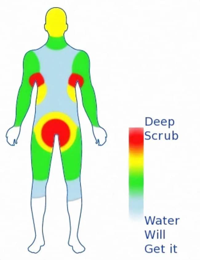
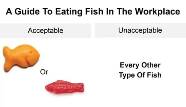
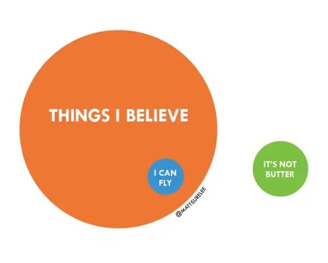
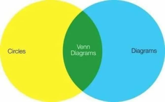
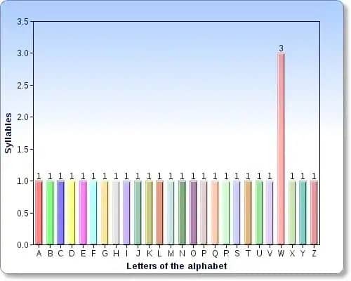
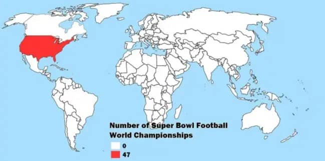
The genius of a good funny chart is that it uses the visual language of authority to deliver a completely unhinged observation, and your brain believes it because it’s in chart form. Slap two circles together and suddenly you’re being informed that a Greek mythological punishment, a mall duck, and your Monday commute share meaningful overlap, and the diagram format makes it feel like peer-reviewed fact. That’s the trick. The structure lends credibility to nonsense, and the nonsense happens to be true.
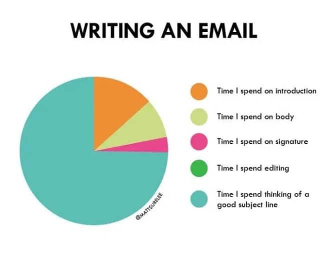
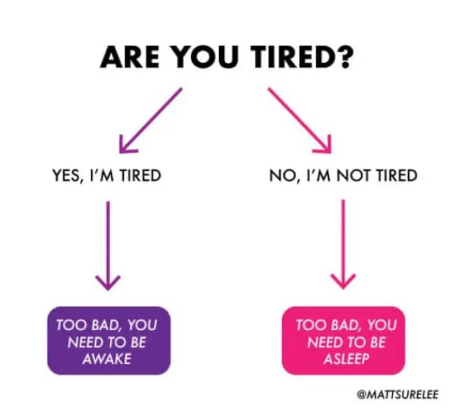
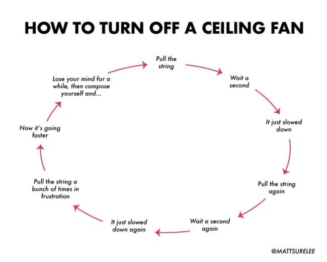
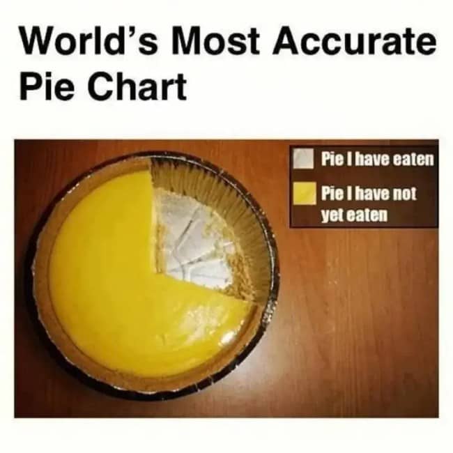
Then there’s the adulting-analytics genre, which reads you like a diary. There’s a specific horror in a pie chart that accurately breaks down the hours you’ve spent agonizing over a work email subject line, only to receive a one-word reply. Or a flowchart mapping the inescapable trap of being exhausted whether or not you need to be awake. These aren’t jokes so much as surveillance. Somebody’s been watching, and they made a graph.
And the fake-academic ones are my favorite, the alignment charts and unofficial rubrics applying rigorous methodology to completely absurd subjects. Categorizing teachers by their secret moral alignment, or European detective fiction by emotional trope, with the deadpan seriousness of a thesis defense. The commitment to the format is the whole joke. Real academic rigor, pointed at the dumbest possible question, delivered with a straight face.
What makes these land is that they take the coldest, most impersonal format imaginable and use it to say something painfully intimate. A chart is supposed to be objective, detached, above it all, and then it turns that detachment on you and calmly proves your entire routine is predictable. Getting emotionally exposed by a bar graph is a genuinely modern experience and it’s funnier than it has any right to be.
And there’s a real comfort buried in the attack, honestly. When a chart nails your specific brand of procrastination or your exact circadian dysfunction, the underlying message is that you’re not uniquely broken, you’re statistically normal, part of a documented population of people doing the same dumb thing. The diagram isn’t just roasting you. It’s confirming you have company, which is the nicest thing a pie chart has ever done.
The data is unhinged. The diagnosis is accurate. Regards.
If the personal attacks were your kind of fun, our relatable content is right where you’d want to land next, and we’ve got plenty of chart comedy archives, infographic humor threads, and relatable diagram compilations for anyone who has ever been read for filth by a Venn diagram. Check the data.
Read Memes
Get Paid


Priya Coleman is a viral content specialist and meme analyst with over six years in digital publishing. Her past roles include viral content editor for PopSugar's humor vertical and meme correspondent for HuffPost’s comedy section. Priya specializes in spotting trending meme moments just before they peak—like the chaotic delight of the Ever Given’s Suez Canal mishap or the existential comedy of This is Fine. She brings her sharp wit and instinctive knack for viral content to Thunder Dungeon, always keeping the community a step ahead of the latest meme craze.