These interesting infographics are exactly the kind of thing I open “for one second” and then suddenly I’m learning about swimsuit visibility, airline seating profits, and why my houseplant is plotting its final exit. I love a good visual guide because it makes the world feel briefly organized. If you’re into data visualization, helpful charts, and educational infographics that turn random facts into tiny brain treats, this batch is for you.

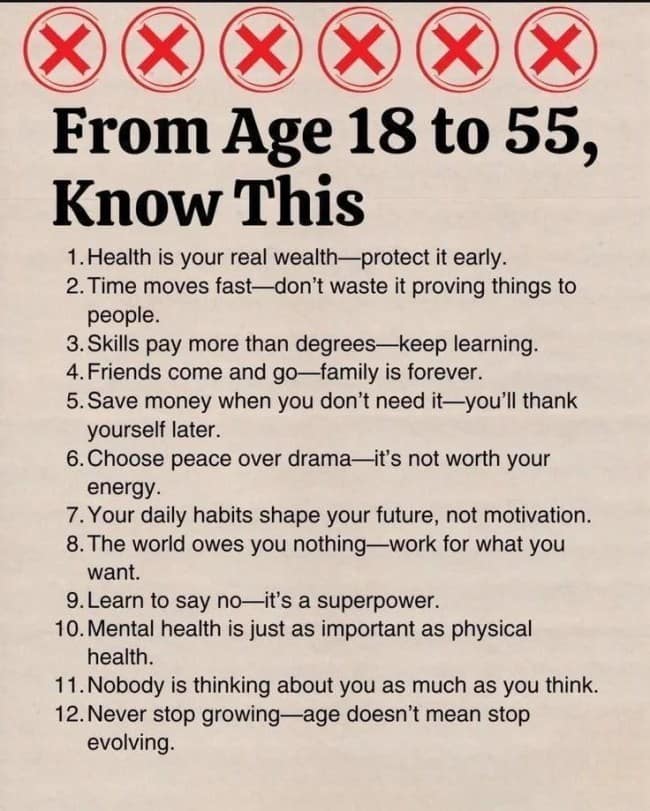
A reminder that while you cannot control the weather, global inflation, or your neighbor's unhinged morning leaf-blowing schedule, you can technically choose to react like an immovable, emotionally bulletproof rock.
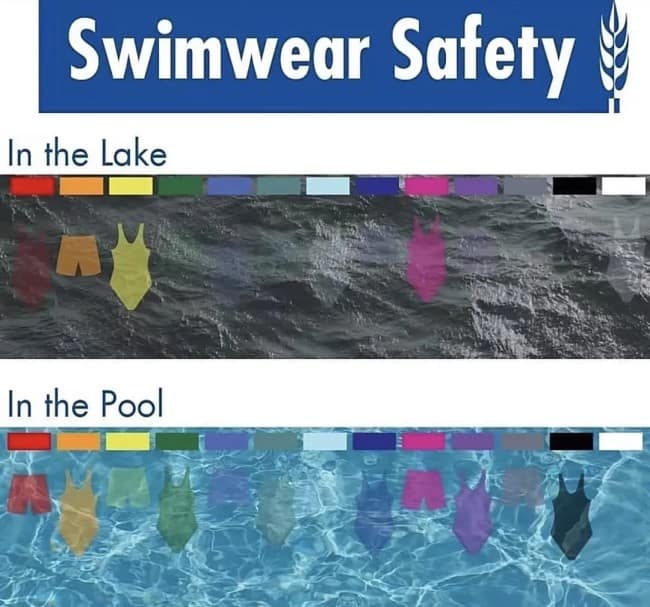
An essential public service announcement revealing that dressing your child in a dark blue or green swimsuit is essentially gifting them a highly functional aquatic invisibility cloak.
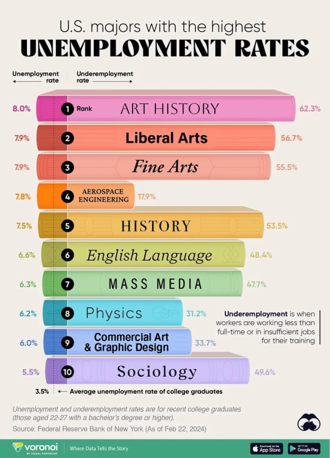
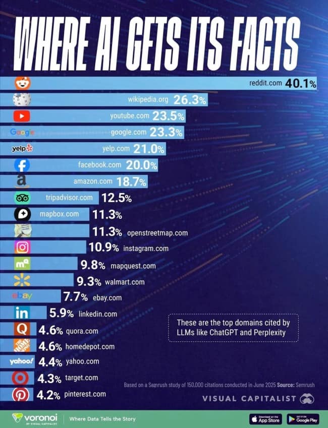
Art History majors finally securing that coveted number-one spot on a national ranking board, even if the metric in question inspires immediate financial panic.
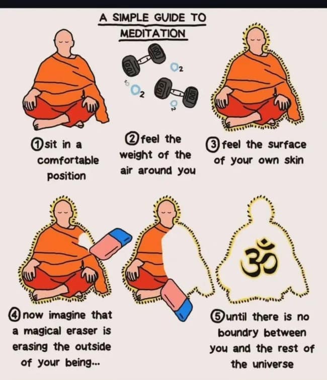
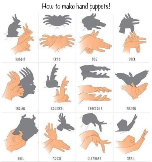
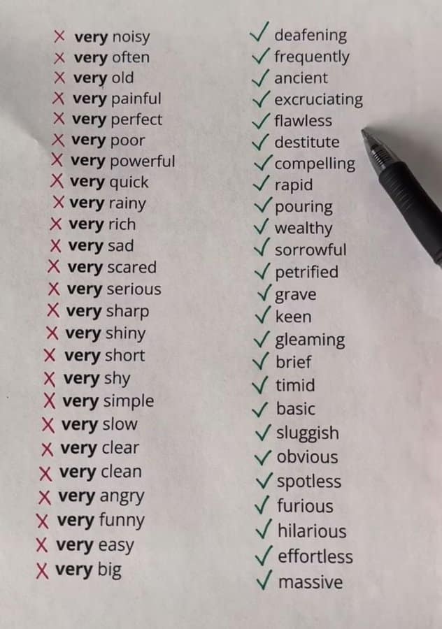
Please follow the instructions carefully; if you over-index on step four, you risk permanently erasing your short-term memory along with your mental boundaries.

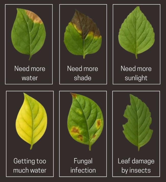
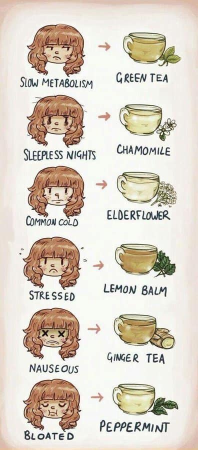
A highly practical checklist designed to help you precisely categorize the exact physiological method you accidentally used to destroy your new living room houseplant.

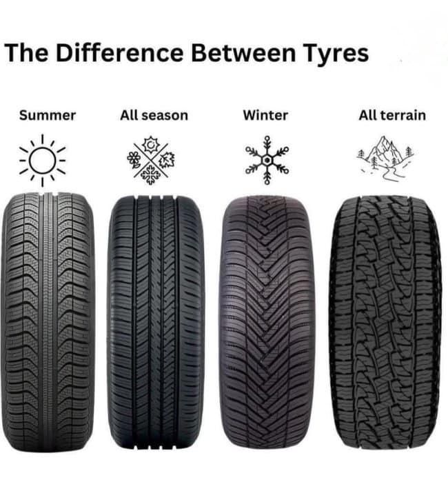
A helpful guide for choosing the exact tire tread required to safely navigate your seasonal morning commute, unless you live in a deep winter climate where "all-season" basically translates to "good luck."
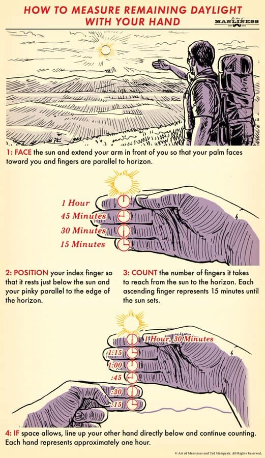
Staring directly into the blinding afternoon sun in the middle of a hiking trail while aggressively counting your own knuckles to convince yourself you aren't completely lost.

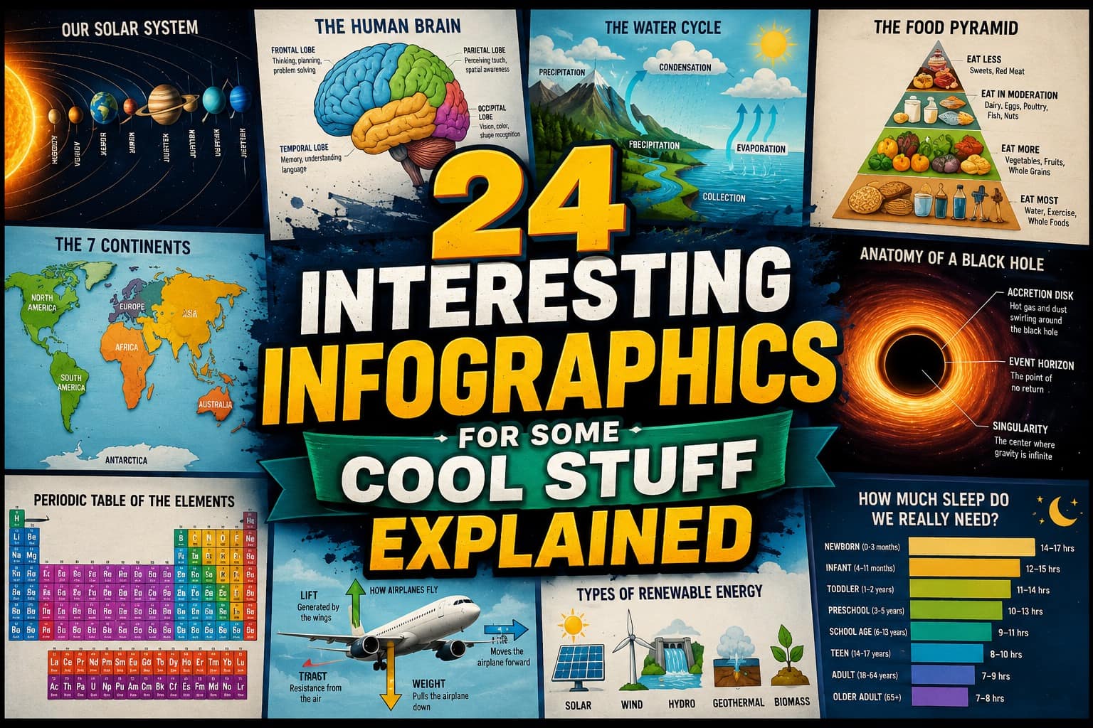
Today’s theme: cool stuff, but actually explained.
The best interesting infographics do that satisfying little magic trick where complicated information stops looking like homework. A dense topic gets turned into clean boxes, color coding, labels, diagrams, and suddenly your brain goes, “Oh, I can handle this.” That’s the power of data visualization: it takes chaos and gives it a floor plan.
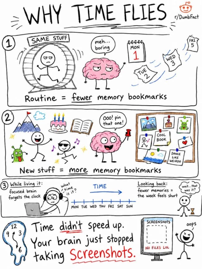
And I love how wide the range is here. One minute you’re looking at helpful charts about plant health, tire types, or basic body numbers. The next, you’re deep in airline economics, Stoic philosophy, or why time feels like it speeds up when your days get repetitive. Educational infographics work because they let you bounce between practical survival and “wait, that’s actually fascinating” without committing to a whole documentary.
There’s also a real-world usefulness to this kind of scroll. Some of these are safety reminders. Some are style shortcuts. Some are little life hacks that might save you ten minutes, one bad purchase, or a doomed houseplant. Interesting infographics are basically the internet’s cleanest form of productive procrastination.
If you want more brain-friendly rabbit holes, follow this with 40 Funny Shower Thoughts That Made Me Pause, 25 Tech Fails That Made Me Question Everything, and 32 Relatable Memes About Random Life Things.
I’m Laura Bennett, and I support educational infographics because sometimes I want to feel productive without opening a spreadsheet.
Read Memes
Get Paid

Laura Bennett has spent eight years immersed in internet culture, specializing in deep dives into meme origins, evolving meme trends, and digital subcultures. As a contributor for several prominent online platforms, including BuzzFeed’s meme division and Know Your Meme, she’s written extensively about viral moments from Crying Jordan to Woman Yelling at a Cat. Laura believes memes aren't just internet jokes—they're modern-day folklore. She brings that passion to Thunder Dungeon by keeping readers connected to what's culturally significant, hilarious, and timelessly viral.