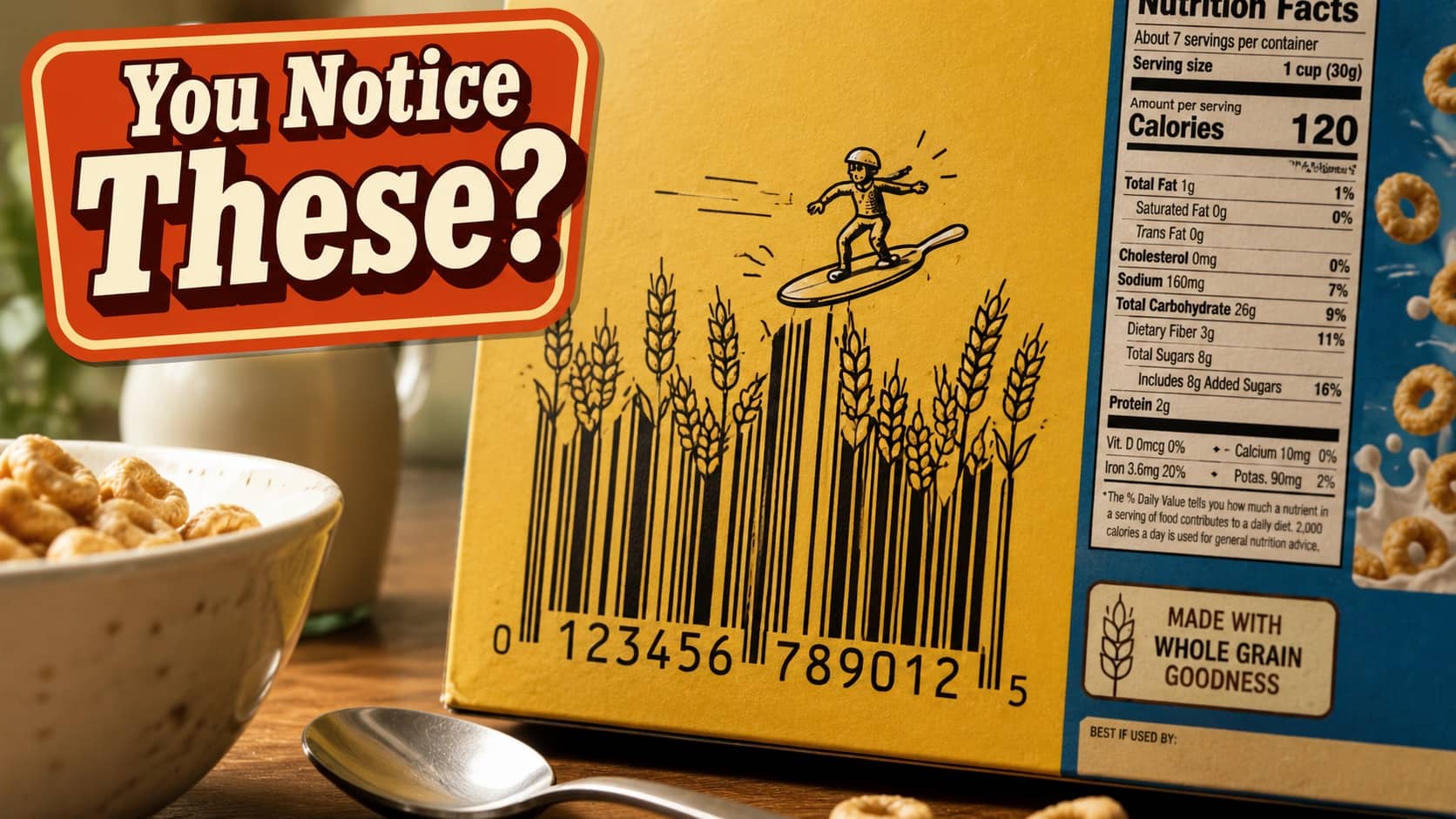
OK here is something I never thought I would say with this much sincerity. Somewhere, in a small office, an underpaid graphic designer has been quietly turning the standard product barcode into a tiny piece of accidental art, and the rest of us have only recently started noticing. These creative barcodes are the small ongoing archive of that exact creative rebellion, posted by alert shoppers who happen to look at the back of the package before tossing it in the trash. The design is small. The commitment is real. Pour the coffee.
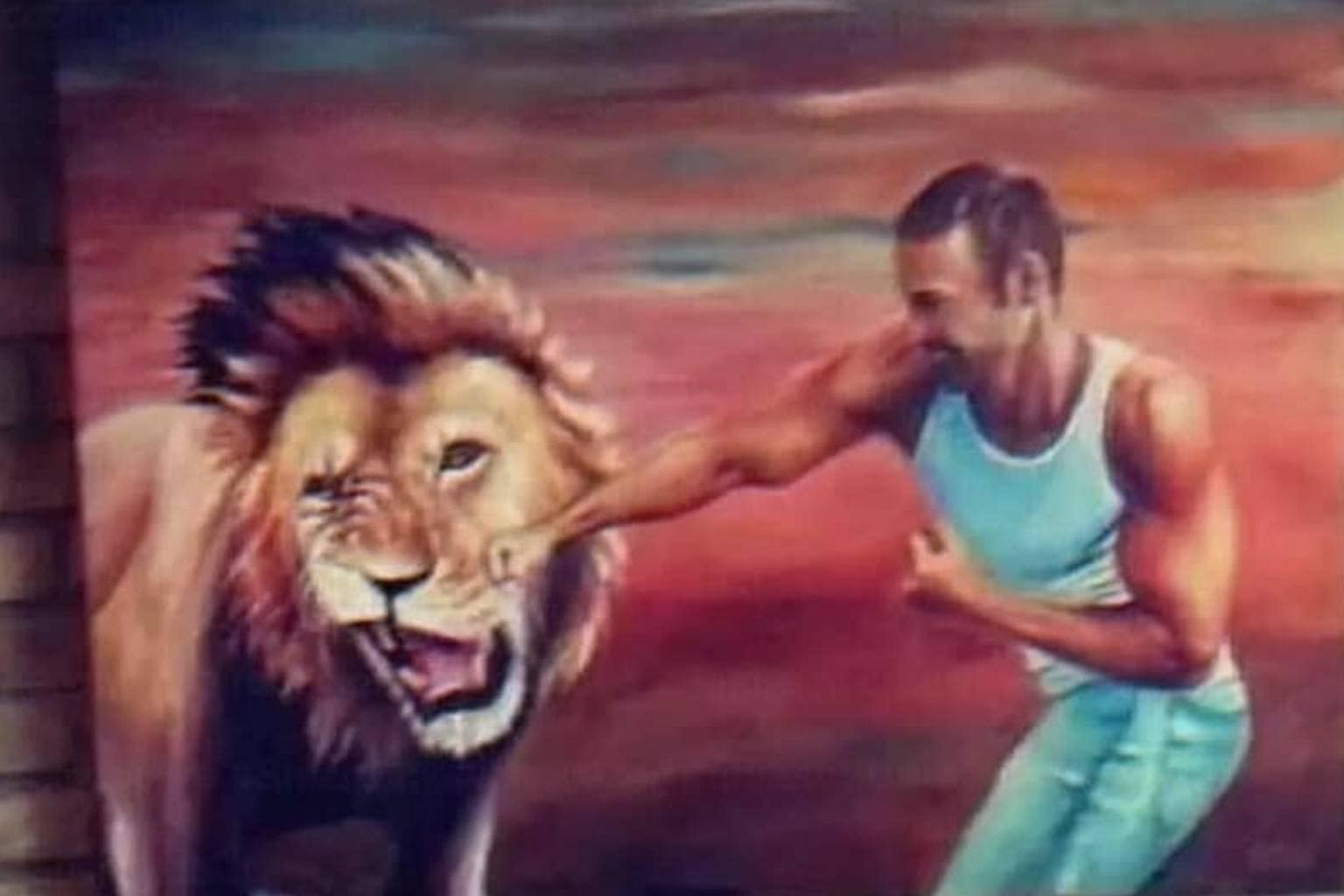
My budget is currently wiping out harder than this little guy.
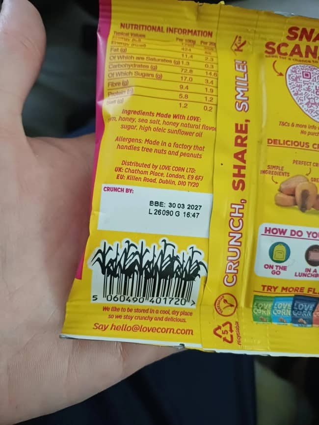
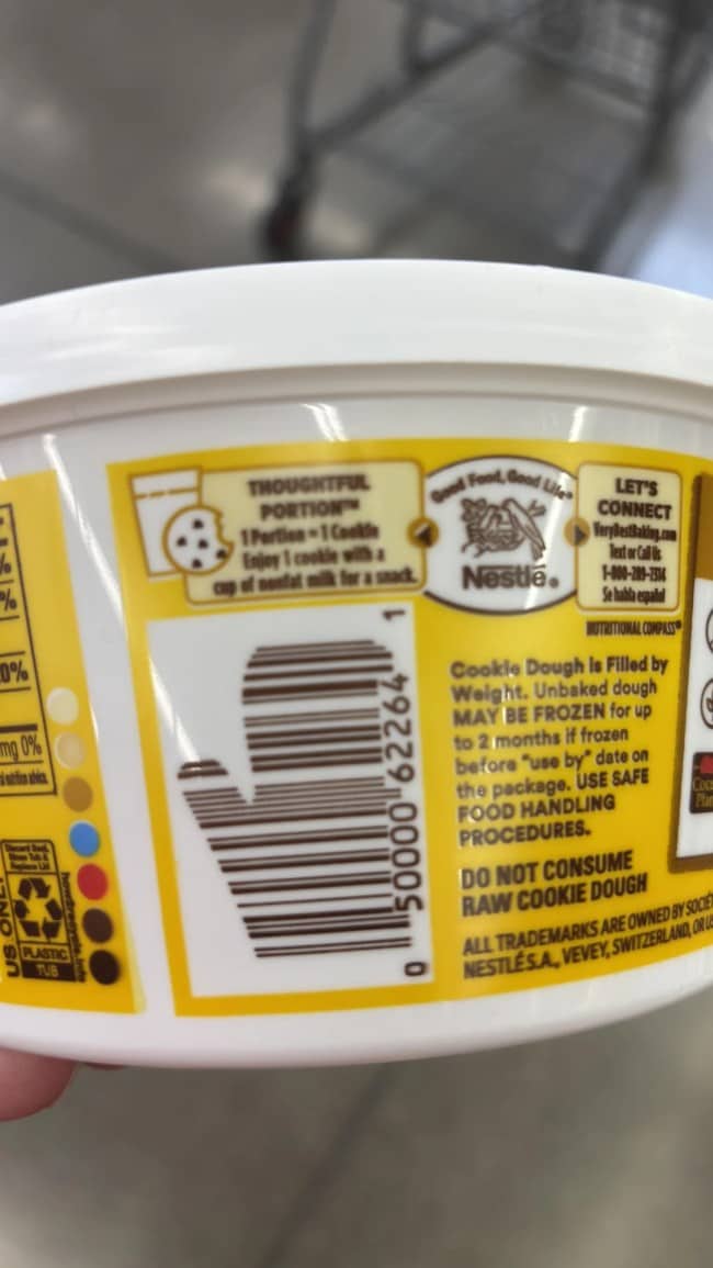
A beautiful, golden crop of supply chain logistics.
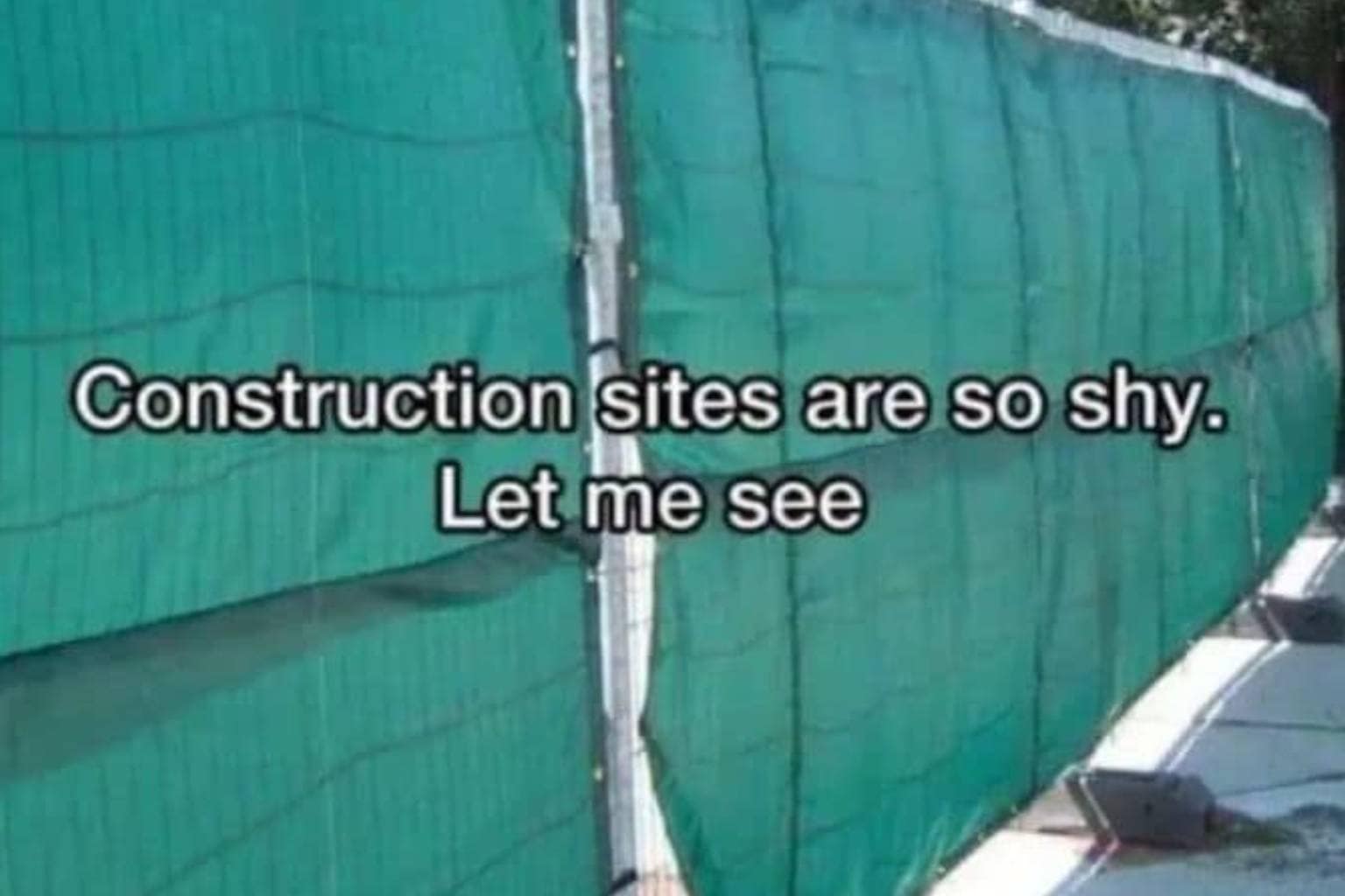
For when you want your capitalistic purchases to feel a little more rustic.
Don't talk to me until my barcode has been properly processed.
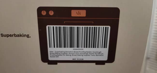
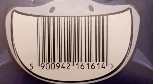
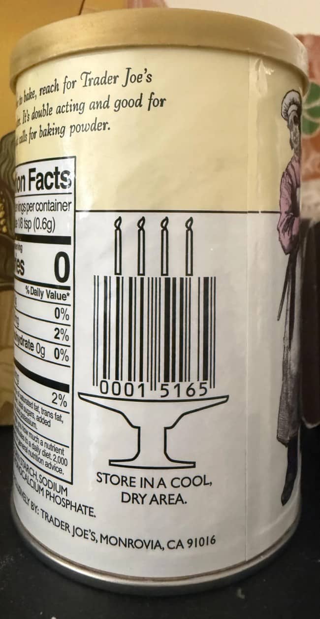
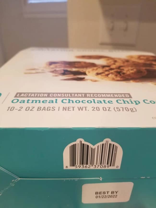
Creative barcodes
Read More
Look, the actual reason this lane of content has produced such an enthusiastic following is that the standard product barcode is, structurally, one of the most boring visual elements in the entire consumer environment, and the people who manage to inject genuine creativity into that exact constraint deserve significantly more attention than they have historically received. The creative packaging design circulating online is essentially the documented evidence of small acts of professional defiance, where somebody who could have done the minimum decided, instead, to turn a logistical requirement into a small visual gift for whoever happens to notice.
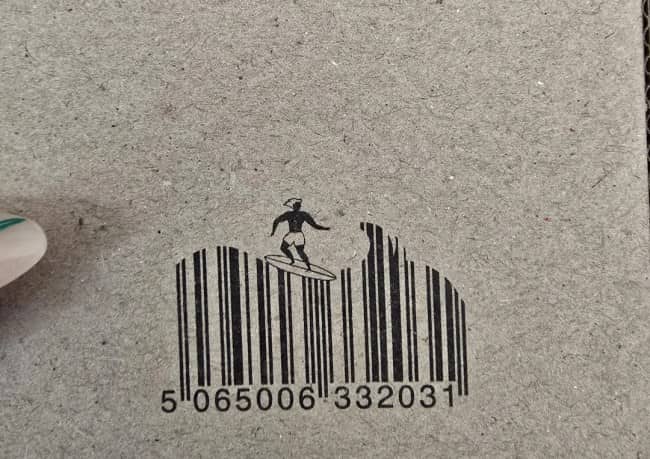
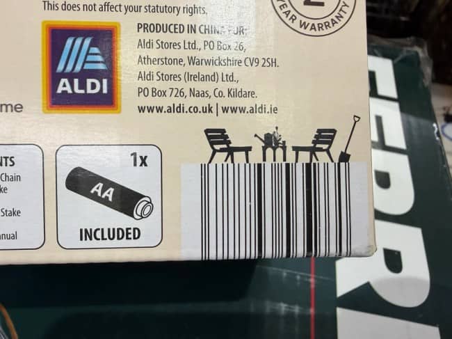
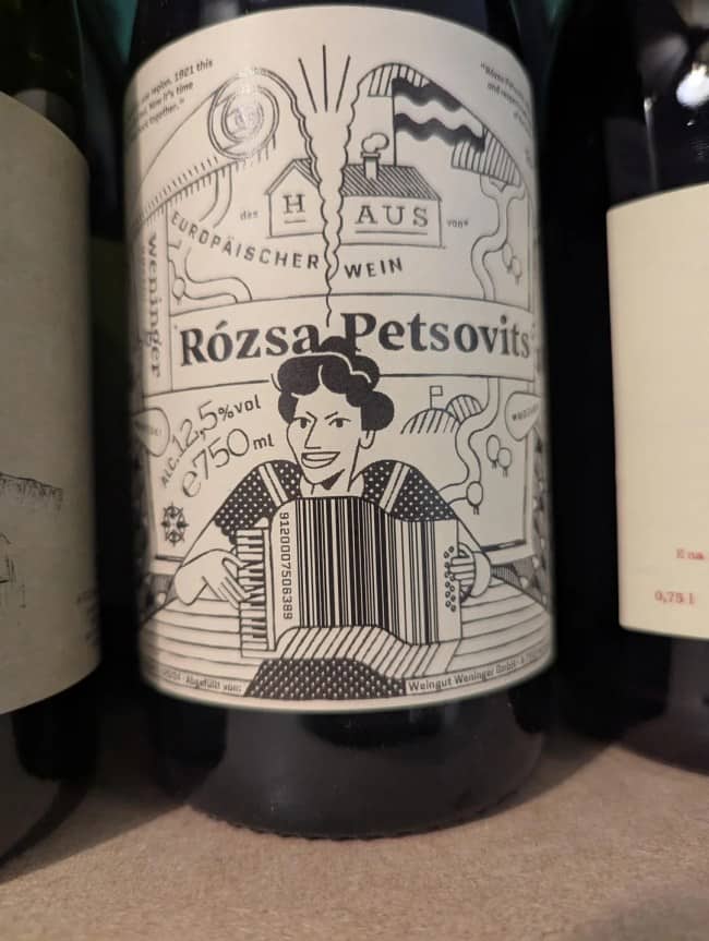
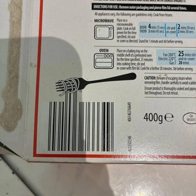
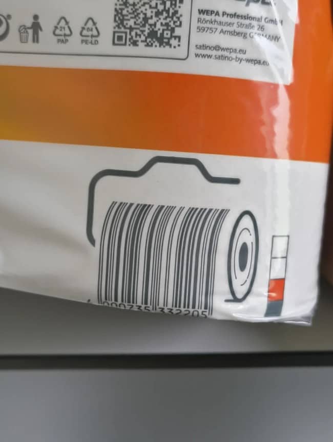
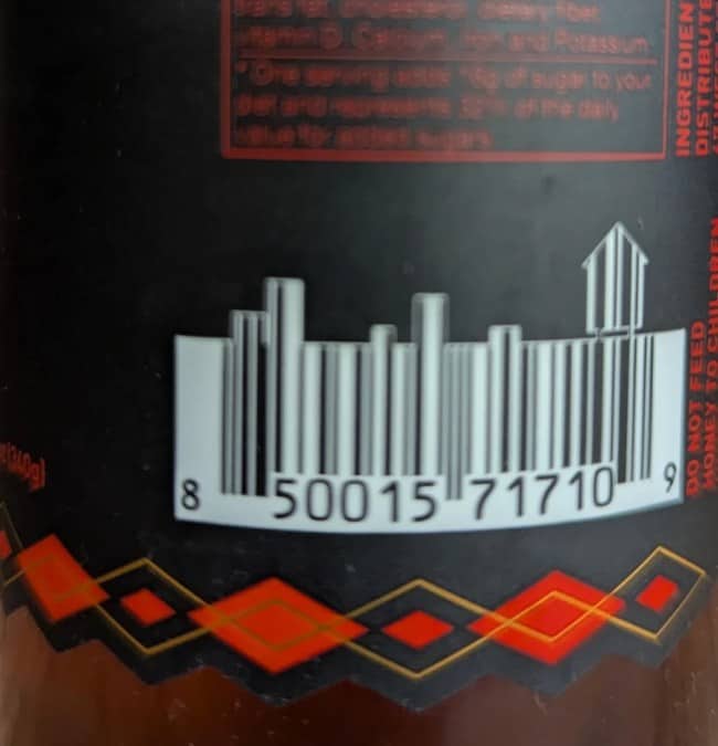
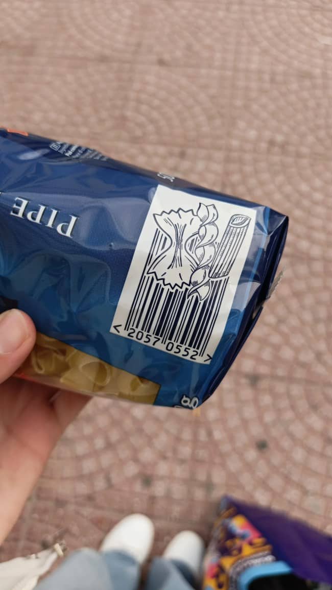
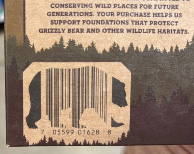
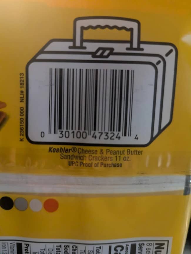
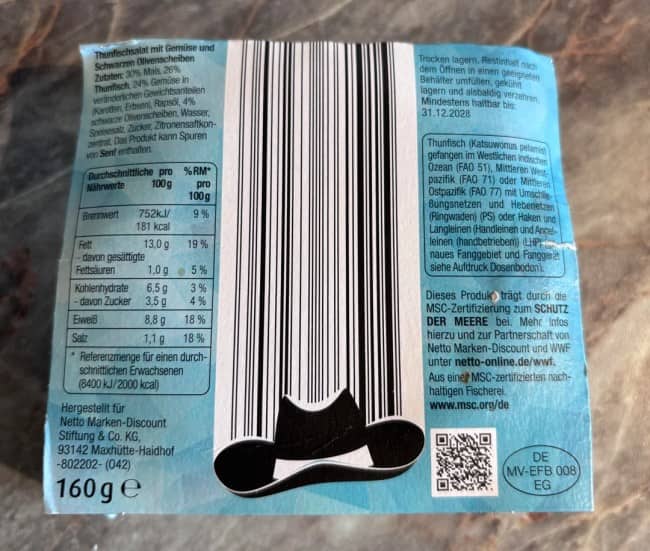
The thematic content specifically is where this gets genuinely impressive. The barcode shaped like a cornfield on a corn product. The barcode shaped like a coffee mug on a coffee product. The funny barcode designs in this lane are essentially documenting a quiet professional category where the constraint is real and the creative response is, somehow, exactly proportionate to the constraint. The thematic integration is what separates the truly inspired barcode from the merely competent one, and the difference is, frankly, where most of the satisfaction lives.
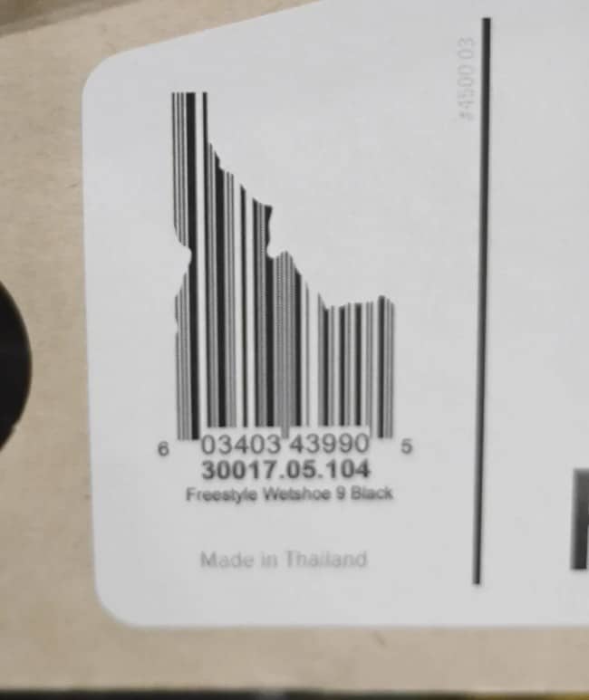
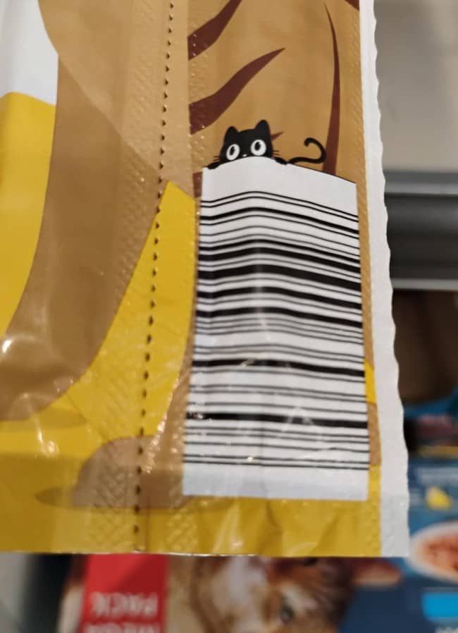
The optical hiding content has its own particular flavor of charm. The cat sneaking over the top of the barcode. The bicycle disappearing into the lines. The clever package design in this category is essentially evidence that the people doing this work have been quietly experimenting with how much character they can sneak into the available real estate without breaking the actual scanning function, and the experimenting is, on close inspection, deeply satisfying to discover.
The larger thing happening across all this packaging content is that the modern consumer environment is, on close inspection, full of small acts of creative effort that the rest of us are not, mostly, paying enough attention to notice. The product is the focus. The packaging is the wrapper. The barcode is, technically, just a logistical necessity. And yet somebody, somewhere, has been turning each of these constraints into a small piece of intentional art, and the noticing is the entire reward for the noticer.
The funny barcode content that endures is the kind that captures this exact dynamic. The audience is not, mostly, looking for product reviews. The audience is looking for small visual gifts hidden in the unglamorous corners of consumer life, and the gifts turn out to be, statistically, more abundant than anybody quite realized. The design is the reward. The reward is, against every consumer instinct, what makes the audience keep looking.
The package is the same. The barcode is, suddenly, an entire small mood. The internet has, finally, found a way to honor the designers who have been quietly improving everyday life for years.
If the hidden design appreciation was your kind of fun, our package art content is right where you’d want to land next, and we’ve got plenty of label design archives, product photography threads, and graphic design appreciation compilations for anyone whose grocery trips involve a slightly more attentive scanning approach. Read the back of every package.
Read Memes
Get Paid

Katie Rodriguez is a seasoned writer with eight years dedicated to meme commentary, viral internet events, and digital storytelling. Formerly a senior meme analyst at Bored Panda and an occasional guest contributor at Vice's Motherboard, Kat specializes in meme culture’s intersection with social media phenomena—covering trends like Milk Crate Challenge, Area 51 Raid, and Baby Yoda. She’s known for her witty writing style and deep understanding of why certain memes resonate across generations, making her a valuable voice on Thunder Dungeon.