Vintage winter olympic posters
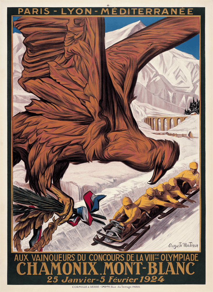
Welcome, welcome, welcome to the magnificent world of vintage Olympic graphic design! Look at these posters! They are absolutely splendid. Nowadays, we get a weird, blobby mascot that looks like a rejected Pokémon, but back in 1924? We got a giant eagle! A giant eagle staring down a bobsleigh team like they owe him money! It is menacing! It is majestic! It is everything the Winter Games should be!
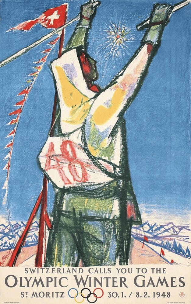
These vintage Winter Olympic posters are a reminder of a time when we didn’t just market sports; we mythologized them. The 1948 St. Moritz poster? It captures the post-war joy of hurling yourself down a mountain with a stick! It screams “We survived, now let’s ski!” It is art, plain and simple. We have lost that sense of grandeur, replacing it with corporate minimalism, and frankly, it is a tragedy. Bring back the eagles! Bring back the drama!
Before digital rendering and minimalist logos took over, the Olympic Games were advertised with stunning, hand-drawn art. We have collected the most striking, dramatic, and historically significant posters from the early days of winter sports.


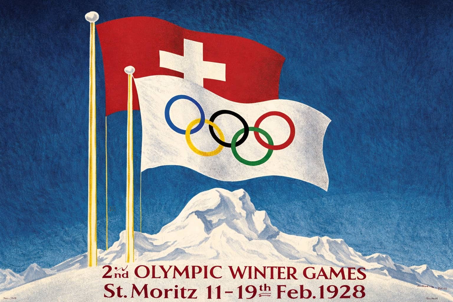
The 1928 St. Moritz poster is so clean it hurts. It is the Swiss flag, some rings, and a mountain. That is all you need! It says, “Come to Switzerland, it is cold and we are neutral.” These designs are timeless. They make me want to put on a wool sweater and attempt a sport I am physically unqualified for.
If you are feeling the Olympic spirit, keep the torch burning. We recommend checking out vintage sports photos, olympic history facts, and retro design blogs for more athletic art.
Read Memes
Get Paid

Laura Bennett has spent eight years immersed in internet culture, specializing in deep dives into meme origins, evolving meme trends, and digital subcultures. As a contributor for several prominent online platforms, including BuzzFeed’s meme division and Know Your Meme, she’s written extensively about viral moments from Crying Jordan to Woman Yelling at a Cat. Laura believes memes aren't just internet jokes—they're modern-day folklore. She brings that passion to Thunder Dungeon by keeping readers connected to what's culturally significant, hilarious, and timelessly viral.