Worst logo redesigns
Look at it! Just look at it! It is bland! It is boring! It is RAW! Why do companies do this? They take a perfectly good, iconic logo with heritage and soul, and they put it in a blender until it is just a flat, soulless mush! It is disgusting! The Cracker Barrel logo used to look like a cracker barrel. Now it looks like a clipart disaster made by a toddler with a mouse!
These worst logo redesigns make me want to scream. Pepsi? It looks like a cheap sticker! Tropicana? You ruined the juice! People couldn’t find the orange juice because you took the orange off the box! You donuts! It is design malpractice. It is lazy, it is cheap, and it insults the customer. Get out!
Rebranding is a risky business, and these companies failed spectacularly. We have compiled the most hated, confusing, and downright ugly design updates that prove “modern” isn’t always better. From minimalist disasters to creepy mascots, here are the redesigns that flopped.
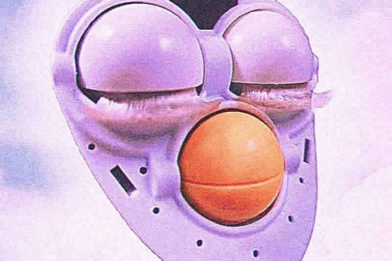
The Cinnamon Toast Crunch squares are nightmare fuel. Why do they have human eyes? It is disturbing. These redesigns prove that sometimes, you just need to leave things alone. If it isn’t broken, don’t flatten it into a vector file and ruin everyone’s childhood. It is a shame.
If you enjoy criticizing bad design choices, there is plenty more to roast. Look up graphic design fails, bad packaging, and corporate cringe for more visual disasters.
Read Memes
Get Paid

Katie Rodriguez is a seasoned writer with eight years dedicated to meme commentary, viral internet events, and digital storytelling. Formerly a senior meme analyst at Bored Panda and an occasional guest contributor at Vice's Motherboard, Kat specializes in meme culture’s intersection with social media phenomena—covering trends like Milk Crate Challenge, Area 51 Raid, and Baby Yoda. She’s known for her witty writing style and deep understanding of why certain memes resonate across generations, making her a valuable voice on Thunder Dungeon.