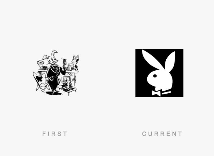
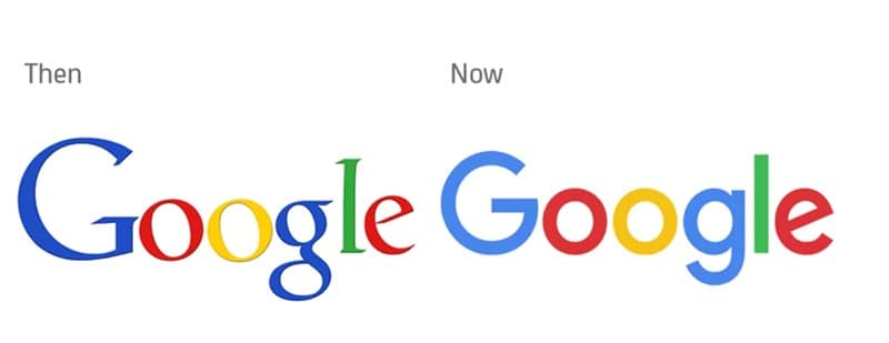
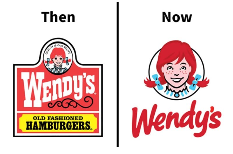
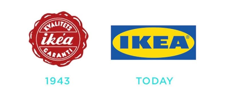
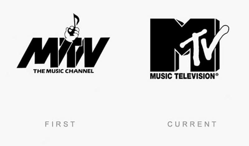
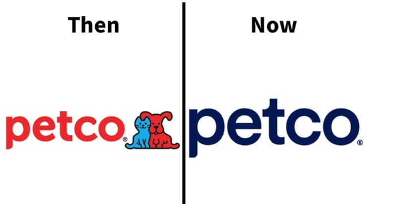
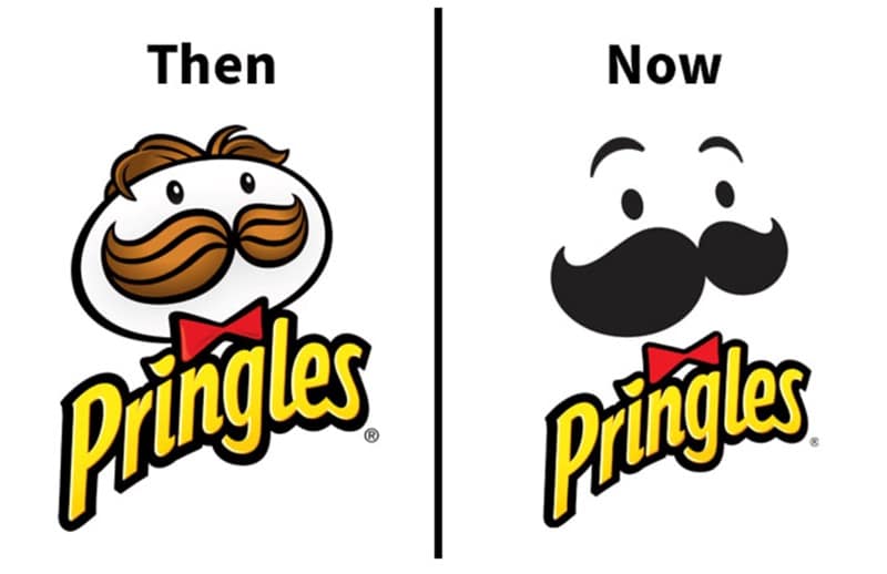
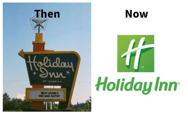
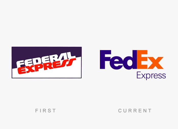
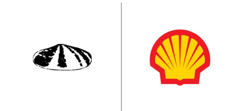
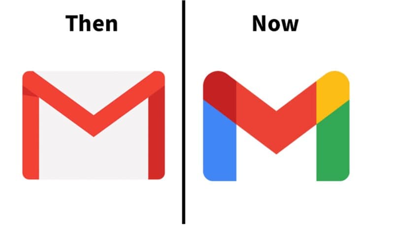
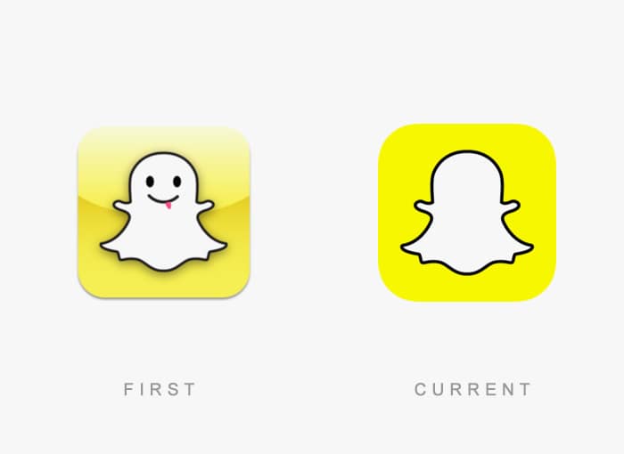
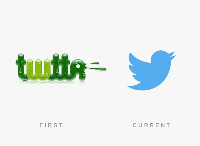
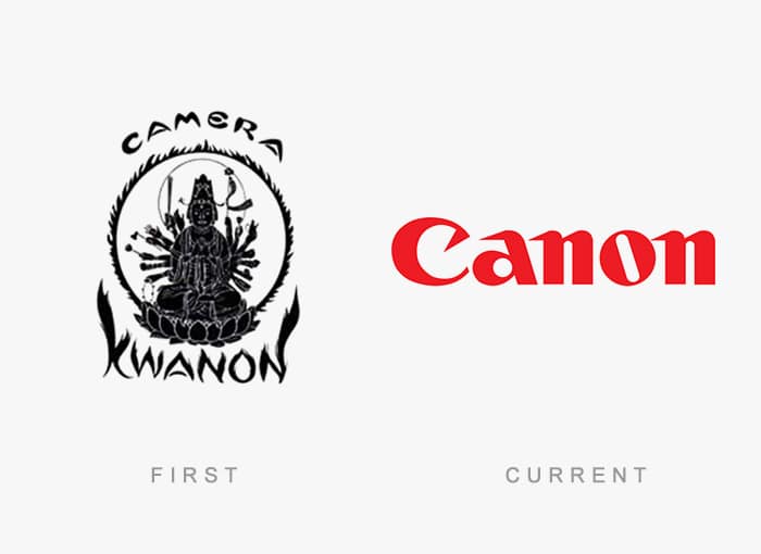
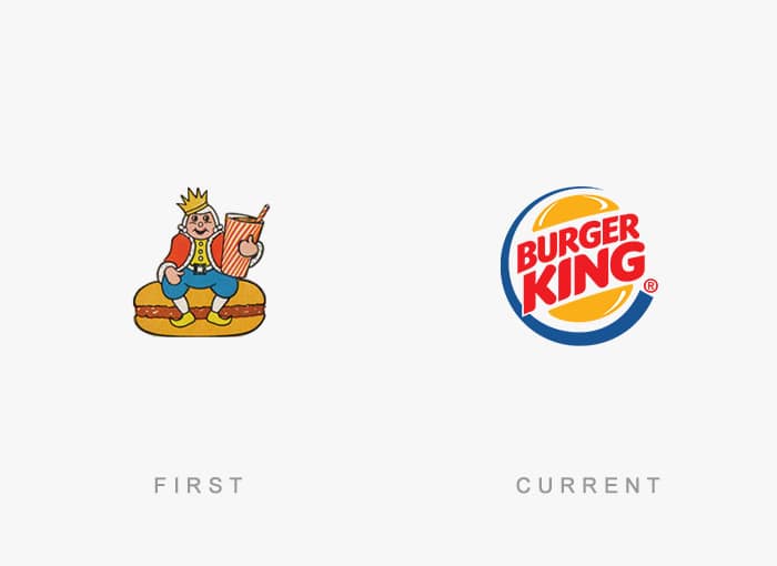
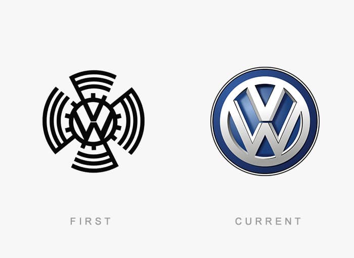
Famous logos then and now
Logos are the face of a brand, which makes looking at their early versions like digging through someone’s old yearbook photos. It’s all awkward fonts, questionable color choices, and mascots that have since been quietly retired. Some redesigns make sense—modern, streamlined, easy on the eyes. Others feel like someone just got bored in Photoshop and decided to mess with something that wasn’t broken. But it’s fascinating to see the journey. From intricate hand-drawn crests to minimalist shapes that could double as app icons, these transformations reflect not just design trends but also how brands want to be seen. Sometimes it’s about relevance. Sometimes it’s about rebranding after a PR disaster. And sometimes it’s just to keep the design department busy. Whether you think the changes are improvements or crimes against branding, you can’t deny it’s a fun trip through design history.
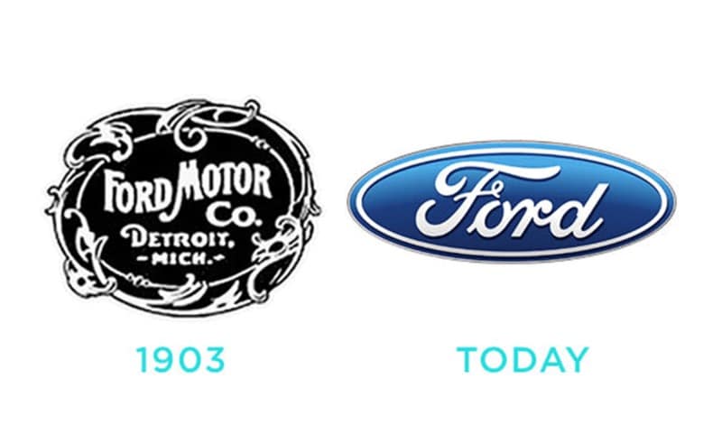
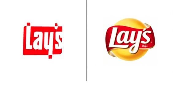
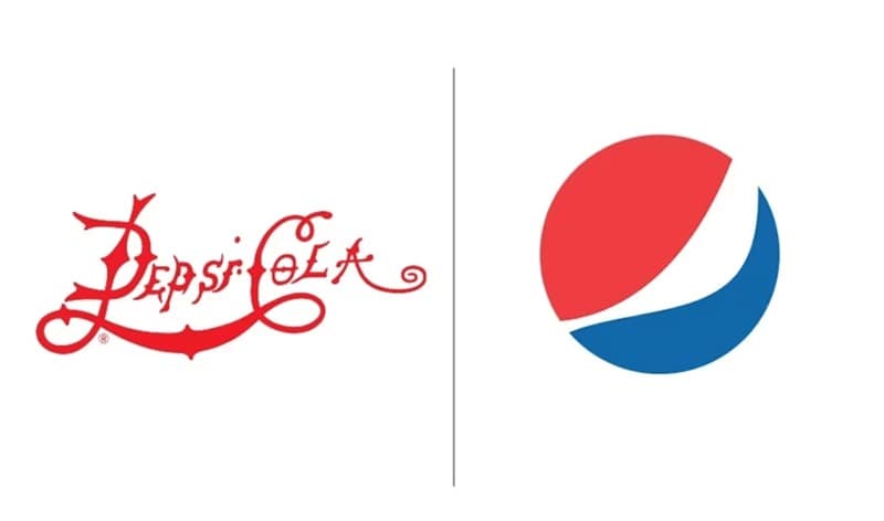
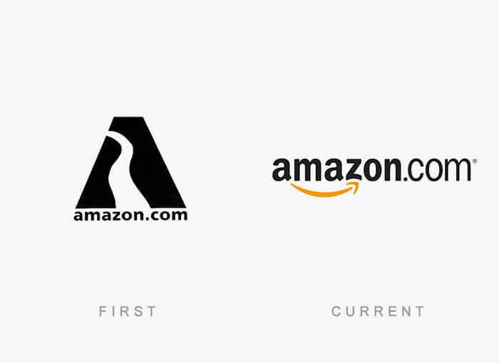
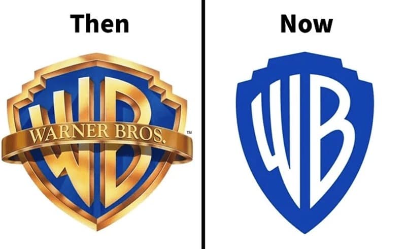
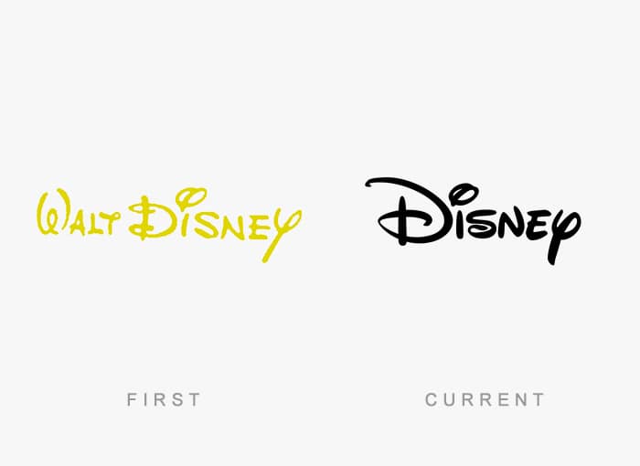
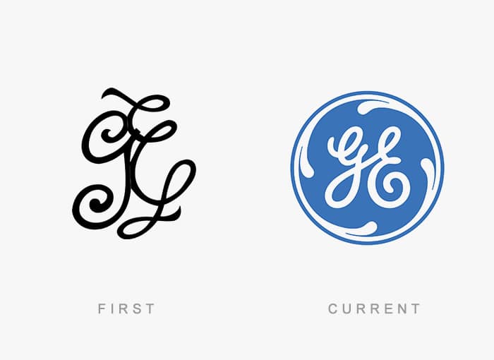
Here are 50 side-by-side comparisons of famous brand logos from their earliest days to their current versions. You’ll see iconic companies that kept their core identity intact while modernizing their look, as well as brands that went through complete personality shifts. Some will make you nostalgic. Others will make you wonder what the boardroom conversation sounded like.


Looking at these logo evolutions, you realize that branding is just as much about fashion as clothes are. Trends change. Fonts go in and out of style. And the color palettes of the 70s? They’ve been buried for good reason. But while some redesigns are clear improvements, others feel like they’ve stripped the soul out of the original. The best logos manage to evolve while still being instantly recognizable. The worst look like they were created for an entirely different company. Either way, they’re a fascinating reminder that nothing in design is permanent.
If you enjoyed this logo time travel, explore more posts on retro branding, packaging changes, rebranding hits and misses, and design nostalgia. The evolution never really ends.
Read Memes
Get Paid

Roy R., Chief Meme Curator
Roy founded Thunder Dungeon in 2012 and has since guided its growth into a 2.5 million‑strong community of meme enthusiasts. With over a decade of digital‑media experience and a nose for viral humor, Roy oversees content strategy, ensuring every post is both hilarious and high‑quality