This funny twitter thread about maps is what happens when someone asks an innocent question and the internet responds with both a lecture and a roast, at the same time. If you’re into Mercator projection drama, map projection facts, and geography jokes that make you feel smarter and pettier in one scroll, you’re going to love this.
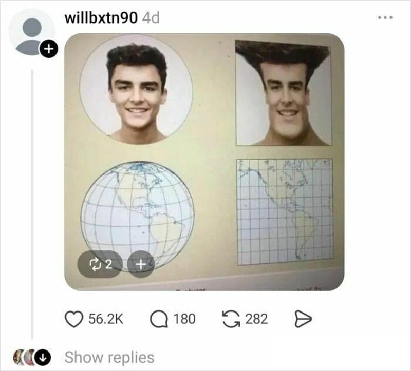
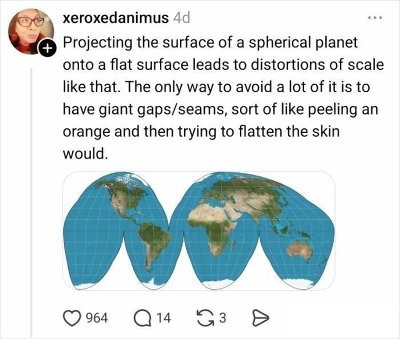


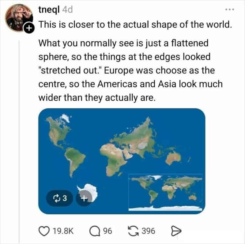

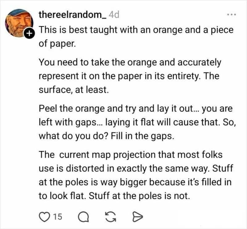

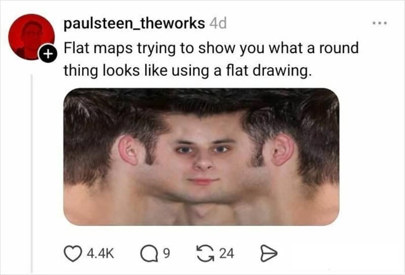
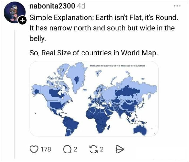
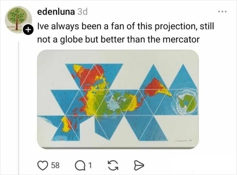


The first reason this thread is so good is the perfect blend of helpful and chaotic. People genuinely try to explain the problem—how you can’t flatten a sphere without distortion—but they do it with the internet’s favorite teaching style: a visual analogy so cursed you remember it forever. That’s peak map projection content, because once you see a “this is what flattening looks like” example, your brain never goes back to the classroom wall version.
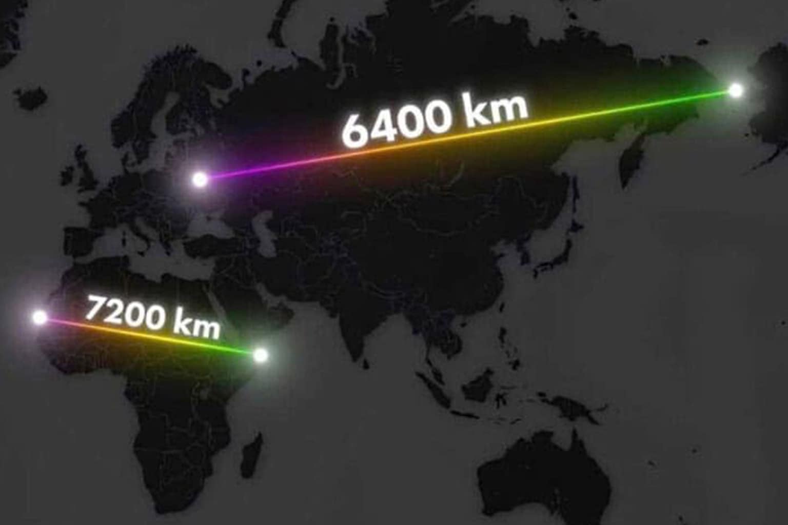
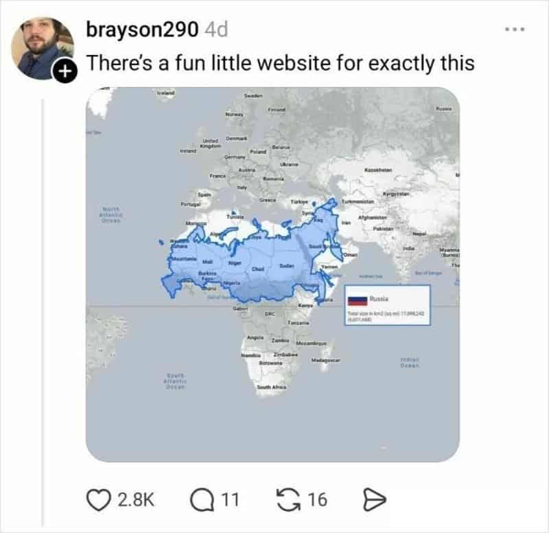
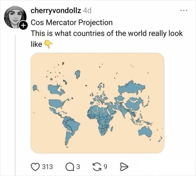
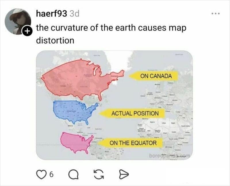
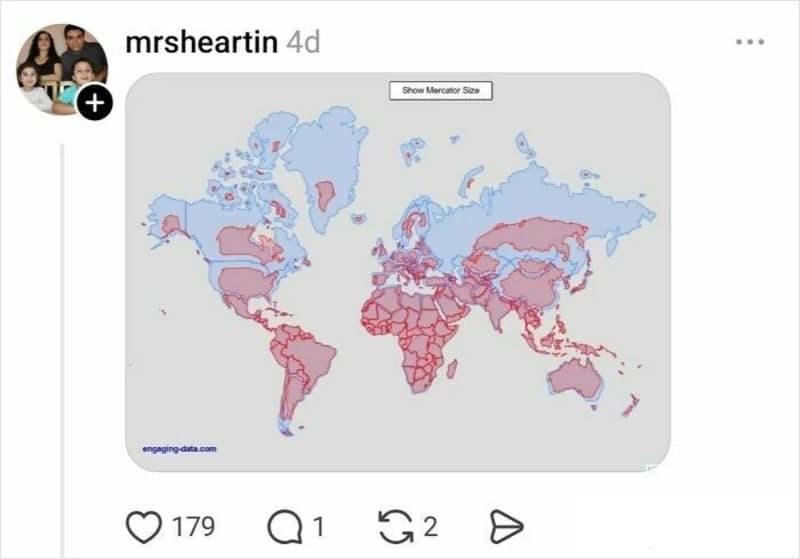
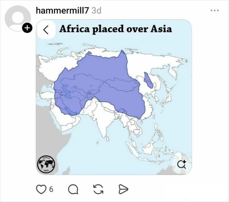
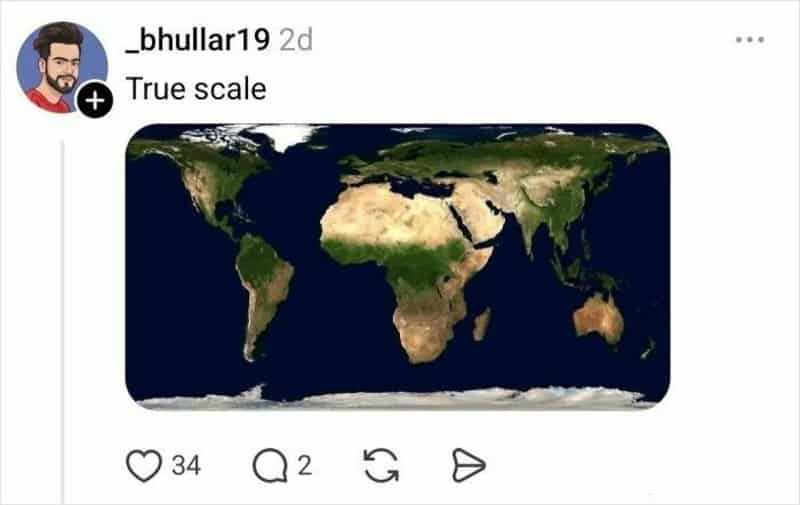
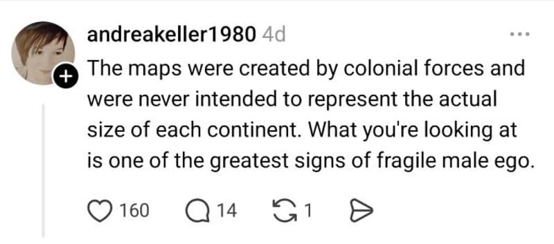
Then there’s the collective “wait… so the maps were lying?” moment, which is honestly a rite of passage. A lot of us grew up staring at the Mercator projection and absorbing its vibes without realizing it exaggerates landmasses near the poles. The thread turns that realization into comedy, and the jokes land because the surprise is real. Geography jokes hit hardest when they’re built on that little spark of learning—like a meme that also rewires your sense of scale.
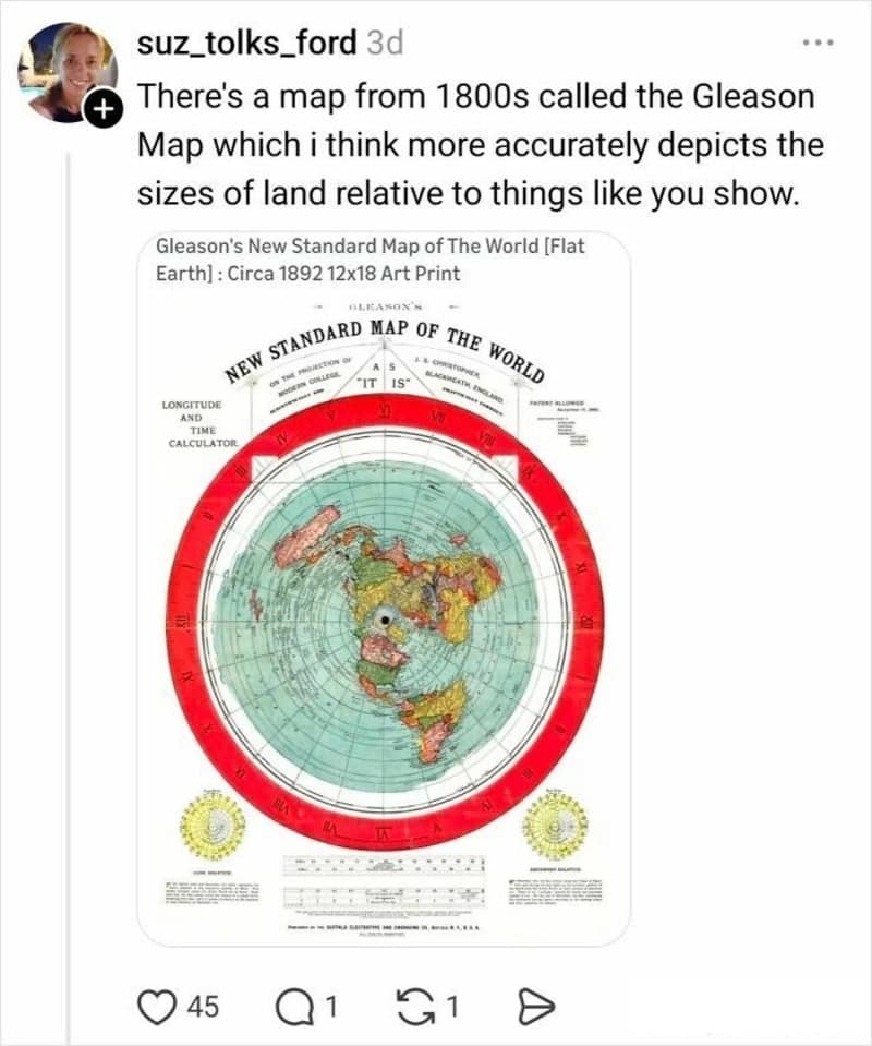
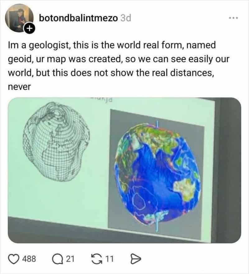
The third theme is the tone of the replies: equal parts professor and group chat menace. Some people summarize it in the simplest possible terms, others arrive with full cartography receipts, and a few choose pure sarcasm as their teaching method. It’s a reminder that the internet can be a genuinely good classroom… as long as you’re okay with getting lightly cooked while you learn.
And when it’s done, you’re left with two things: respect for map projection facts, and the urge to drag outlines around a “true size” tool for the rest of the night like it’s a new hobby. That’s how you know a thread is elite.
If you want more “I learned something against my will” energy, go for 40 Interesting Maps That Will Change How You See The World, 30 Geography Memes That Sound Fake But Aren’t, and 30 Data Visualizations That Made Me Stop Scrolling.
I’m Katie Rodriguez, and I love when the internet teaches a real lesson while still being hilarious about it—because apparently that’s the only way my brain fully commits.
Read Memes
Get Paid

Katie Rodriguez is a seasoned writer with eight years dedicated to meme commentary, viral internet events, and digital storytelling. Formerly a senior meme analyst at Bored Panda and an occasional guest contributor at Vice's Motherboard, Kat specializes in meme culture’s intersection with social media phenomena—covering trends like Milk Crate Challenge, Area 51 Raid, and Baby Yoda. She’s known for her witty writing style and deep understanding of why certain memes resonate across generations, making her a valuable voice on Thunder Dungeon.