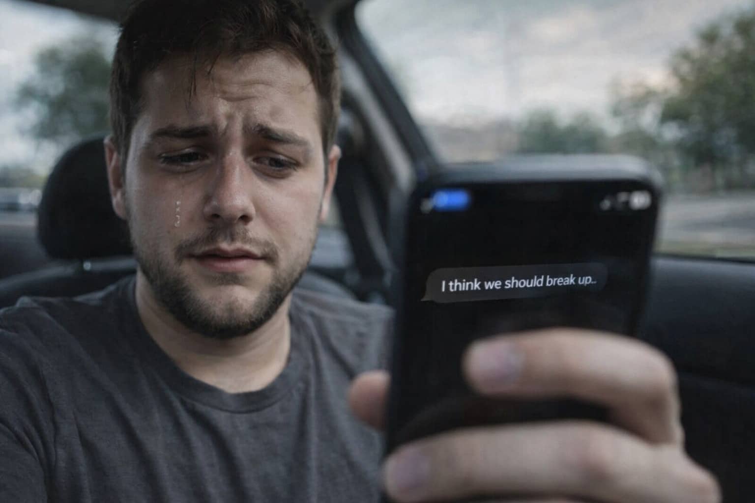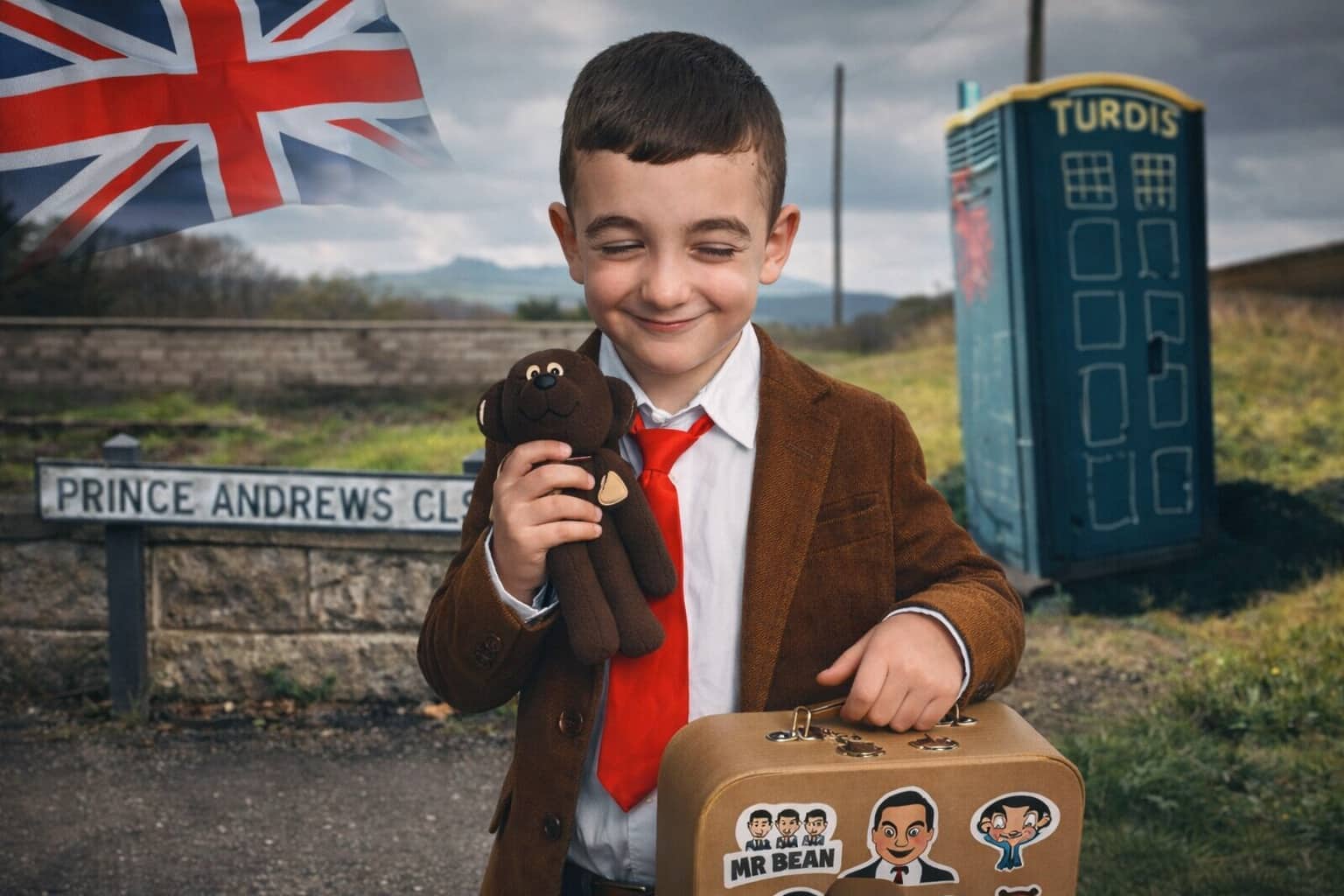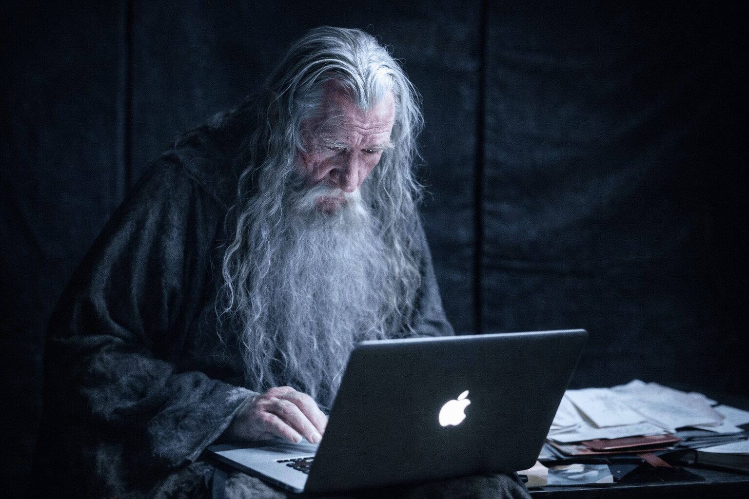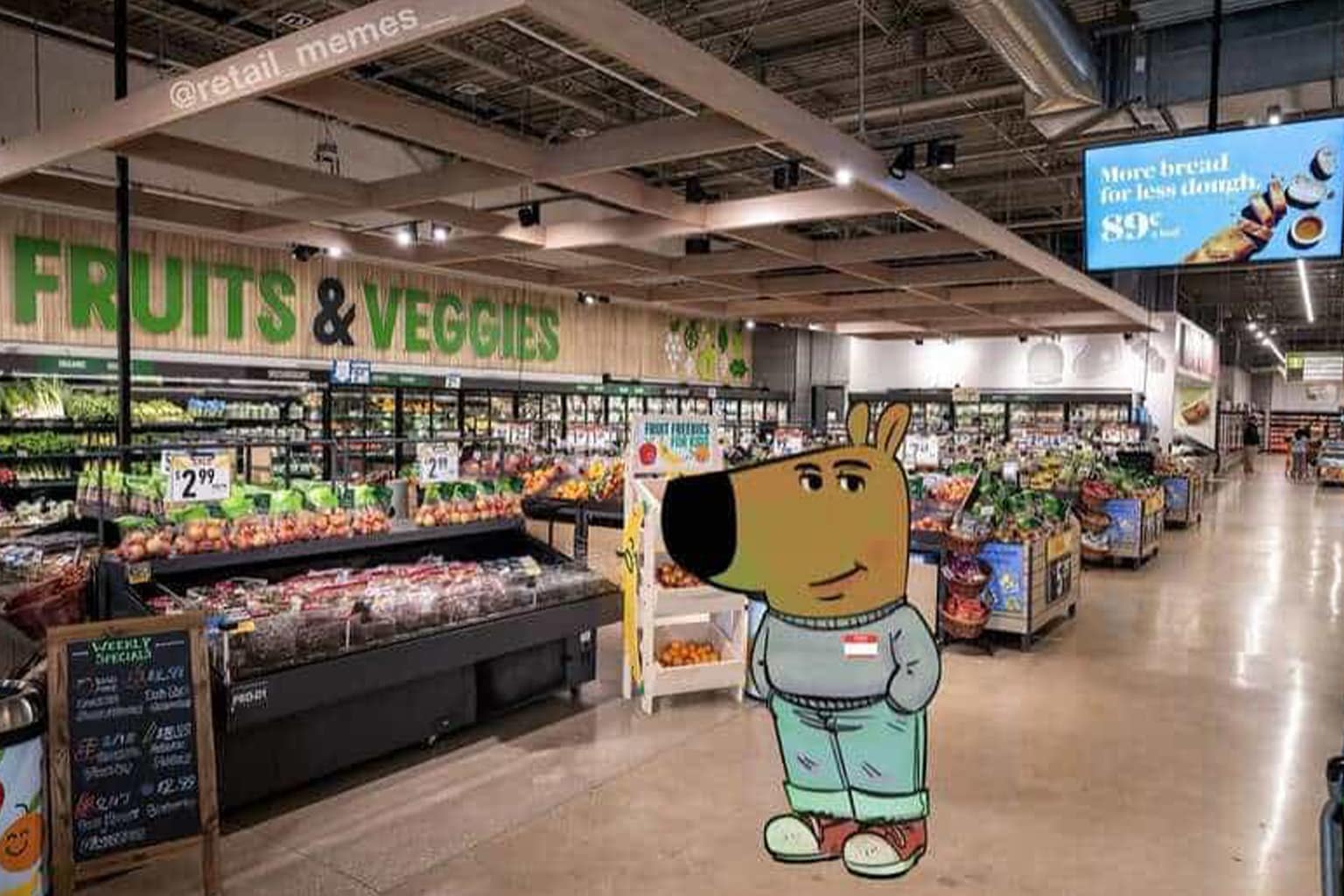
These unfortunate designs are proof that sometimes the human brain sees one shape, and suddenly you can’t unsee it. If you’re into design fails, bad design, and anything accidentally NSFW that’s clearly unintentional, this gallery is going to have you giggling like you shouldn’t.
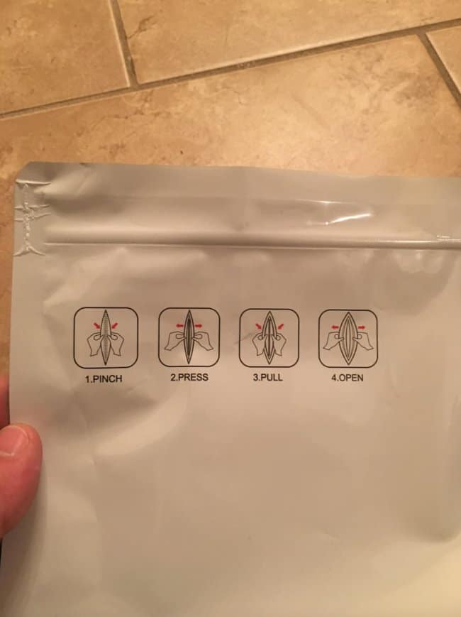

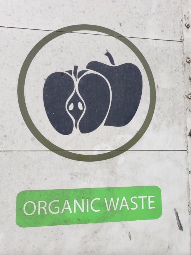
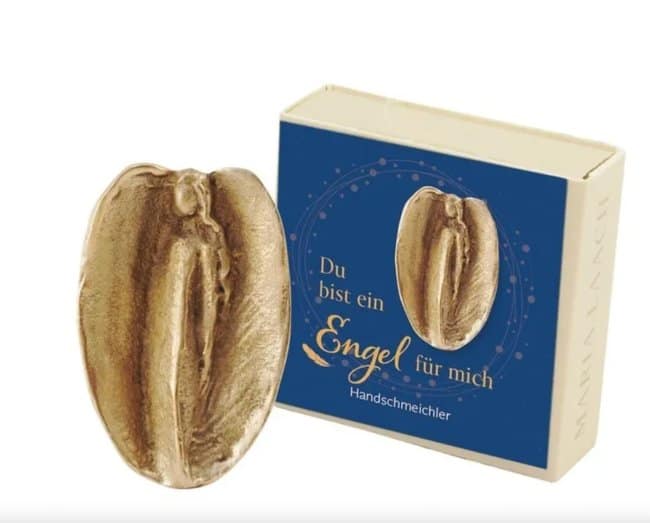
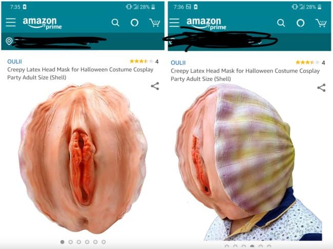
What makes this kind of collection so funny is that it’s not trying to be edgy—it’s just everyday stuff getting betrayed by angles, folds, and overconfident graphic choices. A simple logo, a map, or a “helpful” instruction diagram suddenly reads like a biology lesson, and your brain immediately goes, “Nope, that’s not what you meant.” The best design fails are the ones where you can tell someone, somewhere, signed off proudly… and then the internet did what it does.
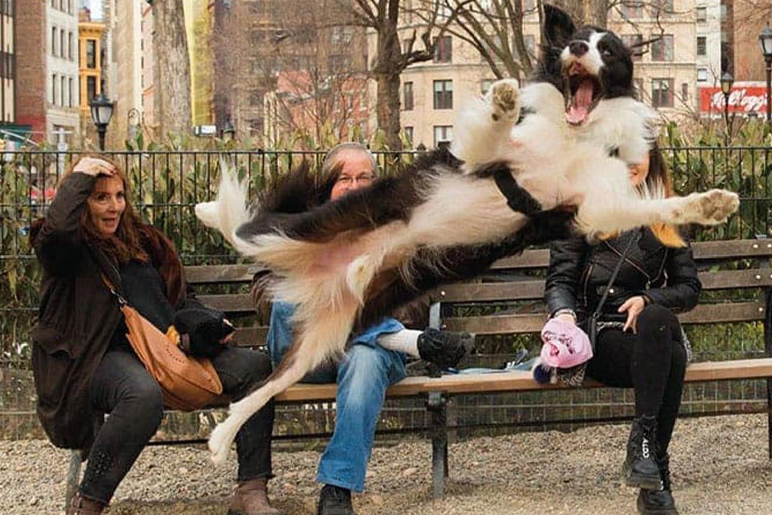
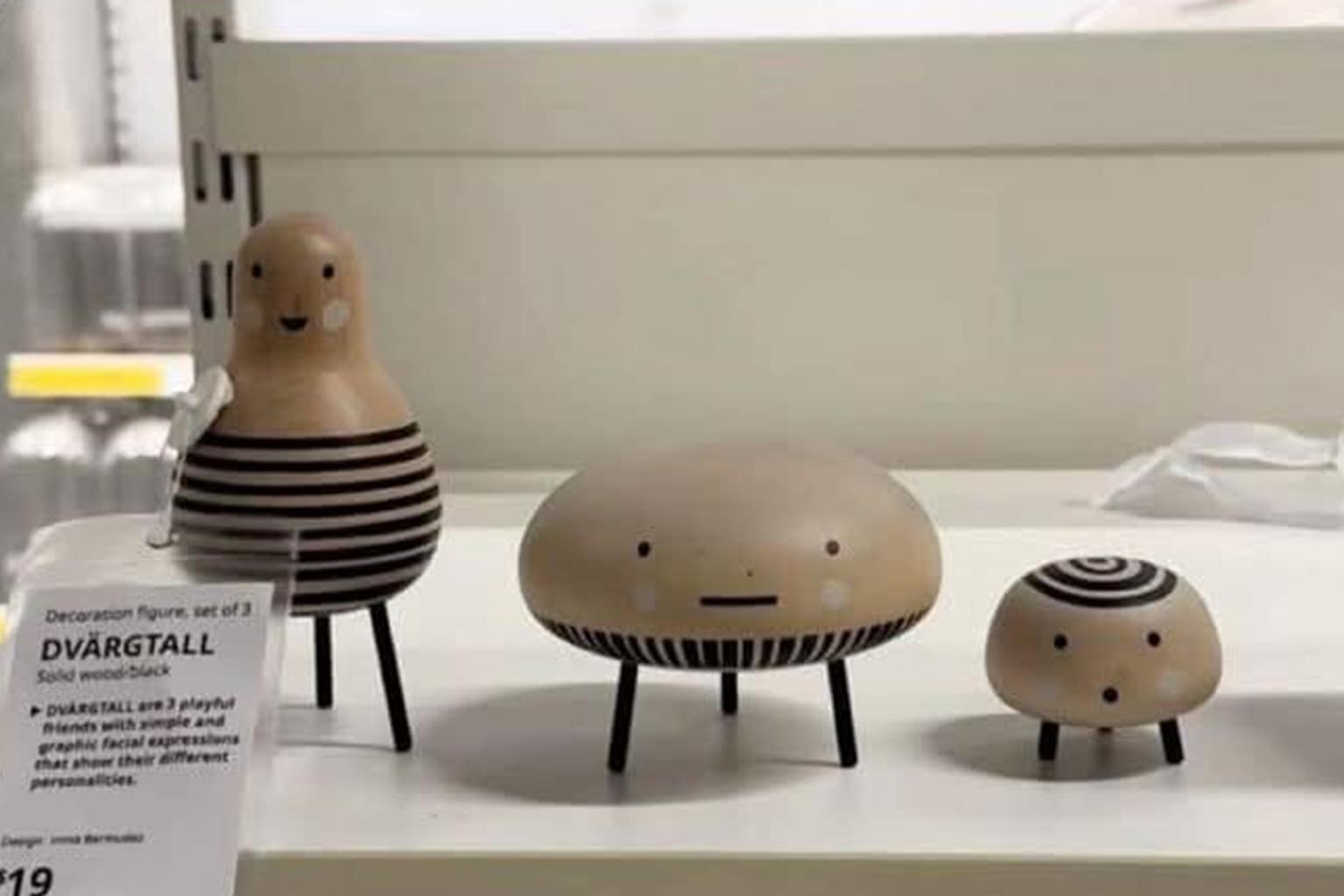
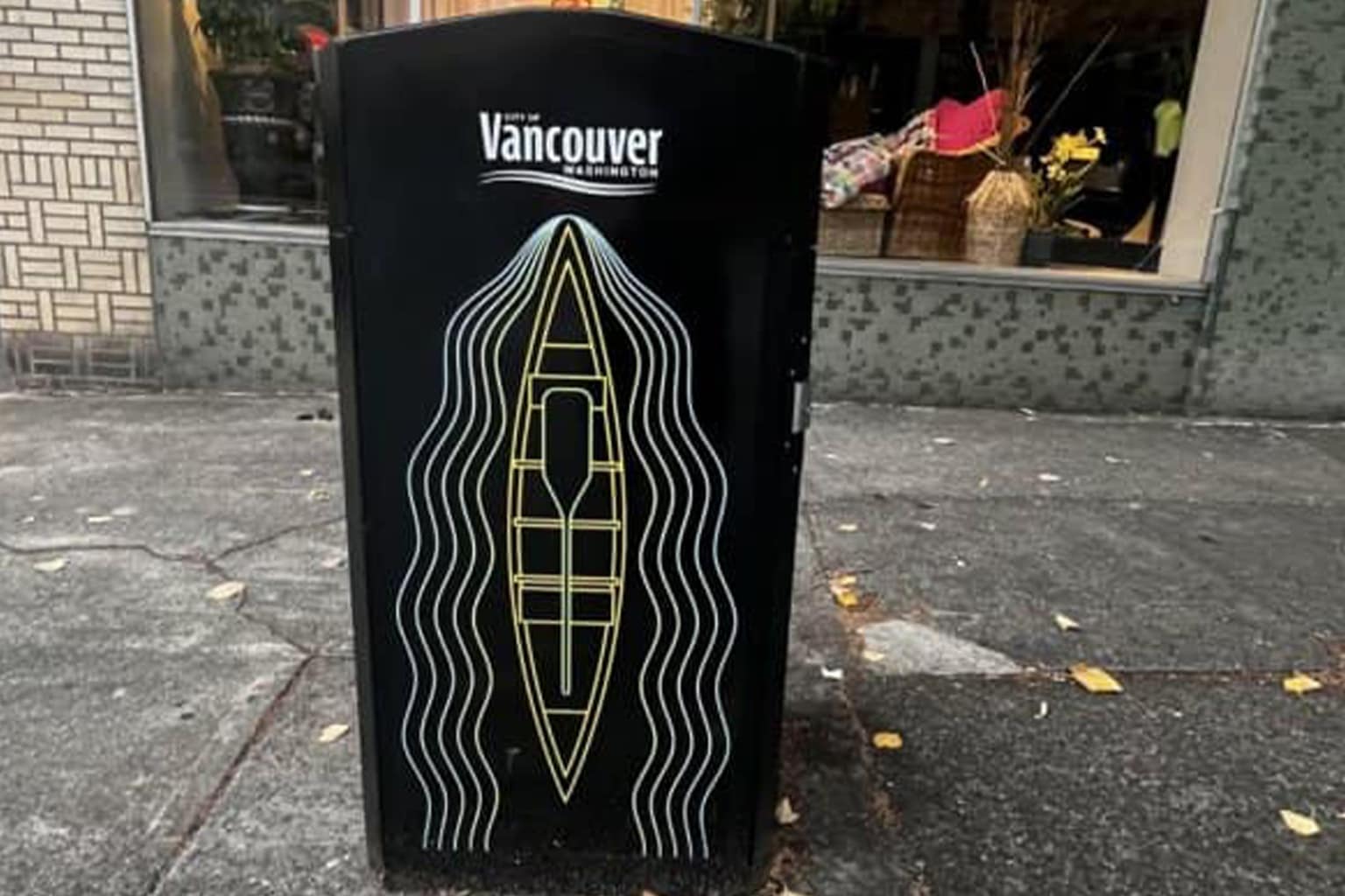
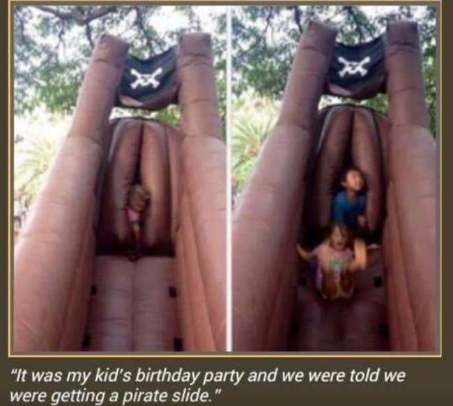
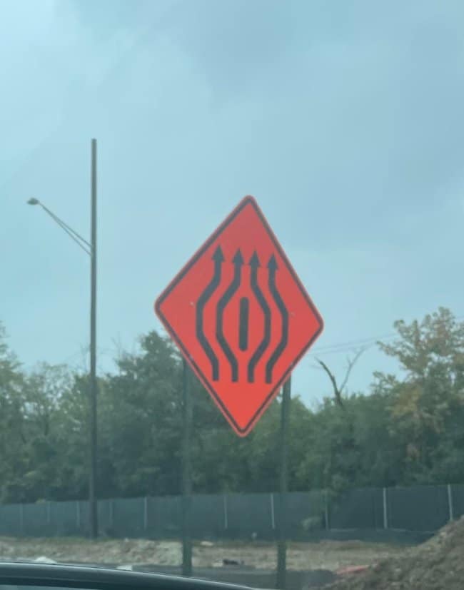
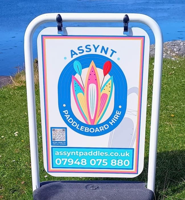
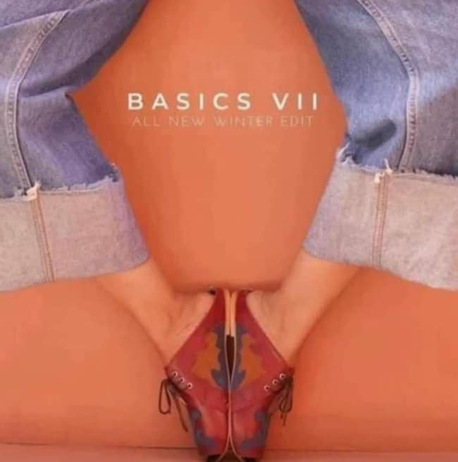
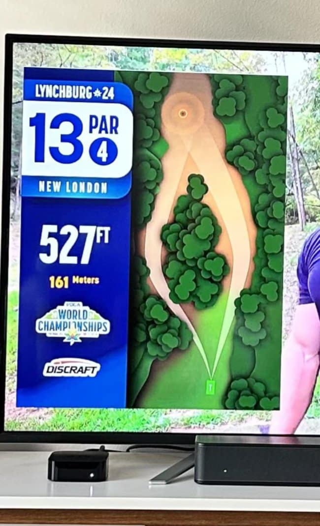
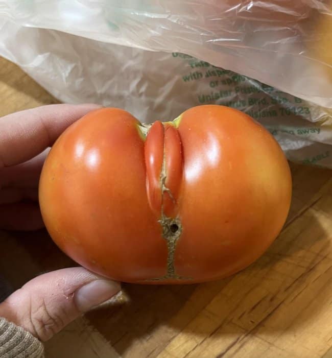
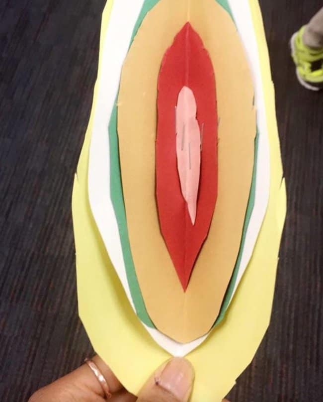
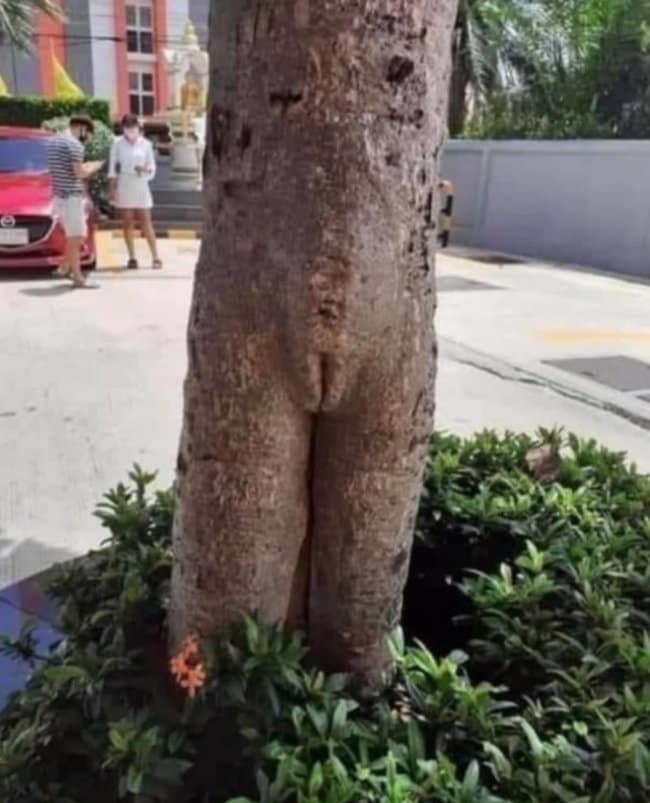
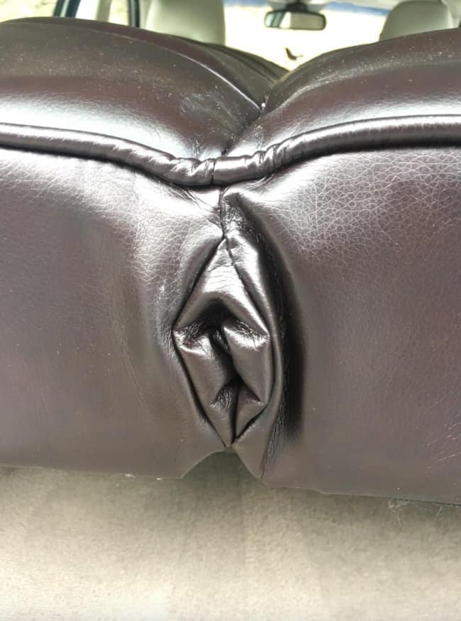
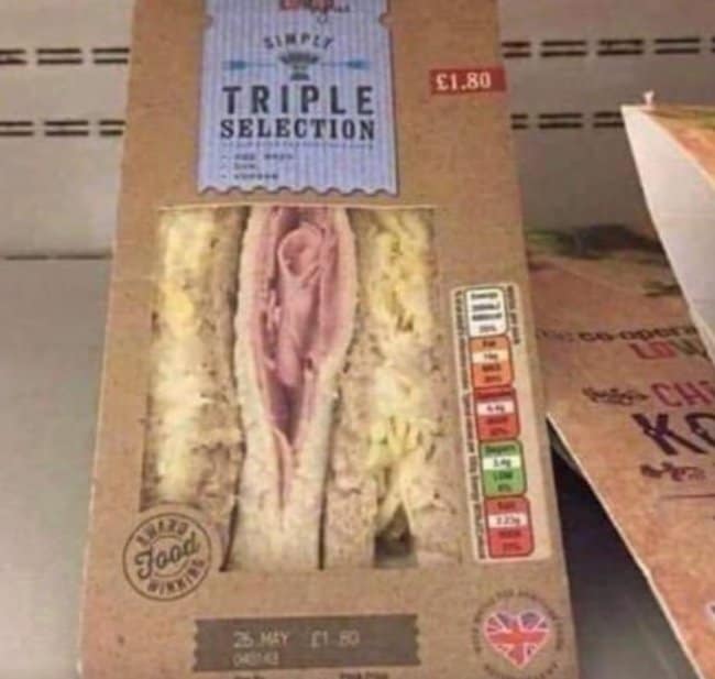
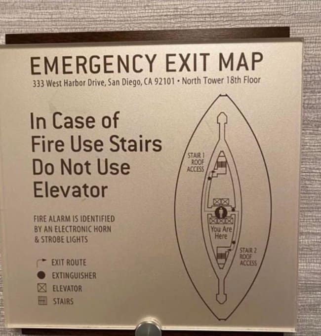
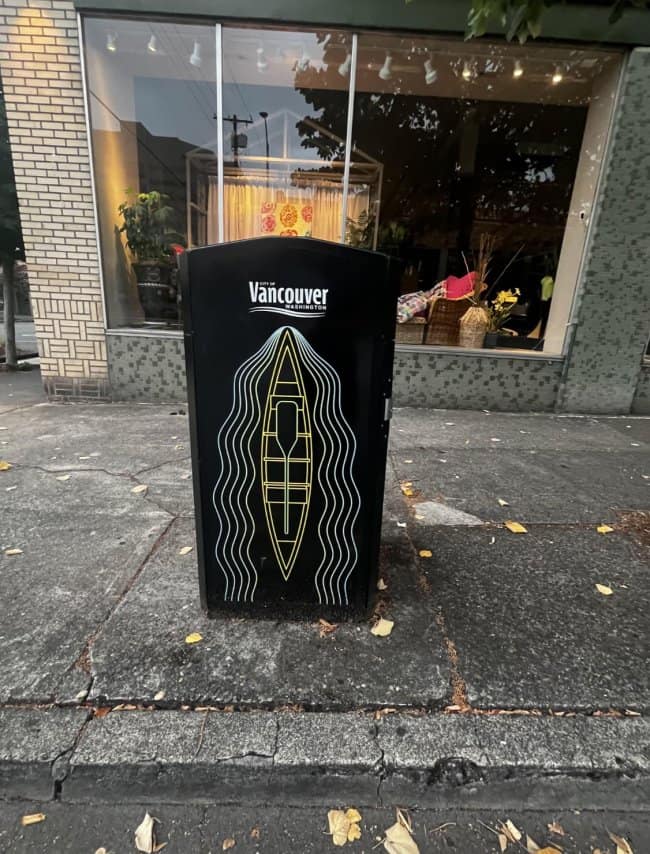
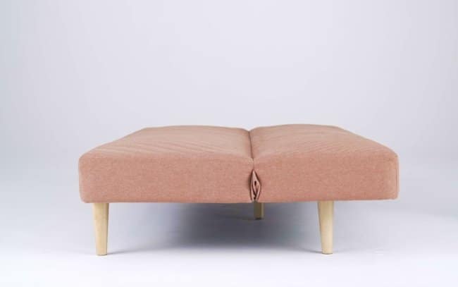
Another theme is how physical objects are basically chaos artists. Fabric creases, upholstery seams, food layers, inflatable shapes, and even nature itself can line up in the most unfortunate way possible. It’s classic bad design energy, except half the time it’s not even “design” so much as geometry having a prankish little moment. Add context—like placement on clothing or the way a sign stacks shapes—and suddenly it’s a full accidental optical illusion.
And then there are the unfortunate designs that feel like they should’ve been caught in a five-second review. Sometimes all it takes is one person to squint and say, “Hey, maybe rotate that,” but nobody did, and now it’s accidentally NSFW forever. Honestly, it’s kind of wholesome in a weird way: a reminder that our brains are pattern-spotting machines and we all laugh at the exact same “wait a minute” moment.
If you’re in the mood for more scroll-worthy chaos, go next to 27 Signs That Accidentally Started A Fight With The Internet, 17 Packaging Choices That Needed A Second Opinion, and 45 Funny Maps That Raised Too Many Questions.
I’m Katie Rodriguez, and I love collecting the kind of harmless internet hilarity that turns an ordinary day into a shared laugh.
Read Memes
Get Paid
Katie Rodriguez is a seasoned writer with eight years dedicated to meme commentary, viral internet events, and digital storytelling. Formerly a senior meme analyst at Bored Panda and an occasional guest contributor at Vice's Motherboard, Kat specializes in meme culture’s intersection with social media phenomena—covering trends like Milk Crate Challenge, Area 51 Raid, and Baby Yoda. She’s known for her witty writing style and deep understanding of why certain memes resonate across generations, making her a valuable voice on Thunder Dungeon.