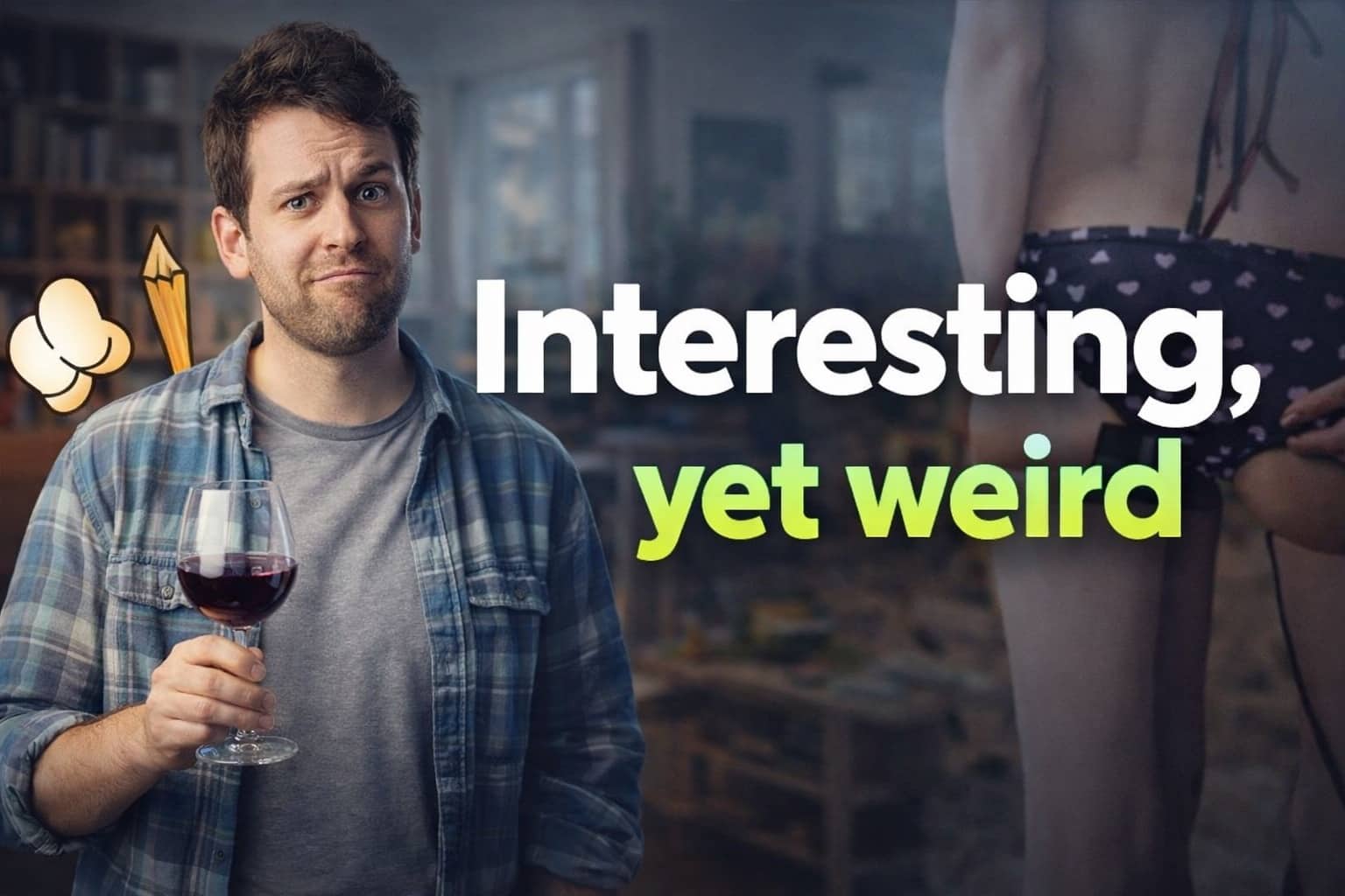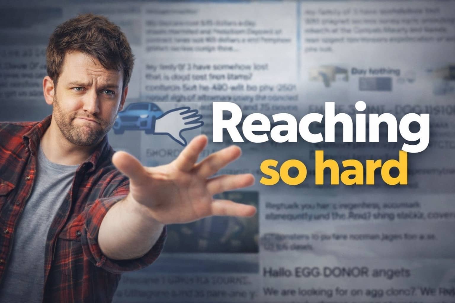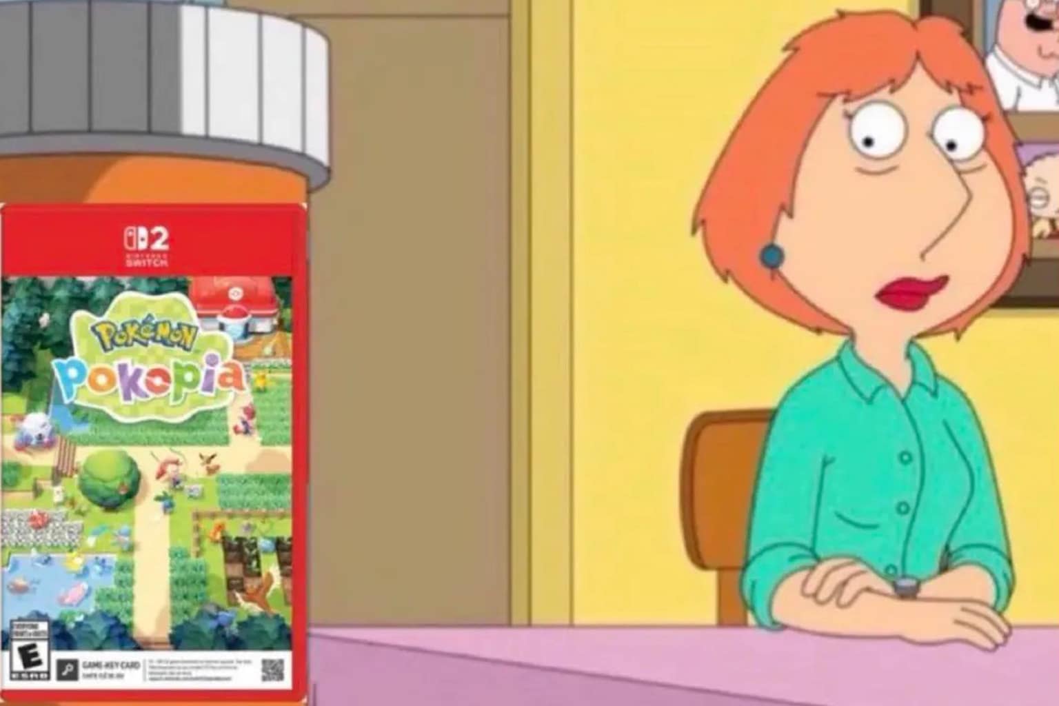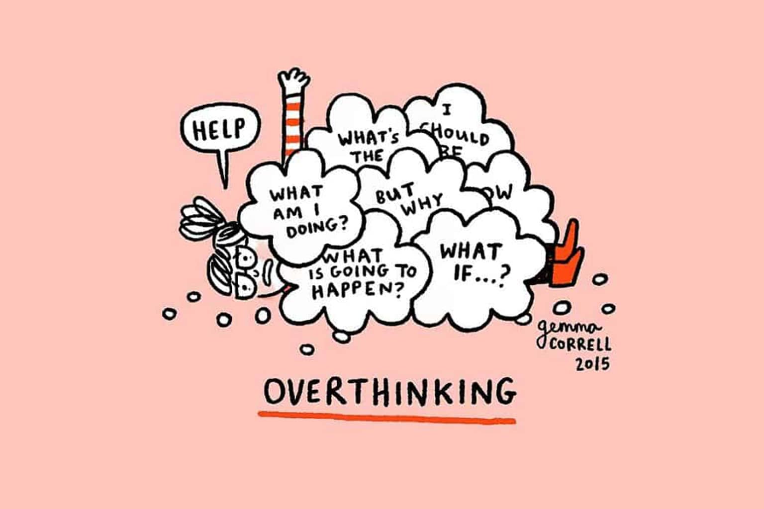

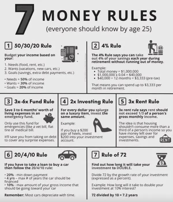
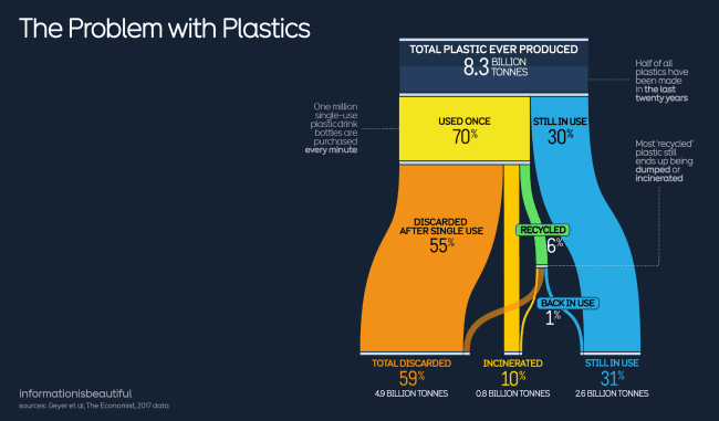
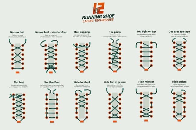
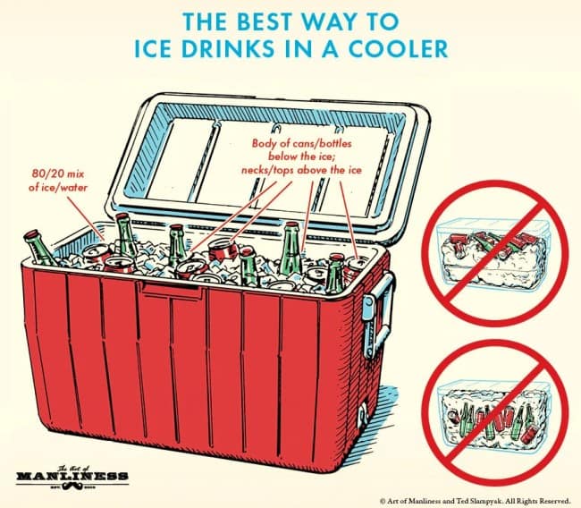
Smart charts
We live in a world drowning in information, and somehow, these smart charts make it all make sense—usually with sarcasm. These are the infographics, diagrams, and data visualizations that manage to be both educational and hilarious. They break down everyday nonsense like procrastination, relationships, and snack habits with more accuracy than most scientists.
The beauty of smart charts is that they tell the truth in the funniest way possible. They don’t overcomplicate; they just expose how ridiculous everything is when you actually map it out. You don’t need a PhD to appreciate these—you just need a Wi-Fi connection and a willingness to laugh at your own bad decisions.
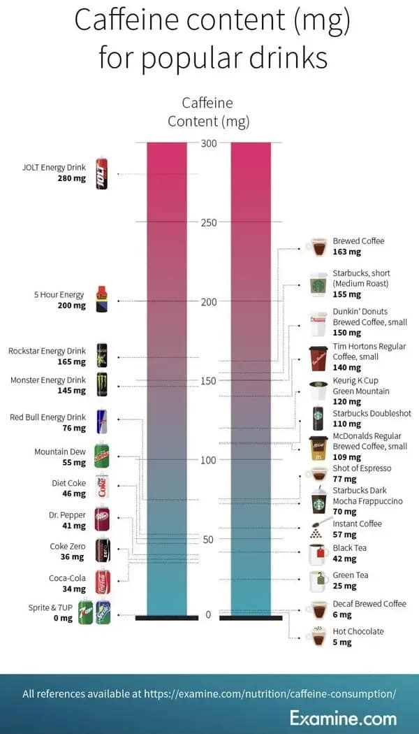
These smart charts explain the world better than any classroom ever could. From graphs that reveal how caffeine controls our souls to pie charts breaking down why we procrastinate, every one hits a little too close to home. They’re funny, insightful, and weirdly useful in ways you’ll never admit out loud. Prepare to feel educated—sort of.
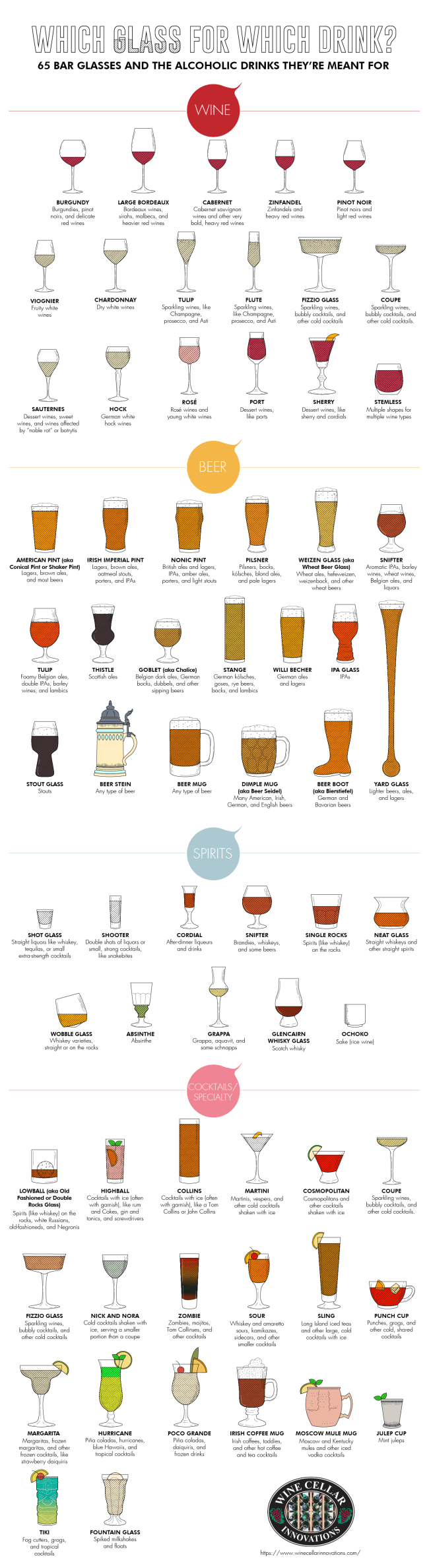
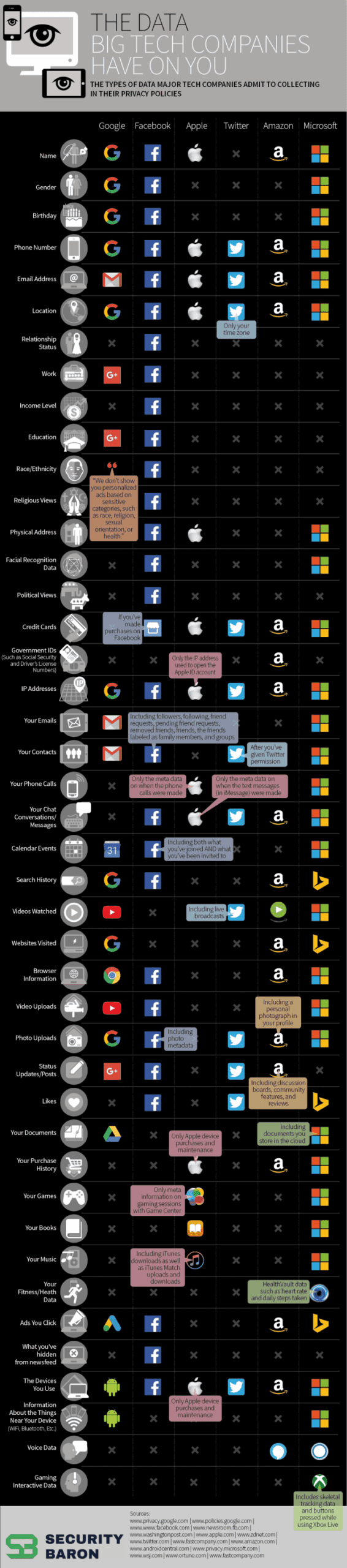
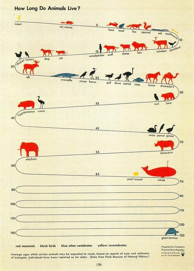
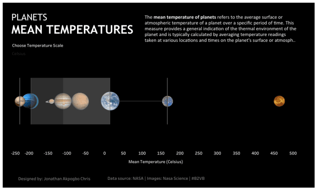
After scrolling through these smart charts, you’ll feel oddly enlightened and slightly attacked. They take the small absurdities of life—like snack schedules or bad decisions—and turn them into perfect visual comedy. The best part? They make being dumb feel intellectual.
These charts prove that humor and information can coexist beautifully. They’re proof that if you can graph it, you can laugh at it.
Smart charts make life’s nonsense look scientific. For more clever comedy, check out infographic memes, data jokes, and chart humor that turn stats into stand-up.
Read Memes
Get Paid

Laura Bennett has spent eight years immersed in internet culture, specializing in deep dives into meme origins, evolving meme trends, and digital subcultures. As a contributor for several prominent online platforms, including BuzzFeed’s meme division and Know Your Meme, she’s written extensively about viral moments from Crying Jordan to Woman Yelling at a Cat. Laura believes memes aren't just internet jokes—they're modern-day folklore. She brings that passion to Thunder Dungeon by keeping readers connected to what's culturally significant, hilarious, and timelessly viral.