Google Maps Logo Redesign Memes
Updated on November 16, 2025
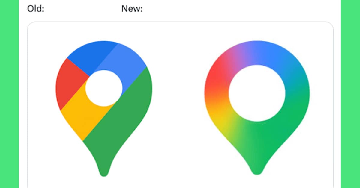
I opened my phone to check a grocery route and did a full double-take—the Google Maps logo redesign memes were already rolling in, and my brain filed the update as “new icon, same chaos.” First flurries outside, lukewarm coffee inside, and my thumbs declared a brief detour into comedy.
The timing’s perfect: year-end updates landing like patch notes, Google quietly widening the “pin hole,” and every dashboard gobbling pixels. Between Android home screens, iOS app grids, and late-night Reddit threads, this mini-gallery felt like a bug report with punchlines. Expect nods to the Google Maps icon, funny logo memes, and a handful of tech meme images that tell the story faster than any changelog.
15 Google Maps Logo Redesign Memes
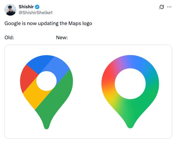


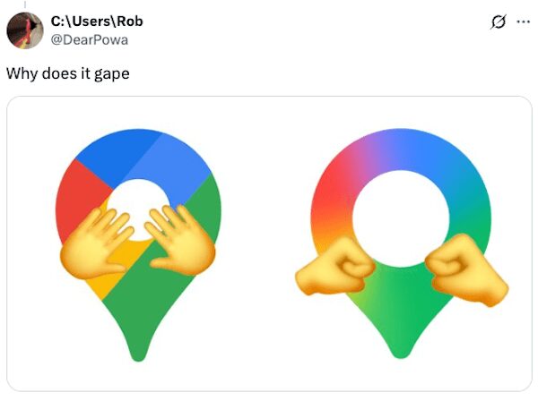


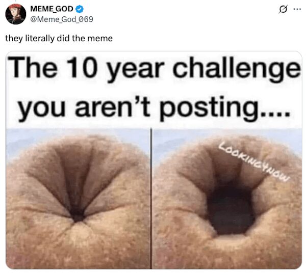

You saw the instant classics—magnifying-glass jokes, donut comparisons, and a floorplan arrow that looks suspiciously hungry. The best Google Maps logo redesign memes worked because the crops were clean and the colors did the talking. A couple even mocked “wider hole, stronger signal” like it was a KPI.
Those “app grid before/after” squares landed hard. Side-by-sides made the Google Maps icon look like it hit the gym for negative space; captions treated it like a corporate retreat deliverable. You saved the tidy ones into home screen aesthetics so your launcher can keep its vibes consistent.
Brand crossover gags were peak mileage: Gmail and YouTube imagining their own “hole expansion initiatives,” plus one brave Chrome circle volunteering as tribute. In a few tech meme images, the pin posed like an audit diagram, which is exactly the tone the internet deserved today.
The signage jokes kept pace: wayfinding arrows with “mind the hole,” office printers asking if they should also get wider, and a calendar tile titled “Meeting: Just A Little Gap.” By now the funny logo memes were doing what logos rarely get to do—be the punchline and the setup simultaneously.
And yes, the navigation puns wrote themselves. “Recalculating… gap width,” “Proceed to the pin with the world’s largest donut,” and a mock release note that read “performance improvements (for holes).” The strongest Google Maps logo redesign memes avoided meanness and stuck to situational absurdity—easy to save, easier to share.
If your camera roll likes tidy systems, keep three on deck: one “before/after,” one donut comparison, one faux release note. That trio covers most chats without adding noise to your notification tray.
Round out the mood with 37 Smart Tech Memes That Are Dumb, 14 iPhone 17 Memes For Design-Brained Friends, and 50 Branding Updates In Photos That We Can’t Unsee.
Alex Thompson triages icons like incidents, labels screenshots like tickets, and keeps morale green between deploys.

