Interesting Graphs For Fast “Ohhh” Moments
Updated on October 16, 2025
I knew I’d fallen down a rabbit hole when a subway capacity chart made me text three friends—peak interesting graphs afternoon. It’s fall brain season, coffee is loyal, and my feed’s full of r/DataIsBeautiful posts that double as party tricks.
Today’s roundup is the good kind of nerdy: snackable visuals that turn “huh?” into “aha!” in one glance. Expect timelines that reframe history, rankings that humble your guesses, and tiny charts that fix arguments before they start. If you like infographics, data visualization, and tidy statistics, this is your cozy-weather scroll.
30 Interesting Graphs For Quick Curiosity Hits
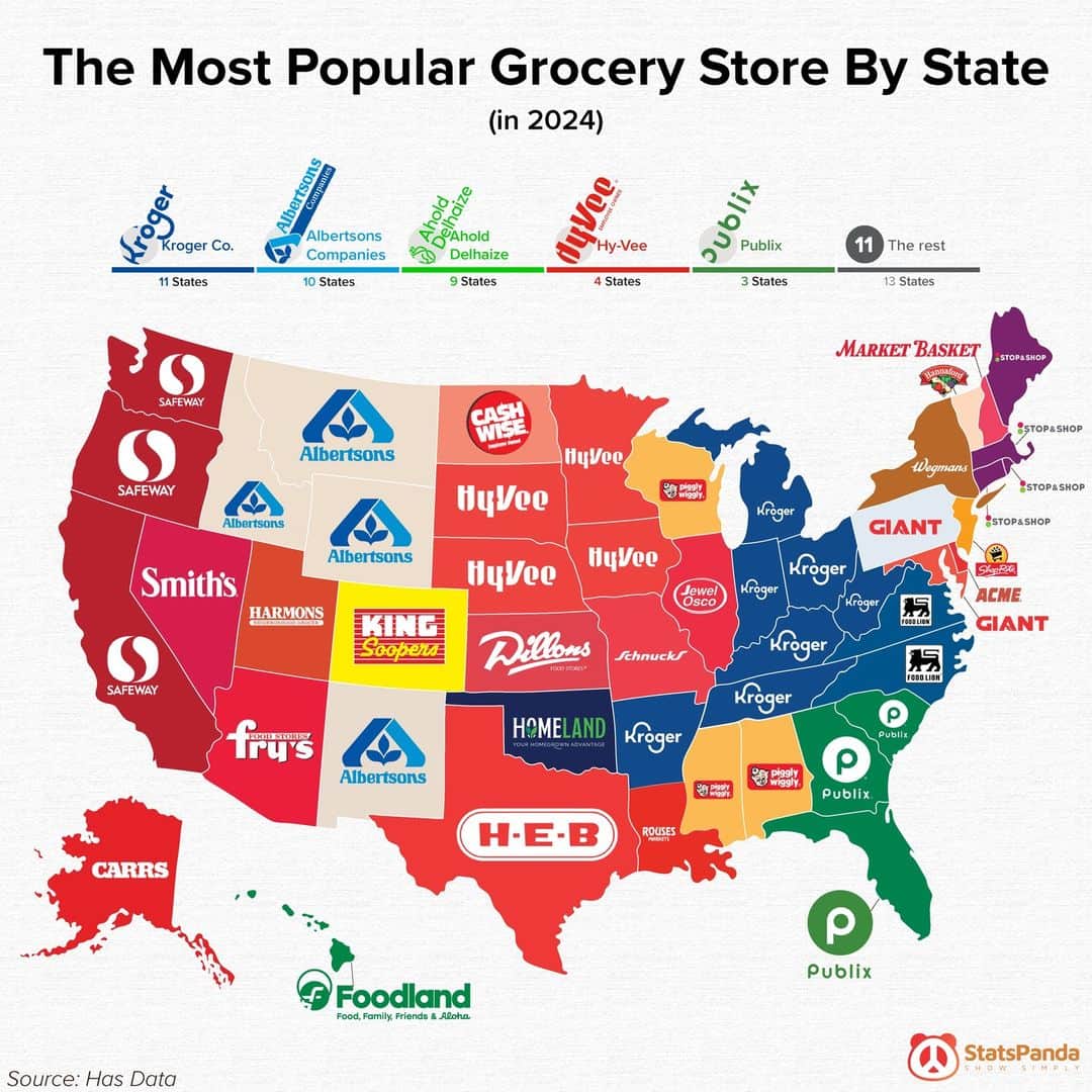
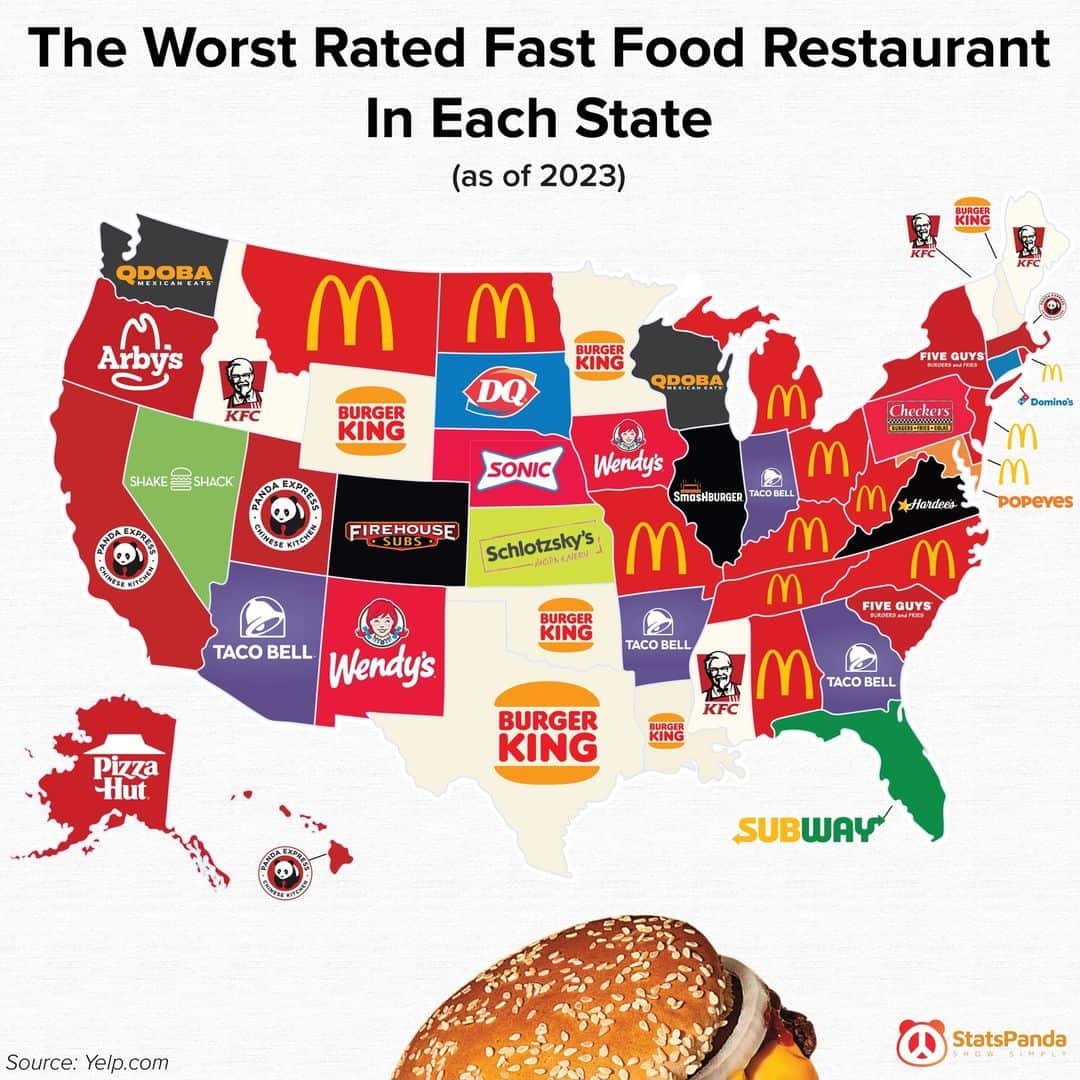


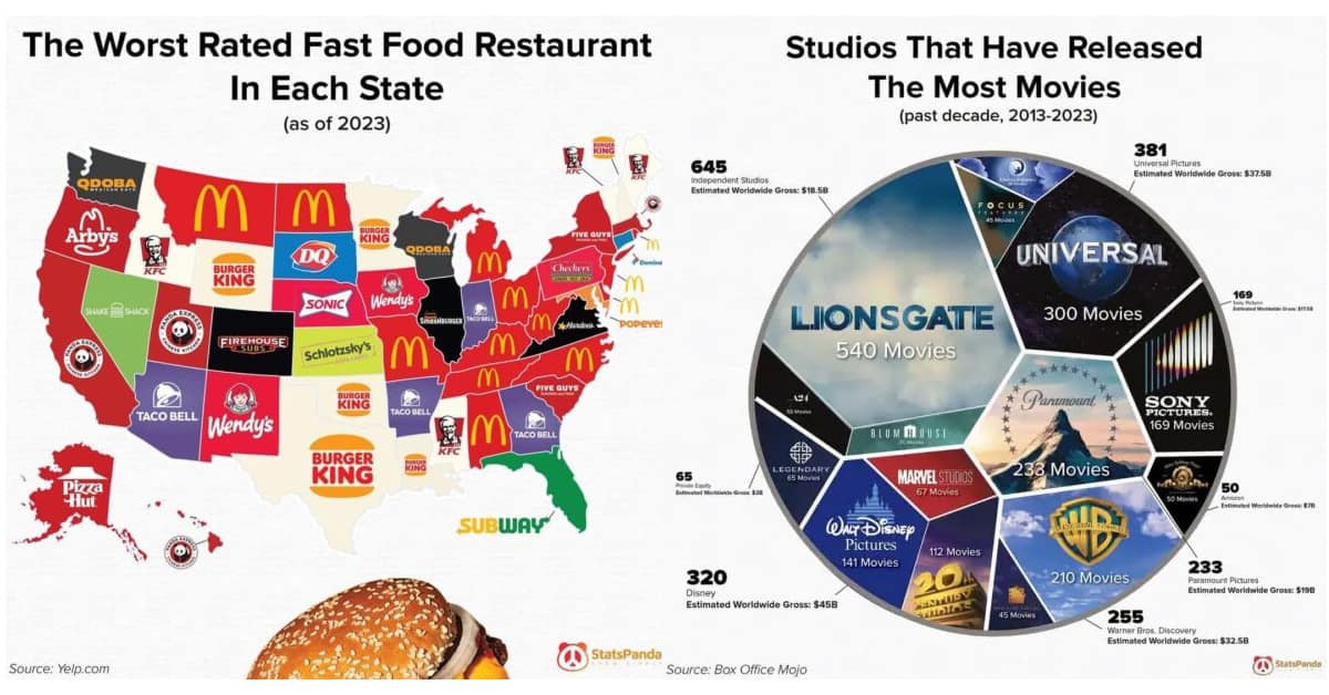
Back from the gallery? Same—my thumbs tried to fact-check my memory. The best interesting graphs work because they’re specific, simple, and a little surprising. Save a few under data visualization so you’ve got instant conversation ammo for the next commute or coffee queue.
Platforms play different roles. Instagram carousels love before/after comparisons; X rewards a crisp single chart with one-line context; TikTok thrives on “explain this axis like I’m late to class.” When in doubt, lead with a clear title and one highlight point—your future self will thank you. For deeper dives, stash links to fun facts hubs so you can source the numbers later.
Design matters more than most people admit. Label your axes, avoid rainbow soup, and let one color carry the punchline. That’s how statistics become stories: one standout shade, one takeaway, zero squinting. If a chart needs a legend longer than a grocery list, it’s a blog post in disguise.
Seasonal note: back-to-school energy makes this stuff magnetic. Budget breakdowns feel timely, weather trend lines make sweaters feel inevitable, and “how people actually spend their time” wheels are basically workplace gossip with numbers. Drop a clean visual in the group chat and watch replies multiply.
Credibility check: screenshots travel farther than citations, so add a source in the corner when you can. We’re here for delight, not misinformation. Also, remember that correlation is not causation—it’s a flirtation that needs a chaperone. Keep a few curiosity hits labeled “cool, not conclusion.”
If your brain’s still buzzing after these interesting graphs, steer into 45 Mind-Blowing Facts For People Who Love Being Wrong, take a lap through 23 Visual Explanations You’ll Quote All Week, and cap the night with 40 Maps And Charts You’ll Save—perfect side quests once the gallery juices your inner nerd.
Author bio: Priya Coleman arranges pixels and punchlines like thrift-store art—odd, charming, and somehow perfect above the couch.
Read Memes
Get Paid

Priya Coleman is a viral content specialist and meme analyst with over six years in digital publishing. Her past roles include viral content editor for PopSugar's humor vertical and meme correspondent for HuffPost’s comedy section. Priya specializes in spotting trending meme moments just before they peak—like the chaotic delight of the Ever Given’s Suez Canal mishap or the existential comedy of This is Fine. She brings her sharp wit and instinctive knack for viral content to Thunder Dungeon, always keeping the community a step ahead of the latest meme craze.