23 Sports Logo Changes Guaranteed to Make You Question Design Choices
I assumed professional teams spared no expense in nailing their branding—until I saw a few sports logo changes that made me question if the design meeting took place in a dimly lit garage. Turns out, not every rebrand is a triumph. Sometimes, it’s a masterclass in how to transform a decent icon into a bland or outright baffling creation. Well, at least they’re consistent in surprising us, right? So let's get into some logo downgrades.
In this post, you’ll find 23 sports logo changes, each illustrating a unique level of questionable design prowess. Some images highlight how a once-distinctive emblem deteriorated into flat shapes and bland color palettes, making you wonder if the concept of an update was misunderstood from the start. These logo downgrades hint at the collective disbelief fans expressed online. Here and there, you’ll see redesigned team emblems that left everyone scratching their heads over missing mascots and confusing abstract shapes. Meanwhile, it’s hard to ignore those rebranding fails that tried to modernize a classic aesthetic, only to lose the original charm in the process. A few of these updates were presumably made under the assumption that minimalism equates to excellence, but the result often borders on incomplete doodles. The entire gallery of sports logo changes underscores how a brand-new look can drift far from what fans adored—like an adventurous haircut you regret the second you see it in the mirror.
If you’re the type who loves a good cringe over design missteps, these images capture the essence of “Yes, we did it… but maybe we shouldn’t have.”
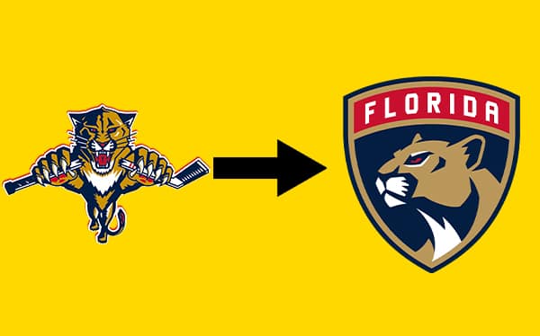
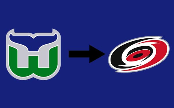
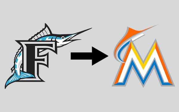
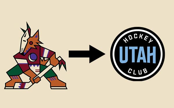
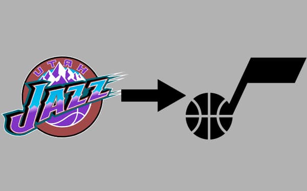
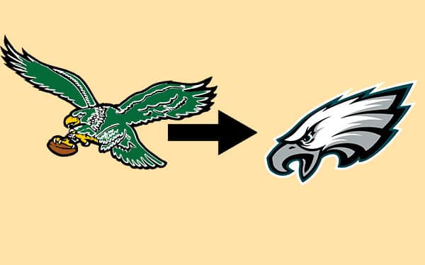
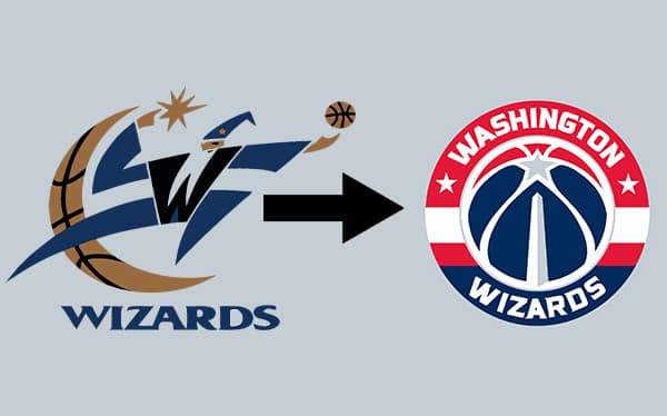
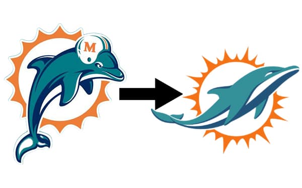
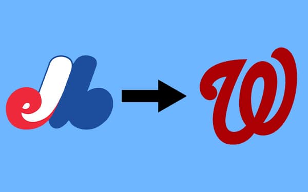
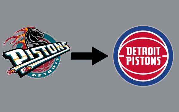
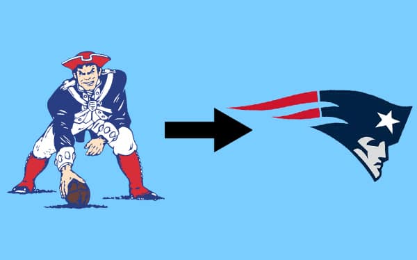
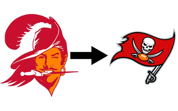
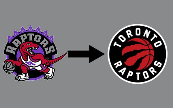
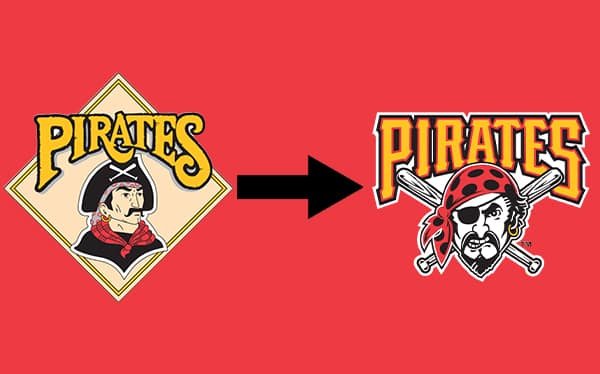
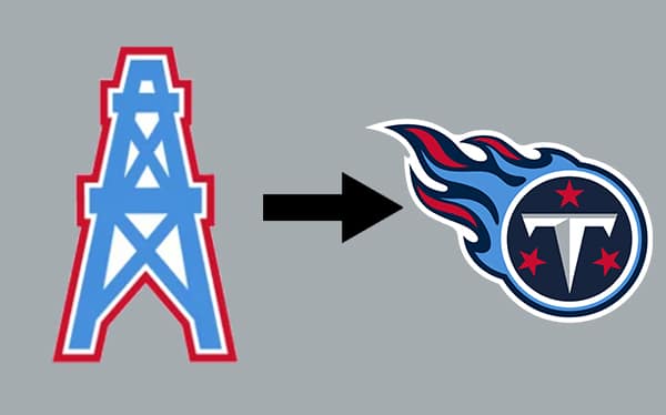
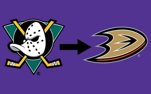
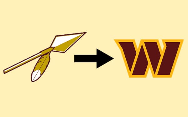
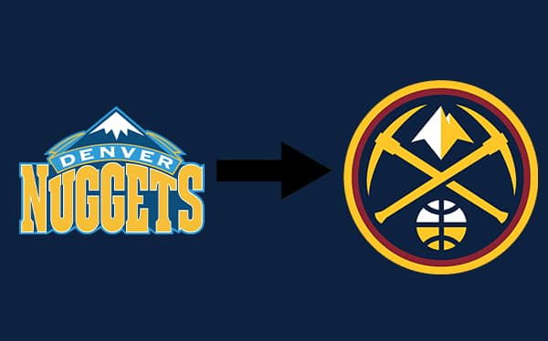
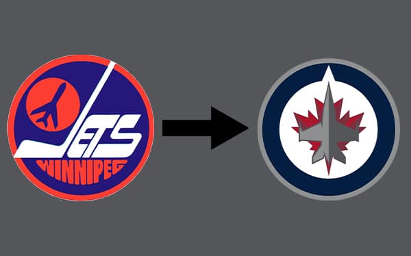
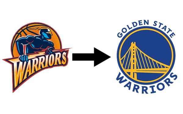
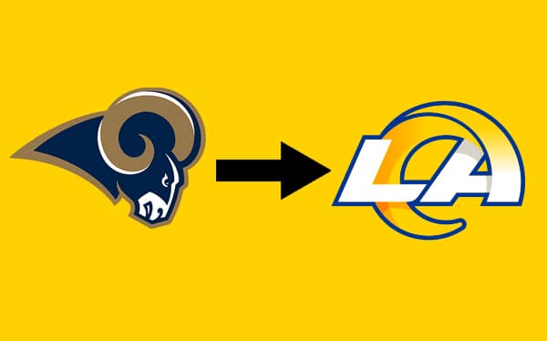
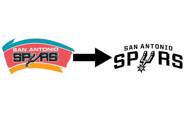
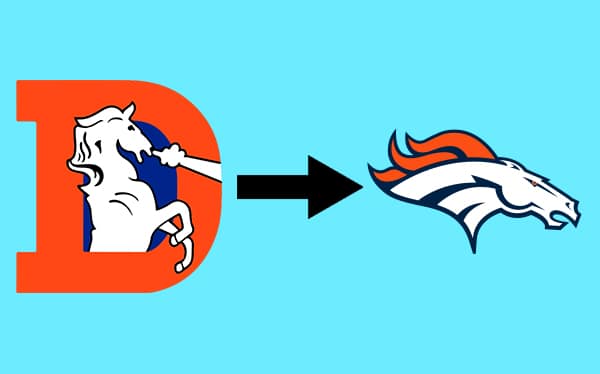
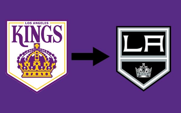
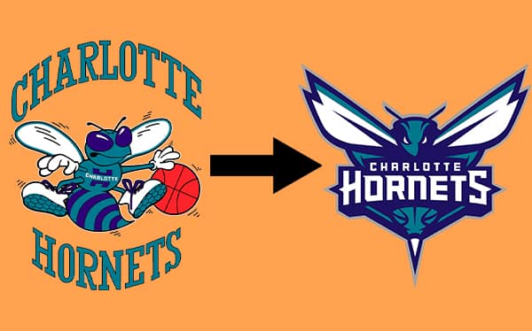
Once you reached the end, you likely found yourself both amused and slightly aghast at the transformations. You witnessed sports logo changes stripped of their defining features, replaced by simplified graphics that could’ve been drafted on a napkin. It was a parade of curious design decisions that left you pondering if there’s ever going back.
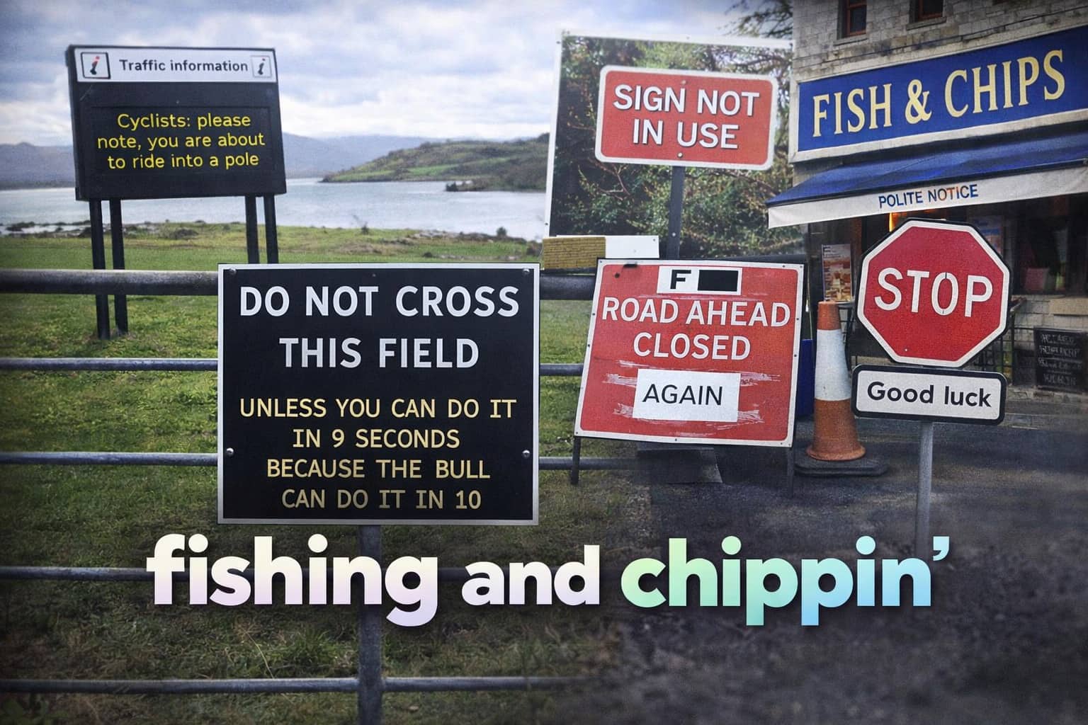
If this stroll through aesthetic mishaps excited your interest in design gone wrong, you might want to check out a gallery dedicated to weird signage fails, where text and imagery collide in all the wrong ways. Another post highlighting marketing blunders could also keep you in that sweet zone of skeptical fascination. Stick around Thunder Dungeon for more content about sports logo changes, and other branding fails that scratch the itch for comedic critique.









rest in piece winnipeg jets 1.0
Not only are most of the redesigns better, a lot of them are also team location changes. The Hartford Whalers became the Carolina Hurricanes because NC gets hurricanes, but wasn’t known for a whaling industry. That’s how you get stupid crap like the LA Lakers. Even if you kept the name, Raleigh, NC can’t incorporate into the negative space the same as the H for Hartford. This list needs a redesign.
The Utah Hockey club and the Tennessee Titans didnt have a choice. They had to chamhe logos and it had to be completely different because they moved. That is the only two that I dont agree with.