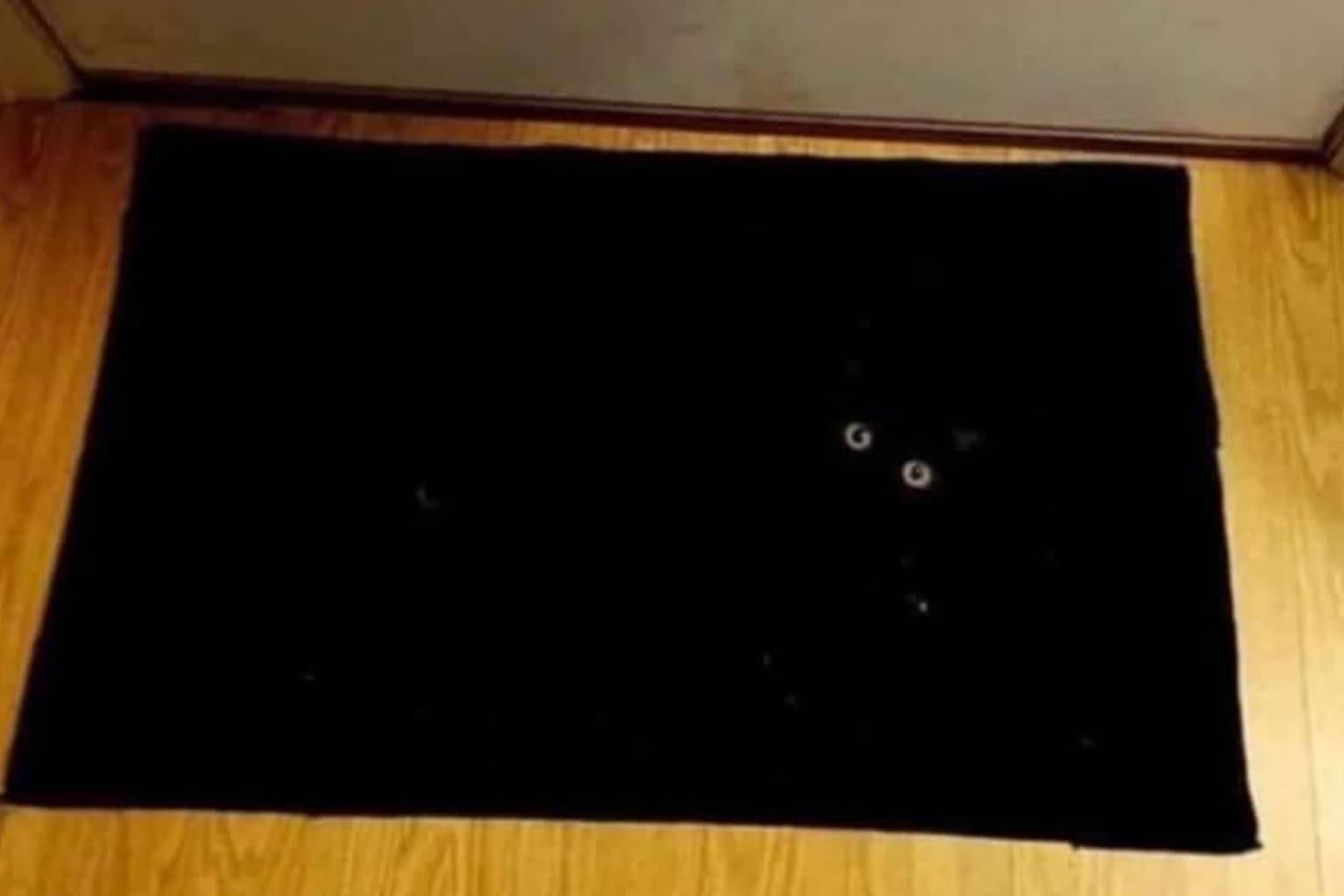
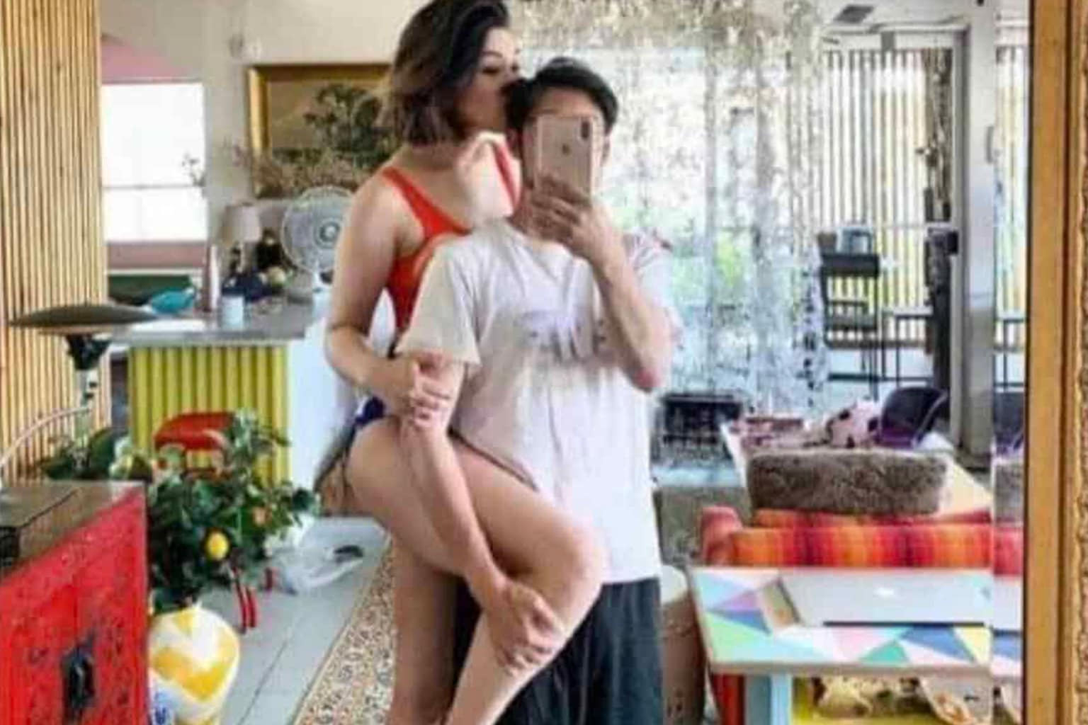
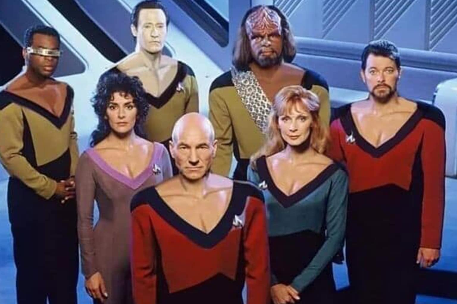
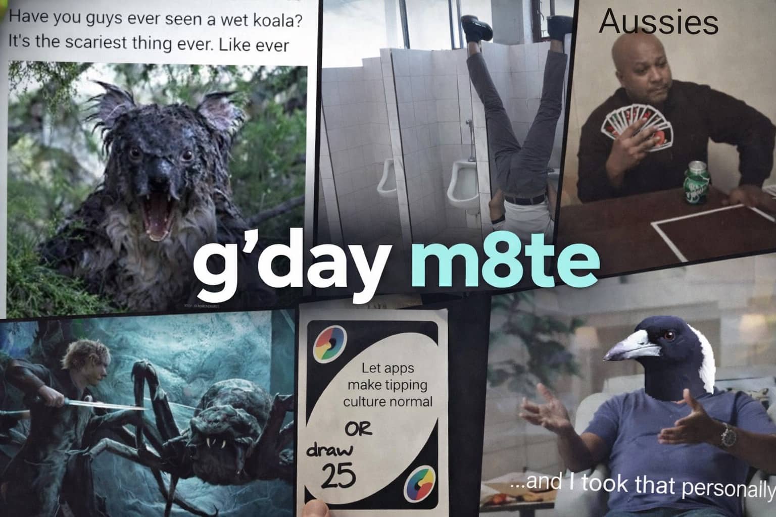
Word placement 101
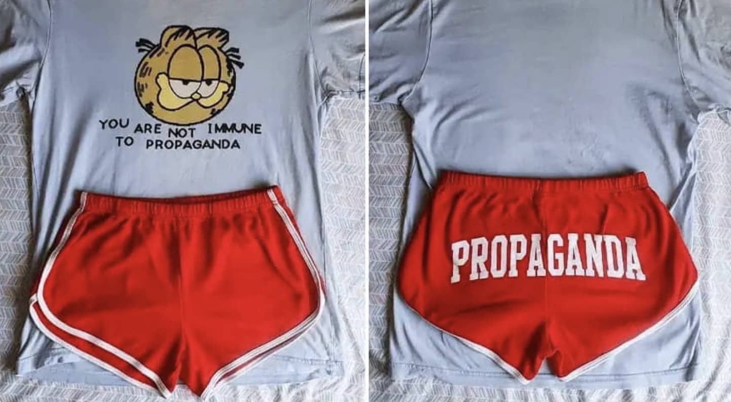
I once picked up a T-shirt with its slogan arranged in such a way that I spent five minutes decoding a single phrase. If you’ve also squinted at questionable sign layouts, these images will validate your suspicion that some designers just liked living on the edge.
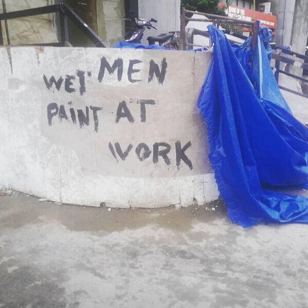
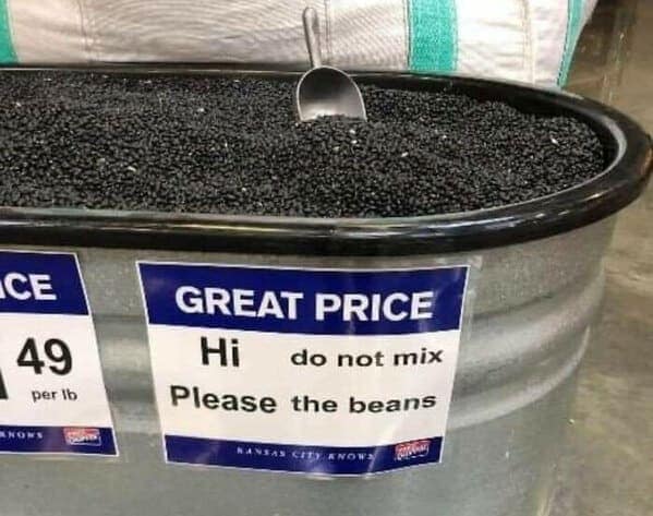
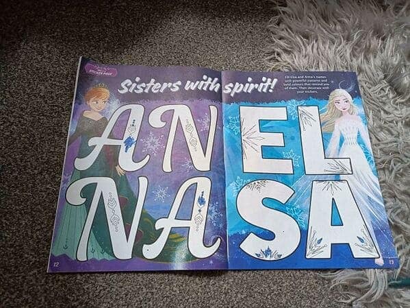
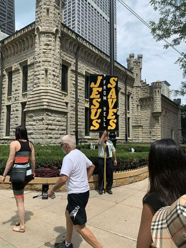
Imagine strolling through a store, expecting run-of-the-mill promotions, and stumbling upon bad signage so chaotic that you have to pause and decipher it. Each image in this collection showcases design fails capturing every possible error in spacing, line breaks, or downright oblivious layout. Sometimes a single letter shift leads to unintended comedic gold, while other times a brand’s entire message gets lost in awkward text arrangement. Whether it’s a billboard with an accidental hidden swear or a T-shirt slogan reading like a riddle, these mishaps highlight the delicate balance between creativity and coherence. You’ll catch yourself involuntarily tilting your head, trying to unscramble the writer’s original intention, only to realize maybe they never thought twice about it. Hilarity (and confusion) inevitably follow.
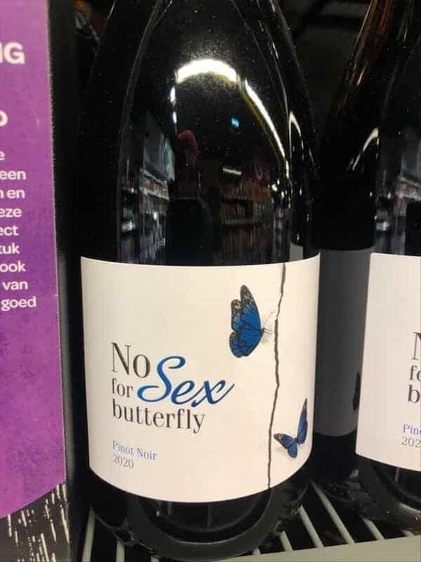
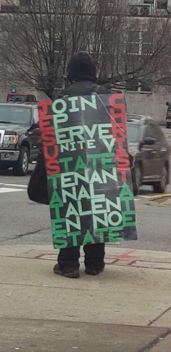
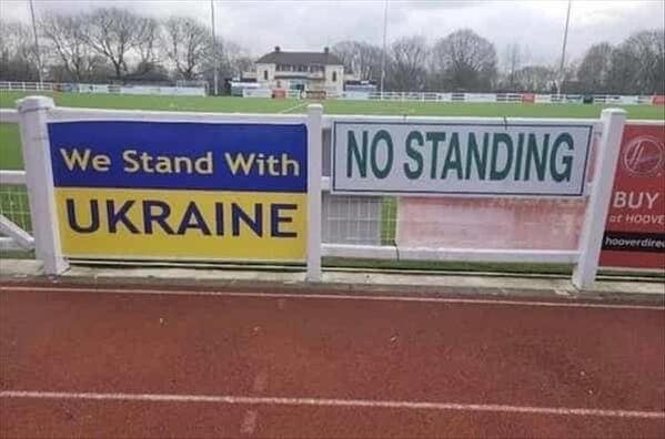
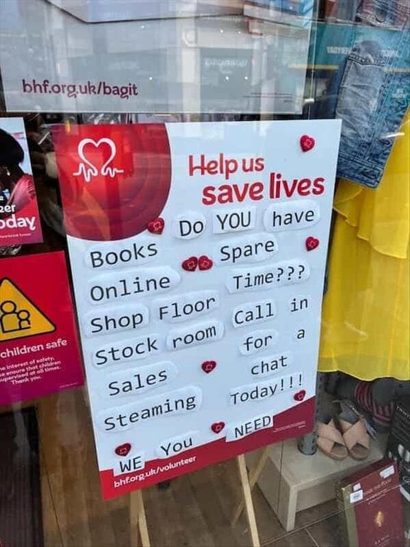
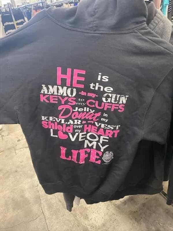
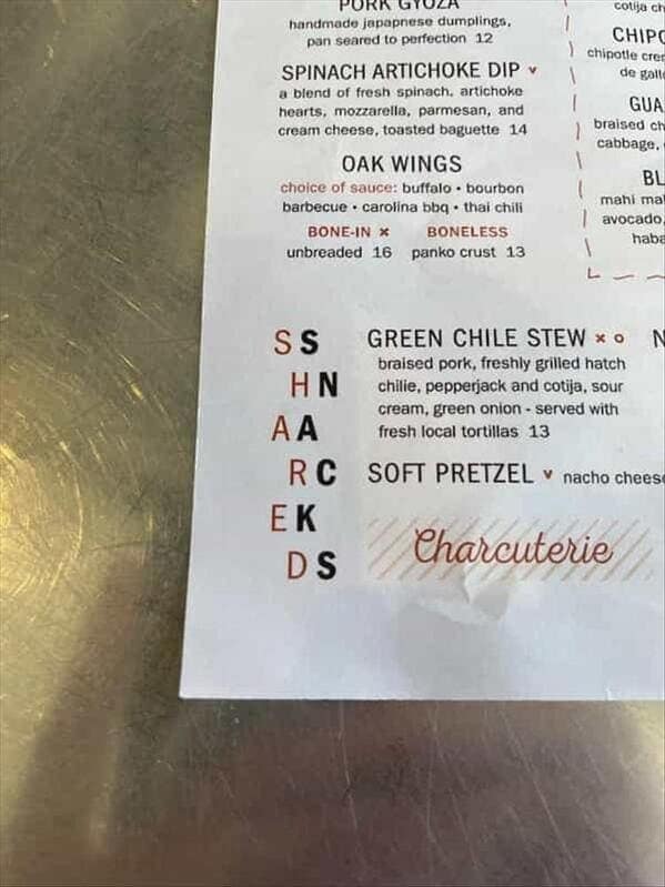
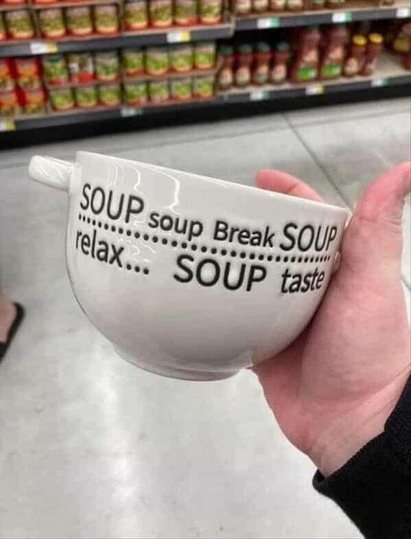


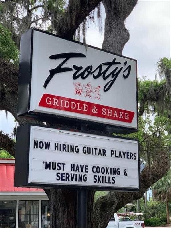

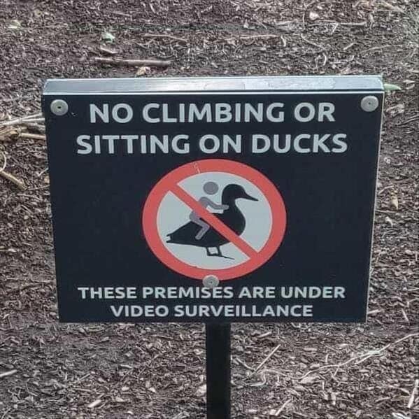
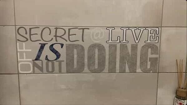

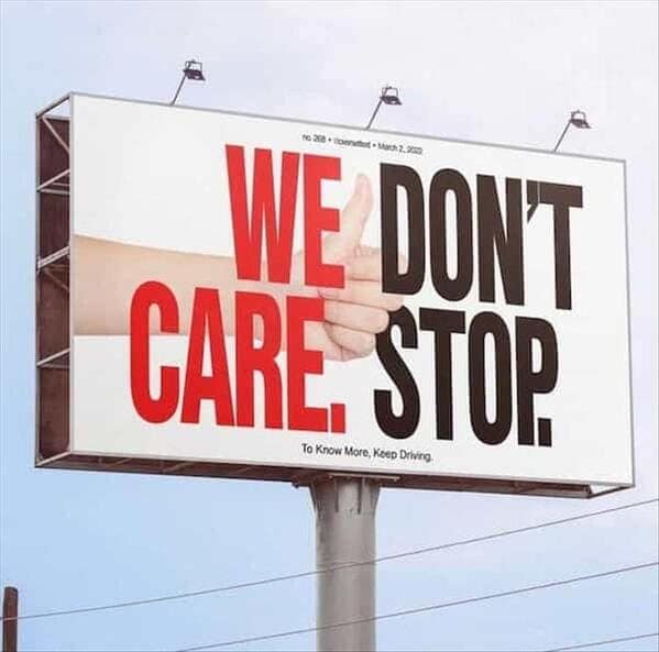
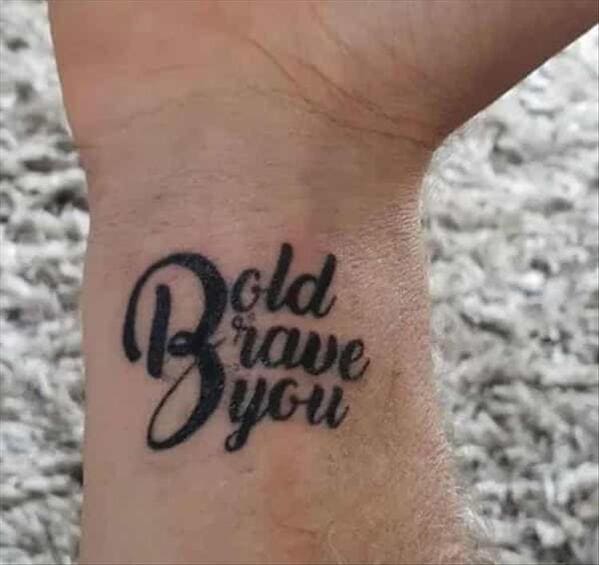
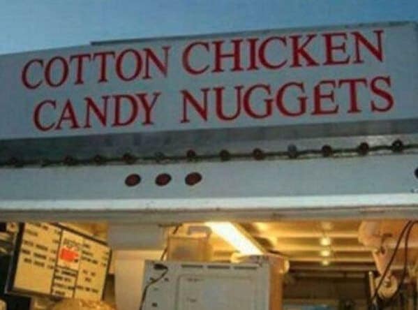

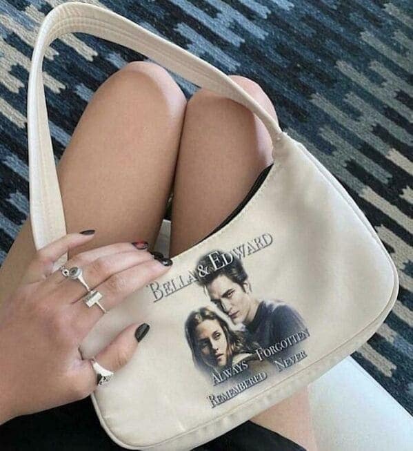
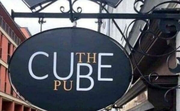

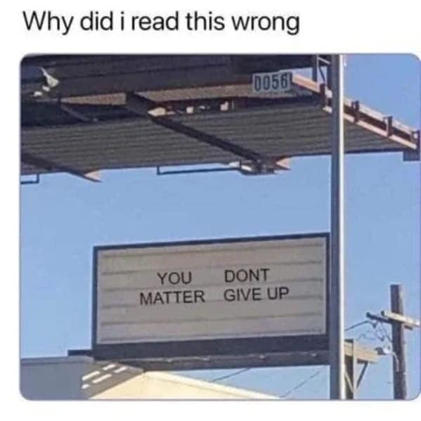
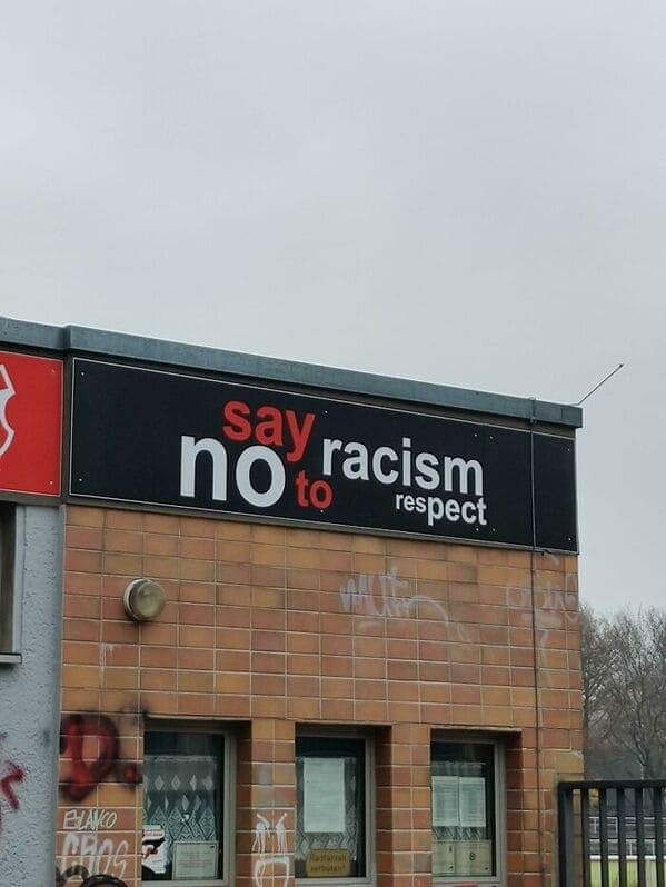
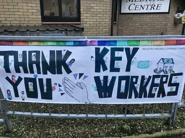
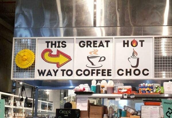
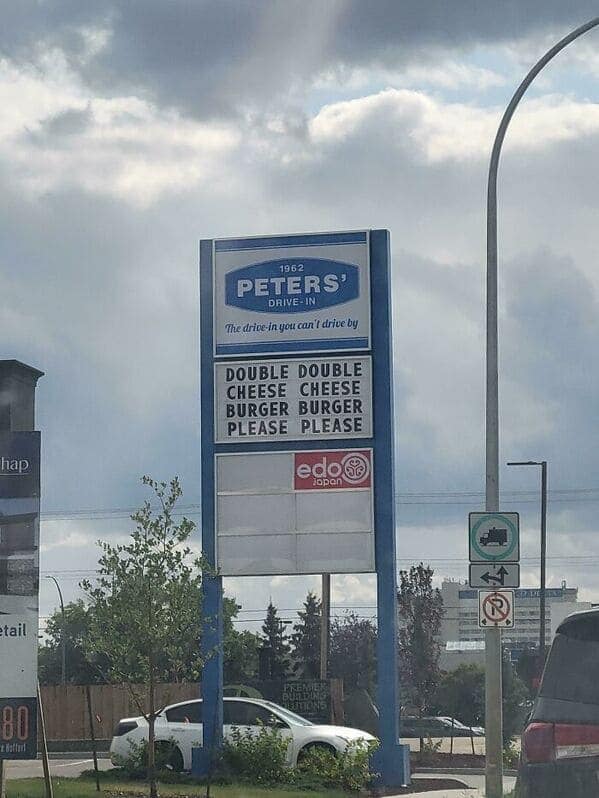
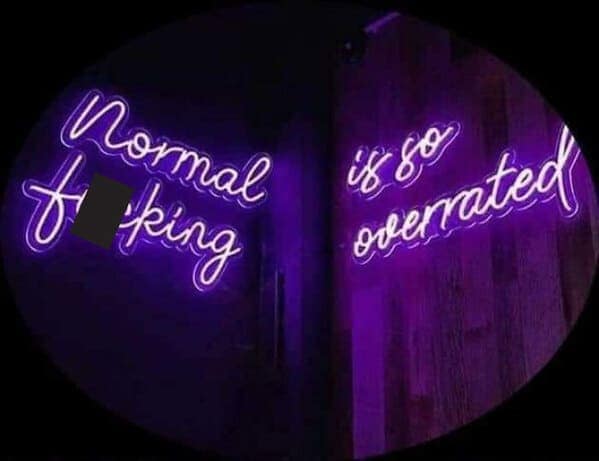
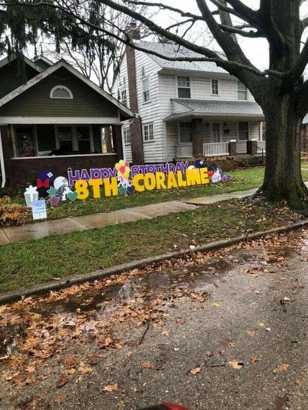

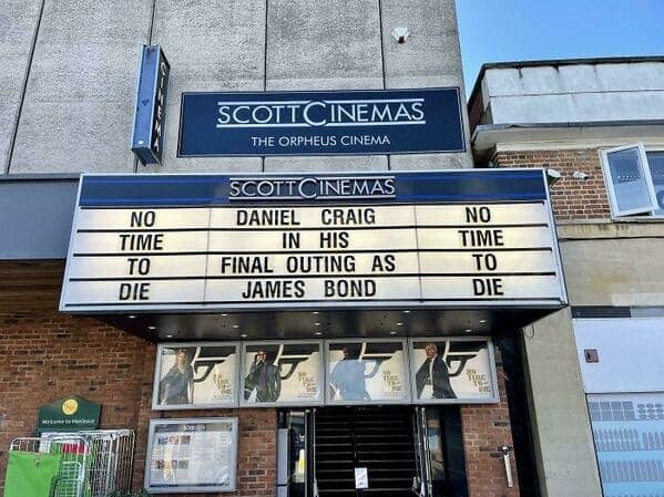

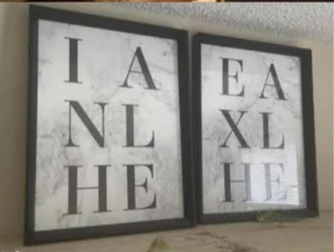

After scrolling through these puzzling designs, you likely felt both entertained and slightly more appreciative of the times you’ve caught your own typos. You witnessed entire messages derailed by one misplaced word, leaving you smirking at just how easily a meaning can change with unwise spacing choices.
If this word placement fiasco struck a chord, explore Thunder Dungeon’s additional galleries featuring bad signage, design fails, or awkward text arrangement. Delve deeper into the realm of questionable layout decisions, and find more reasons to mutter, “Maybe a quick second look wouldn’t have hurt.”


