Confusing graphs
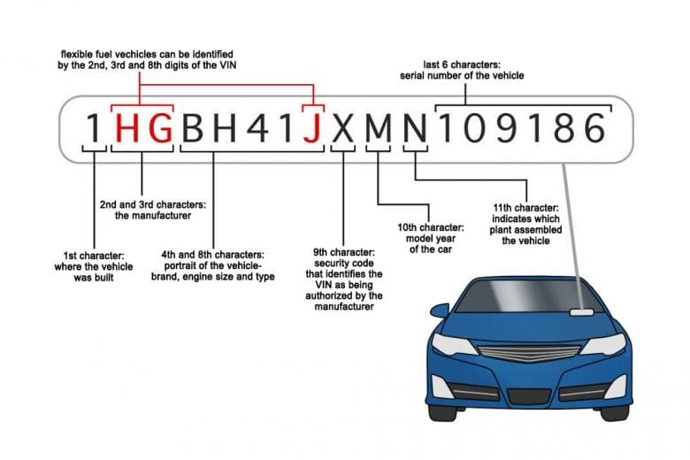
We’ve all come across those graphs and infographics that make us question everything we know about data visualization. You know the ones—where the lines don’t quite add up, the colors seem to have no meaning, and the overall message is anything but clear. I remember being in a meeting once, staring at a graph that seemed to defy the very laws of logic. It was supposed to explain something simple, but instead, it left the entire room in a state of collective bewilderment. If you’ve ever felt that confusion, you’re in for a treat with this collection of bizarre and confusing graphs that will make you rethink how information is presented.
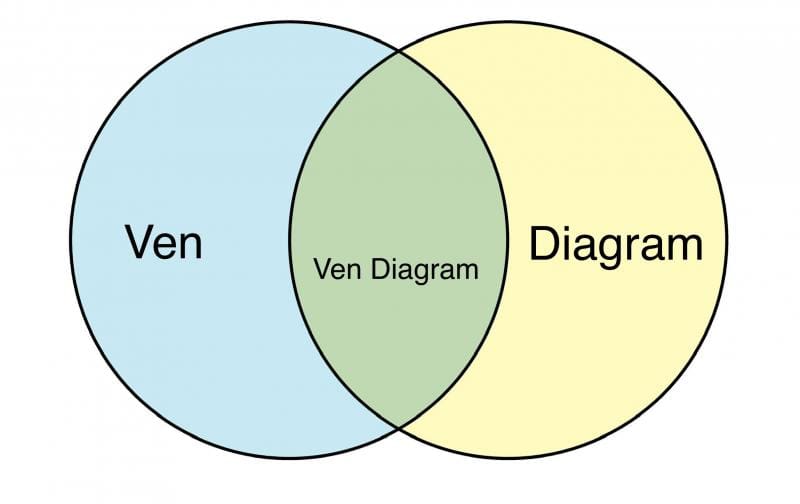
This compilation of 25 confusing graphs and infographics is a visual journey into the bizarre world of data misrepresentation. Each graph in this collection is a masterclass in how not to present information, yet they’re so bewildering that you can’t help but be intrigued. From pie charts that don’t add up to bar graphs that seem to be missing crucial bars, these images will make you question everything you thought you knew about data visualization. The confusing nature of these graphs is only amplified by their attempt to convey complex information in the most convoluted way possible. Whether it’s a line graph that spirals into nonsense or an infographic that somehow manages to obscure the very facts it’s trying to highlight, these examples serve as both a cautionary tale and a source of endless amusement. As you scroll through, you’ll find yourself marveling at how something intended to clarify can end up causing more confusion than clarity. So prepare to dive into a world where the visuals make you second-guess the information—and maybe even your sanity.


After exploring these 25 confusing graphs and infographics, you’ve undoubtedly been left scratching your head. The visual chaos of these charts made what should have been straightforward information feel like a puzzle that even the most seasoned data analyst would struggle to solve. You’ve seen how data can be twisted, turned, and tangled into a mess that leaves you questioning not just the graph, but reality itself. This collection provided a bizarre yet fascinating look into the world of information gone awry, and no doubt, you’ve walked away both entertained and slightly more wary of the next graph you encounter.
If these confusing graphs and infographics have left you wanting more puzzling content, Thunder Dungeon has plenty to offer. Explore our other meme galleries that focus on the strange, the bizarre, and the outright confusing—whether it’s hilariously bad designs, mind-bending optical illusions, or other visual oddities that make you question what you’re seeing. There’s a whole world of content waiting to perplex, amuse, and entertain you, so why not dive deeper into the humor of the nonsensical?


