Get ready to cringe, folks, as we dive headfirst into the world of terrible interior design. On the internet, laughter often comes from the most unlikely places, and terrible interior design is no exception. It's a comedy goldmine where the absurd meets the aesthetic.
People online have a unique fascination with terrible interior design. They're drawn to the jaw-dropping, eye-watering choices that defy all sense of style. It's a mix of shock, amusement, and the sheer disbelief that someone thought these design elements were a good idea.
Today, we're about to embark on a tour of 40 truly terrible interior design elements and furniture that'll make you question the very concept of taste. Get ready to cringe, laugh, and maybe even feel a little grateful for your own decor choices!
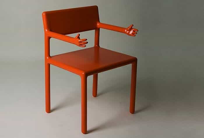
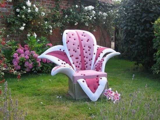
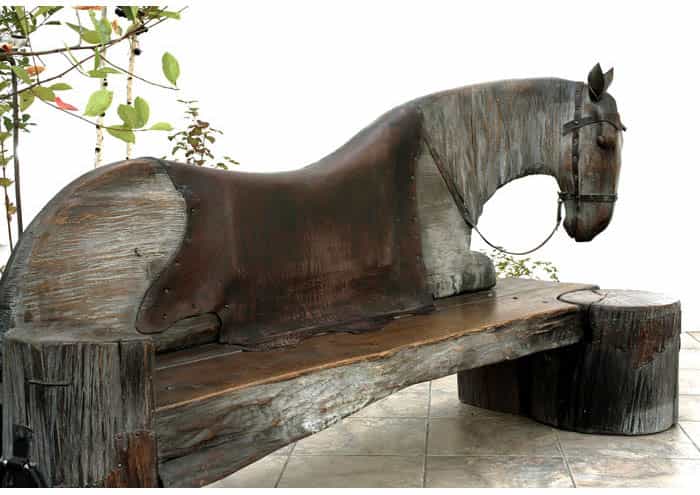
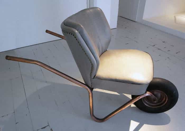

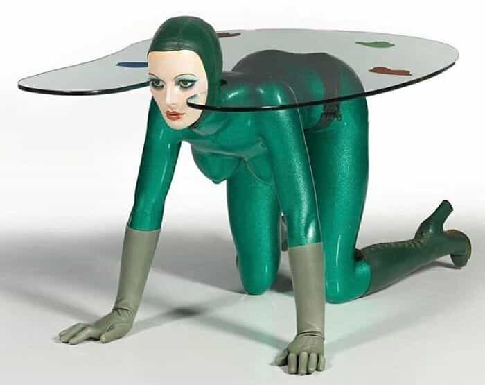
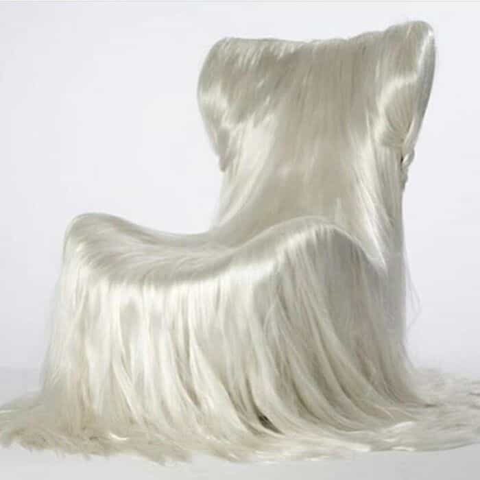
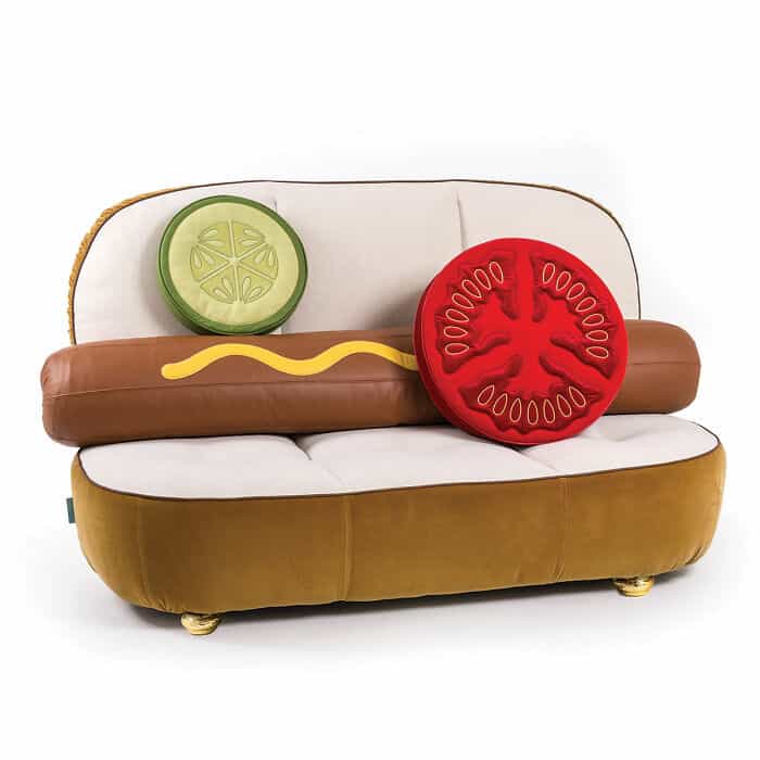
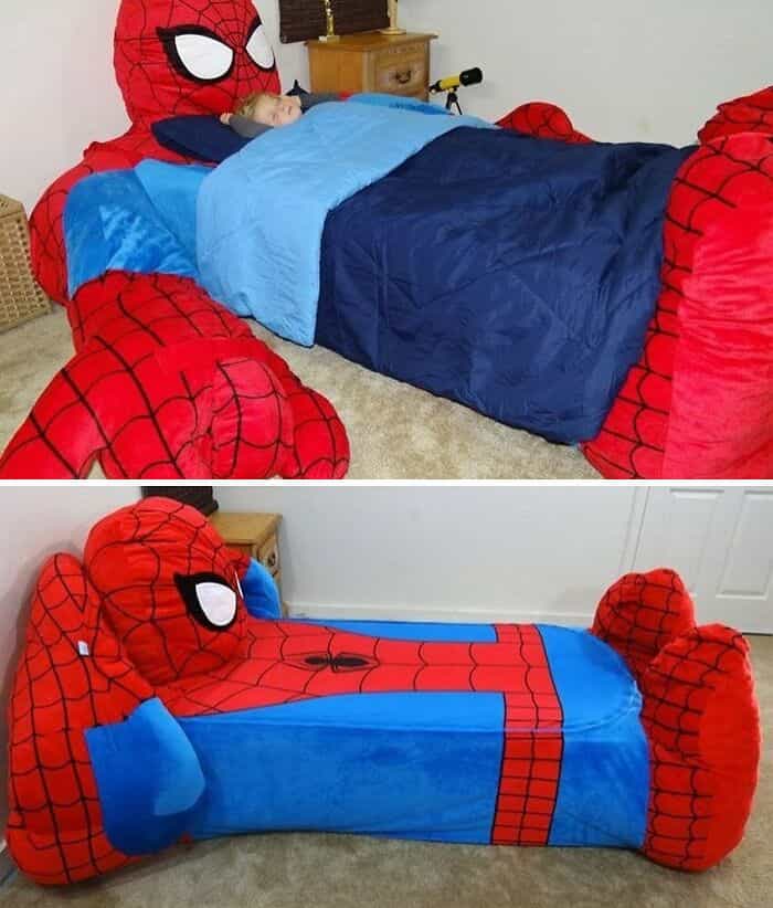


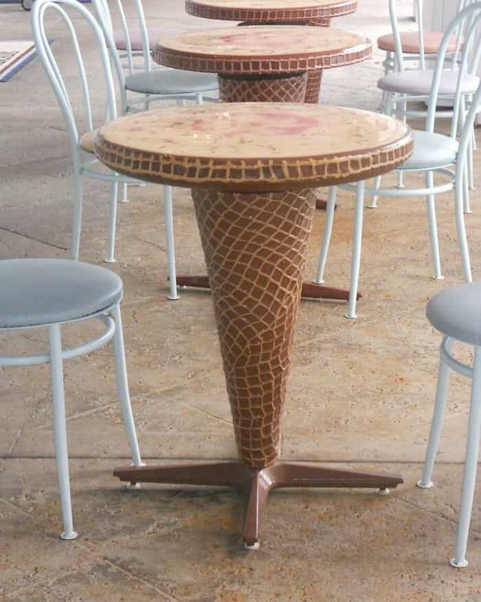
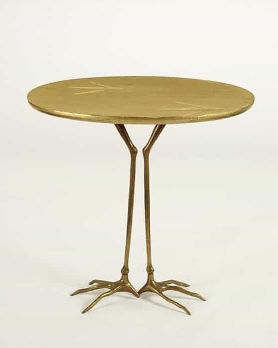
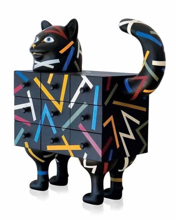

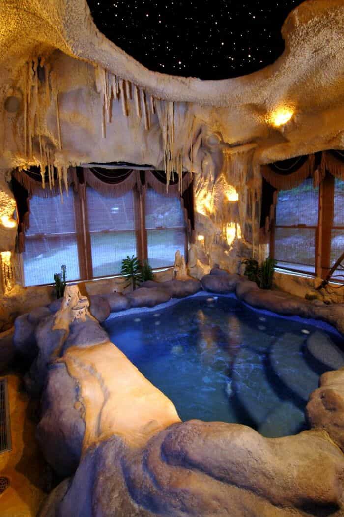

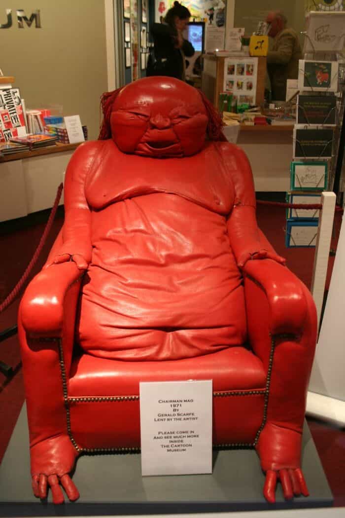
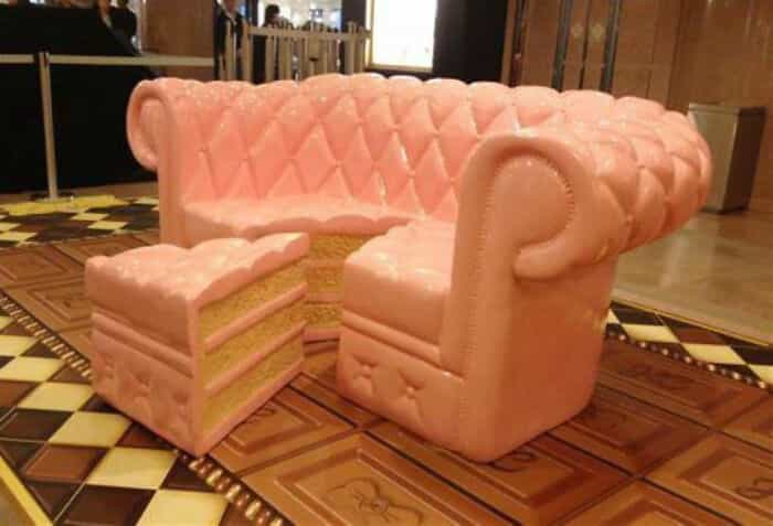
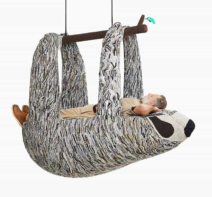
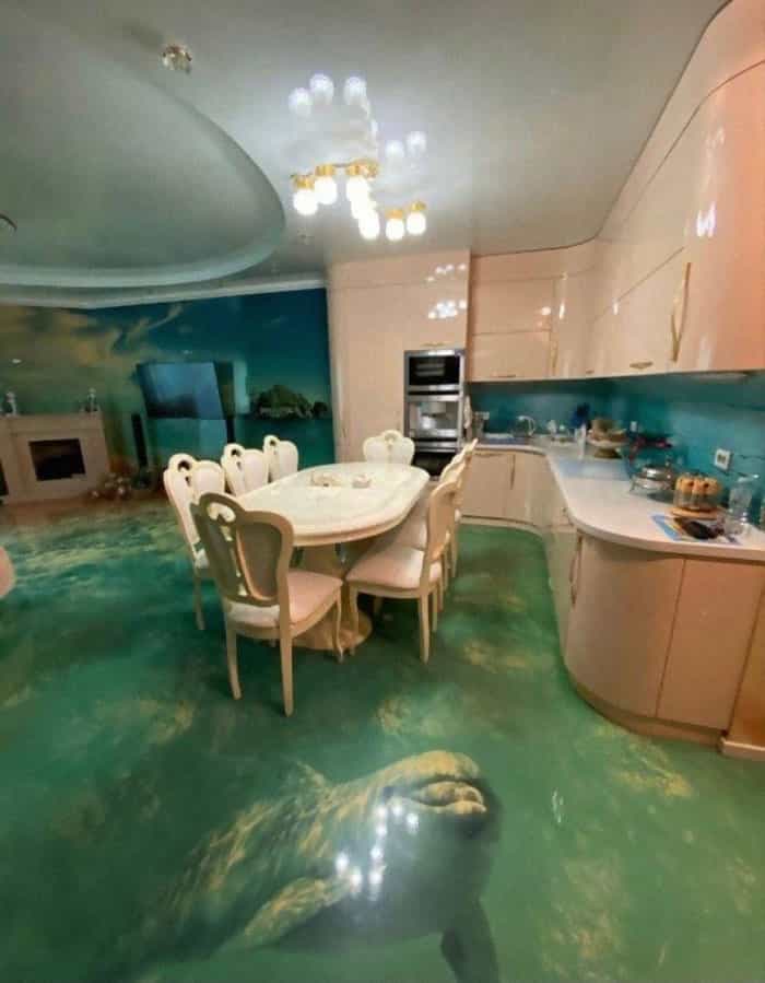
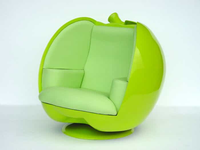
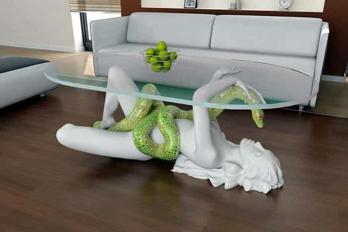

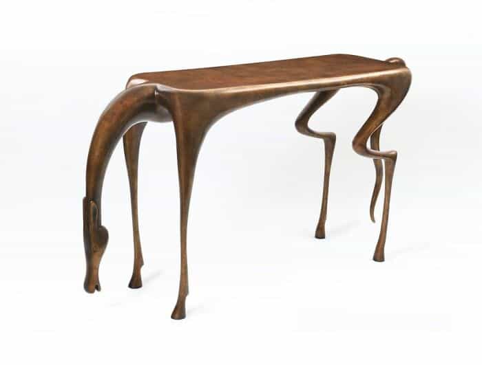
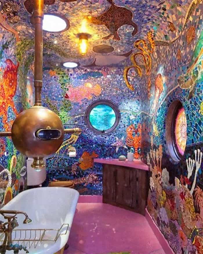
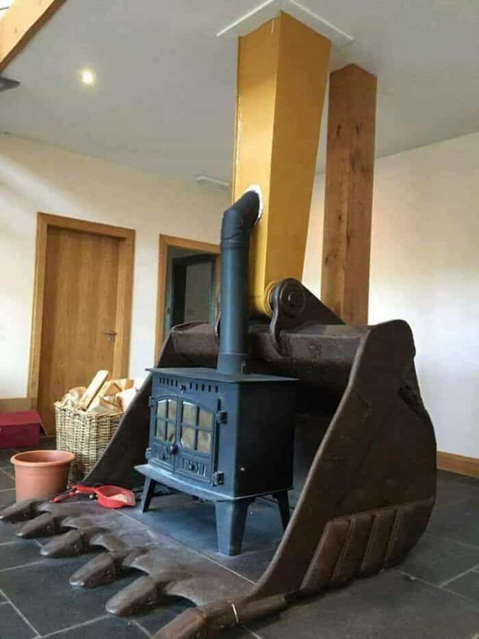
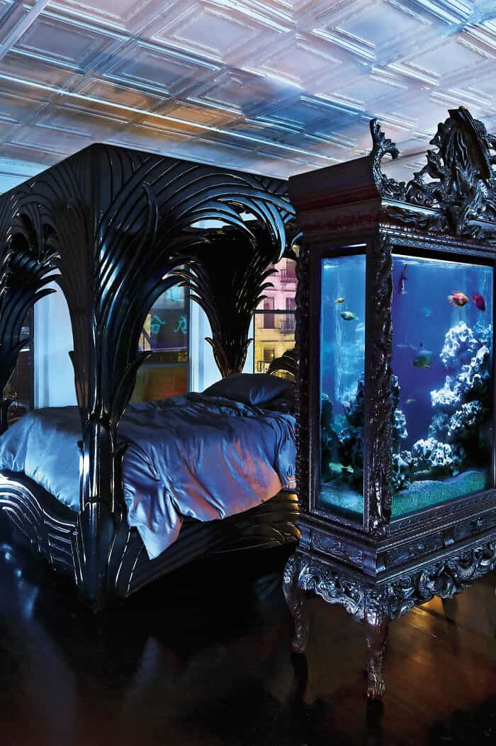
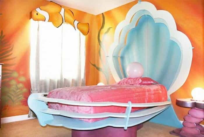
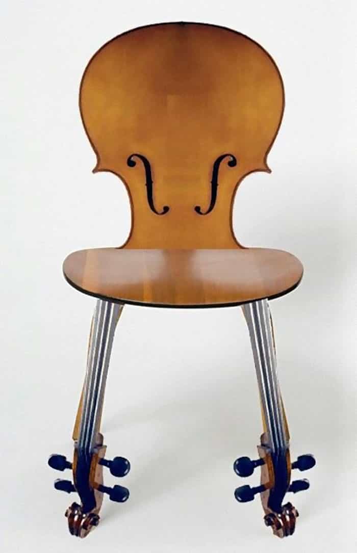
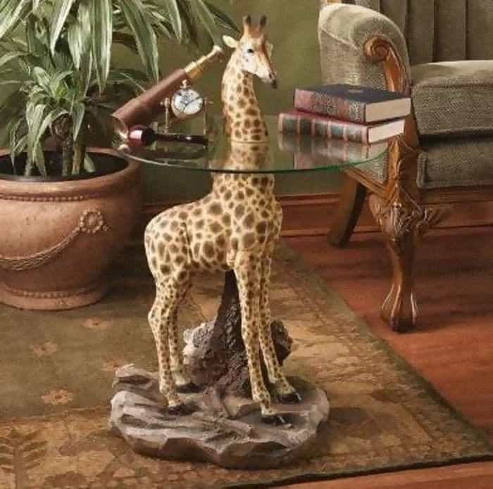
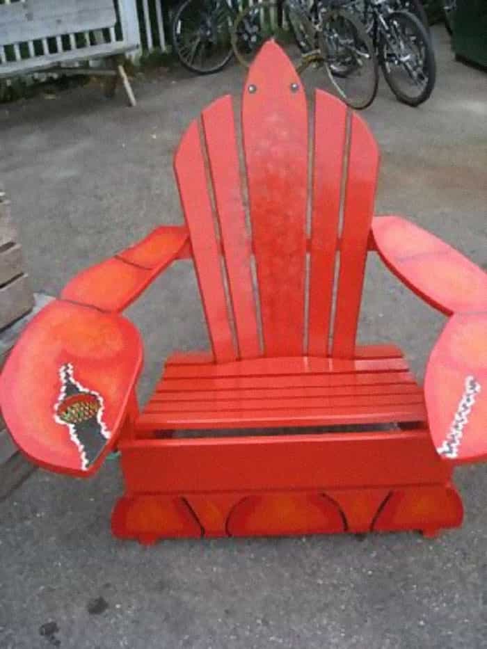
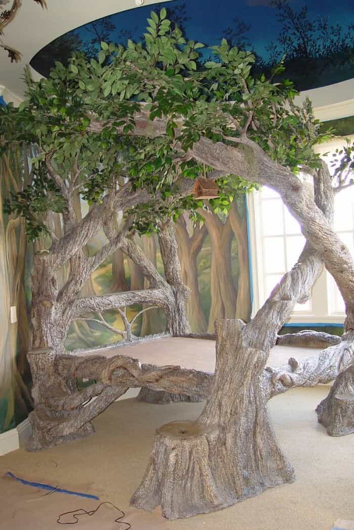
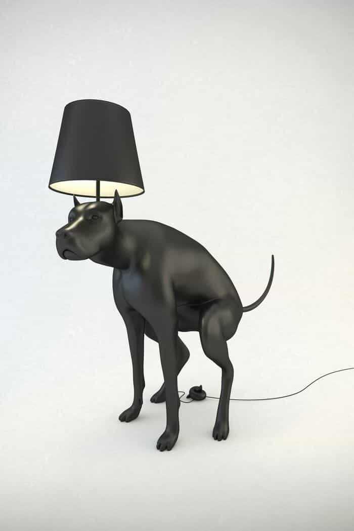
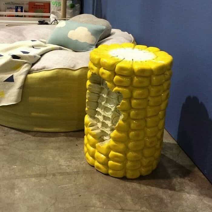
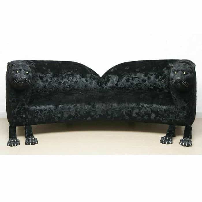

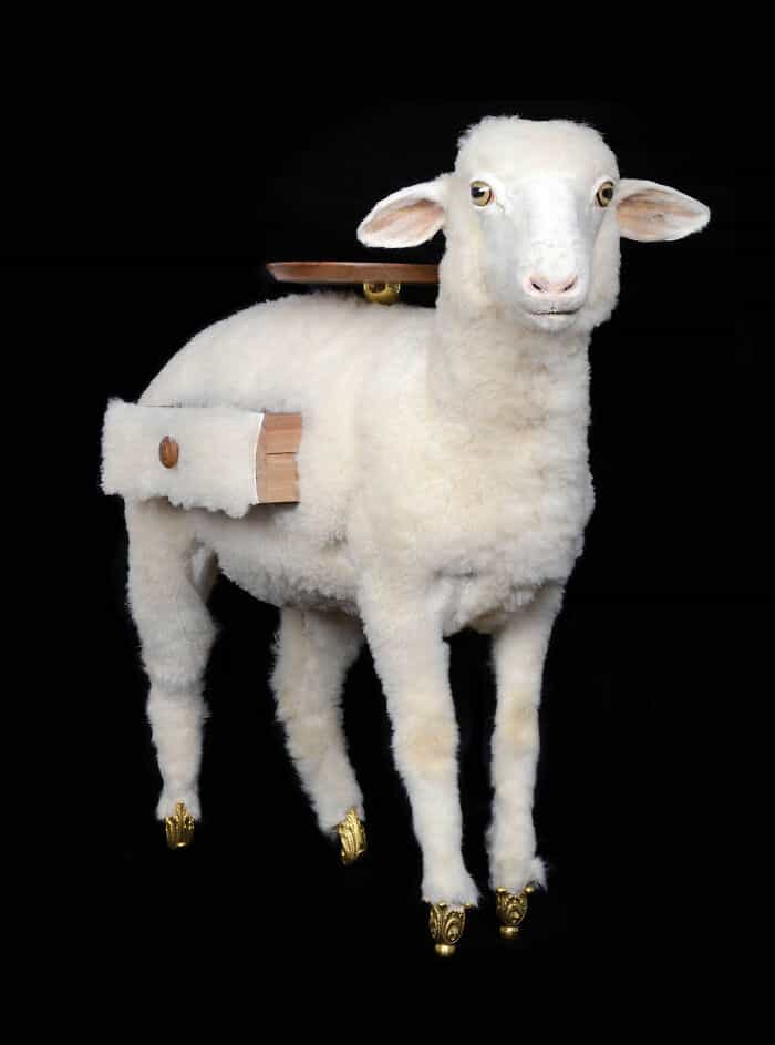

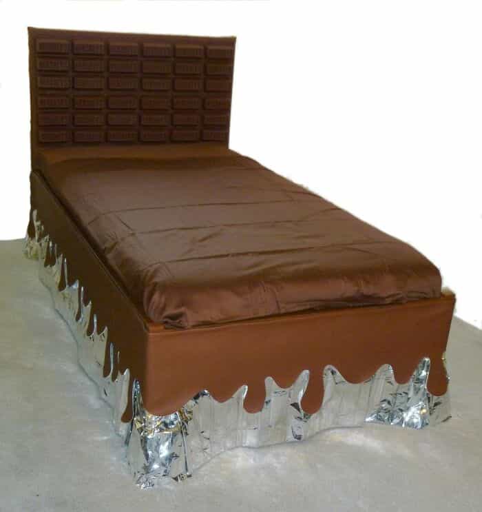
As we conclude our exploration of 40 cringe-worthy interior design elements and hideous furniture, we've witnessed a parade of design disasters that defy belief. From mismatched colors to bizarre decor choices, these examples are a testament to the wild world of terrible interior design.
But the amusement doesn't stop here! Our website is a treasure trove of design-related humor, and if you enjoyed this post, there's a wealth of similar content waiting for you. Dive into our collection of articles that dissect design blunders and celebrate the quirky side of aesthetics, from "Design Disasters" to "Decor Fails." We offer a world of laughter that revolves around the unconventional and outrageous.
So, whether you're a design enthusiast or simply looking to have a good laugh, stay tuned for more terrible interior design hilarity right here on our website.









1